-
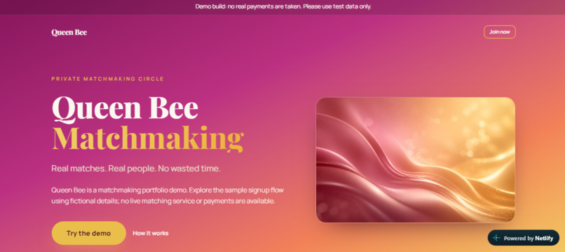
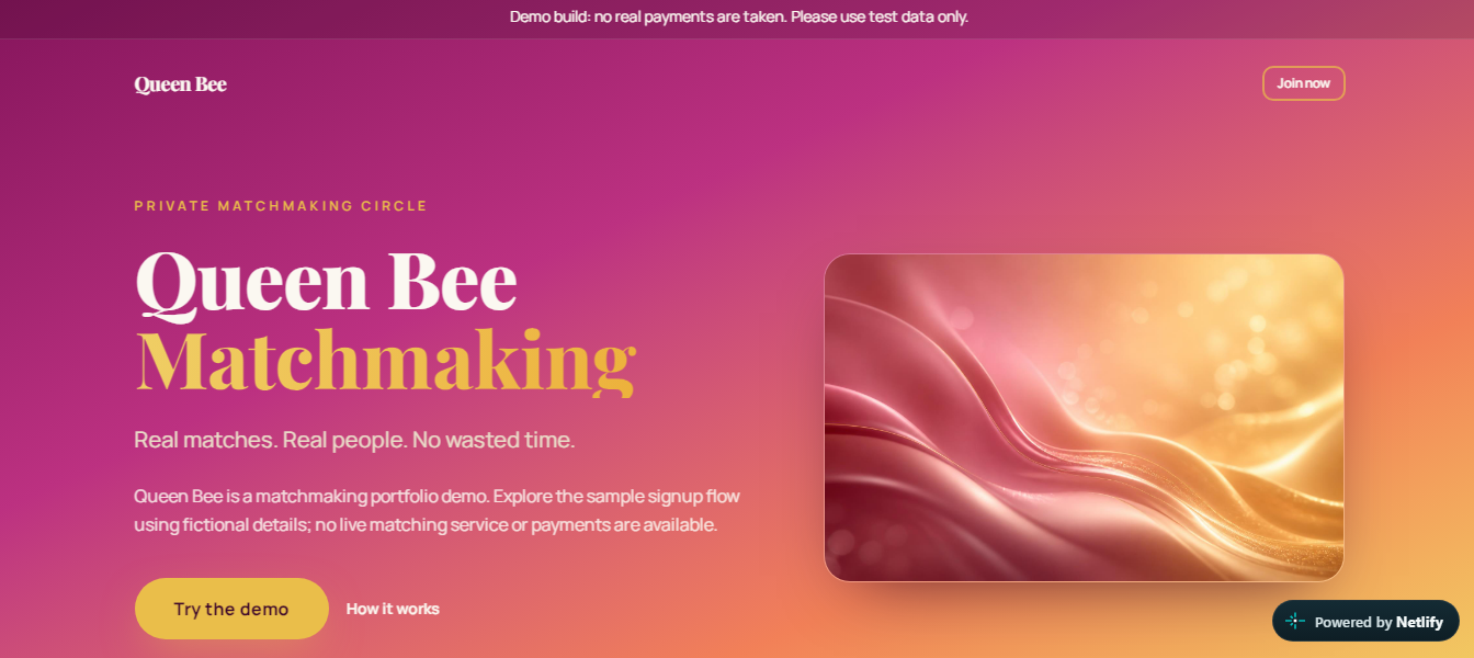
Landing page featuring the luxury pink-and-gold hero section, value proposition, and prominent sandbox disclaimer banner.
-
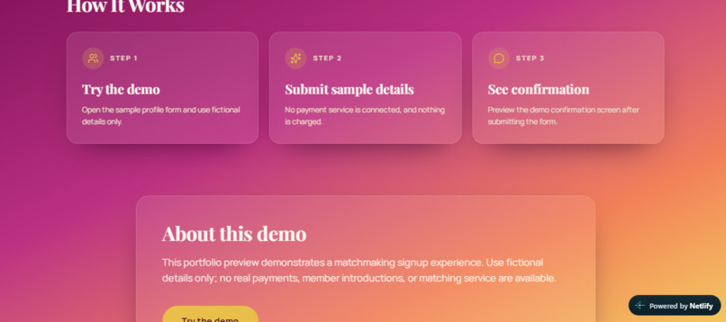
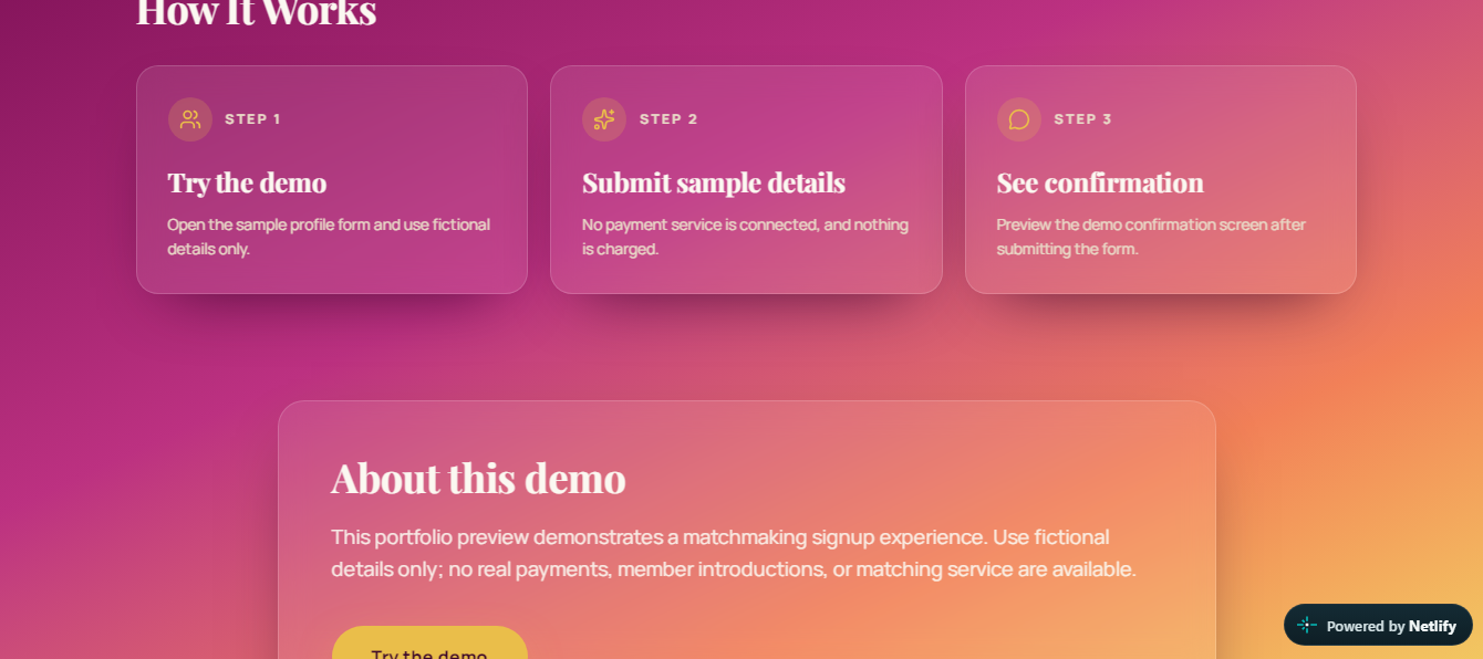
Guided 3-step user flow outlining the sample profile submission and simulated confirmation preview.
-
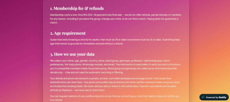
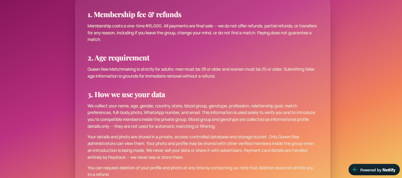
Dedicated Terms & Privacy page reinforcing transparent demo boundaries and portfolio scope.
-
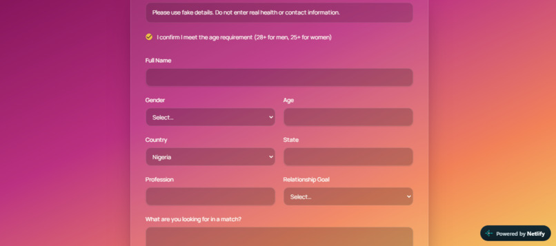
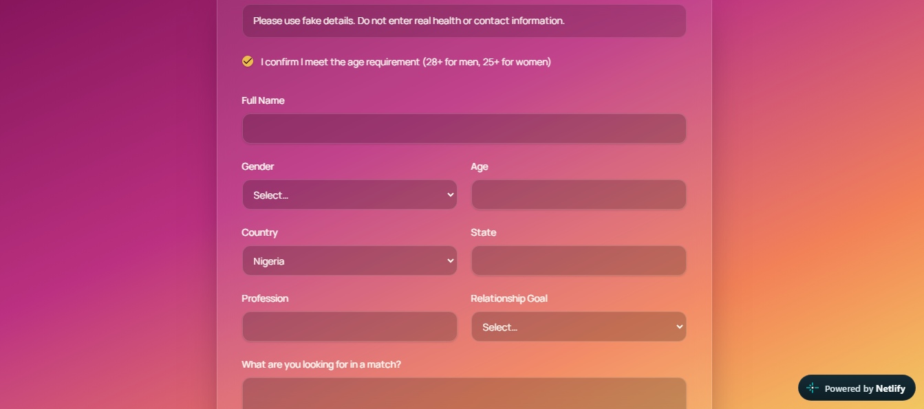
Interactive sample profile onboarding form built for testing with fictional sandbox data.
Inspiration
Most matchmaking platforms suffer from bloated interfaces and high onboarding friction. QueenBee Matchmaking was engineered to explore a sleek, modern UI/UX design standard tailored for private, high-end social networks.
What it does
- Private Circle Landing Experience: Features a polished, luxury-aesthetic hero section ("Private matchmaking circle") with clear value propositions and responsive navigation.
- Interactive 3-Step Guided Flow: Walks visitors through an intuitive process: opening the sample profile form, inputting fictional sandbox data, and previewing simulated confirmation states.
- Transparent Sandbox Boundaries: Explicitly integrated warning banners, about cards, and footer notices that clarify the platform's portfolio scope and simulated transaction mechanics.
- Social Ecosystem Placeholders: Integrates structured placeholder hubs for community channels and social integrations (Bigo Live, Instagram, TikTok, WhatsApp).
How I built it
Architected and rapidly prototyped the UI layout, deployed version control via GitHub, and configured continuous live deployment on Netlify.
Challenges I ran into
Balancing a high-end, commercial-grade visual design with absolute transparency so judges and visitors immediately recognize the production-ready UI architecture versus sandbox/demo execution scope.
Accomplishments that I'm proud of
Shipping a mobile-responsive, beautifully styled live production deployment (queenbeematchmaking.netlify.app) complete with custom typography, clean component structure, and a bespoke "R.O.B" designer footprint.
What I learned
Managing UI/UX hierarchy, building transparent sandbox safety notices into consumer-facing layouts, and executing seamless GitHub-to-Netlify deployment pipelines.
What's next for QueenBee Matchmaking
- Implementing persistent backend user databases and real-time matching algorithms.
- Transitioning the simulated signup flow into a fully encrypted production gateway.
Built With
- css
- github
- html
- javascript
- netlify
- tailwindcss
- ui
- ux
