-
-
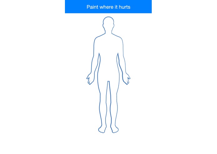
Pain input screen
-
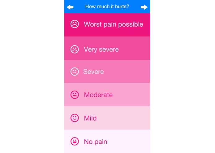
Pain severity rating
-
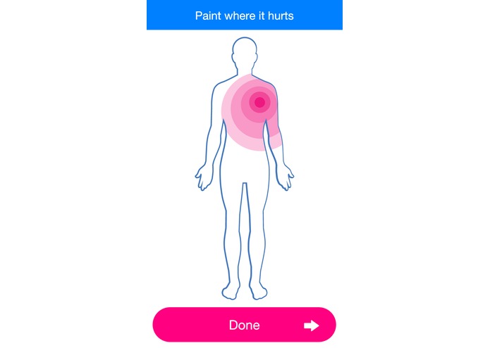
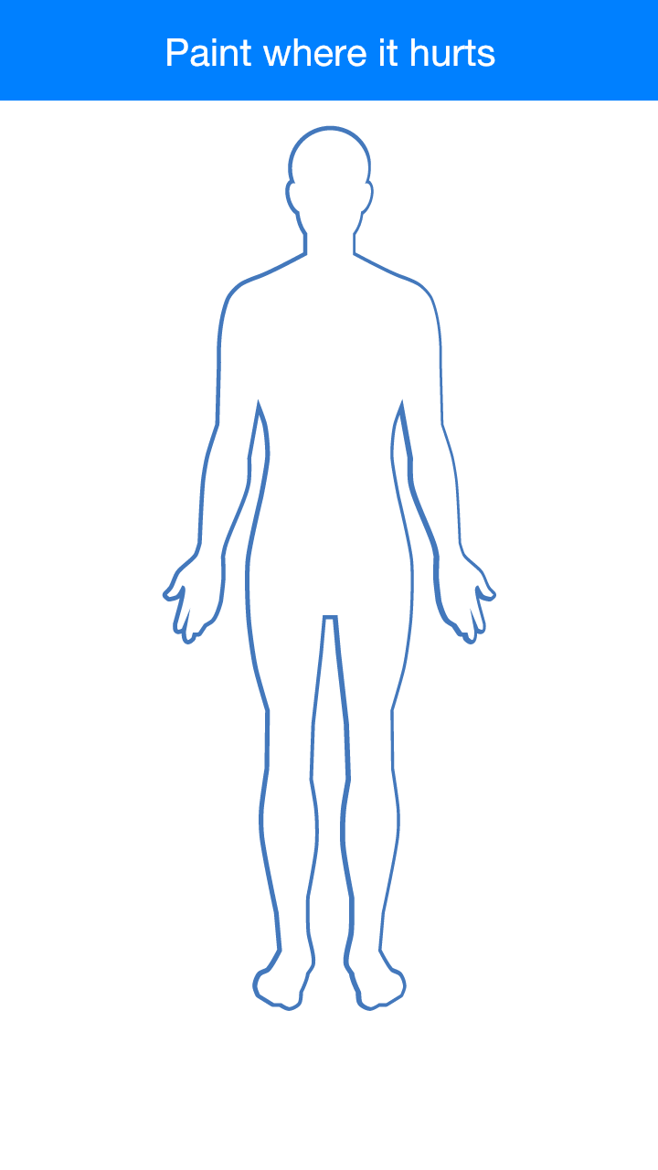
Pain mapping
-

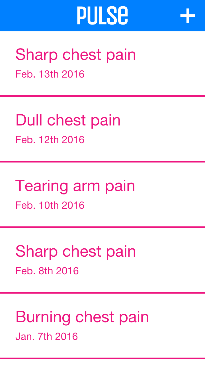
Log
-
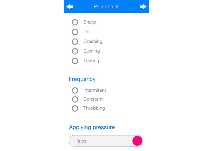
Pain type


Inspiration
Hospital pain rating charts show the severity of pain, but when we spoke to medical professionals they wanted a greater level of detail. A single pain level datapoint doesn't let doctors follow trends when they change their treatment plan.
What it does
Pulse allows a patient in hospital care or checking in to easily tell doctors where they're experiencing pain and how bad it is. This can help doctors triage incoming patients and monitor response to new treatment plans for patients with chronic pain.
How we built it
We used Adobe Comet to rapidly iterate on a streamlined design, then moved to React Native to accelerate our mobile development process. We shared our progress and interface with medical mentors and doctors at every stage.
Challenges we ran into
Debugging and working with Android devices was tricky at times, but we learned how to debug in an emulator and over USB. We also had to learn React Native as we wrote our app.
Accomplishments that we're proud of
We integrated all feedback from mentors and doctors, so we know that they would actually use our software. We also learned React Native and made a clear UI flow.
What we learned
Feedback from doctors in a range of medical fields taught us that the bridge between qualitative descriptions of pain and quantitative data needs to be smooth and consistent for each patient. Our team also learned React Native for this hack.
What's next for Pulse
We hope to add more long-term data analysis to help doctors figure out how their treatment plans are affecting patients.


Log in or sign up for Devpost to join the conversation.