-
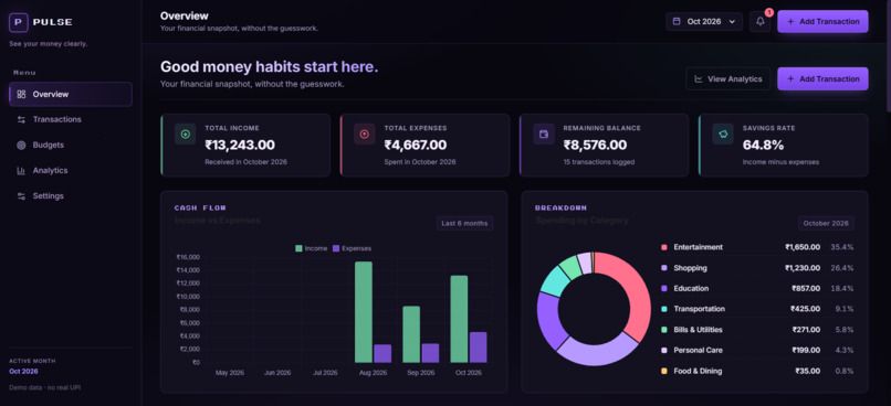
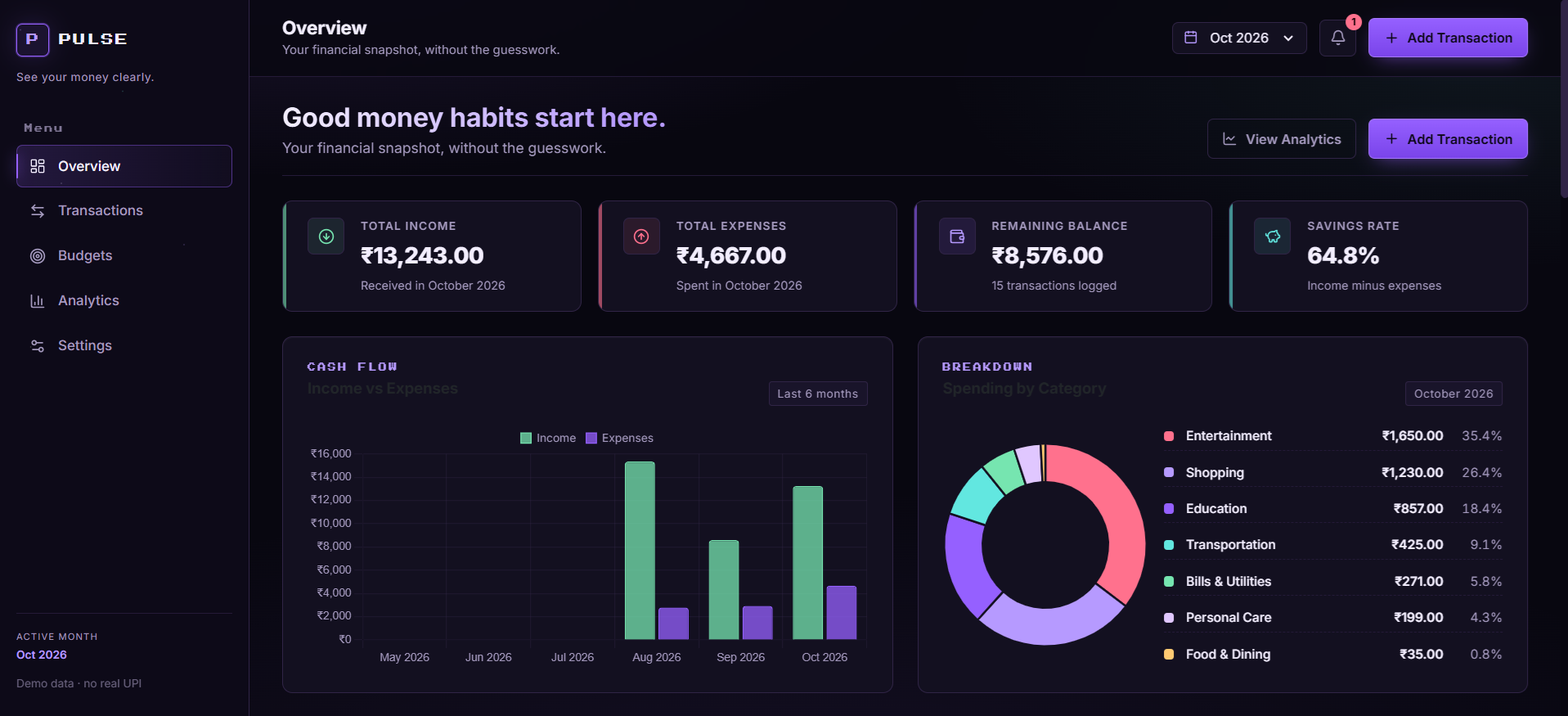
dashboard
Inspiration
It is the 28th of the month. You check your bank balance and it is way lower than it should be. You know you spent money. You just don't know where. UPI made it too easy. A tap here, a scan there, and suddenly ₹3,000 is gone on food delivery without you noticing. Spreadsheets feel like homework. Most expense apps want you to sign up, sync your bank, hand over your data. We just wanted something simple that would show us where the money actually went. So we built it.
What it does
PULSE is a personal expense tracker. You log income and expenses, pick a category, and it does the rest. The dashboard shows income, expenses, balance, and savings rate for the month. There is a cash-flow chart for the last 6 months, a doughnut of where your money went, and budget bars that turn amber when you are getting close to a limit and red when you blow past it. It also shows short insights pulled from your actual data, like "Food & Dining is your biggest category this month" or "you spent 34% more than last month." There is a transactions page with search, filters, and sorting. A budgets page where you set monthly limits per category. An analytics page with trends and breakdowns. And a settings page where you can change the warning threshold, clear everything, or reset the demo data.
How we built it
Flask, SQLite, and SQLAlchemy on the backend. Jinja2 templates, Bootstrap 5 just for layout utilities, and a custom CSS design system on top. Chart.js for charts. Vanilla JS for the interactive bits. No React, no Node, no external APIs.
The project is split into four layers so it doesn't turn into spaghetti:
- routes/ - five blueprints, one per page
- services/ - all the money math (totals, budget usage, insights)
- utils/ - categories, validators, formatters
- templates/ and static/ - the UI
The decision we are happiest about: every amount in the database is stored as integer paise, not floats. Rupees only appear at the very end when formatting for display. No rounding bugs, no weird totals on the charts.
Budgets are not stored anywhere. They are recalculated from transactions every time. Sounds expensive, but it means editing a transaction updates every budget bar instantly, which is what you would expect anyway.
The look is its own thing too. Dark purple, pixel font on the labels, neon violet accents, faint scanlines in the background. We wanted it to feel like a finance terminal from a sci-fi movie, not another Bootstrap admin template.
Challenges we ran into
The float thing. Early on we summed rupee amounts as floats and totals were off by paise here and there. Small, but it added up on the charts. We rewrote the whole data layer around integer paise. Took a day, fixed it for good.
Live budgets. We could have cached usage in the DB to make pages faster, but then editing a transaction would not update the budget until you recalculated. We picked correctness. Every page load recomputes.
Not looking generic. Dark mode Bootstrap is not a design. We spent a lot of time on spacing, typography, and border opacity so it wouldn't look like a template.
Python 3.14. We accidentally installed a preview build. SQLAlchemy choked on the str | None type hints in our models. Switched to Optional[str] and dropped back to 3.12, which fixed it.
Accomplishments that we are proud of
It actually works. It is not a mockup. Every number on screen is derived from the database, every chart is drawn from real transactions, and every insight is calculated in Python.
The seeder runs once and only once. First launch gives you around 30 realistic student transactions across 3 months plus a set of budgets that includes at least one warning and one exceeded, so the dashboard looks alive from the first second. Restart the app and it does not duplicate anything, thanks to a flag in the settings table.
The database has real constraints. Check constraints on amounts and categories, a unique constraint so you cannot make two budgets for the same category in the same month. Invalid states are not reachable.
And the UI. We have seen a lot of college project dashboards and they look like college project dashboards. This one does not.
What we learned
Splitting money math into service functions was the smartest thing we did. Once routes stopped doing calculations inline, the code got much easier to read and debug.
DB constraints are a good safety net. You validate in the route, sure, but the constraint catches the case you forgot.
Integer paise for currency. Non-negotiable now.
CSRF protection via Flask-WTF from day one saved us later. Would have been painful to bolt on at the end.
Design takes real time. We probably spent more hours on CSS than on any single feature.
What's next for Pulse - Expense Tracker
Import. Real UPI statements, CSV files, whatever, so you don't have to type things in.
A category guesser. Start typing "Zomato" and it suggests Food & Dining. Learn from your past transactions.
Recurring entries. Rent, subscriptions, allowance, set them once.
Custom categories. Right now you are stuck with ours, which is fine, but people have their own ways of splitting things.
Export monthly reports as PDF or images. Useful for parents or for your own records.
A mobile app. The design already looks good on a phone, making it native would be fun.
And eventually optional cloud sync, so you can move between devices without losing anything. But same rule as now: no forced logins, no data leaving your machine unless you want it to.


Log in or sign up for Devpost to join the conversation.