-
-
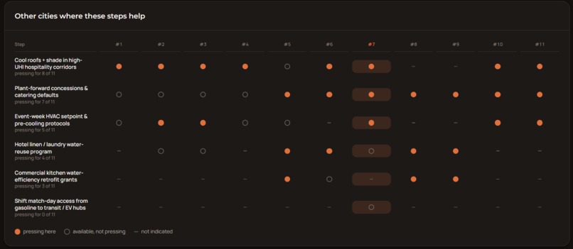
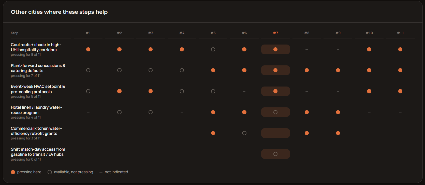
Comparative insights about ranked efficacy of intervention strategies in other cities apart from the one chosen in "Compare Hosts".
-
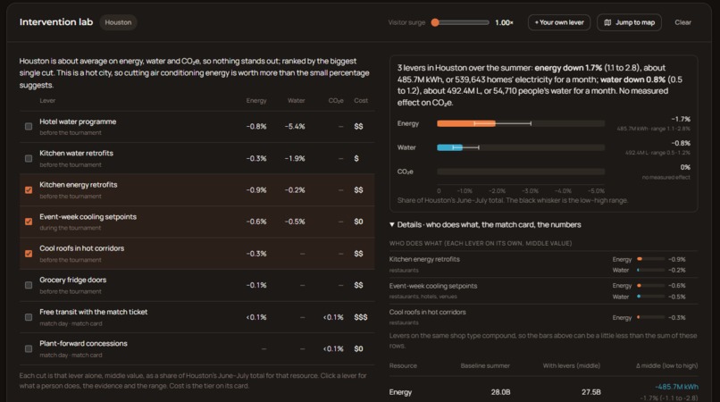
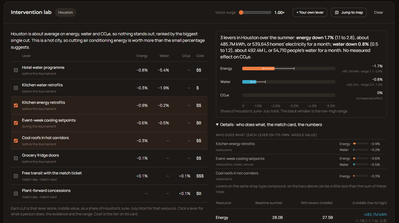
Examples of data visualization in our "Intervention Lab", showing the numerical effects of intervention levers on EFW footprint deltas.
-
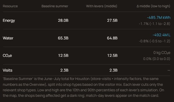
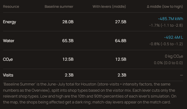
Sample data benchmarks that compare EFW data with certain intervention levers with the summer baseline.
-
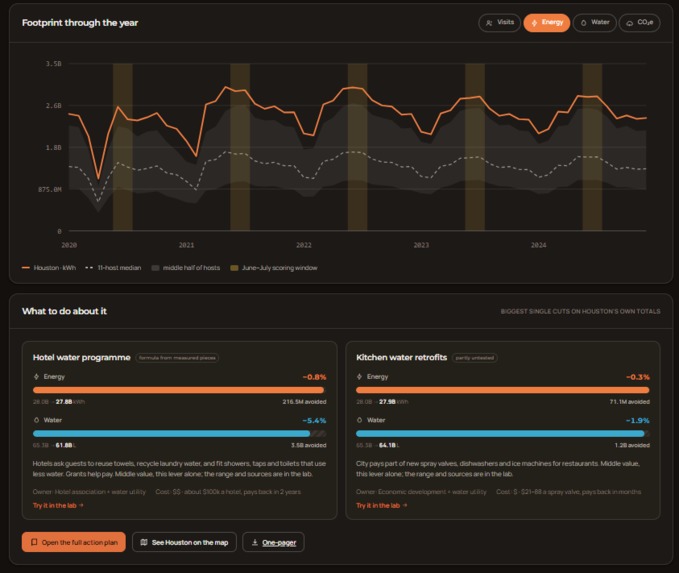
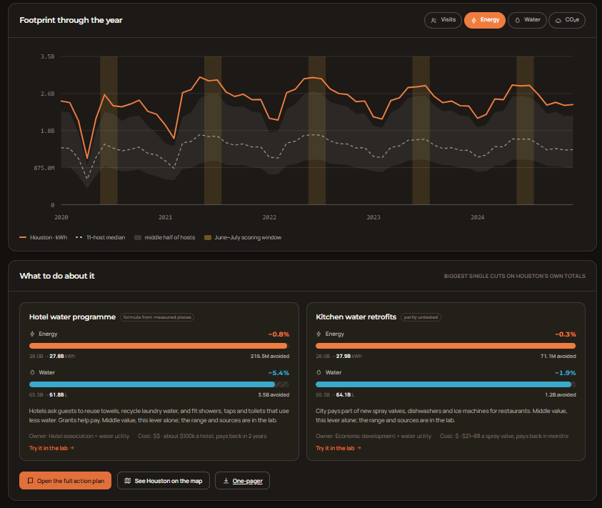
"Footprint throughout the year" panel on "Compare Hosts" that shows a sneak peek into the recommended intervention playbook cards.
-
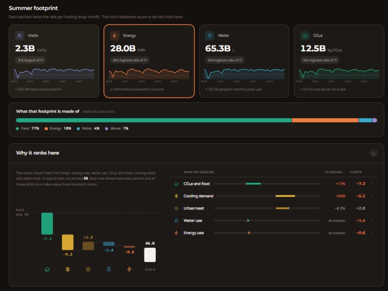
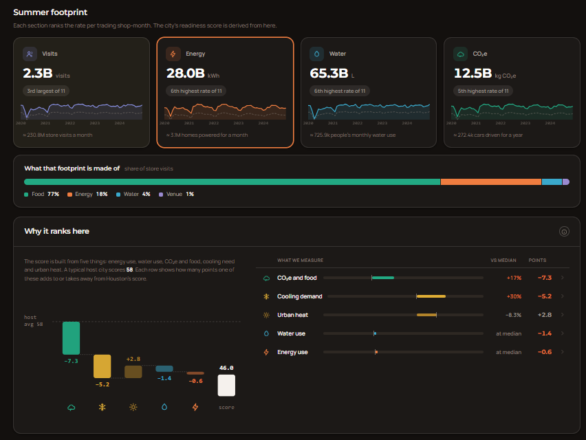
A more thorough picture of our "Overview" tab, showing the relation between absolute EFW demand and a statistically computed readiness score
What inspired us
2022. Beijing hosts the Winter Olympics. Administrators and venue organizers diverted almost 200 million gallons of water from a precious freshwater reservoir to a permanently dry riverbed to supply two competition zones with the massive amounts of water needed for artificial snow.
The diversion strained local water supplies in the rest of the region, far below the UN water-scarcity threshold, and ended up being labelled poor oversight and a misallocation of common pool resources.
When fans go to sports games, urban sustainability is overlooked because strategies for maintenance occur under the hood. But this is the reality of system failures in the sports venue administration industry. And this is what inspired us to use the data provided to us to conceive of a fix once and for all; Not solely limited to water, but every resource that matters to a successful event.
The same holds true for the largest sports event in the world. The 2026 FIFA World Cup brought large crowds of fans to 11 cities in the United States. Every one of those fans needed a place to sleep, food to eat, and a way to get to the stadium. Hotels, restaurants, and grocery stores all use energy and water to serve people, so more visitors means more demand on the city.
We wanted to answer two questions. First, which host cities face the most strain on energy, water, and food? Second, what can a city actually do about it, and how much would each action save? We built Pulse, an all-in-one command suite, which ensures that every FIFA administrator, manager, city planner, hotel group, or sustainable intervention expert explore these questions without reading a spreadsheet populated with confusing and imprecise estimations. We also wanted the work to be useful and replicable for cities that host large events in the future.
What Pulse does
Pulse is an all-in-one resource management platform designed for FIFA tournament organizers to track, evaluate, and optimize Energy, Food, and Water (EFW) consumption across host cities. Instead of relying on static, city-wide averages, Pulse provides localized, data-driven tools to manage environmental impact:
Dynamic Footprint Mapping
Traces localized EFW consumption across shops, hotels, restaurants, and stadiums over a 5-year timeframe, mapping visitor population patterns against activity spikes down to specific district clusters.
Interactive Scenario Lab
Functions as a risk-free testing sandbox where managers simulate the impact of pre-existing and custom sustainability interventions (e.g., retrofits, water recycling) as well as peak-demand visitor surges using dynamic mathematical multipliers.
Standardized Host Comparison
Benchmarks host cities against one another using a normalized statistical distribution model. It accounts for city size and visitor traffic via regression analysis, measuring true resource efficiency rather than penalizing larger metropolises for sheer scale.
Action Playbooks and One-Pagers
Identifies high-impact sectors and automatically ranks tailored, priority-based intervention strategies for each city. It exports comprehensive, single-page action plans for immediate stakeholder alignment.
Centralized Command Overview
Consolidates seasonal footprint fluctuations, readiness scoring, high-density visitor hotspots, and top recommendations into a single dashboard.
What we learned
We learned that energy, water, and food are closely linked. A restaurant uses energy to cook and to cool its dining room, and it uses water to wash dishes and make ice. Cutting one often cuts the others too.
We also learned that real data is messy. Some datasets did not include locations, some grouped two cities together, absolute values were confounded with rates, and some numbers had random noise added on purpose to protect privacy. Turning this into numbers we could trust took much more time than building our product’s actual backbone.
Finally, we learned to be honest about uncertainty. Most published savings figures were either never measured or were measured at a single hotel. We learned to show a range of likely results instead of one number that looks exact but is not.
How we built it
Step 1: Estimating use for each business
We started with card spending data for 20,569 businesses across the 11 host cities, from December 2019 to December 2024. Each business has a location, a type (restaurant, hotel, grocery store, gas station, and so on), and a count of customers each month. We focused on June and July, the months of the tournament.
For each type of business, we researched an average amount of energy, water, and carbon dioxide per customer visit. For example, a restaurant visit is about 2.8 kilowatt-hours (kWh) of energy and 25 liters of water, and a hotel guest-night is about 28 kWh and 300 liters. The estimate for one business is then:
$$ E_i = C_i \times f_{\text{type}(i)} $$
where \(C_i\) is the number of customers at business \(i\) and \(f_{\text{type}(i)}\) is the energy per visit for that type of business. The same formula works for water and carbon dioxide. Adding up every business in a city gives the city total. We placed each business on an interactive map so people can see where demand is highest.
Step 2: Measuring how much a change saves
We studied seven changes a city could make, such as hotel water programs, more efficient kitchen equipment retrofits, doors on grocery store fridges, and free public transit for ticket holders. No study has measured a whole hotel or restaurant before and after one of these changes. So we broke each saving into smaller pieces that have been measured, and multiplied them.
For example, when hotels ask guests to reuse towels and sheets, the water saved per room each night is:
$$ \text{Water saved} = p \times m \times w $$
where \(p\) is the share of nights guests agree to take part, \(m\) is the kilograms of laundry per room each night, and \(w\) is the liters of water needed to wash one kilogram of laundry. Published studies give a range for each piece: \(p\) is between 30% and 49%, \(m\) is between 2.3 and 5.4 kg, and \(w\) is between 5 and 20 liters.
Step 3: Handling uncertainty with a simulation
If we multiplied the three lowest values together, we would get a result that is too pessimistic, because it is rare for every piece to be at its lowest at the same time. Multiplying the three highest values has the same problem in the other direction. So we used a Monte Carlo simulation, which means we let a computer try many random combinations.
For each piece, we used a triangular distribution. This is a simple shape defined by a low value, a most likely value, and a high value. Values near the most likely one are picked more often. The computer picks one value for each piece, multiplies them, and repeats this 100,000 times.
We then sort the 100,000 results and report three of them:
- the 10th percentile, which is higher than 10% of the results,
- the 50th percentile (the median), which is the middle result,
- the 90th percentile, which is higher than 90% of the results.
This means that 8 times out of 10, the true saving should fall between the 10th and 90th percentile. For the towel program, the median is about 16.7 liters per room each night. A room holds about 1.4 guests on average, so this becomes \(16.7 \div 1.4 \approx 11.9\) liters per guest. Out of the 300 liters a guest uses, that is a cut of about
$$ \frac{11.9}{300} \approx 4\% $$
Some published sources claimed 30%, which is about seven times too high.
Step 4: Combining changes
When a user turns on two changes that affect the same kind of business, we cannot simply add their percentages. If the first change cuts use by \(a\) and the second by \(b\), the second change only acts on what is left after the first. The combined cut is:
$$ \text{Combined cut} = 1 - (1 - a)(1 - b) $$
For example, a 10% cut followed by a 20% cut gives \(1 - (0.9)(0.8) = 0.28\), or 28%, not 30%. Users can also add their own changes with their own estimated cuts.
Step 5: Changes that happen at the stadium
Some changes, such as plant-based food at the stadium or free transit with a ticket, affect fans instead of nearby businesses. For these, we use:
$$ \text{Total saved} = \text{number of matches} \times \text{seats} \times \text{saving per fan} $$
For example, plant-based stadium food saves about 0.29 kg of carbon dioxide per fan. A single match with 70,000 fans would save about \(70{,}000 \times 0.29 \approx 20{,}000\) kg, or 20 tonnes.
Step 6: Scoring how ready each city is
Each city gets a readiness score from 0 to 100. It combines five parts: energy use per business, carbon dioxide from food, water use per business, cooling degree days (a measure of how hot the summer is, based on how many degrees each day is above a comfortable temperature), and the urban heat index (how much hotter the city is than its surroundings).
These parts use different units, so we cannot add them directly. For each part, we found the statistical distributions that best fit the monthly per-shop data for the 11 cities and placed each city on the corresponding curves. A city's position \(p\) is a number between 0 and 1 that tells us what share of the curve lies below that city. We then combine the five parts into a strain score \(S\) using weights:
$$ S = 0.35\,p_{E} + 0.25\,p_{C} + 0.20\,p_{W} + 0.10\,p_{D} + 0.10\,p_{H} $$
where \(E\) is energy, \(C\) is carbon dioxide, \(W\) is water, \(D\) is cooling degree days, and \(H\) is the heat index. The weights add up to 1, and energy gets the largest weight.
Finally, we turn strain into readiness, so that a higher score is better:
$$ R = 100 \times \frac{S_{\max} - S}{S_{\max} - S_{\min}} $$
The city with the most strain gets 0, and the city with the least strain gets 100.
Challenges
Computing readiness scores
The readiness score compares cities to each other, not to a fixed standard. This caused a problem: if a change is applied to every city at once, every city improves by a similar amount, so the rankings and scores barely move. The score would suggest the change did nothing, even when it saved a lot. It was also hard to combine parts measured in different units. Our first version used z-scores, which measure how many standard deviations a city is from the average:
$$ z = \frac{x - \mu}{\sigma} $$
where \(x\) is the city's value, \(\mu\) is the average of all 11 cities, and \(\sigma\) is the standard deviation. With only 11 cities, one extreme city could stretch the scale for everyone else. We switched to fitted curves so that one unusual city has less effect. Two parts, summer heat and the heat index, also never change no matter what action a city takes, which limits how much any change can move the score.
Showing the effect of changes on the map
Each change affects different kinds of businesses. Towel reuse only affects hotels, and fridge doors only affect grocery stores. Our data did not label grocery stores separately from restaurants, so we identified about 3,020 of the 17,157 food businesses as grocery or convenience stores by searching their names. The map then had to recalculate every affected business in the chosen city, highlight the businesses a change touches, and update the totals right away without reloading the page.
Another problem was that hotels have very few card customers in our data, so hotel changes looked tiny on the map even when they saved a large share of a hotel's water. We chose to show the percentage cut as the number to trust. Some changes, such as stadium food, do not appear on the map at all, because stadiums themselves show almost no card customers. We moved those changes to a separate match card that uses the number of matches and seats instead.
What we're proud of
On the teamwork front, we're extremely satisfied with how our final debugging phase went. We were confronted with several challenges, from UI bugs to shipping inconsistencies in our back-end data routing features. New updates invalidated old ones, and the feedback process was tight, yet arduous. At times, the challenges of fitting the right distribution to the right data in a generalizable fashion, ensuring new commits didn't wreck Pulse's overarching infrastructure, and at one point, overhauling our entire user experience, felt insurmountable. And yet, we pulled it off. The team effort resonates with us immensely.
In terms of our features and technical accomplishments, we're quite proud of the level of sophistication of our spatial map and intervention/scenario lab features. Not all the data we were given was relevant to our product plan, since the packages concerned several tracks in total. Hence, sifting through the packages value by value, field by field, helped us curate the right dataset on top of which both features interact. Now, FIFA resource managers have access not just to strategies that worked in the past, but most importantly, the dynamic and predictive ability to test their own strategies and their ramifications, with live observations of the spatial and temporal blast radius of those changes. We believe that as urban resource planners, that's one of the best tools to have in your arsenal.
Next steps for Pulse
Our main goal was to help sports tournament resource officials accurately manage evolving EFW demands effectively during a sporting mega-event. Therefore, our next practical step would be to expand Pulse to cities around the world that are administering large international tournaments in other sports, such as Wimbledon, the Cricket World Cup, and the Olympics. This would require us to interact with more vast data spreads and fine-tune more complex distributions, possibly involving high-octane algorithms and training models to make EFW projections not solely based on past data (like in Pulse), but also rooted in inference and reinforcement learning.


Log in or sign up for Devpost to join the conversation.