-
-

1024 x 1024 uncropped image of app icon
-
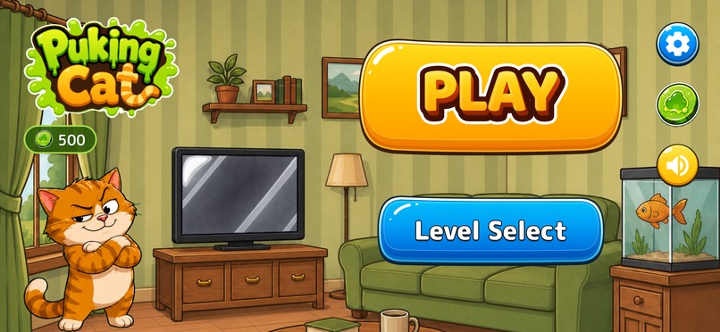
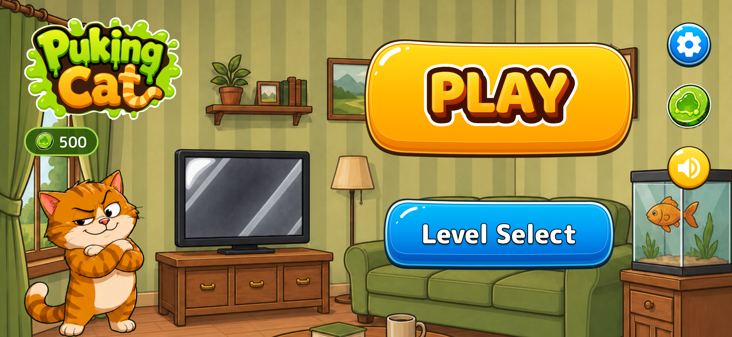
The lobby: Play, Level Select, the shop, and the TV a featured player's own cat appears on.
-
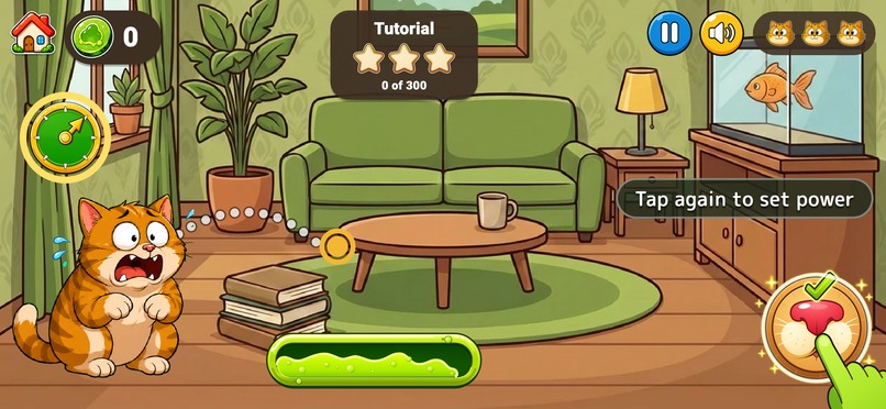
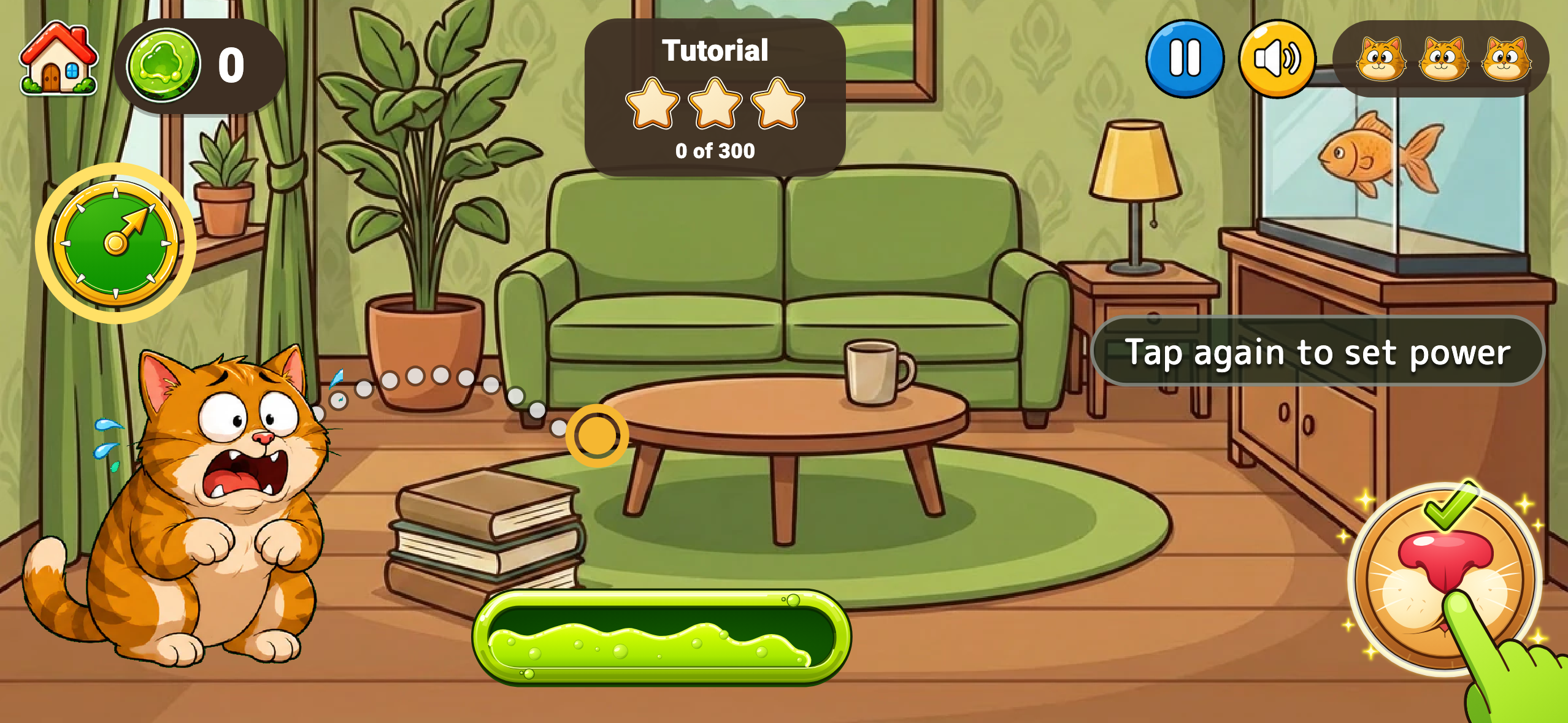
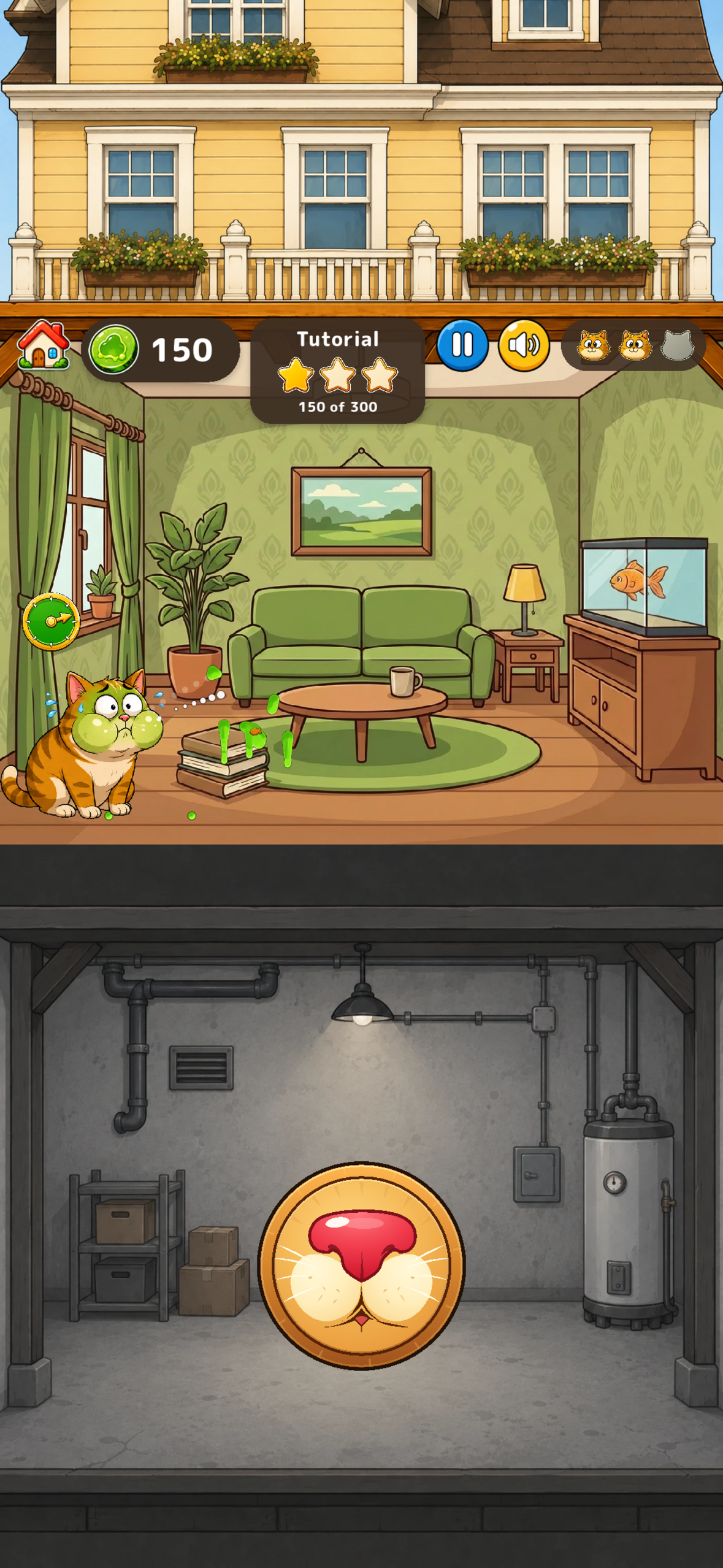
The tutorial. The first tap locked the angle and drew the arc; the second tap sets the power.
-
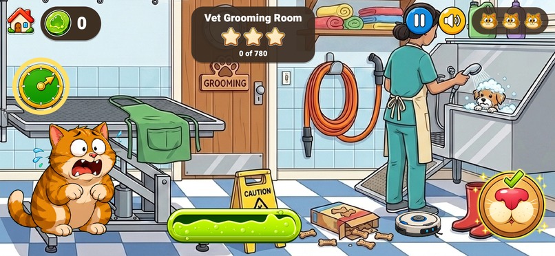
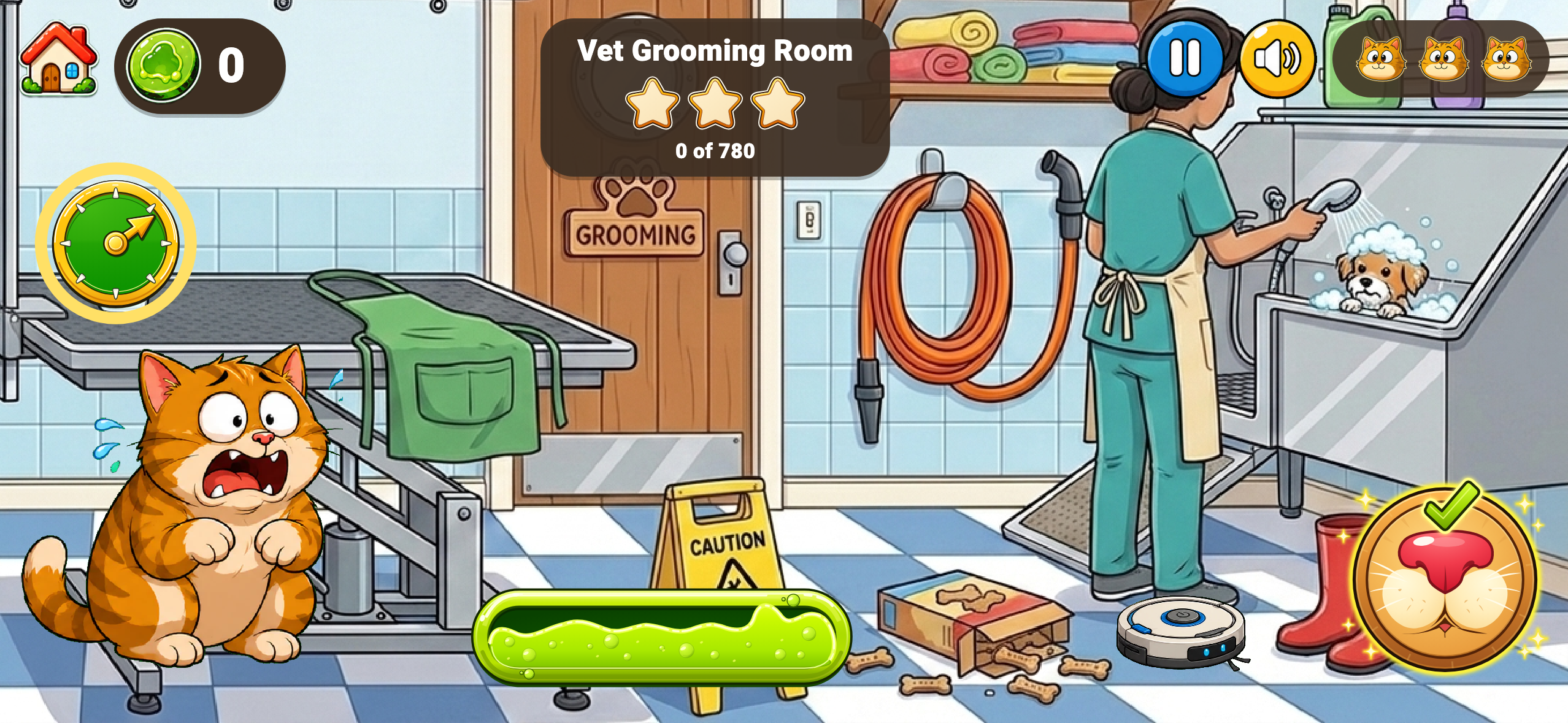
Vet Grooming Room. Later levels add moving obstacles, so the shot has to be timed as well as aimed.
-
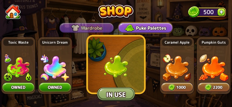
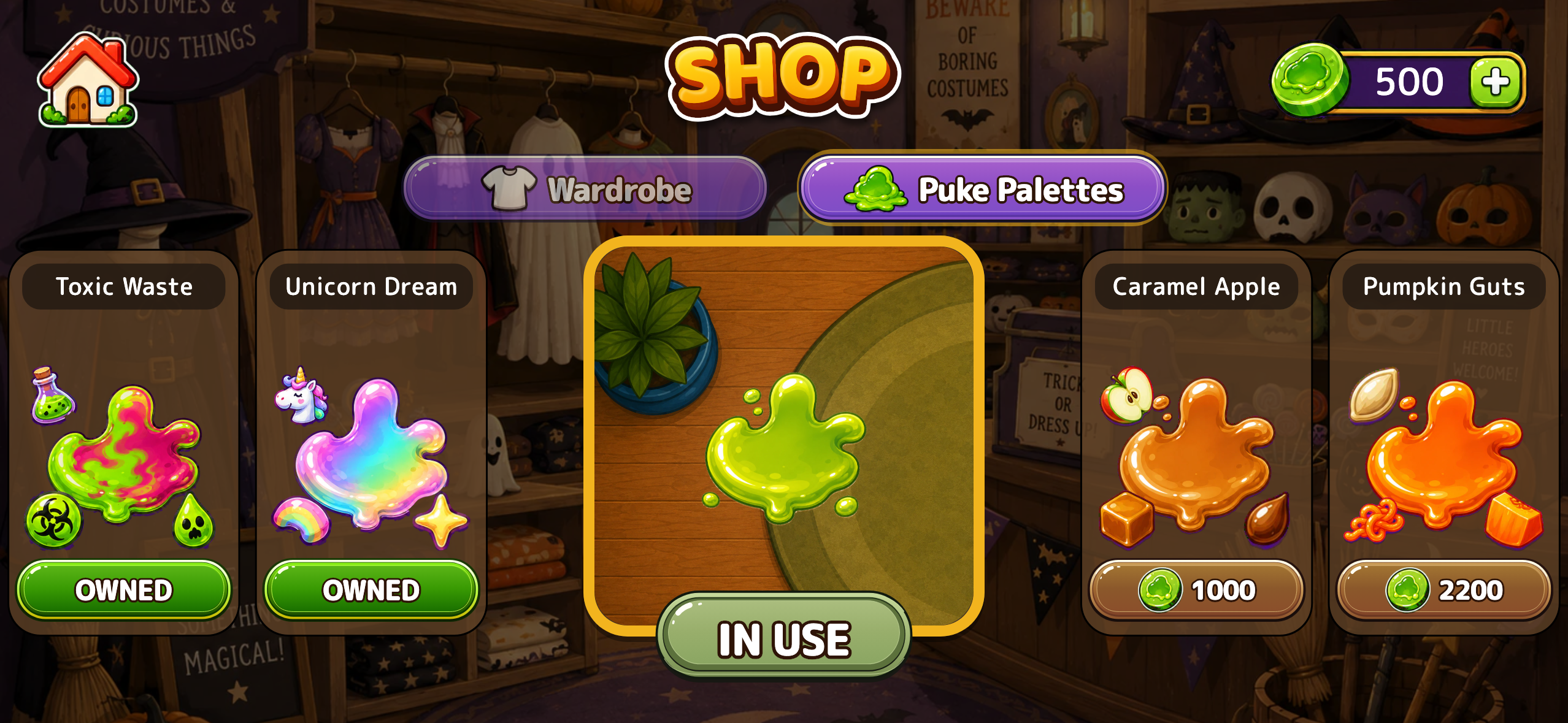
Puke Palettes in the shop. Every flavour has its own colour and particles, paid for in Puke Coins.
-
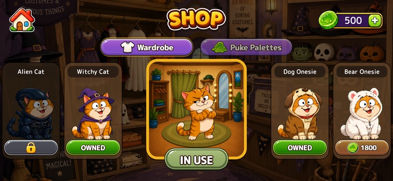
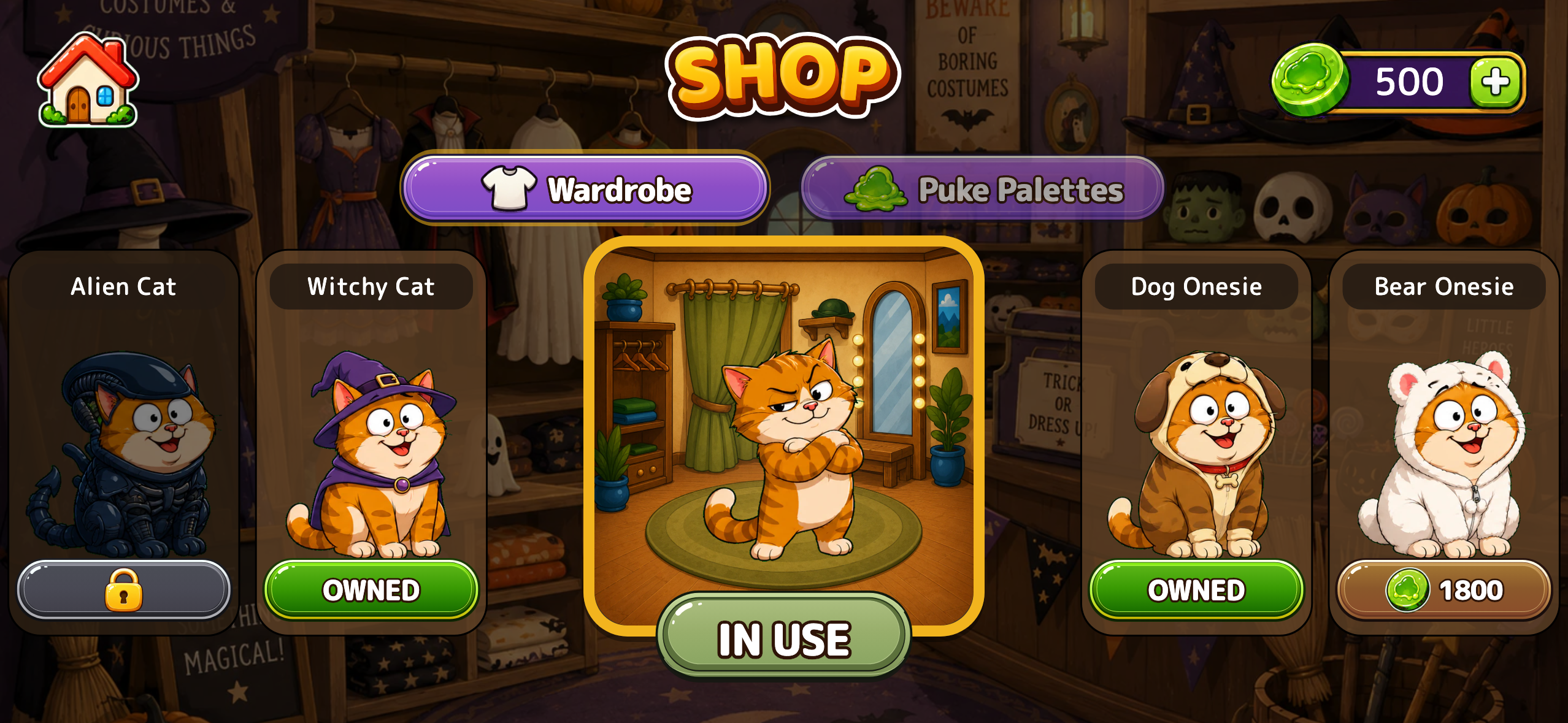
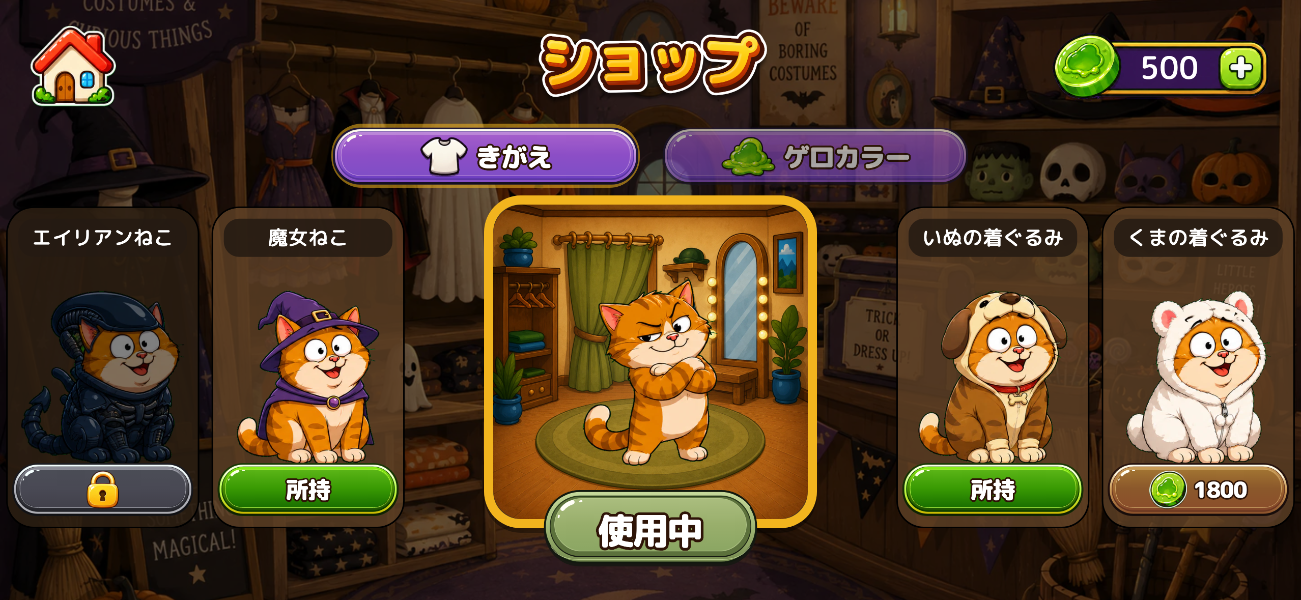
The wardrobe. Cat costumes bought with coins earned by playing - no real money anywhere in it.
-
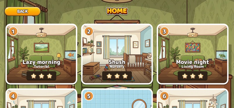
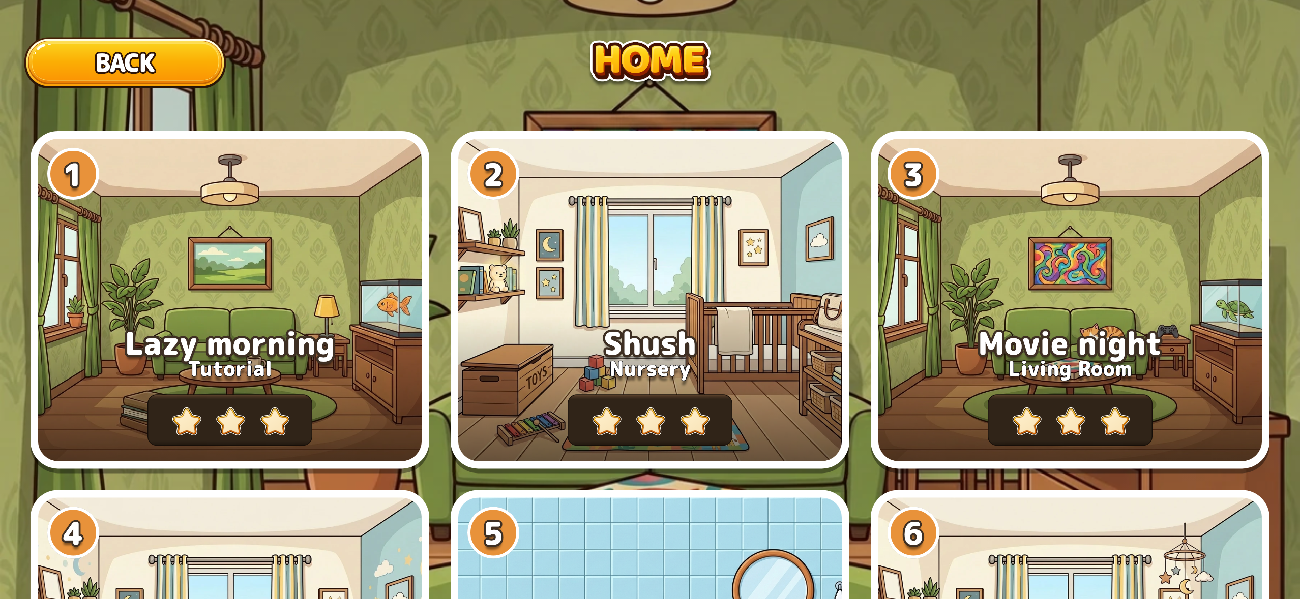
The room grid for a building. Each room comes in variants, each with its own three-star target and leaderboard.
-
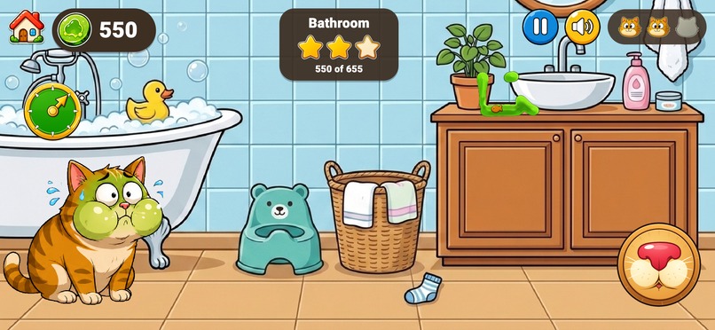
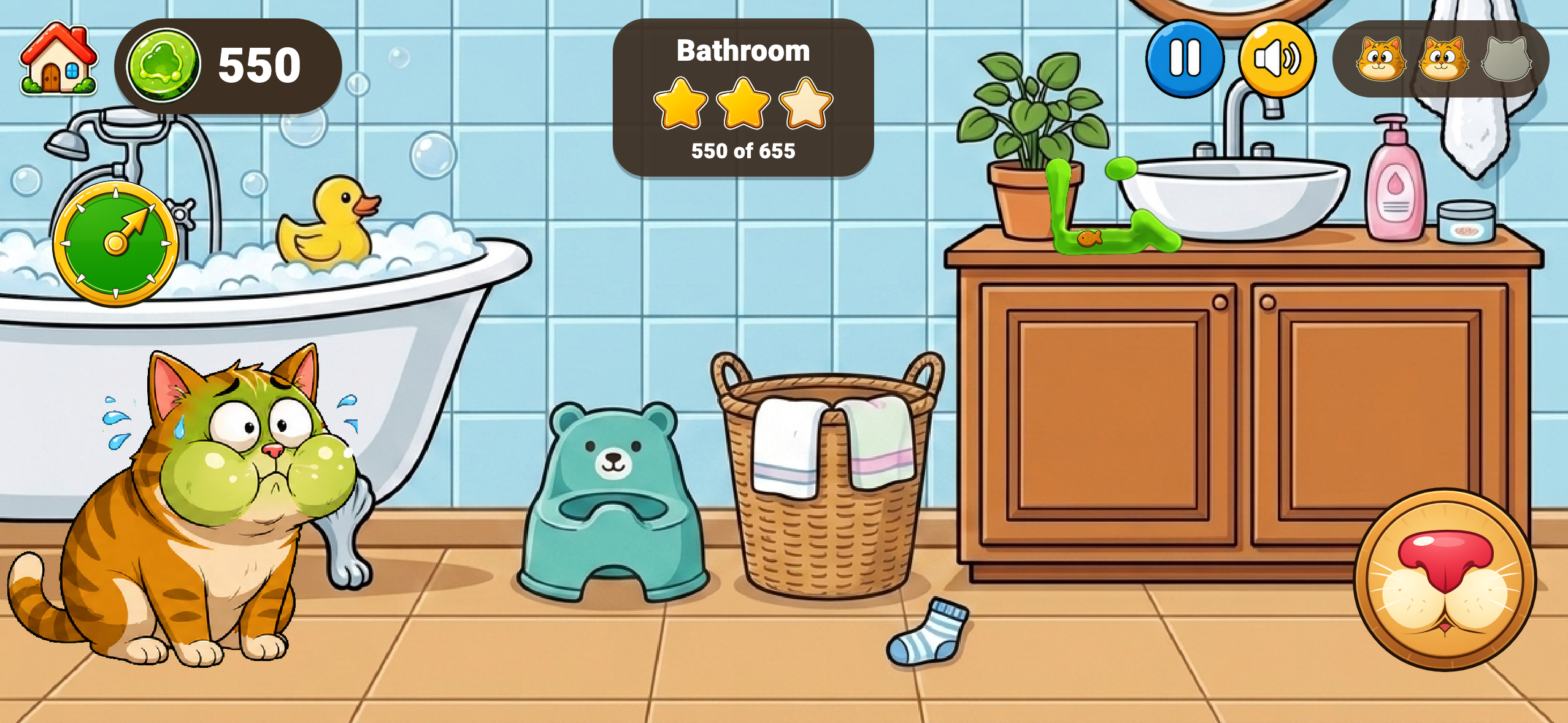
Bathroom, mid-run: 550 of the 655 needed for three stars, slime settled where it actually landed.
-
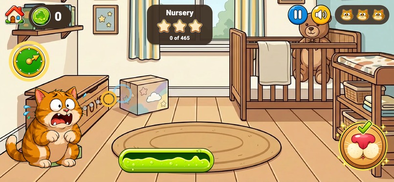
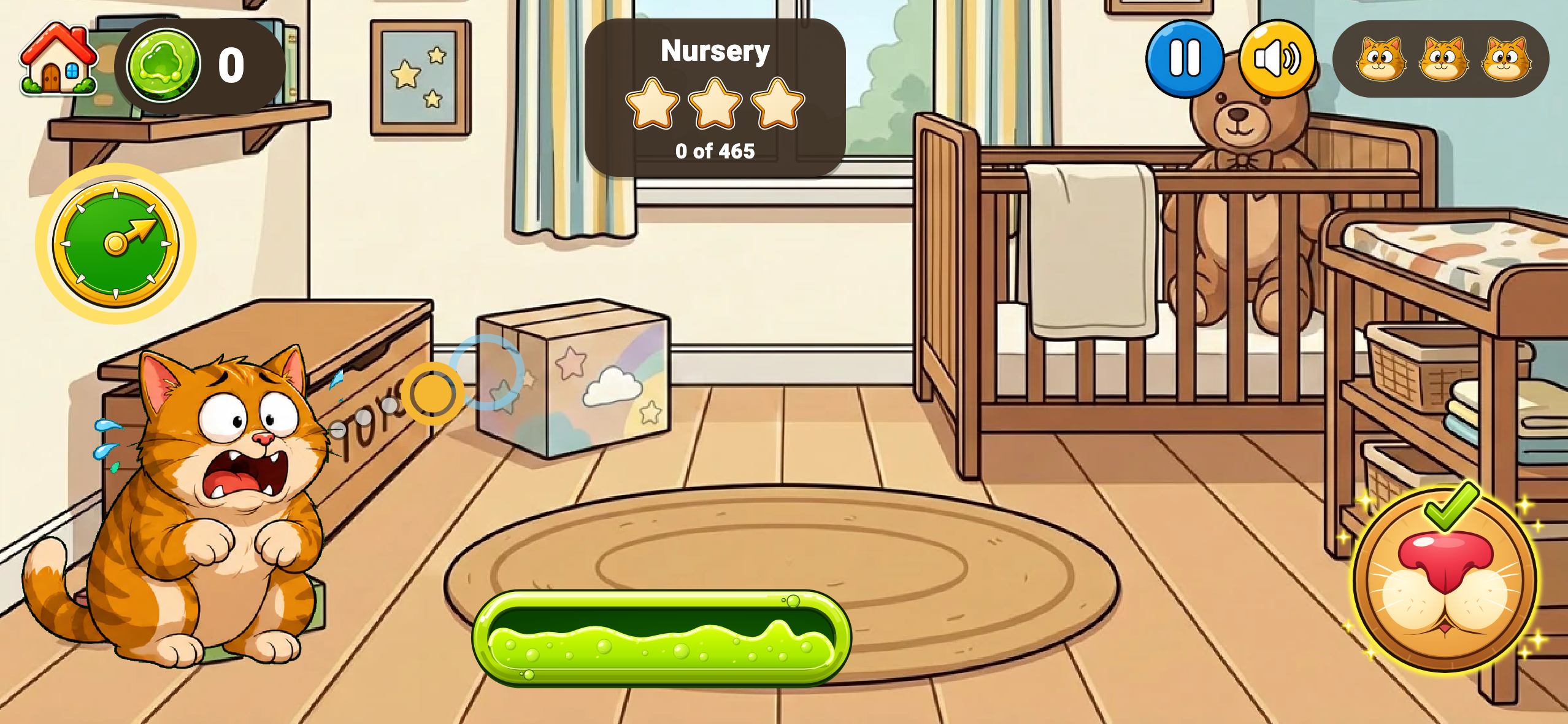
Nursery. The angle is locked and the dotted arc previews the shot; the power meter decides the reach.
-
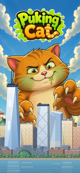
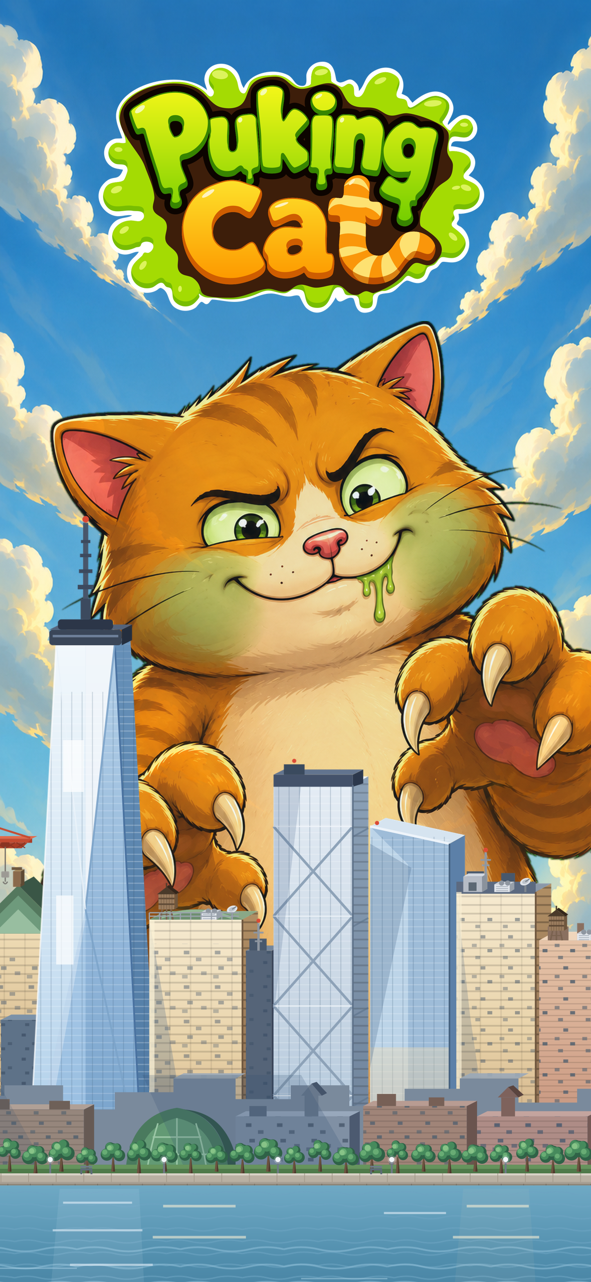
Puking Cat promo art, 1179 × 2556 and ready to use
-
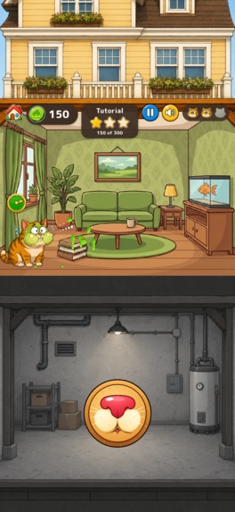
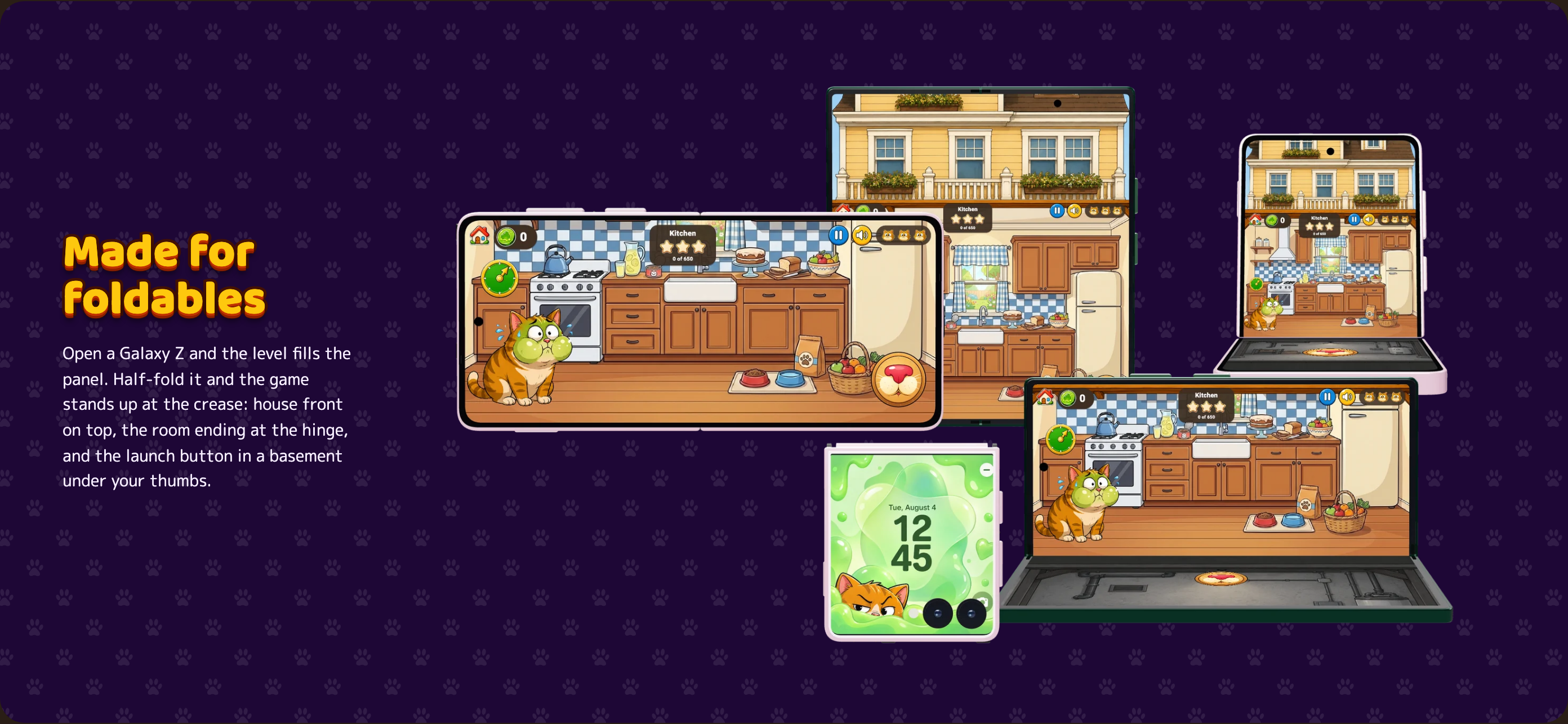
Flex Mode on a half-folded Galaxy Z Flip: the room ends at the crease and the launch control sits in the half below it.

Inspiration
This game is fun, and the inspiration for it came from a very real joke.
My husband and I always used to joke about our cats and how, when they puke (which, if you are a cat owner, you know happens more often than you would like), they somehow seem to aim for the hardest thing in the room to clean. You can give them a whole floor of perfectly wipeable surfaces and they will still find the rug, the blanket, or the upholstered chair.
At some point, we started joking that maybe they are actually trying to maximise the damage while minimising our ability to clean it.
And I thought, this is hilarious. This should be a mobile game! Years ago, I wrote the idea down in Apple Notes: make a game where you are the cat and your goal is basically to ruin the room on purpose. Shipaton gave me the reason to actually go and build it.
From the start, I wanted Puking Cat to feel like something a much larger professional game studio could have made, even though I was building it myself. I am a perfectionist, which is very useful for work and a bit of a curse for mental wellbeing, but here it meant I kept noticing one more detail I wanted to improve.
Who is it for?
Puking Cat is for casual players who enjoy physics, timing and score-chasing games. It is easy to pick up for a few minutes, but hidden bonus targets, three-star goals and leaderboards give players a reason to keep improving.
What does it let them do?
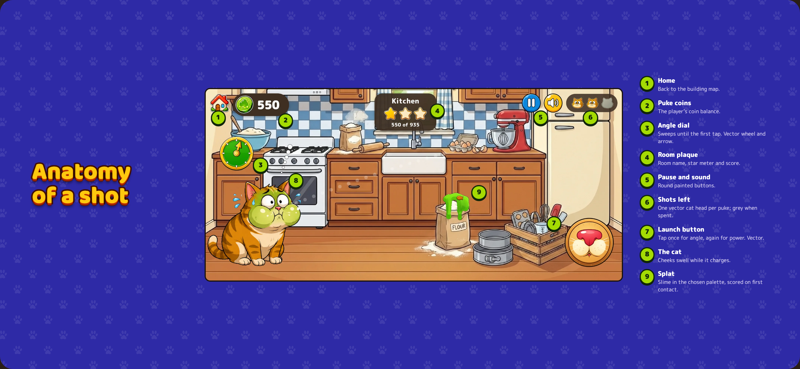
Puking Cat is a physics game with a very simple control scheme: tap once to lock the angle, tap again to lock the power, then the cat launches slime across the room.
The controls take seconds to understand, but getting a really good shot takes timing and judgement because you only have a limited number of shots and the room itself becomes part of the challenge. Furniture and everyday objects have different values, pets and protected objects cost you points, and one object in every level is secretly worth 500 bonus points. I do not tell you which one.
Part of the fun is trying different targets and slowly learning what the room is worth. A sofa that looks valuable might give you an ordinary score, while some innocent-looking object turns out to be the jackpot.
What makes it interesting or different?
There are more than 50 levels across six buildings, and each room comes in three variants with different props and targets. Players earn up to three stars per level, unlock more rooms and buildings, collect Puke Coins, and spend them on cat costumes and slime palettes. As the game progresses there are moving obstacles, hidden easter eggs and different room setups to figure out.
Replayability was important to me because I did not want a level to be something you clear once and forget. Every level has its own three-star score targets, tuned for that particular room, retries are unlimited and completely free with no cooldown or ad gate, and every level has its own Game Center and Google Play Games leaderboard. Even after you finish a room, there is still a reason to come back because maybe you only got two stars, maybe you still have not found the 500-point object, or maybe someone on the leaderboard now has a score that is personally offensive.
There is also Community Cats, which started as a referral feature and then got a little out of hand. This is a unique feature I haven't seen in any other game. If you refer a friend, both of you can submit a photo of your own cat for a chance to be featured on the television in the game lobby.
At first, I thought I would just turn the submitted cat into a cartoon portrait and put that on the TV, but then I figured, why stop there? Now a featured cat can get its own little cartoon clip. :) For the player, seeing their actual kitty suddenly starring inside the game is such a nice surprise that the referral almost comes as a bonus.
Sound is part of the game’s identity too. I made an original Eurodance-style track on purpose because I wanted Puking Cat to have a catchy signature sound that people would remember after closing the game. Real players have told me they still catch themselves singing the “Meow Meow” hook later, which is exactly the kind of problem I was hoping to create. :D
How does it make money? Catvertising!
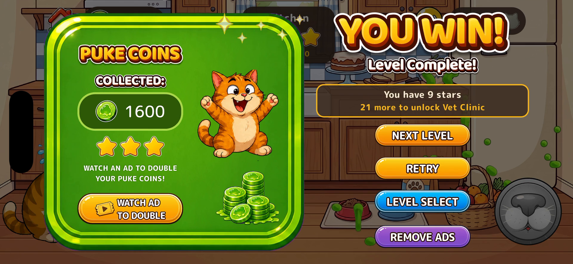
Advertising. The whole game is free to play. Players never need to pay to unlock a gameplay level and never need to watch an ad just to retry. A free player can choose a rewarded video for one extra shot after losing, or choose one after winning to double the Puke Coins they earned. RevenueCat powers the optional Remove Ads subscription, and subscribers get a limited number of those boosts without watching the rewarded video.
That monetisation model fits the kind of game I am making. Puking Cat is about experimenting, trying a different angle and immediately having another go, so putting a timer, payment or forced ad in front of a retry would work against the gameplay itself. RevenueCat’s State of Subscription Apps 2026 also notes that combining ads, IAP and subscriptions is much more common in gaming than the overall app average, so a hybrid model makes sense for the genre.
My goal is to grow the player base enough that the free ad-supported version can make the game sustainable while people who prefer an ad-free experience can subscribe. Hostile UX is also against my personal values. If someone wants to keep playing, I would rather let them play.
How I built it
I built Puking Cat myself in Flutter and Dart, and the slime became a much bigger technical feature than I expected.
The first version used image animation, which worked until I started thinking about what slime should actually do when it hits different shapes. Slime landing on a flat table should not behave the same way as slime hitting a dome, the curved arm of a sofa or a diagonal surface, so I tried Flame physics next, but that still did not give me the behaviour I wanted.
From there I started experimenting with my own physics system, and every solved problem seemed to reveal several new ones. How should the slime spread around a curve? What happens when it reaches an edge? When should gravity take over? When should it stop moving? How do I keep all the previous mess visible without continuing to simulate it forever? I definitely underestimated this feature.
The final system uses a custom physics engine written in pure Dart. A drop follows a projectile arc until first contact, then the fluid simulation takes over and handles how it spreads and settles against the surface it hit.
The system eventually became complex enough that I created a separate internal package just for the slime API and simulation.
I also hand-trace the collision geometry for every level so the solver hits the surfaces the player can actually see. This is one of those details nobody notices when it works, but everybody notices when it does not, because a slightly wrong collision line can make slime stop in empty space or pass straight through a piece of furniture.
I have spent a surprising amount of time making sure imaginary cat puke hits cartoon lamps and chairs in exactly the right place. :D
To help with level tuning, I built a certification grid that runs the real solver through combinations of 60 angles and 24 power values. It helps me check whether targets are reachable and gives me a rough idea of possible score ranges, but I still play every level myself because the solver can tell me that a shot technically exists and I can still look at it and think, no, this feels awful.
The visual design got the same level of attention because I wanted the whole game to feel like one finished product rather than a collection of unrelated assets.

I hand-traced the gameplay UI as vector art, including the angle dial, launch control, buttons, and score glyphs, so they stay sharp as the screen changes size. Buttons have dedicated pressed, glowing, and disabled states, the candy-style headings use live layered text so they stay crisp on larger screens and can be translated without being redrawn, and even the score popups have their own illustrated alphabet and animation timing, all in vectors, no AI slop!

I also kept finding places where a normal game would use generic UI and turning them into little cat details instead: the launch button is a cat muzzle, the remaining shots are shown as little cat heads, the cat’s cheeks puff up while you charge the shot, and each slime flavour has its own particles. The cat has different poses for feeling sick, charging, puking, recoiling, winning and looking completely confused after a bad shot, and I kept the proportions consistent so it still feels like the same character across all of those states.
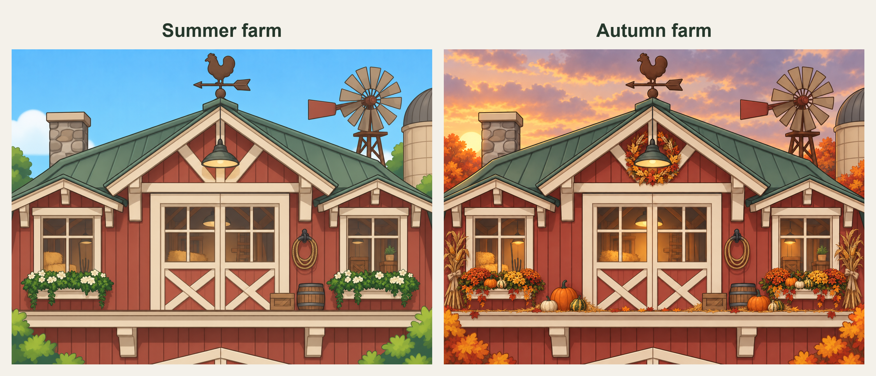
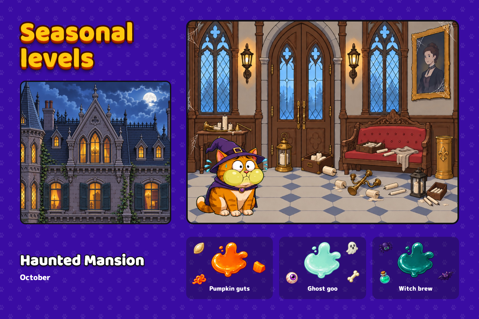
The rooms are built with the same amount of care. Each room keeps the same architecture across its three variants, but I change the props and clutter so each one feels like a different little scene. I plan those scenes around the month of the year and what should actually belong in that room, so summer, back-to-school, harvest season, Halloween and winter all need different objects, and a classroom should not feel like a kitchen with the props moved around.
This is NOT an automated level-generation process. I keep working on each level manually until the composition, target placement, collision geometry, and score thresholds all feel right.
I also designed the game for different screen shapes instead of stretching one phone layout everywhere. On Galaxy Fold devices, the playable room keeps its intended scale while more of the building opens around it. In a half-folded posture, the room meets the hinge while the controls sit below it where your hands can reach them. The Galaxy Store presentation follows the same approach: polished metadata and real gameplay rather than mock screens showing something the player never gets.
The ad system has design rules too. A failed level never forces an ad before the player can retry, rewarded ads are optional and appear exactly where the reward makes sense, and interstitials only appear at natural breaks with frequency and time limits so they do not become the thing the player remembers about the game.
I track five placements through a single enum across the ad service, analytics and RevenueCat Ads, including rewarded ads after a fail or win, interstitials after natural breaks and a tablet banner that sits in the painted ceiling area outside the playfield. RevenueCat receives the ad events and revenue alongside the subscription data, so the free ad-supported path and the Remove Ads subscription are part of one monetisation system.
For OneSignal, I deployed a real in-app campaign to returning players and built the message as custom HTML so it looks like one of the game’s own dialogs, with the cat asking, “Turn on notifications? Pweease?”
PING ME opens the native permission prompt, NO THANKS closes it, and players can later manage the subscription from Settings. I also added an app-side second chance after a qualifying three-star win, with limits so the game does not keep asking forever.
I verified APNs and Android FCM, checked the required notification entitlements and added a release guard around the OneSignal App ID after once discovering that a shipped build did not have a valid one. That experience made me much more careful about testing the whole player path instead of assuming an integration works because the package compiles.
What was hard
The slime was definitely the biggest technical surprise because I started with “I need a cute slime animation” and somehow ended up building a fluid simulation package.
I rewrote the physics more than once because earlier approaches either could not handle the room geometry properly or did not look good enough. One of those rewrites happened because I simply could not accept what the slime was doing on curved furniture, which probably says quite a lot about both the project and me.
Performance was another problem in the early versions because keeping every previous slime simulation alive made each new shot more expensive. Baking settled shots into a static layer fixed that without removing the growing mess from the room, which was important because watching the room get progressively worse is part of the payoff.
Level design brought a different kind of complexity. A target can look completely reachable until another piece of furniture blocks the curved projectile path, then changing one object can suddenly affect several other shots. There was a lot of going back and forth between certification results, actual gameplay, screen recordings, collision geometry and score thresholds.
The automated testing helped me find technical problems, but it still could not approve a level for me. “Reachable” and “fun to hit” are two different things.
The visual work had the same problem in another form. Once I decided I wanted the game to look like a professional studio had made it, small inconsistencies started bothering me much more than they probably should have. A button state, an outline, a cat pose, a prop that did not belong in the room or an animation that felt slightly off could keep me working on something long after it technically worked.
And then there is another modern development challenge: babysitting AI coding agents that occasionally wake up with a fresh idea about how to “improve” working code or erase another agent’s work...
Accomplishments I am proud of
I am most proud that the game feels much bigger than a one-person project, because that was one of my goals from the start. Real players have told me that Puking Cat is fun and that the visual quality is surprisingly high for an indie game, which meant a lot because I spent a huge amount of time on exactly those two things.
For the game itself, I am proud that the control scheme is only two taps but there is enough underneath it to stay interesting. You have timing, trajectory, hidden object values, limited shots, penalties, moving obstacles, three-star targets, free retries, progression through buildings and per-level leaderboards. A player can understand what to do almost immediately and still spend several attempts working out the best way to do it.
For the design, I am proud of all the details that could very easily have been skipped. The UI is hand-traced and scalable, headings are live layered text, buttons have proper interaction states, score popups have their own illustrated glyphs and animation, the cat reacts to charging, puking, winning and failing, each slime palette has its own particles, rooms keep their architecture while their stories change with the season, and Fold devices get a layout designed around the hardware instead of a stretched phone screen.
I also did not want the visual side of the game to turn into AI slop. The editorial work is probably the part of Puking Cat I am most protective of.
Community Cats is another thing I am especially proud of because I genuinely have not seen a referral feature like it in another game.
Puking Cat was also selected from more than 90 other apps to be featured on Discover Indie Apps, which was a nice sign that this ridiculous idea makes sense to people outside my own head too.
The OneSignal work is another thing I am proud of because it turned a mistake into a better implementation. I discovered that I had SDK integration but no working app-side permission flow, used a dashboard-created in-app message to recover without waiting for another release, then fixed the code path and added release checks. That campaign has already run for real users rather than existing only as demo code.
Which award categories am I targeting?
- Best Game: simple two-tap controls, but deep replayability from limited shots, hidden jackpots, star targets, moving obstacles, and per-level leaderboards.
- RevenueCat Design: cute character art, storybook room interiors, hand-traced vector gameplay UI, live scalable type, custom score art and animation, expressive character reactions, seasonal rooms, and foldable-specific layouts.
- Catvertising: ads add optional value after wins and fails, retries stay free, and the ad-supported path is tracked alongside the Remove Ads subscription.
- Best App for Galaxy: I designed the game for Fold and Flex Mode instead of stretching a phone layout, with real gameplay carried through to the Galaxy Store presentation.
What I learned
One of the biggest things I learned is that a game with very simple controls can still be extremely hard to design well, because when there are only two taps, every part around those taps has to make sense. The angle sweep has to be readable, the power cycle has to feel fair, targets need to be reachable, and the player needs enough information to improve without the game solving the shot for them.
I also learned that automated testing and actually playing the game answer different questions. The certification grid can tell me whether a target can be hit from the sampled inputs, but it cannot tell me whether the shot feels good, whether the target looks awkward on screen or whether the whole level feels fair, so I need both the numbers and my own judgement.
The same thing applies to visual quality. Having an asset is not the same thing as having a polished game because the polish usually lives in the annoying details: the button state, the outline weight, the animation timing, the cat expression, or the prop that does not belong in that room. Players seem to notice more of those things than I expected, especially the cat reactions, the slime behaviour and apparently the music, because they keep singing it later. :D
What's next for Puking Cat The Game
The next big focus is content. I am building toward a schedule of three new levels per day, planned around the month and season, because I want autumn to actually feel like autumn, back-to-school rooms to contain objects that belong in a school, Halloween to have its own visual language and winter to change the world again without throwing away the rooms players already know.
That structure gives me room to keep expanding the progression with new buildings, moving obstacles, cosmetics, leaderboard competition and more Community Cats, while still giving players reasons to return to older levels.
I also want to keep watching where people laugh, which rooms they replay, which hidden targets they discover and where the difficulty stops feeling fair, because those are the things that will tell me what to build next.
The long-term goal is that somebody can open Puking Cat months later and still find something new to destroy, while somewhere in the game there is probably still one perfectly good easy-to-clean floor that the cat has completely ignored.

Log in or sign up for Devpost to join the conversation.