
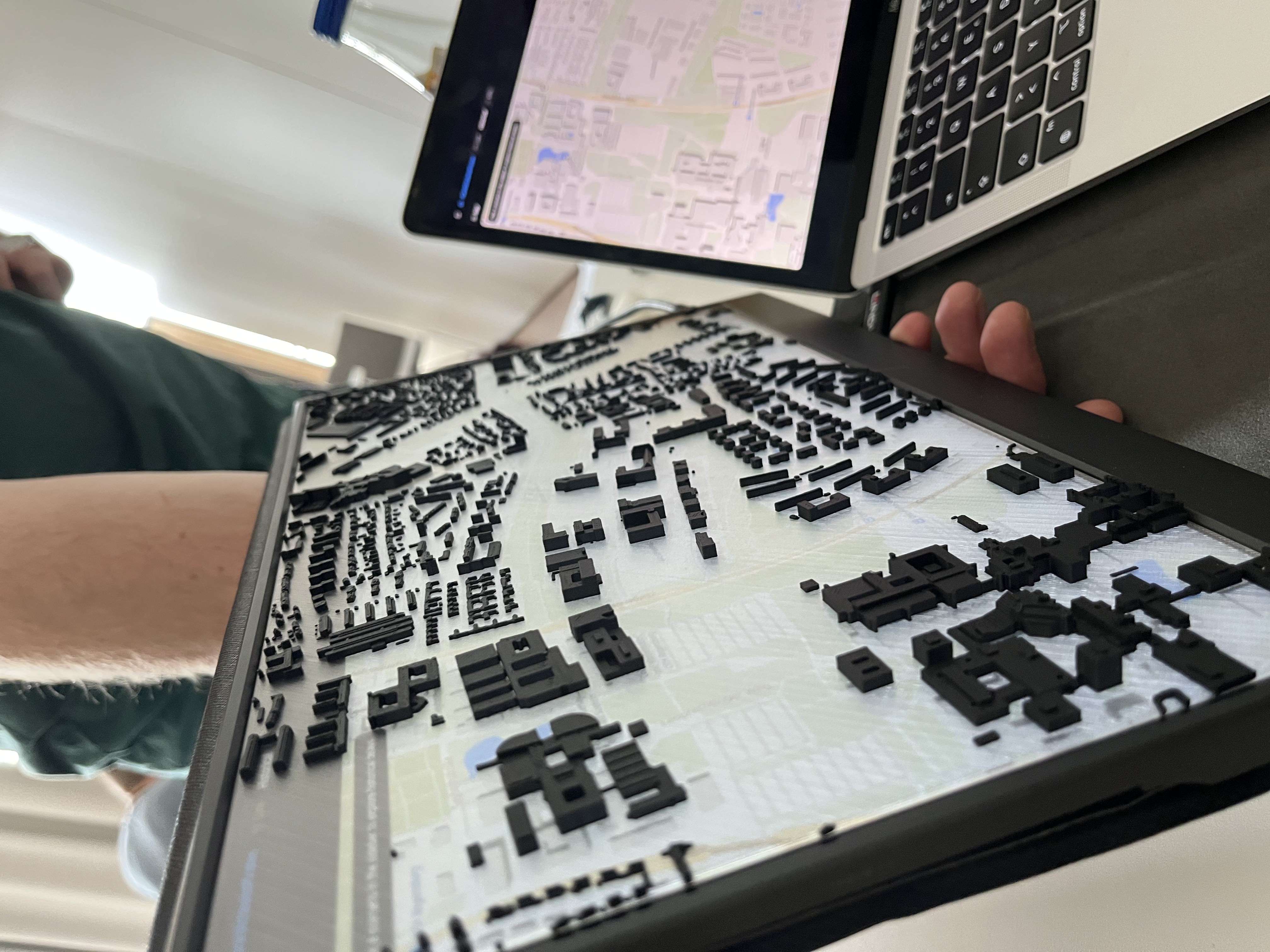
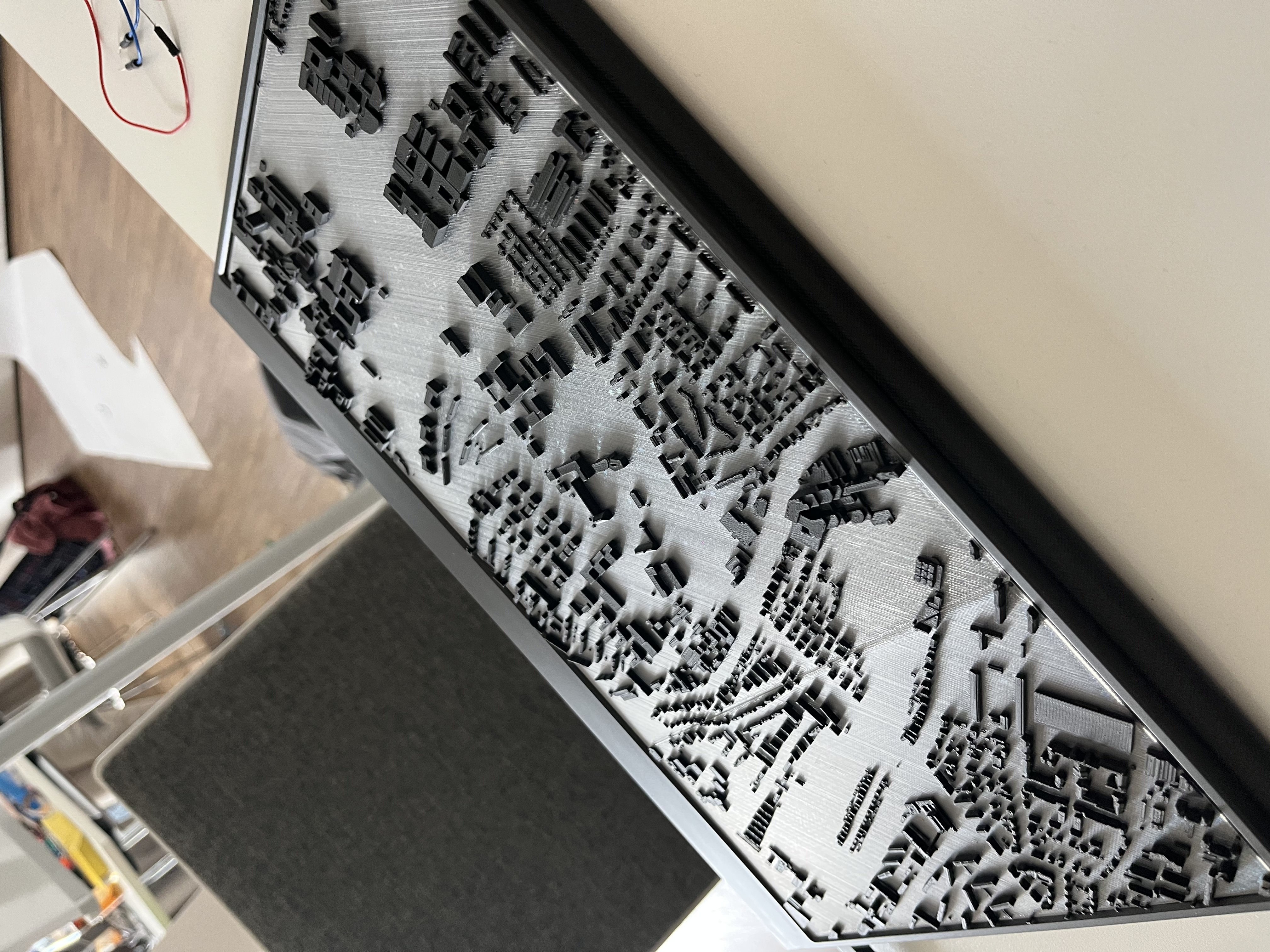
Inspiration
It's 16:07. Someone's waiting at a stop in Regensburg. The app says the bus comes in 2 minutes. It doesn't. This isn't random. It happens every day, at the same time, on the same route. The driver knows it, the dispatcher knows it, the passengers know it. Nobody knows why, and nobody knows how to fix it.
Das Stadtwerk Regensburg already had the answer. They handed us 3.8 million stop events from the last two years. Every bus, every stop, every second of delay, all recorded. The catch is that it sat in 25-column UTF-16 CSV files that no dispatcher is going to open at 4pm while the phone is ringing. The knowledge was there. It just wasn't visible. So we made it visible.
What it does
Efficiently analyzing bus traffic data with real time heatmap visualisation and the possibility to forecast delays with our trained machine learning model.
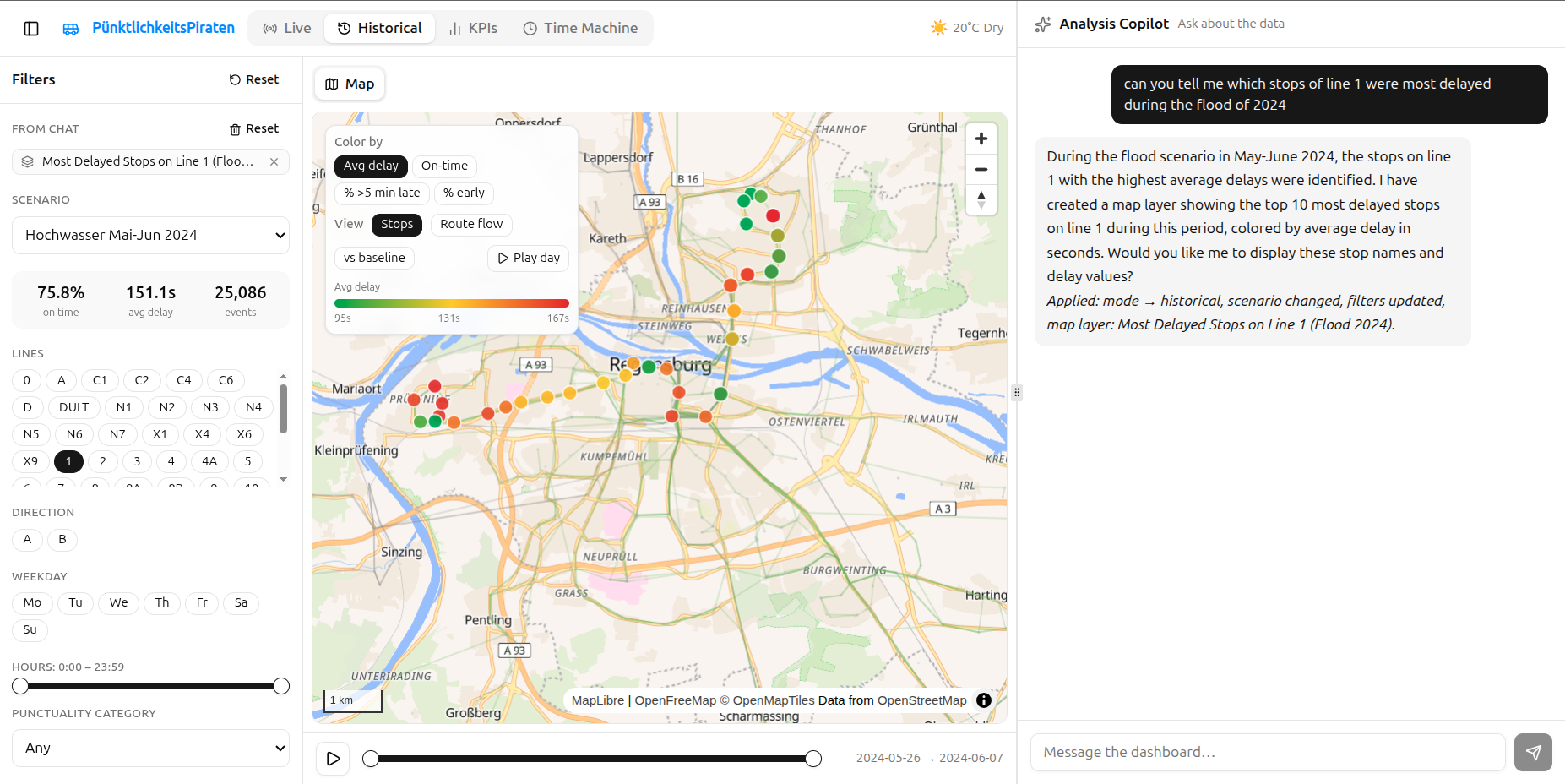
It's a dashboard with two halves, a map on the left and a chat on the right.
- Live map. Watch the real buses move, colored by how late they are, with a quick readout of how the whole network is doing right now.
- Historical map. Delay heatmaps, a route view that shows where a line loses time and where it makes it back, a slider that replays a full day hour by hour, weather overlays, and a "compare to normal" mode that isolates what a situation like rain or rush hour actually changed.
- Chat. Ask a question in plain German or English, like "where does line 1 lose the most time in the afternoon". The assistant sets up the map, runs the query, and shows the answer on the map or as a chart. You don't click through filters, you just ask.
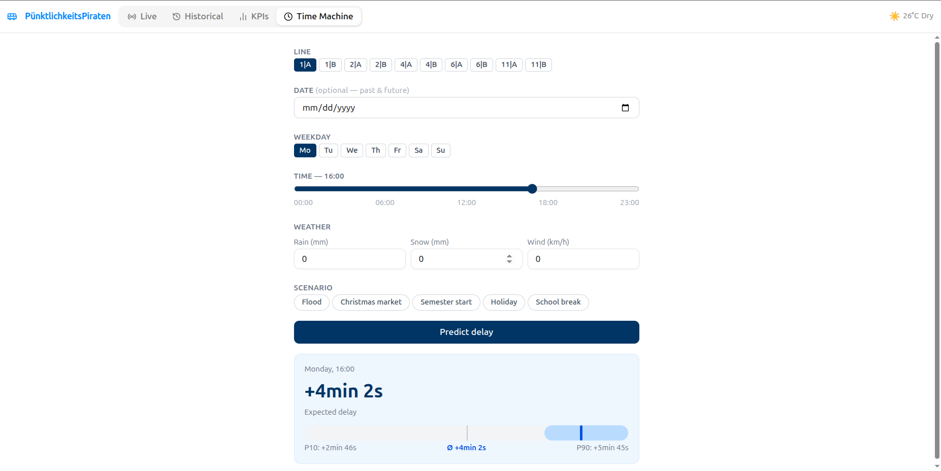
- Time Machine. Pick a line, set the weather and whether it's a holiday, and it predicts the expected delay with a range, using the model we trained.
How we built it
- Frontend. React with Vite and TypeScript, MapLibre for the map, Recharts for charts, Tailwind and shadcn for the UI, zustand and React Query for state.
- Backend. FastAPI on a read-only SQLite database, serving the live bus feed, the GTFS stops and routes, the weather, and the historical aggregates.
- Data. We parsed 3.8 million stop events out of the UTF-16 CSVs into SQLite, then joined in GTFS for coordinates and route shapes, BrightSky for weather, and a calendar of holidays and school breaks.
- Chat agent. An OpenAI gpt-5-mini agent with tools to change the dashboard and to run read-only SQL in a sandbox. It returns actions that the frontend applies, so it operates the dashboard instead of just talking about it.
- Model. An AutoGluon time series ensemble trained on an hourly table by line and direction, with weather and calendar features, served from a predict endpoint.
Challenges we ran into
- No coordinates. The operator data has stop codes but no lat/lon, so nothing could go on a map at first. We matched the codes to GTFS by name, got about 95 percent automatically, and mapped the rest by hand.
- Empty GTFS shapes. The route geometry file was empty, so we rebuilt each line's path from its most common stop order.
- The route view. Near big hubs like the Hauptbahnhof, route variants got mixed together and the line zig-zagged with impossible delay jumps. We fixed it by keeping the dominant variant per line and smoothing the result.
- Making filters visible. With a fixed color scale everything looked equally late. A relative scale, tail metrics like "percent more than 5 minutes late", and a compare-to-baseline mode made the real patterns show up.
- Merging two projects. We built the dashboard and the prediction tool in parallel and had to merge them into one app, which meant reconciling two data models and two chat backends.
Accomplishments that we're proud of
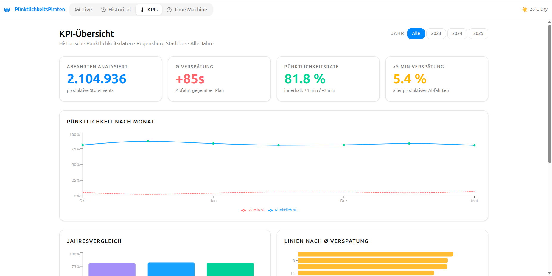
- A dashboard that turns millions of rows into something a dispatcher could actually glance at, live and historical.
- A chat assistant that drives the interface and writes its own SQL, and answers in whatever language you ask.
- The flood paradox. During the June 2024 high water, when we expected the network to fall apart, it was more punctual than a normal week, around 85 percent against 81. Fewer cars, clearer streets. We found it just by asking the chat.
- A forecasting model that beats the seasonal baseline, with public holidays and weather as the strongest signals.
- A route view that shows, stop by stop, exactly where a line falls behind and where it recovers.
What we learned
The forecasts are only as good as the data you have. Cleaning the data and dropping features that were quietly hurting the model mattered more than which model we picked. The visualization turned out to be half the product. The same numbers said nothing on one color scale and told the whole story on another. Real transit data is messy in every way you can imagine, and a high on-time number doesn't always mean good service.
What's next for Puenktlichkeitspiraten
- Run the predictions on the live feed, so instead of "there was a problem here yesterday" the dashboard can say "a problem is about to form here".
- Detect bunching on the busy high-frequency lines.
- Send alerts straight to the control room.
- Add real road-based route shapes, and pull in roadworks, events, and live traffic to help explain the delays.

Log in or sign up for Devpost to join the conversation.