-
-
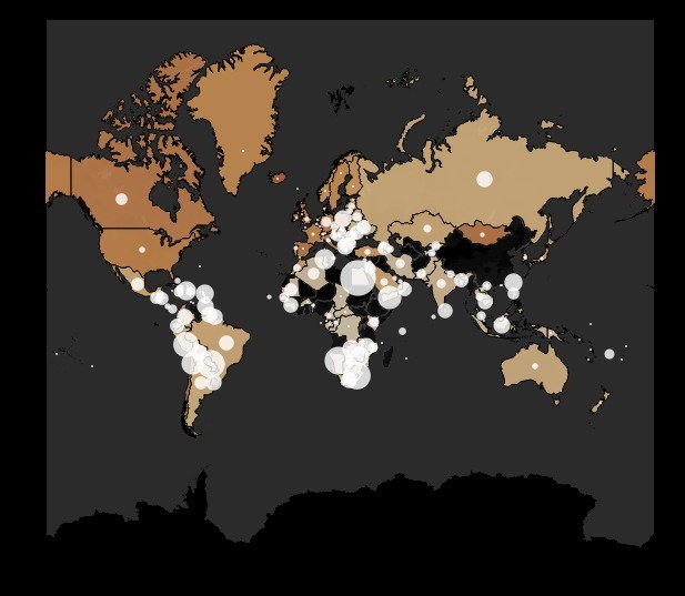
Visualization on Percentage of vaccinated people in all-over world and their respective death rates
-

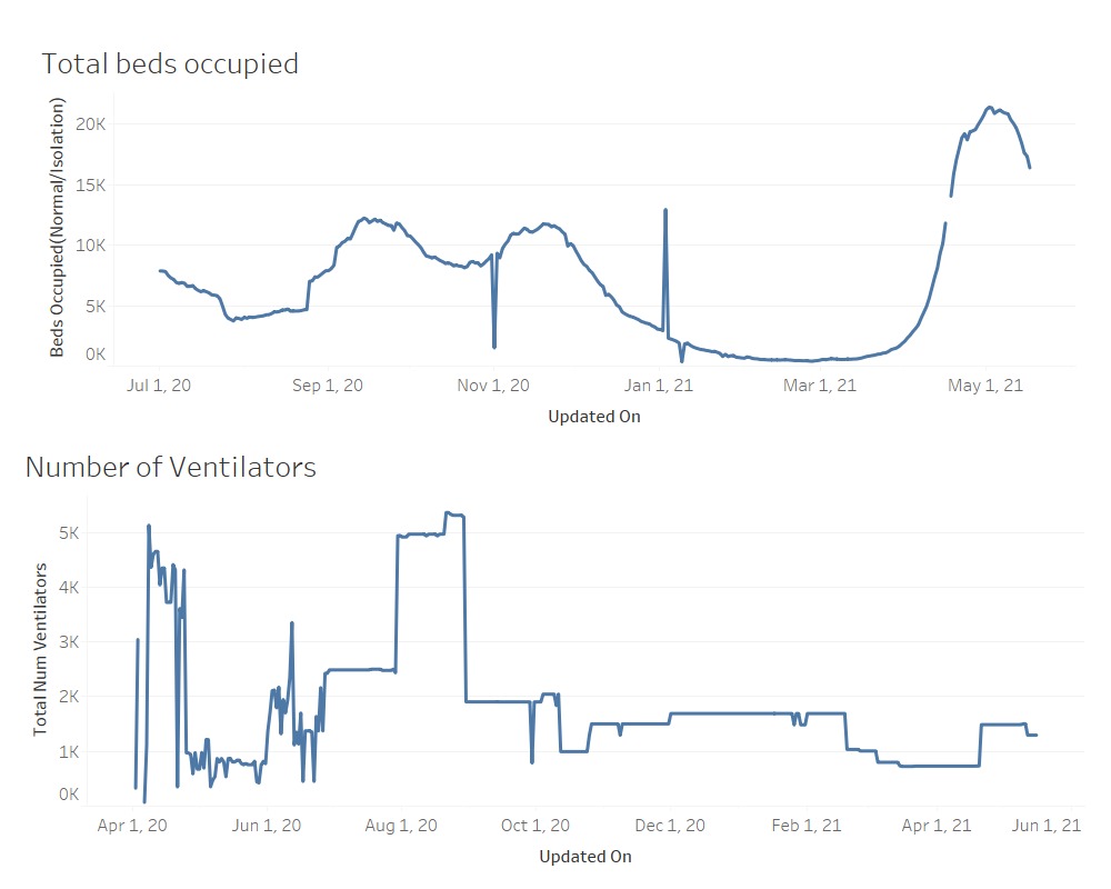
Visualization on Total number of ventilators and beds are being used.
-
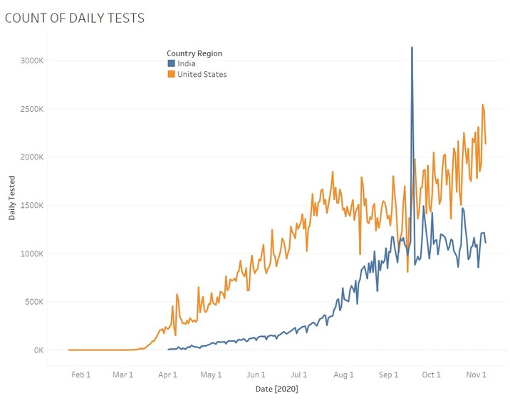
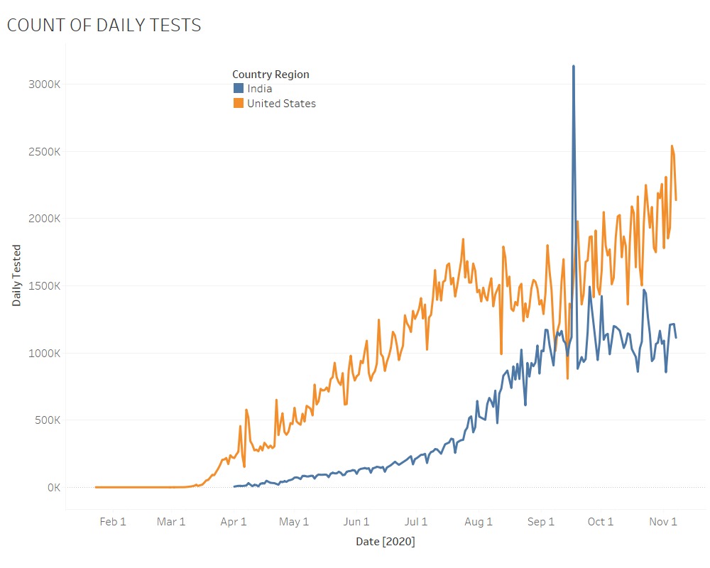
Visualization on total number of covid-19 tests.
-
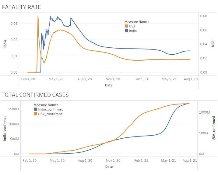
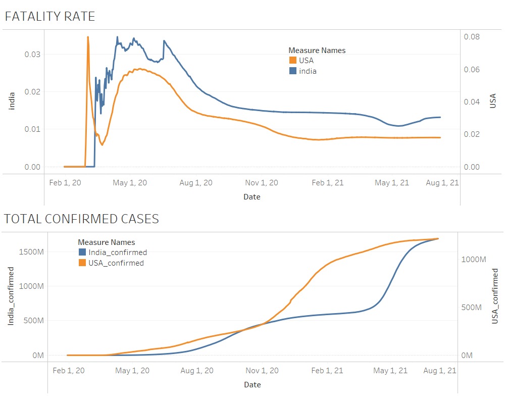
Visualization on number of active cases and fatality rate in both U.S.A and India.

Inspiration
Initially, we just wanted to know how bad the situation is in our country India, as compared to other countries as we had a high number of confirmed cases dataset. Made plotly world maps based on the numbers of confirmed cases and deaths per million inhabitants.
What it does
It made us realize the importance of getting vaccinated.
How we built it
Collected datasets from various official sources and built them with a tableau.
Challenges we ran into
We got different perspectives on the efficiency of vaccines from different sources. Both positives and negatives.
Accomplishments that we're proud of
We are glad about the output we got, having said that we used the tableau software for the first time. We do use the other visualization tools, but this time we tried with tableau and we are happy with that.
What we learned
We have learnt the importance of data to make decisions.
What's next for Public Health Track
These visualizations would help us to reach out to the people and bringing awareness about getting vaccinated.

Log in or sign up for Devpost to join the conversation.