-
-
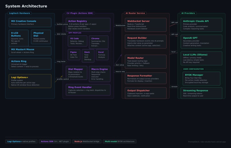
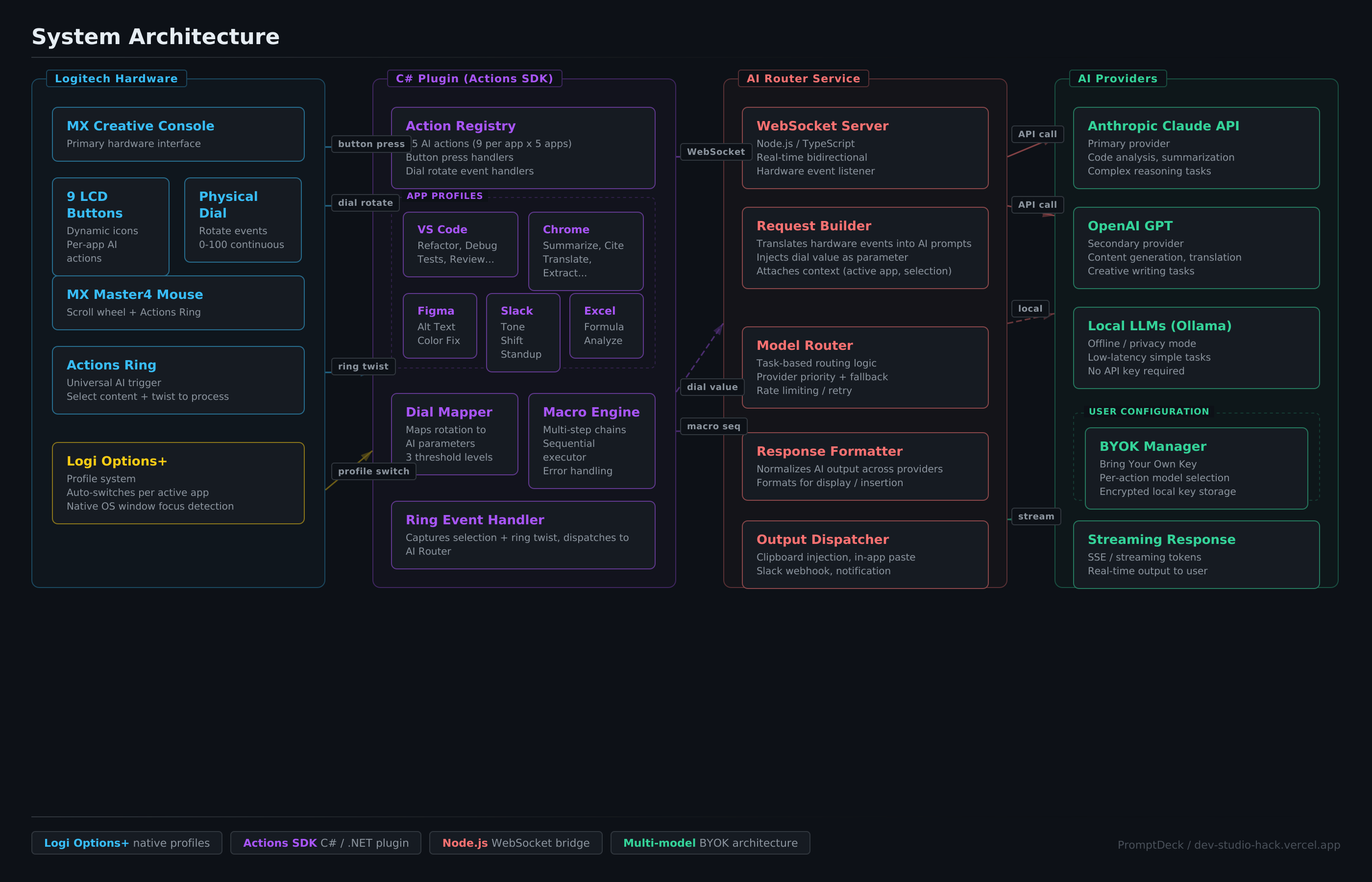
System Architecture: Logitech Hardware → C# Actions SDK Plugin → Node.js AI Router → Claude/OpenAI/Local LLMs with BYOK support
-
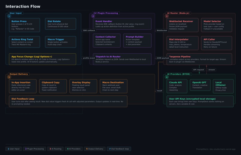
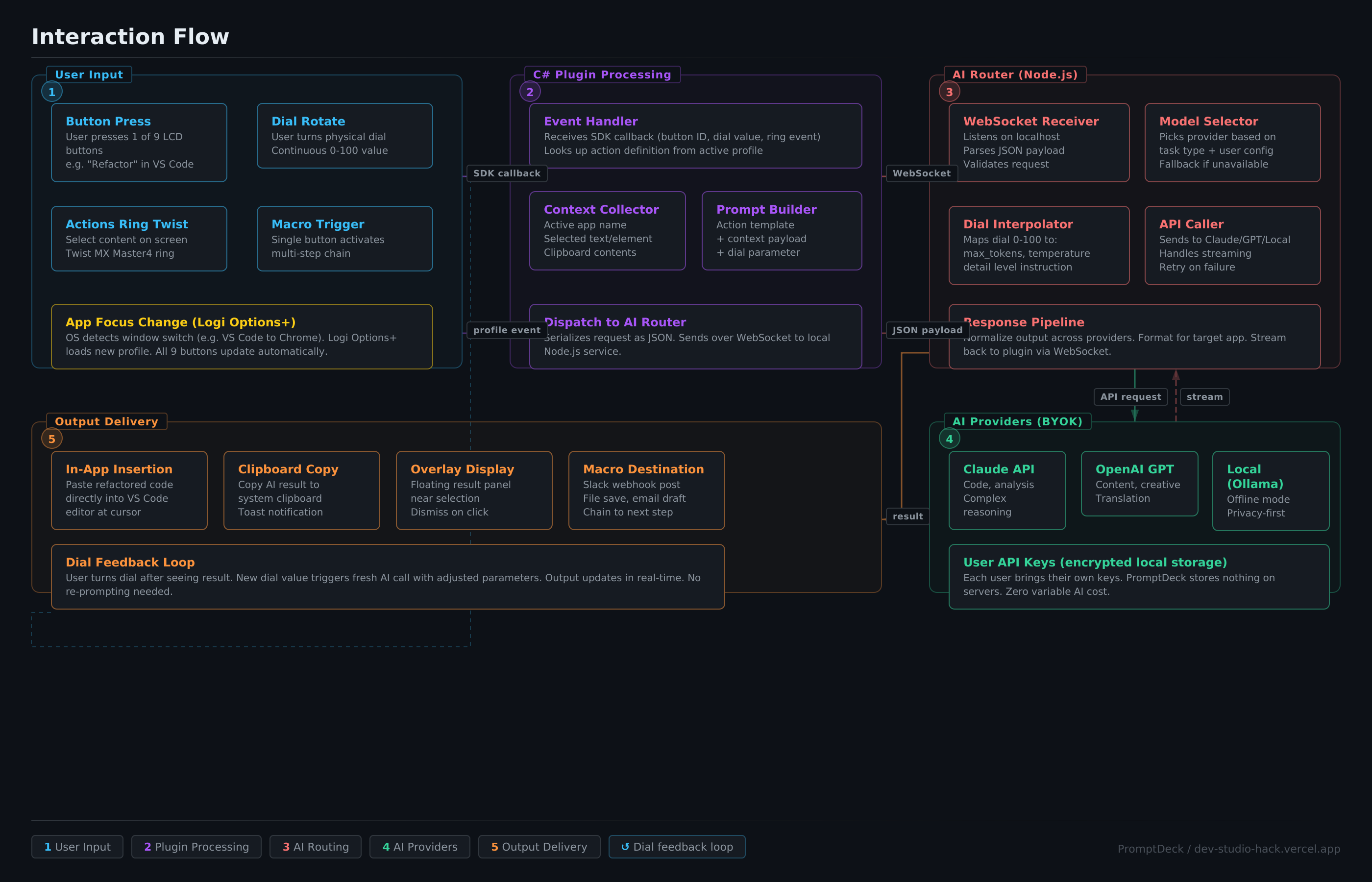
Interaction Flow: 6-stage pipeline from button press to AI output — input, plugin processing, routing, AI call, delivery, dial feedback
-
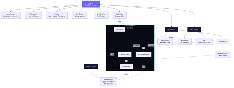
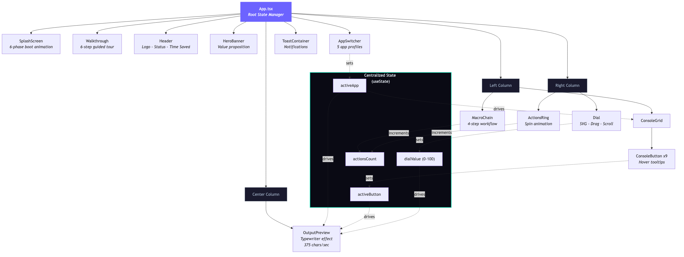
React Component Architecture: App.tsx manages centralized state across 16 components in a 3-column layout with real-time data flow
-

The Dial System: 3 detail levels × 5 apps × 9 buttons = 135 unique AI outputs with 2,141 lines of domain-specific content
-
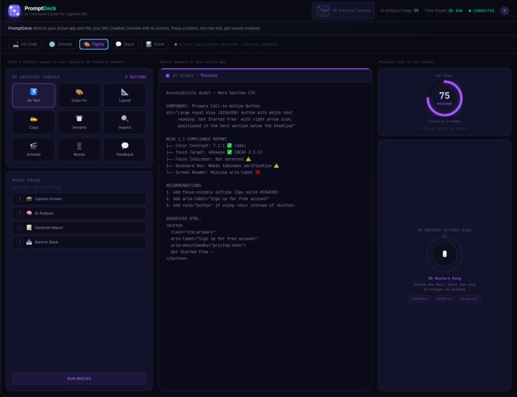
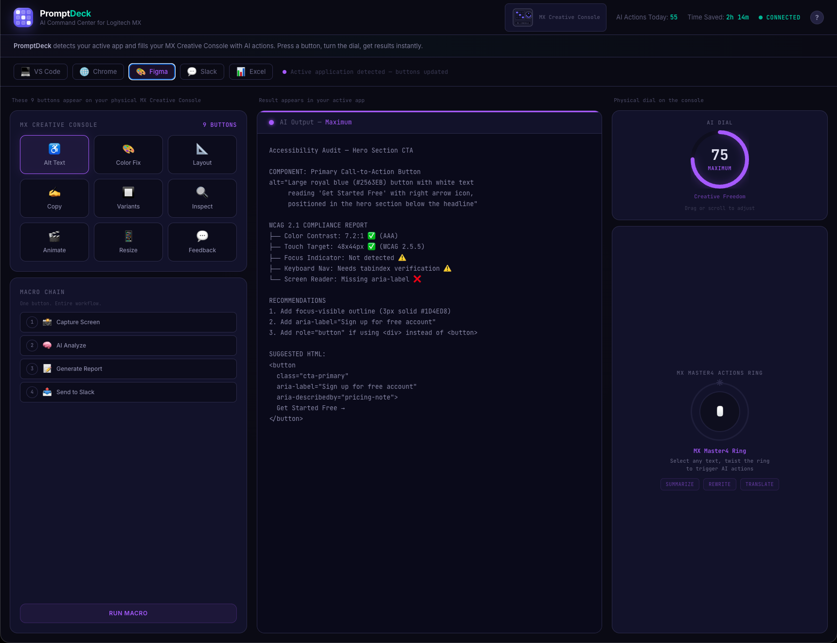
Figma profile: Buttons auto-switch to design actions like Alt Text, Color Fix, and A11y Audit. Each app gets its own AI toolkit.
-
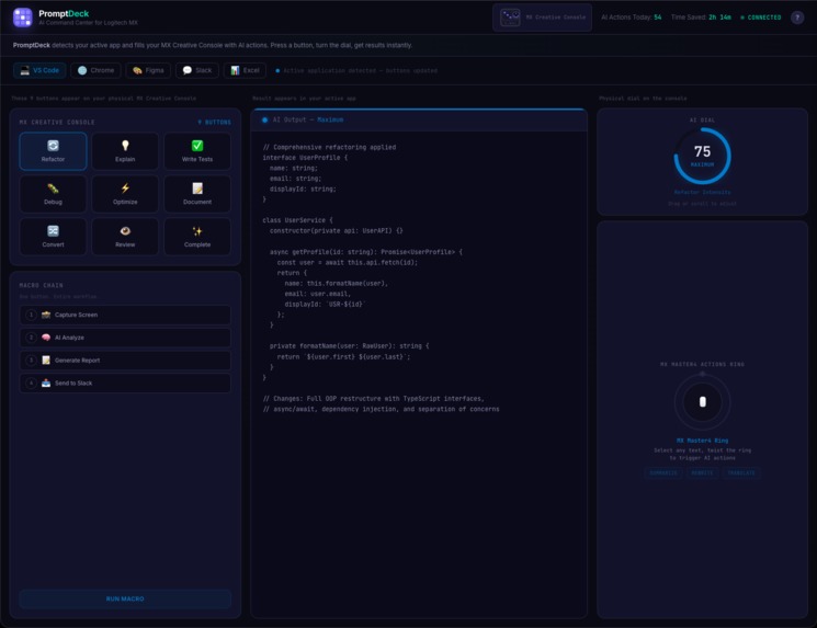
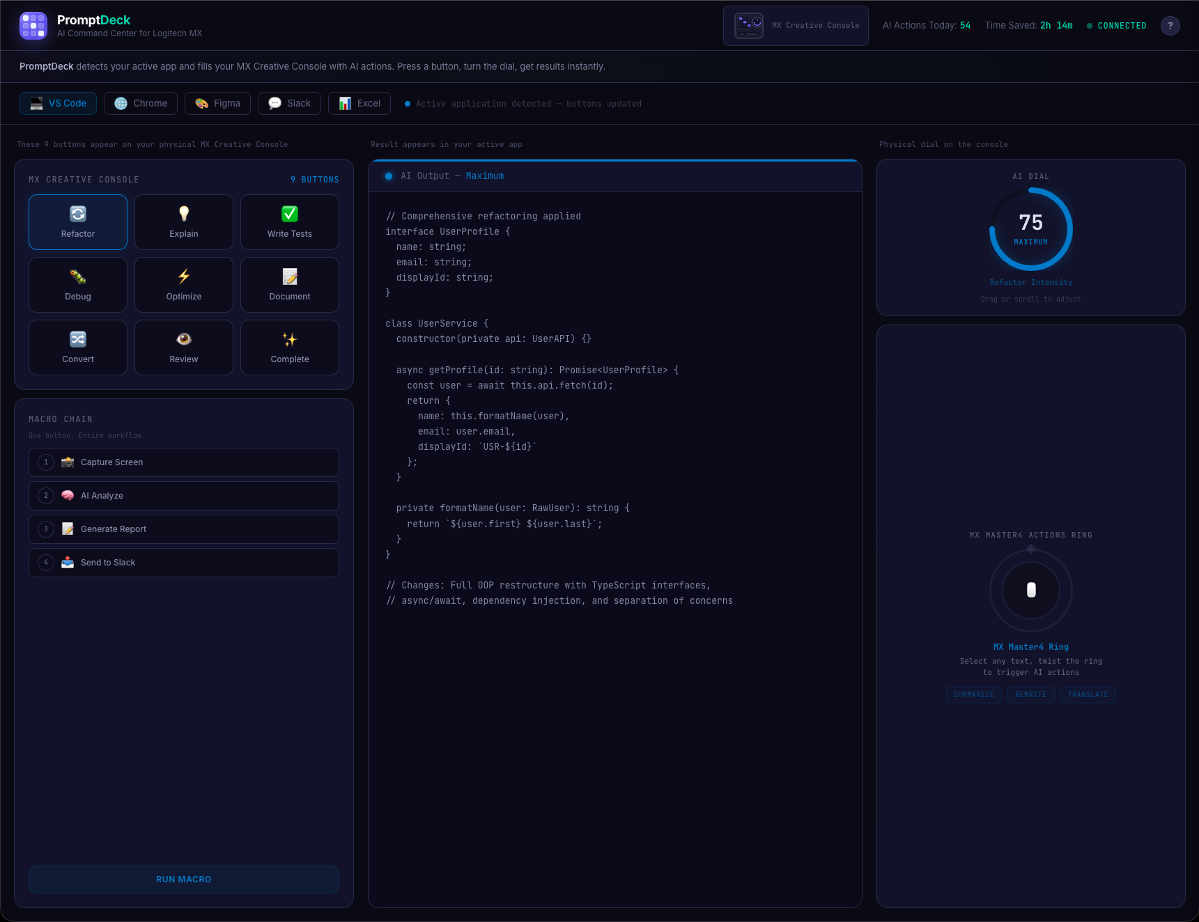
VS Code profile: 9 context-aware AI buttons, real-time output preview, AI intensity dial, and one-press macro chain workflows.
-
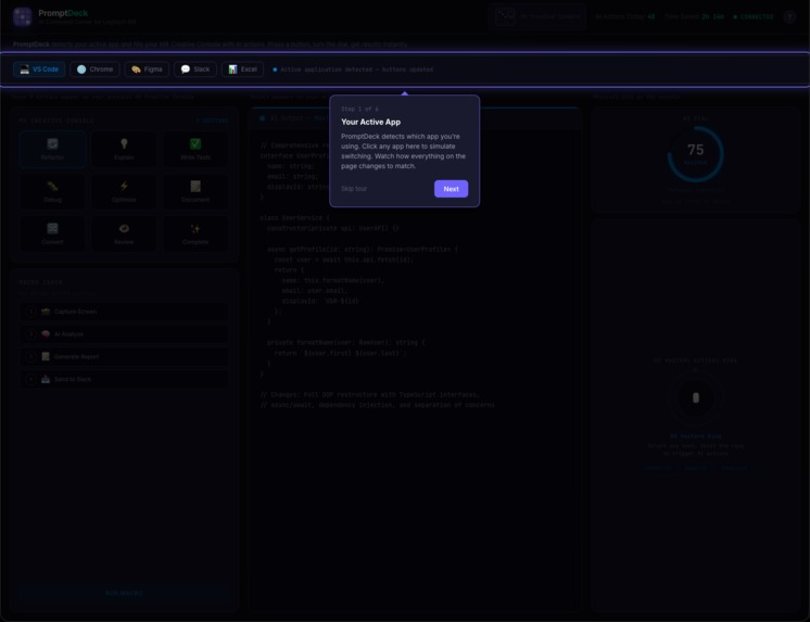
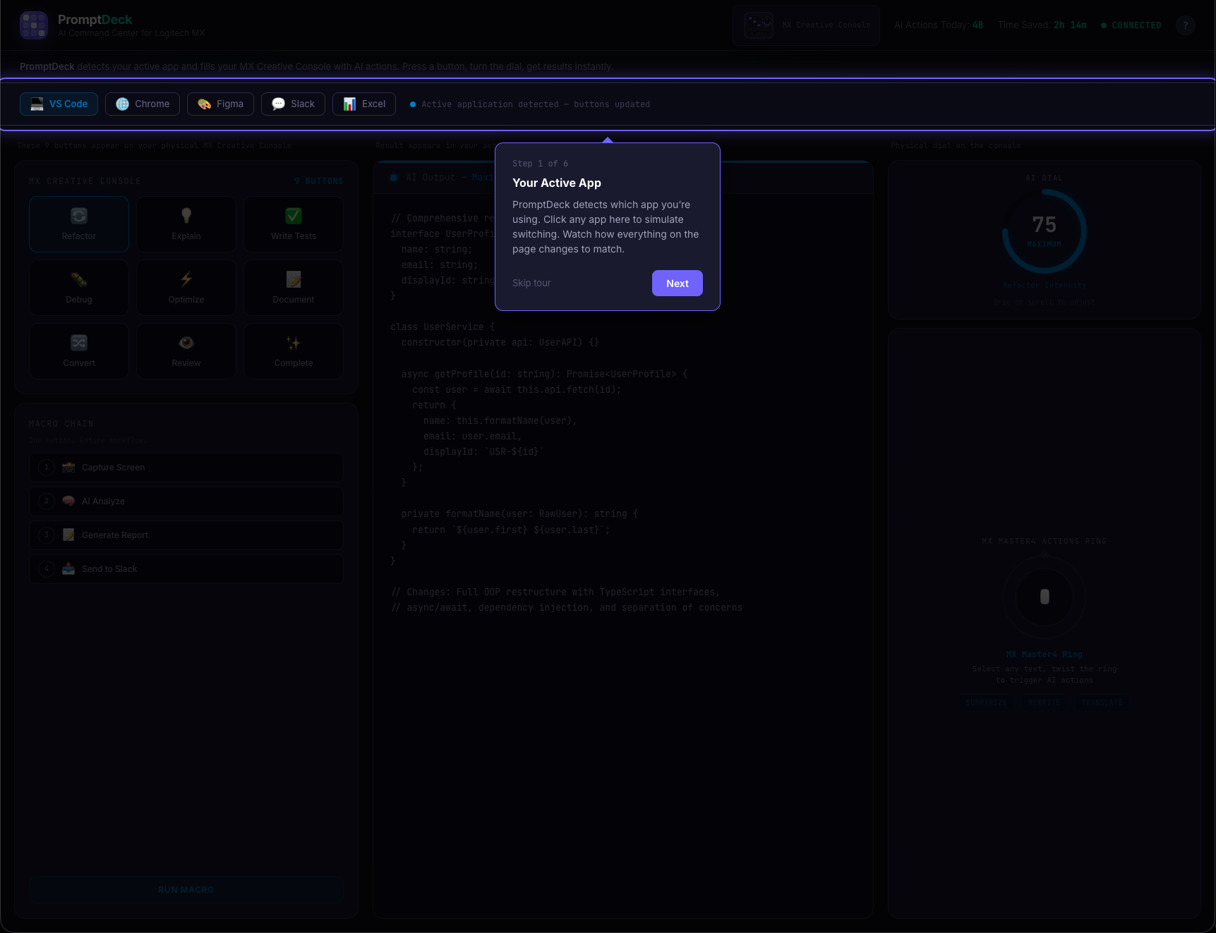
Guided tour Step 1: PromptDeck detects your active app and auto-fills the console with context-aware AI actions.
-
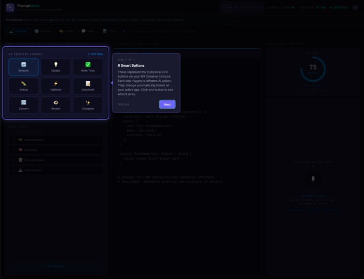
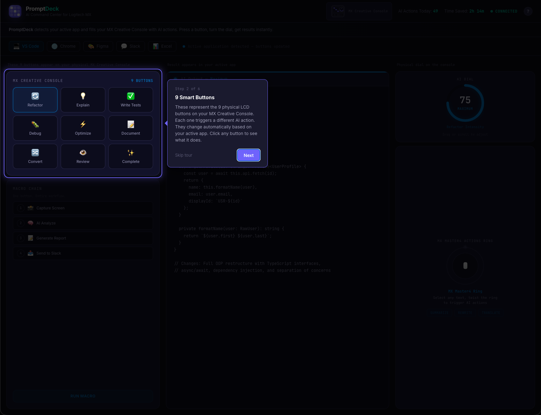
Tour Step 2: 9 smart LCD buttons on the MX Creative Console; each triggers a different AI action, adapting per app.
-
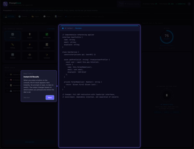
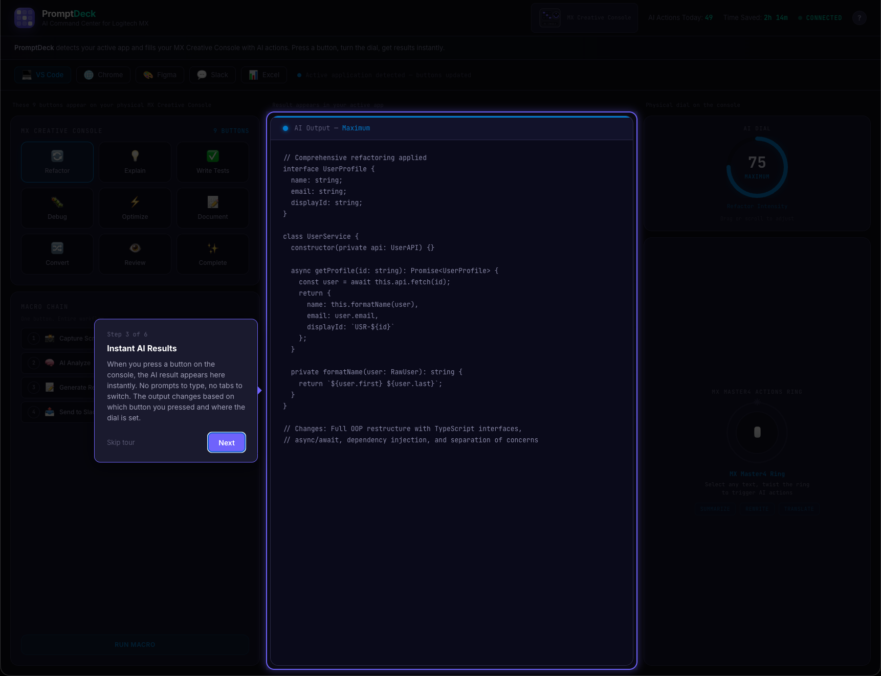
Tour Step 3: Instant AI output preview; press a button on the console, see results immediately. No prompts needed.
-
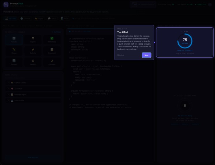
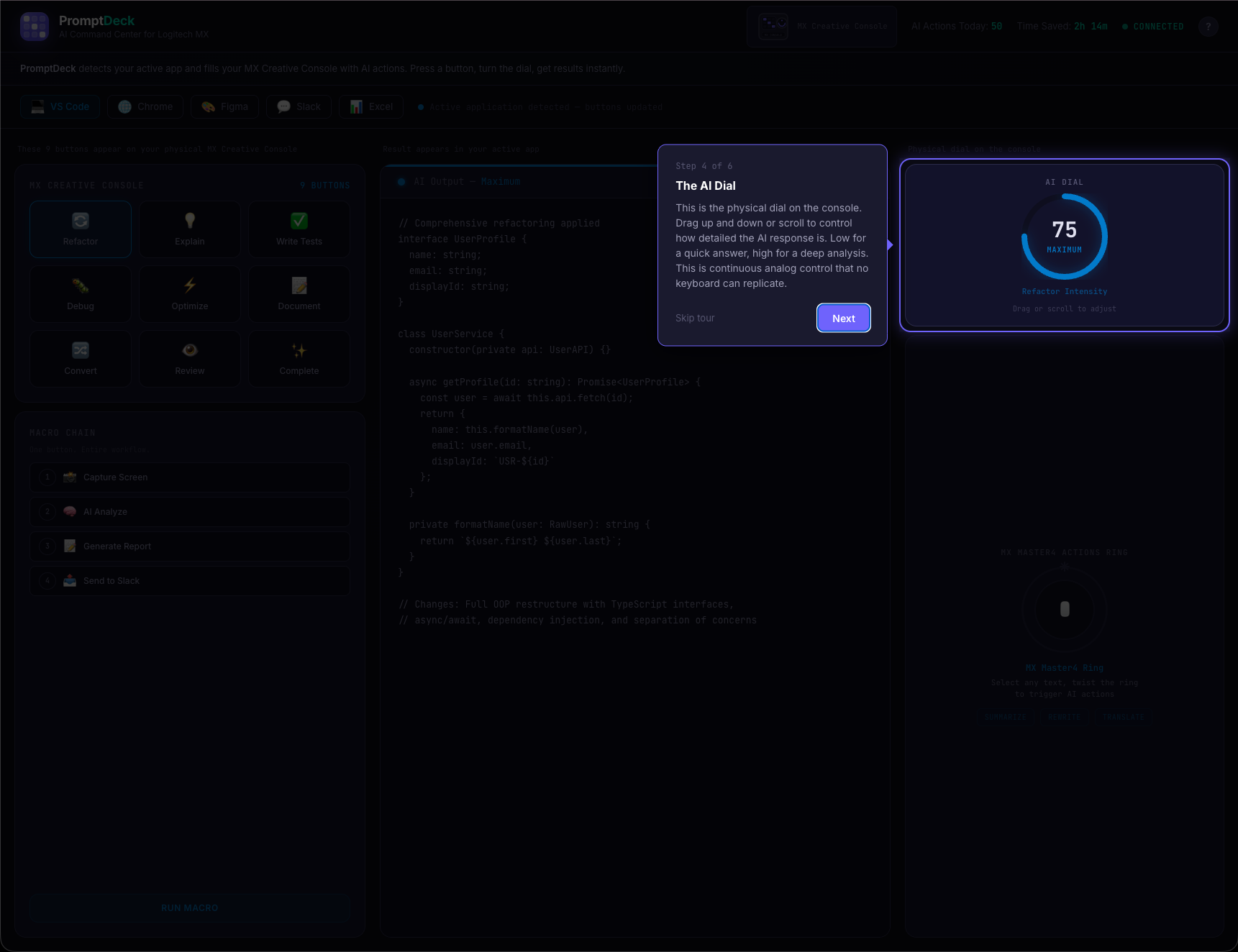
Tour Step 4: The physical AI Dial gives continuous analog control over response depth — minimal to comprehensive.
-
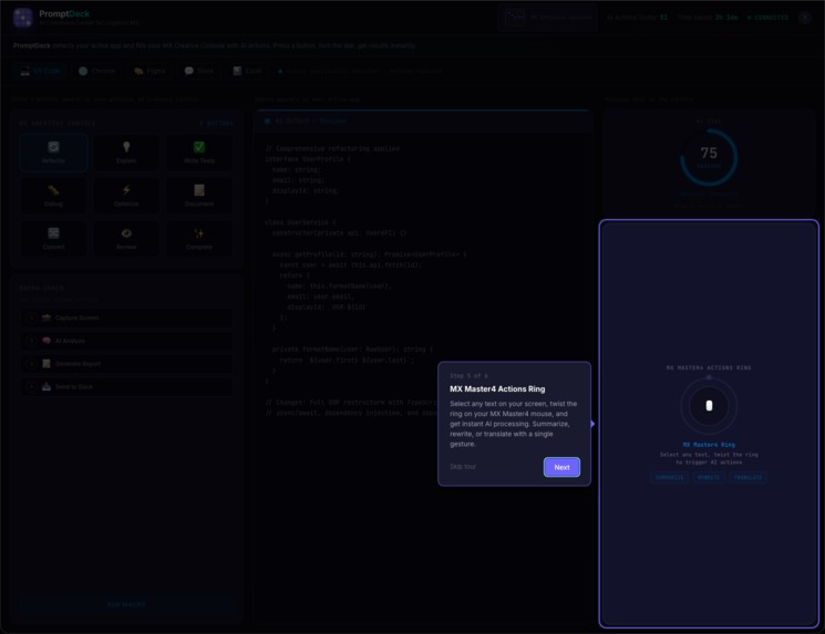
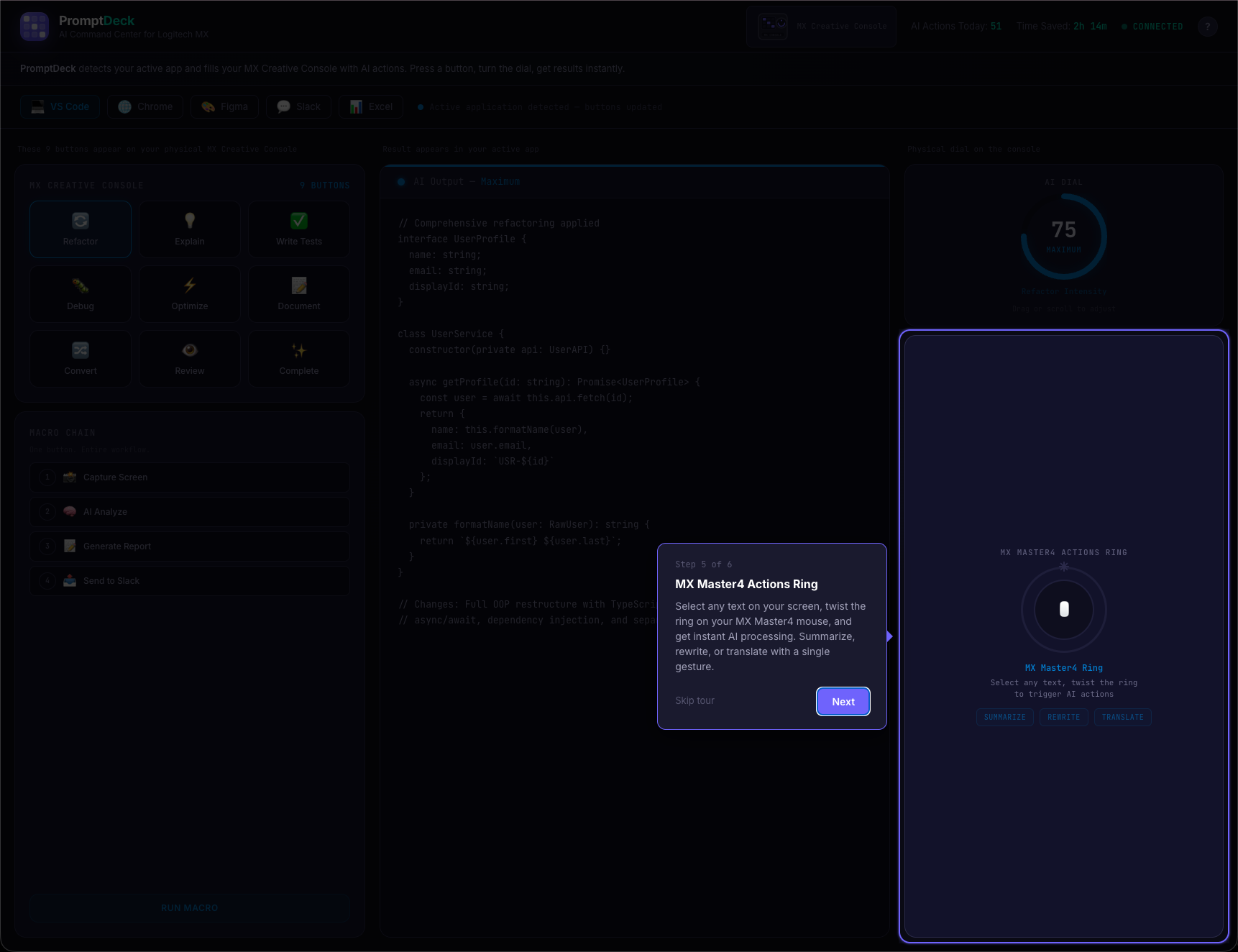
Tour Step 5: MX Master4 Actions Ring; select any text, twist the ring, get instant AI: summarize, rewrite, translate.
-
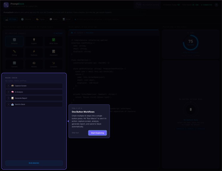
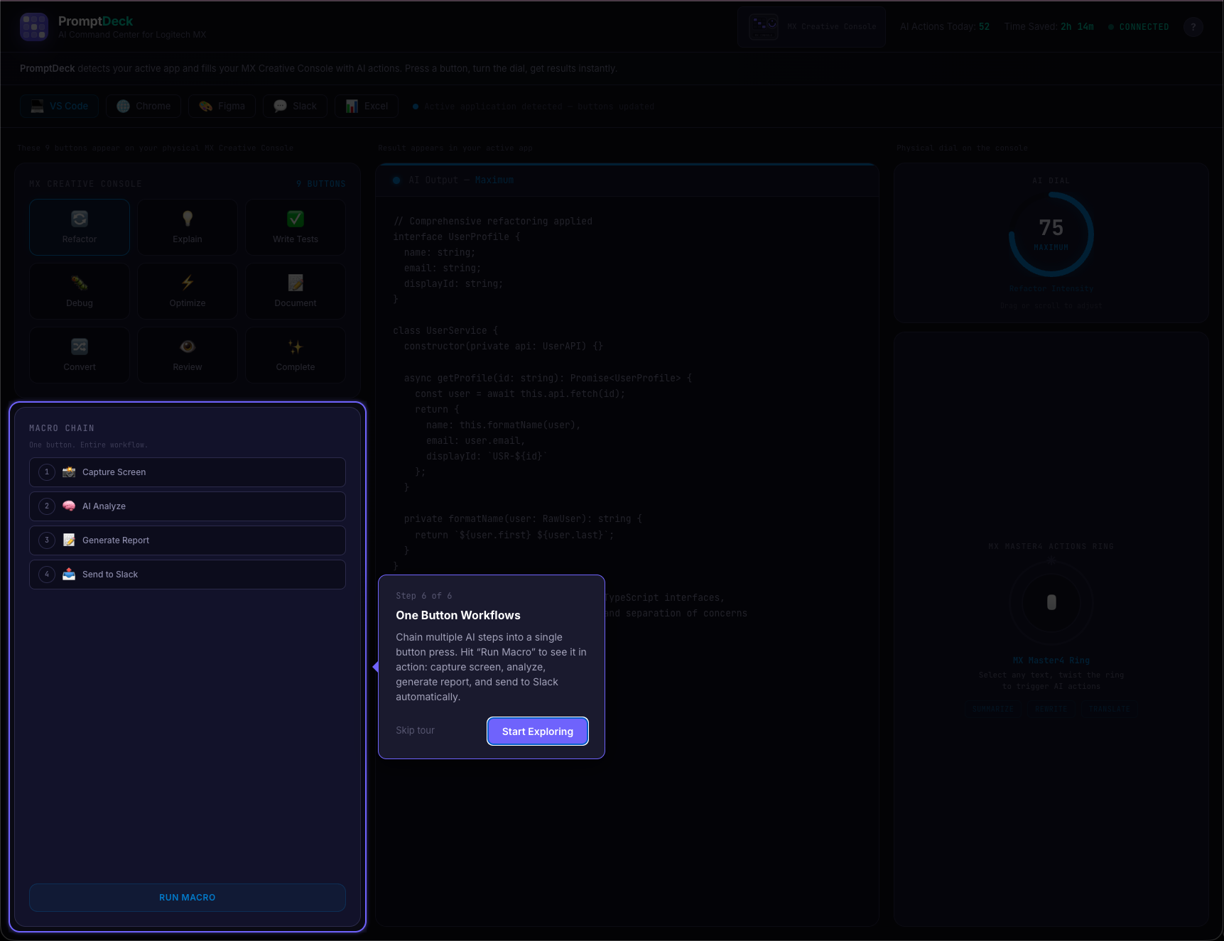
Tour Step 6: One-press macro chains; capture screen, AI analyze, generate report, send to Slack. All automated.
Inspiration
We're Dileep, Yashaswini, and Harsha - three CS grad students at RIT who use AI tools constantly. And we're tired of the workflow.
You're deep in a coding session, hit a wall, so you open ChatGPT in another tab, type a prompt, wait, copy the answer, paste it back, and get back to work. Two minutes later you do it again. And again. By the end of the day you've done this 30+ times.
AI is supposed to save us time. But the way we actually use it? It's just fancy copy-paste.
The MX Creative Console is sitting on desks with 9 LCD buttons and a dial, but most people use it for basic shortcuts. What if those buttons could show context-aware AI actions instead? What if the dial could control how detailed an AI response is? That's the idea we wanted to prove out.
What it does
PromptDeck is a concept for an Actions SDK plugin that makes the MX Creative Console aware of what app you're using and fills the buttons with AI actions that match.
Try the interactive demo now: dev-studio-hack.vercel.app (starts with a guided walkthrough)
Smart Buttons that change per app. Switch to VS Code and the 9 buttons show Refactor, Debug, Write Tests, Explain Code, and more. Jump to Chrome and they become Summarize Page, Translate, Extract Data. Open Slack and you get Tone Shift, Thread Summary, Standup Generator. 5 apps, 45 unique AI actions, zero prompts typed.
The AI Dial - what keyboards can't do. Turn it for continuous control over how the AI responds. Low for a quick answer, high for a full analysis. In VS Code it controls refactor intensity. In Slack it controls formality. It's analog control over AI - there's genuinely no keyboard equivalent.
Actions Ring - select and transform. Select anything on screen, twist the MX Master4 ring, done. Summarize, rewrite, or translate with one gesture.
One-press Macro Chains. A single button press triggers: capture screen → AI analyze → generate report → send to Slack. All automatically, all in sequence.

Who is this for? Anyone who uses AI in their daily work. Developers, designers, marketers, analysts, content creators. If you've ever copy-pasted between ChatGPT and your actual work app, this is for you.
How we built it
We should be upfront: the C# Actions SDK plugin is designed but not fully built yet. What we built for this hackathon is an interactive web demo that proves the concept works and shows exactly how the experience would feel. This is where all our engineering time went.
The demo: dev-studio-hack.vercel.app
We built a full simulation in React 19 and TypeScript using Vite. The goal was to make judges (and ourselves) feel the interaction, not just read about it.
135 unique AI output previews. Every one of the 45 buttons has 3 distinct responses mapped to the dial's three levels (Minimal, Balanced, Maximum). That's 2,141 lines of carefully written, contextually accurate mock content - the VS Code outputs contain real TypeScript refactoring patterns, the Excel outputs include actual regression formulas with R2 values, the Figma outputs have WCAG compliance tables. No reused boilerplate.
Custom SVG dial control. No library. Pure React + SVG with mousedown/mousemove capture on the window, vertical drag sensitivity at 0.5x, scroll wheel support at 0.3x, and CSS transition disabling during active drag for zero-lag feedback. Three thresholds (0-33, 34-66, 67-100) map to the output levels.
Custom walkthrough tour from scratch. 422 lines, no third-party tour library. Uses CSS clip-path: polygon(...) to punch a rectangular cutout in a dark overlay, highlighting one element at a time with a pulsing purple border. 6 guided steps with directional tooltip arrows and auto-scroll.
6-phase splash screen. Logo scales in with cubic-bezier spring easing, 3x3 grid dots light up sequentially mirroring the console's 9 buttons, brand text slides up, progress bar fills, status text cycles from "Connecting to MX Console..." to "Ready", then fades out. 3.4 seconds total.
Per-app color theming. Every interactive element (button glows, dial arc, ring border, macro step highlights, output accent line, and a 900px ambient background glow) shifts to match the active app's brand color with CSS transitions. Switch from VS Code (blue) to Figma (pink) and the entire interface transforms.
On the architecture side, we designed how the full system would work: the C# plugin defines 45 actions using the Actions SDK, Logi Options+ handles per-app profile switching (this infrastructure already exists), and a Node.js service routes AI requests over WebSocket to Claude or OpenAI. The architecture diagrams in our submission reflect this design, not running code.
Challenges we ran into
We spent the first day going down the wrong path. We initially tried to build the C# plugin and the demo in parallel. After hours of environment setup and SDK documentation, we realized we wouldn't finish either one well. We made the hard call to focus entirely on the demo and prove the concept through interaction design instead of a half-working plugin. It felt like giving up at the time.
Writing 135 unique outputs nearly broke us. We thought it would take an afternoon. It took two days. The first batch of outputs were generic and boring - stuff like "Here's your refactored code..." that all sounded the same. We threw out about 80 of them and rewrote from scratch. Getting a VS Code "Refactor" output to contain believable TypeScript patterns, or an Excel "Statistical Analysis" to include an actual regression equation, meant we had to actually understand each domain. By output number 100, we were questioning every decision that led us here.
The walkthrough was a last-minute panic build. We tested the demo with a friend the night before submission and they had no idea what to click first. We tried three different tour libraries, none of them gave us the spotlight effect we wanted, so Dileep built the whole thing from scratch at 2am using clip-path polygons. 422 lines of code written under pressure.
The dial interaction took way more iteration than expected. Our first version used click-and-drag on a circular path, which felt terrible. The second version used a slider, which worked but didn't feel like a dial. The final version uses vertical drag on the dial face with dampened sensitivity, and it finally clicked. Small interaction details like that ate up more time than any of the "big" features.
Accomplishments that we're proud of
The demo actually convinces people. When we showed it to classmates, the first question was always "wait, is this real?" not "what is this?" That's the reaction we were going for. The splash screen, the walkthrough, the typewriter effect - they all work together to make you forget you're looking at a web page.
We shipped on time with a team that had never worked together before. The three of us met through RIT's hackathon community. We divided work by strengths (Dileep on the React components and interactions, Yashaswini on the output content and UX flow, Harsha on the architecture design and diagrams) and somehow didn't step on each other's code.
The content holds up. Click any button, at any dial level, in any app, and you get a real, specific AI response. Not placeholder text. We're genuinely proud that judges can explore the entire demo without hitting a dead end.
What we learned
People don't think in prompts. They think in actions: refactor this, summarize that, make this formal. When we watched people use the demo, nobody missed having a text input. They just pressed buttons. That validated the core idea more than anything we could have designed on paper.
Hardware constraints are a feature, not a limitation. Having only 9 buttons forced us to deeply understand each app's workflow and pick the actions that actually matter. Our first draft had 15 actions per app, and most of them were filler. The 9-button limit made us cut until every button earned its place.
A polished demo teaches you what the real product needs to be. Building the simulation forced us to think through edge cases we would have ignored in a spec doc. What happens when you switch apps mid-output? What dial label makes sense for Excel vs Slack? These questions only came up because we built something interactive.
What's next for PromptDeck
Step one: build the actual C# plugin. The architecture is designed, the interaction patterns are proven through the demo, now we need to write the real Actions SDK integration. This is the immediate next step - get a working plugin that handles even 2-3 app profiles with real AI calls.
More app profiles. Photoshop, Premiere Pro, and Notion are natural fits. Each new app profile adds 9 more AI actions.
Let users customize their buttons. A settings panel where you can drag and drop your own AI actions onto the button grid and pick which AI model powers each one.
Longer term, learn from usage patterns. If someone always summarizes Slack threads and writes standup notes every morning, the console could suggest chaining those into a single button. But that's future work - we need to get the basics right first.
Built With
- anthropic-claude-api
- c#
- logitech-actions-sdk
- node.js
- openai-api
- react
- tailwind-css
- typescript
- vite
- websocket


Log in or sign up for Devpost to join the conversation.