
Inspiration
AI is just awesome. Lately, I’ve been blown away by the speed of recent developments and all the mind-blowing applications they’ve brought us. While scrolling through Devpost looking for something interesting, I stumbled upon this Plotly hackathon.
I’ve never been super into data analytics; pandas and dataframes always felt either laborious or just plain boring over long periods. But I’ve always loved the end result — the amazing visualizations and the insights you can pull out. In many of my past projects, visualizing data gave me critical insights that helped me in achieving my goals. Almost always, I’ve thought, “there’s got to be a faster way to do this without writing so much code,” so I could focus on understanding the data and its behavior rather than wrangling it.
So, when I read about Plotly and what it can do, I was immediately intrigued. This hackathon was the perfect opportunity to try it out.
What it does
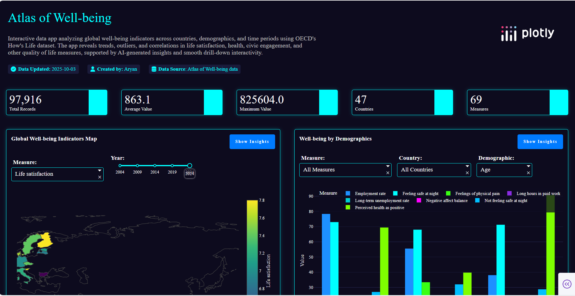
Atlas of Well-Being squeezes every bit of insight from the dataset under consideration — here, I chose the provided OECD Well-Being dataset. The app is visually pleasing (I think?) and provides textual insights from the data (which is one of the parts I love the most). Every component also has a toggleable Show Insights button for on-demand explanations.
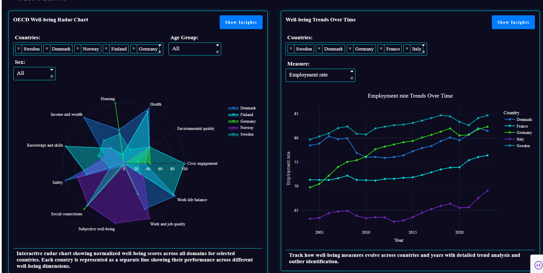
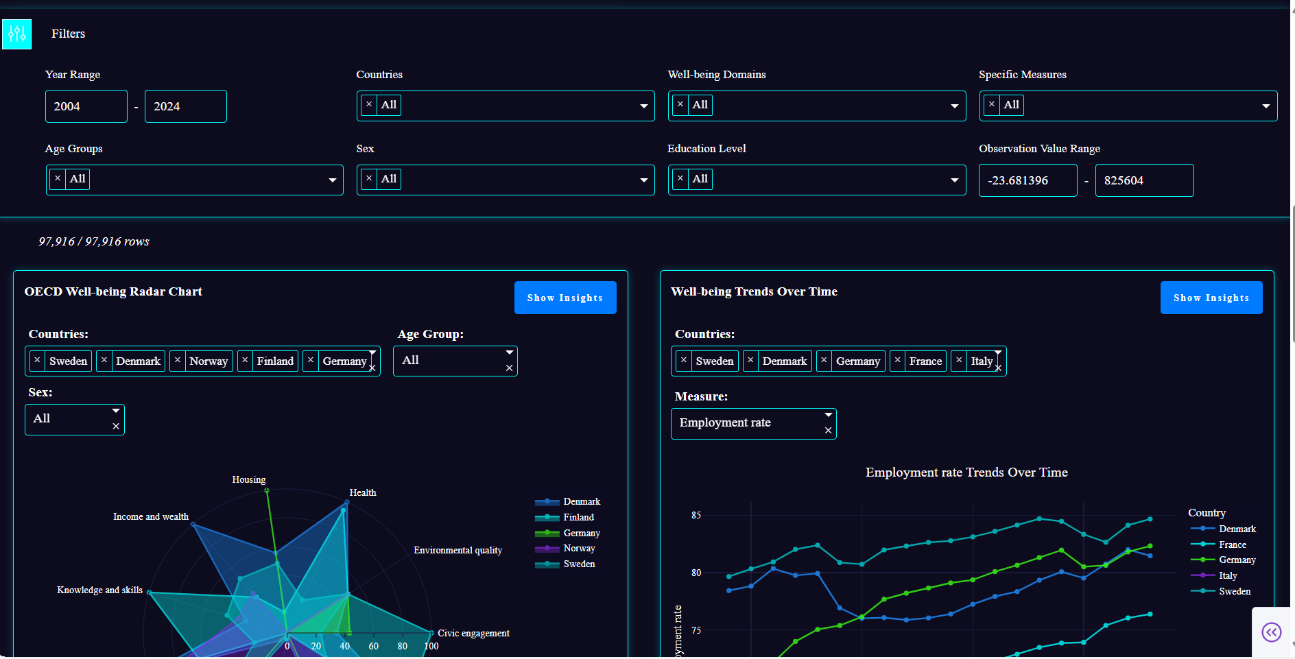
The app includes the following visual components:
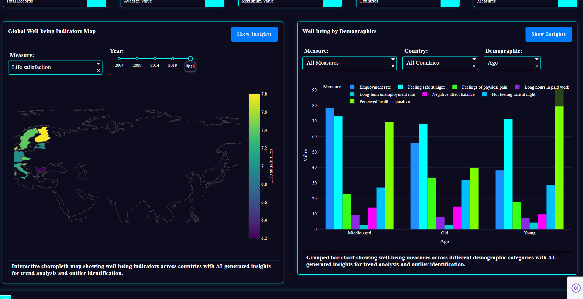
Global Well-Being Map – A choropleth map showing Life Satisfaction, Health, and Civic Engagement across countries with a year slider (2004–2024). Helps quickly spot global trends and patterns.
Country Trends Over Time – Line charts displaying trends for selected countries and measures. Useful to see how well-being evolves over time.
Demographic Breakdown – Grouped bar charts for Age, Sex, and Education categories, showing measure distributions across countries. Allows analyzing disparities and demographic patterns.
Well-Being Radar Chart – A colorful radar chart comparing normalized scores across all domains for selected countries. Helps identify strengths and weaknesses at a glance.
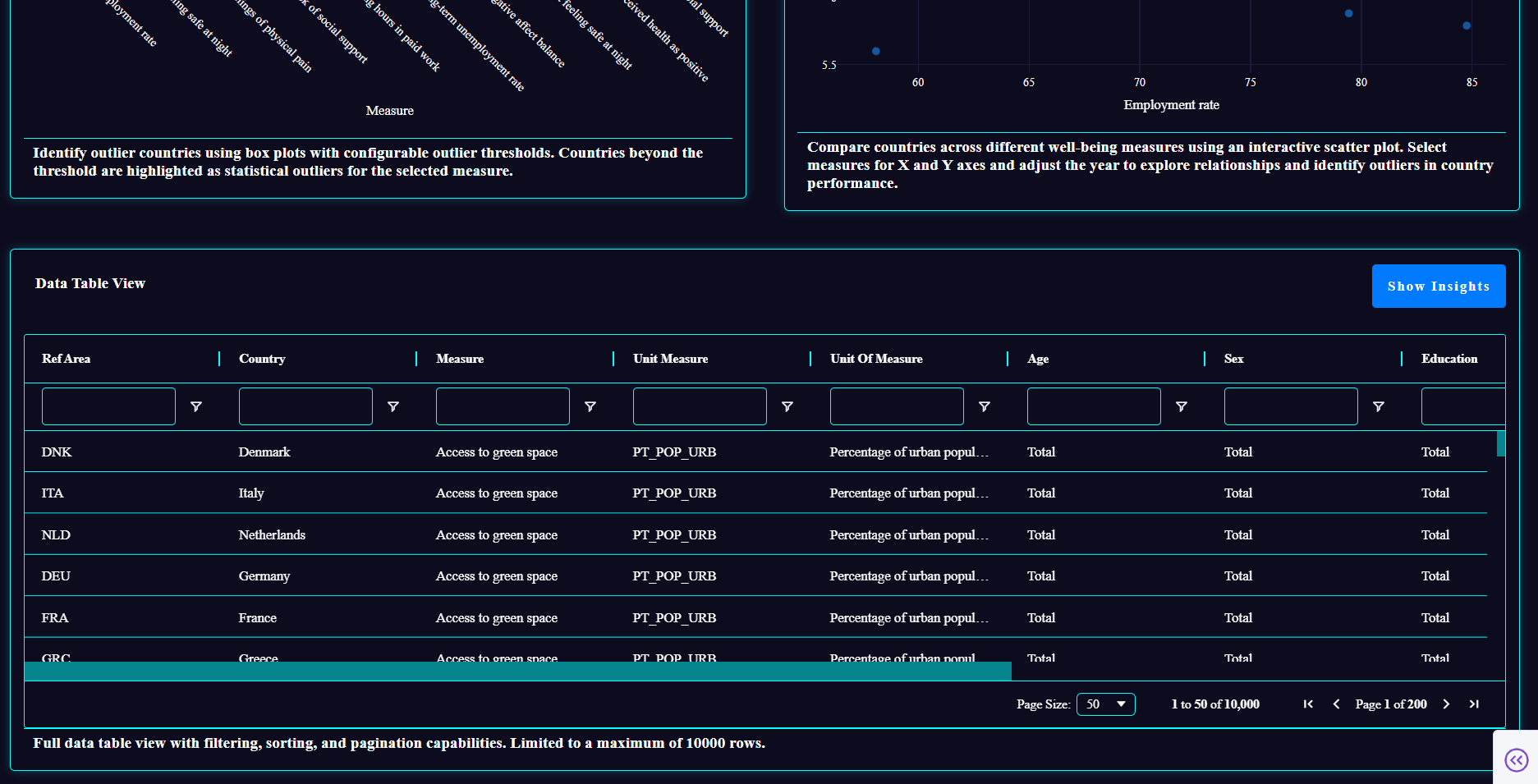
Country Comparison Scatter – Scatter plots comparing two measures across countries in a selected year. Useful for identifying correlations or outlier nations.
Outlier Analysis – Box plots highlighting outlier countries for selected measures based on adjustable thresholds (1.5–3.0 standard deviations).
Comprehensive Data Table – A full-width Dash Ag-Grid table providing an overview of the dataset with filtering capabilities. Enables deeper dives into the raw data.
How I built it
I first analyzed the dataset, which contains well-being indicators for 47 countries from 2004–2024. I then defined the questions I wanted to answer:
- How are indicators distributed globally?
- How do trends evolve over time?
- How do demographics affect well-being?
- How do countries compare across domains?
- Which countries are outliers?
- How can we summarize and explore the dataset efficiently?
I explored the docs and other resources to see what visualizations could best answer these questions and decided on the seven components above.
Thanks to my frontend experience, I had the design process down and could visualize the final product that I wanted. Now, I really have to commend Plotly Studio’s structured prompt system. It treats layout and theme separately, giving a structured way to work that complemented my thought process perfectly. The structured prompts and remixing allowed me to refine components until the app closely matched my vision. The end refinements were done by tweaking the code manually. Finally, deployment was just a click away — it was amazing to have a deliverable ready so fast.
Challenges I ran into
Embarrassingly, I didn’t notice the free AI credits coupon at first and almost panicked thinking I had run out during edits — turns out we had way more than enough! This was my first time working with Plotly and Dash, so I had to spend some time figuring out how it actually worked. Also, the absence of an undo feature slightly slowed me down, but overall, the process was smooth.
In short, were no major obstacles — the workflow was surprisingly fast and enjoyable.
Accomplishments I am proud of
My major accomplishment is, of course, that I was able to learn something new and bring out the product I had in my mind, but the unforeseen and most impressive part was how fast I was able to do it (I was done in almost a couple of hours once I set up and finished the research part!). Through this hackathon, I learned Plotly and Dash from scratch, created a fully functional, interactive, and visually appealing app, and discovered a way to translate a large, complex dataset into meaningful, easily explorable insights.
What I learned
- AI-assisted app building allows rapid prototyping when layouts, themes, and components are clearly specified.
- Large datasets can be transformed into meaningful, interactive insights.
- Thoughtful UI/UX design amplifies the value of visualizations.
- Complex analytics can be approachable and even fun with the right tools.
What’s next
Learning more stuff OfCourse!
Don’t forget to check out the published app — I have given the link for you to explore!


Log in or sign up for Devpost to join the conversation.