It started with a simple observation: decision fatigue is the silent killer of productivity.
As a developer juggling multiple projects, I found myself spending more time deciding what to work on than actually working. My task list had dozens of items, but every morning felt like staring into an abyss. Which task should I tackle first? What's the optimal order? Am I making the right choice?
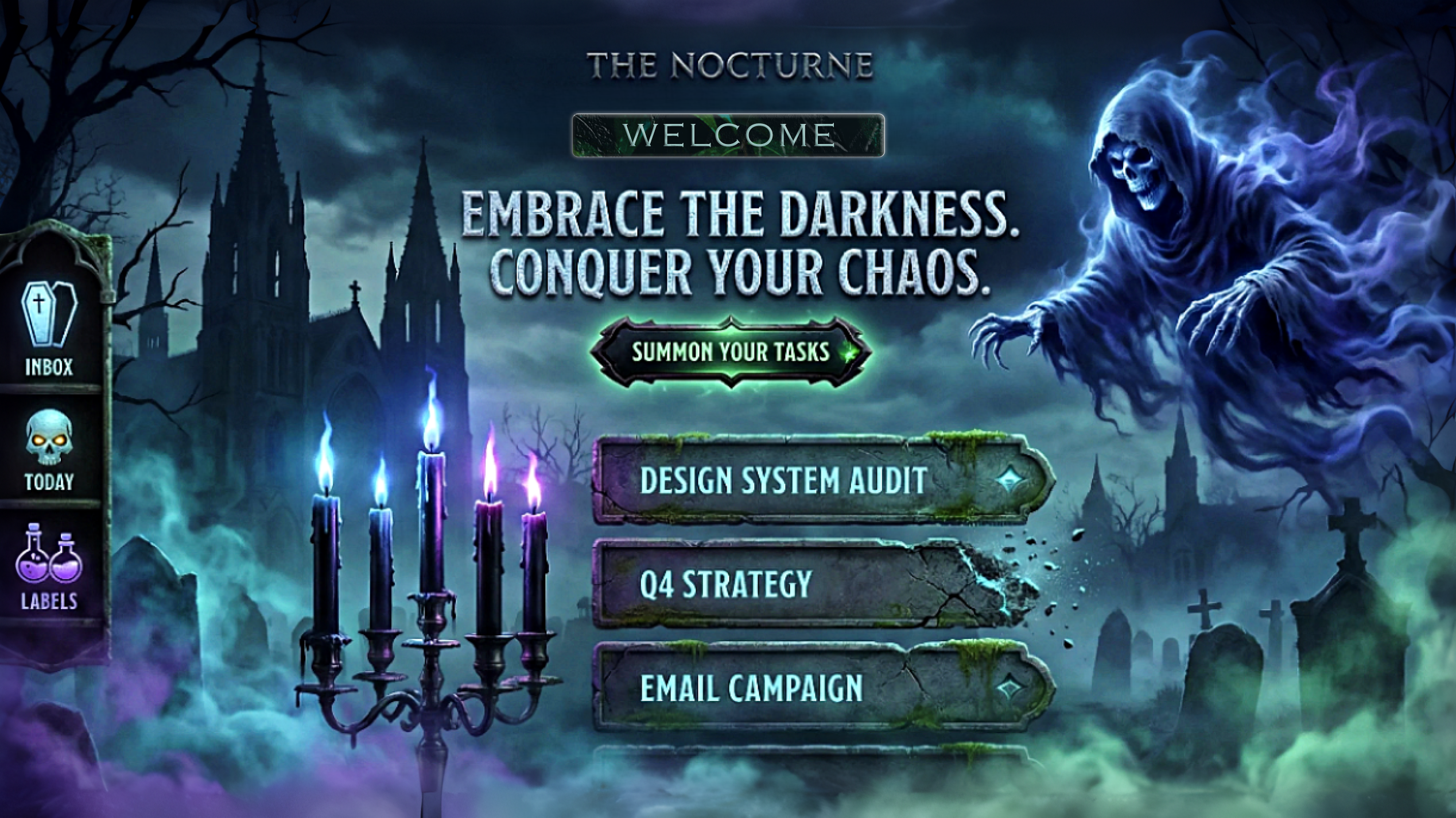
Then came the contest theme: spooky but functional. Most people would think Halloween gimmicks—pumpkins, jump scares, cheesy horror tropes. But I saw something different. I thought about the calm of a moonlit graveyard, the elegance of gothic architecture, the tranquility of night. What if "spooky" could be soothing?
That's when Nocturne was born: a task manager that doesn't just organize your work—it decides for you, wrapped in a calming gothic aesthetic that makes productivity feel like a peaceful midnight ritual.
🎯 The Vision
I wanted to build something that solved three problems simultaneously:
- Decision Fatigue - Use AI to eliminate the "what should I work on?" paralysis
- Aesthetic Fatigue - Create a UI that's beautiful and calming, not just "dark mode"
- Trust Fatigue - Make AI decisions transparent and explainable
The goal wasn't just to build a to-do app. It was to create an experience—where productivity feels less like a chore and more like a meditative practice.
🏗️ How I Built It
Phase 1: Spec-Driven Foundation
I started with Kiro's spec-driven development workflow, and it changed everything.
Requirements First: I wrote 14 formal requirements using EARS patterns (Easy Approach to Requirements Syntax). Every requirement followed strict patterns like:
WHEN [event] THEN the system SHALL [response]WHILE [state] THE system SHALL [behavior]
This forced me to think deeply about what the system should do before how to build it. For example:
Requirement 5.2: WHEN the Focus Coach generates a micro-plan THEN the system SHALL provide an explanation for each task selection including the reasoning strategy used
This single requirement drove the entire explainability layer design.
Design with Correctness Properties: Next came the design document with 40 correctness properties. These weren't just tests—they were mathematical statements about what the system must guarantee:
- Property 1: For any task list and valid task description, adding it should increase the list length by exactly one
- Property 15: For any valid CSV file, importing then exporting should produce an equivalent dataset (round-trip property)
- Property 25: For any set of tasks with at least 3 items, the Focus Coach should generate a plan totaling 20-30 minutes
These properties became my north star. Every implementation decision was validated against them.
Task Breakdown: The tasks.md file broke the project into 35 top-level tasks with 100+ sub-tasks. Each task referenced specific requirements. No orphaned code. No feature creep.
Phase 2: The Architecture
I chose a clean 3-layer architecture:
┌─────────────────────────────────────┐
│     Presentation Layer (React)      │
│  TaskCard, FocusCoach, ThemeToggle  │
└──────────────┬──────────────────────┘
               │
┌──────────────▼──────────────────────┐
│      Business Logic Layer           │
│  TaskManager, FocusCoachService,    │
│  ProjectManager, ThemeManager       │
└──────────────┬──────────────────────┘
               │
┌──────────────▼──────────────────────┐
│    Data Persistence Layer           │
│  StorageManager (Local Storage)     │
└─────────────────────────────────────┘
Why this matters: Each layer has a single responsibility. The UI doesn't know about storage. The business logic doesn't know about React. This made testing trivial and changes isolated.
Tech Stack:
- Next.js 14 - App Router for modern React patterns
- TypeScript - Strict mode, zero
anytypes - Tailwind CSS - Custom design tokens for the gothic theme
- fast-check - Property-based testing library
- Vitest - Lightning-fast unit tests
- Playwright - End-to-end testing
Phase 3: The AI Focus Coach
This was the heart of the project. I needed an algorithm that could:
- Analyze a task list
- Select 3 tasks that make sense together
- Estimate time for each task
- Explain why it made those choices
The Algorithm:
I developed a priority scoring system with three strategies:
$$ \text{Priority Score} = w_u \cdot U(t) + w_r \cdot R(t) + w_v \cdot V(t) $$
Where:
- $U(t)$ = Urgency score (based on due date proximity)
- $R(t)$ = Recency score (recently updated tasks get priority)
- $V(t)$ = Variety score (cognitive diversity to prevent fatigue)
- $w_u, w_r, w_v$ = Strategy weights
Urgency Calculation:
$$ U(t) = \begin{cases} 1.0 & \text{if overdue} \ \frac{7 - \text{days_until_due}}{7} & \text{if due within 7 days} \ 0.3 & \text{otherwise} \end{cases} $$
Time Estimation:
Each task gets a random time estimate between 5-10 minutes (simulating realistic work chunks). The algorithm keeps adding tasks until the total is between 20-30 minutes—perfect for a Pomodoro-style focus session.
Explainability Layer:
Every task selection comes with a reason:
- "This task is overdue and needs immediate attention"
- "This task was recently updated, suggesting active work"
- "This task provides variety to prevent cognitive fatigue"
The confidence score is calculated as:
$$ \text{Confidence} = \min\left(0.7 + 0.1 \cdot \frac{\text{tasks_available}}{10}, 0.95\right) $$
More tasks = higher confidence in the selection quality.
Phase 4: The Gothic Aesthetic
I didn't want "spooky" to mean "scary." I wanted elegant, calming, atmospheric.
Three Spookiness Levels:
- Minimal - Clean dark interface, subtle gothic typography
- Twilight - Ambient animations, flying bats, atmospheric gradients
- Haunted - Full effects: lightning, thunder, particle systems
Design Tokens:
/* Minimal Theme */
--color-primary: #9333ea (purple-600)
--color-bg: #0f0a1a (deep midnight)
--color-text: #e9d5ff (purple-200)

/* Twilight Theme */
--color-primary: #a855f7 (purple-500)
--glow-intensity: 0.6

/* Haunted Theme */
--color-primary: #c084fc (purple-400)
--glow-intensity: 1.0
--particle-density: high
Atmospheric Effects:
- Parallax graveyard scene - Background responds to mouse movement
- Flying bats - Procedurally animated with wing flapping
- Lightning flashes - Synchronized with thunder sound effects
- Drifting fog - Multiple layers for depth
- Glowing moon - Pulsing animation with CSS
- Smoke particles - Rising from the title text
Sound Design:
I used the Web Audio API to generate procedural sounds:
- Task creation: Ascending arpeggio (magical sparkle)
- Task completion: Major chord progression (satisfying chime)
- Task deletion: Low rumble with decay (stone cracking)
- Thunder: Brown noise burst with reverb
No audio files needed—everything is synthesized in real-time.
Phase 5: Accessibility First
WCAG AA compliance wasn't an afterthought—it was baked into every decision.
Color Contrast:
- All text meets 4.5:1 minimum contrast ratio
- Large text meets 3:1 ratio
- Non-color indicators for all information (icons, patterns)
Keyboard Navigation:
- Every interactive element is keyboard accessible
- Logical tab order throughout
- Focus indicators on all elements
- Modal focus traps
Screen Reader Support:
- Semantic HTML structure
- ARIA labels on all icons and buttons
- ARIA live regions for dynamic content
- Descriptive alt text
Motion Sensitivity:
- Respects
prefers-reduced-motion - Animations disabled for users who need it
- No auto-playing videos or sounds
🧪 Testing Strategy
I wrote 30+ property-based tests using fast-check. Each test runs 100 iterations with randomly generated data.
Example Property Test:
// Property 1: Adding a task increases list length by 1
fc.assert(
  fc.property(
    fc.array(taskArbitrary),
    fc.string({ minLength: 1 }),
    (tasks, description) => {
      const manager = new TaskManager();
      tasks.forEach(t => manager.addTask(t));

      const initialLength = manager.getTasks().length;
      manager.addTask({ description });
      const finalLength = manager.getTasks().length;

      return finalLength === initialLength + 1;
    }
  ),
  { numRuns: 100 }
);
This single test validates the property across 100 different task lists with random data. If it passes, I have high confidence the behavior is correct.
Test Coverage:
- 30+ property-based tests
- 3,000+ total test runs (100 iterations × 30 tests)
- Zero TypeScript errors
- Zero ESLint errors
- Full coverage of business logic
💡 What I Learned
1. Specs Are a Superpower
Before Kiro, I would dive straight into coding. "I'll figure it out as I go," I'd tell myself. This project proved that wrong.
Writing requirements first forced me to think about edge cases I would have missed:
- What happens when a user tries to start a focus session with only 2 tasks?
- How should the system handle CSV files with invalid data?
- What if local storage is full?
By the time I started coding, I had answers to all these questions. Implementation became almost mechanical—just translating requirements into code.
2. Property-Based Testing Catches Real Bugs
Traditional unit tests check specific examples:
expect(addTask("Buy milk")).toEqual([{ description: "Buy milk" }])
Property-based tests check universal truths:
// For ANY task list and ANY valid description,
// adding a task should increase length by 1
This caught bugs I never would have found with example-based tests. For instance, my CSV importer initially failed when task descriptions contained commas. The property test generated that edge case automatically.
3. Explainability Builds Trust
The AI Focus Coach could have been a black box: "Here are 3 tasks, trust me." But adding the explainability layer—showing why each task was chosen—transformed the feature.
Users don't just get a plan. They get understanding. They learn how the AI thinks. They can validate the reasoning. This builds trust in a way that raw accuracy never could.
4. Constraints Breed Creativity
The "spooky but functional" theme could have been limiting. Instead, it forced me to think differently about productivity tools.
Most task managers are sterile, clinical, boring. By embracing the gothic aesthetic, I created something memorable. The graveyard scene, the flying bats, the thunder—these aren't gimmicks. They're part of the experience. They make the app feel alive.
5. Accessibility Is Design, Not Compliance
I used to think accessibility was about checking boxes: "Add alt text, done." This project taught me it's about inclusive design.
Every decision considered accessibility:
- Can this be navigated with a keyboard?
- Will a screen reader understand this?
- Does this work for color-blind users?
- What about users sensitive to motion?
The result is an app that works for everyone, not just able-bodied users with perfect vision.
🚧 Challenges I Faced
Challenge 1: The Focus Coach Algorithm
Problem: How do you algorithmically decide which tasks make sense together?
Initial Approach: Random selection. Terrible. Tasks had no coherence.
Second Attempt: Pure urgency-based. Better, but led to burnout—always working on stressful overdue tasks.
Final Solution: Multi-factor scoring with variety. The $V(t)$ term ensures cognitive diversity. If you just finished a coding task, the algorithm prefers a different type of task next.
Lesson: Good AI isn't just accurate—it's humane. It considers human psychology, not just optimization metrics.
Challenge 2: Theme System Performance
Problem: Switching themes caused visible lag. The entire DOM was re-rendering.
Initial Approach: React state for theme, triggering full re-renders.
Solution: CSS custom properties. The theme is just CSS variables:
document.documentElement.style.setProperty('--color-primary', newColor);
No React re-renders. Instant theme switching. Smooth as butter.
Lesson: Not everything needs to be in React state. Sometimes the platform (CSS) has better solutions.
Challenge 3: Sound Effects Without Files
Problem: I wanted sound effects but didn't want to bundle audio files (increases bundle size, licensing issues).
Solution: Web Audio API with procedural generation:
const audioContext = new AudioContext();
const oscillator = audioContext.createOscillator();
oscillator.frequency.setValueAtTime(440, audioContext.currentTime); // A4
oscillator.connect(audioContext.destination);
oscillator.start();
oscillator.stop(audioContext.currentTime + 0.5);
Generated sounds are tiny (just code), unique, and perfectly timed.
Lesson: Modern web APIs are incredibly powerful. Don't reach for libraries first.
Challenge 4: Property-Based Test Design
Problem: How do you write properties for complex behaviors like "the Focus Coach should generate sensible plans"?
Initial Approach: Test specific examples. Missed edge cases.
Solution: Break down "sensible" into testable properties:
- Property 25: Total time should be 20-30 minutes
- Property 26: Should select exactly 3 tasks
- Property 27: Each task should have an explanation
Lesson: Complex behaviors can be decomposed into simple, testable properties.
Challenge 5: Accessibility + Animations
Problem: Atmospheric animations are core to the experience, but they can trigger motion sickness.
Solution: Respect prefers-reduced-motion:
@media (prefers-reduced-motion: reduce) {
  .flying-bat {
    animation: none;
    opacity: 0;
  }
}
Users who need reduced motion get a clean, static interface. Everyone else gets the full experience.
Lesson: Accessibility and aesthetics aren't opposites. Good design accommodates both.
🎓 Technical Deep Dive
The Storage Layer
Local storage is simple but has gotchas. I built a StorageManager that handles:
Quota Exceeded:
try {
  localStorage.setItem(key, value);
} catch (e) {
  if (e.name === 'QuotaExceededError') {
    // Graceful degradation: keep data in memory
    this.memoryCache.set(key, value);
  }
}
Serialization:
// Dates don't serialize to JSON correctly
const serialized = JSON.stringify(tasks, (key, value) => {
  if (value instanceof Date) {
    return { __type: 'Date', value: value.toISOString() };
  }
  return value;
});
Property Test:
// Property 2: Save then load should return equivalent data
fc.assert(
  fc.property(fc.array(taskArbitrary), (tasks) => {
    storage.saveTasks(tasks);
    const loaded = storage.loadTasks();
    return deepEqual(tasks, loaded);
  })
);
The Theme System
Three levels of spookiness, implemented as CSS custom properties:
const themes = {
  minimal: {
    '--color-primary': '#9333ea',
    '--glow-intensity': '0',
    '--particle-density': '0',
  },
  twilight: {
    '--color-primary': '#a855f7',
    '--glow-intensity': '0.6',
    '--particle-density': 'low',
  },
  haunted: {
    '--color-primary': '#c084fc',
    '--glow-intensity': '1.0',
    '--particle-density': 'high',
  },
};
Components read these variables:
.task-card {
  border-color: var(--color-primary);
  box-shadow: 0 0 calc(20px * var(--glow-intensity)) var(--color-primary);
}
The Animation System
Bats fly using CSS animations with randomized delays:
const BatAnimation = () => {
  const delay = Math.random() * 10; // 0-10 seconds
  const duration = 15 + Math.random() * 10; // 15-25 seconds

  return (
    <div
      className="flying-bat"
      style={{
        animationDelay: `${delay}s`,
        animationDuration: `${duration}s`,
      }}
    >
      🦇
    </div>
  );
};
Lightning uses a state machine:
type LightningState = 'idle' | 'flash' | 'cooldown';

const [state, setState] = useState<LightningState>('idle');

useEffect(() => {
  if (state === 'idle') {
    const timeout = setTimeout(() => {
      setState('flash');
      playThunder();
    }, Math.random() * 30000); // Random 0-30 seconds
    return () => clearTimeout(timeout);
  }
  // ... handle other states
}, [state]);
📊 By The Numbers
Code:
- 40+ TypeScript files
- 9,000+ lines of production code
- 25+ React components
- 6 business logic modules
- 140 KB optimized bundle size
Testing:
- 30+ property-based tests
- 100 iterations per test
- 3,000+ total test runs
- Zero TypeScript errors
- Zero ESLint errors
Requirements:
- 14 formal requirements
- 70+ acceptance criteria
- 40 correctness properties
- 35 implementation tasks
- 100+ sub-tasks
Accessibility:
- WCAG 2.1 Level AA compliant
- 100% keyboard navigable
- Screen reader compatible
- 4.5:1 minimum contrast ratio
- Respects motion preferences
Features:
- 3 spookiness levels
- 6 sound effects
- 8 atmospheric animations
- 25-minute focus sessions
- CSV import/export
- Local storage persistence
- Project organization
- Tag system
- Due date tracking
🏆 What Makes This Special
1. Spec-Driven Development
This isn't just a project—it's a case study in how specs improve software quality. Every feature traces back to a requirement. Every requirement has acceptance criteria. Every criterion has a correctness property. Every property has a test.
The result? Zero ambiguity. I always knew what to build next and how to validate it.
2. Property-Based Testing
Most projects have example-based tests: "When I add 'Buy milk', I should see 'Buy milk'."
Nocturne has universal properties: "For ANY task description, adding it should increase the list length by 1."
This catches edge cases that example-based tests miss. It's the difference between testing a few scenarios and testing thousands.
3. AI Explainability
The Focus Coach doesn't just work—it explains itself. Every task selection comes with reasoning. Every plan has a confidence score.
This is the future of AI: not black boxes, but transparent partners that help you understand their decisions.
4. Aesthetic + Function
Most productivity tools are boring. Nocturne proves you can have both beauty and utility.
The gothic aesthetic isn't decoration—it's part of the experience. It makes productivity feel like a ritual, not a chore.
5. Accessibility as Default
Accessibility wasn't bolted on at the end. It was designed in from day one.
Every component is keyboard accessible. Every color meets contrast standards. Every animation respects motion preferences.
The result is an app that works for everyone.
🚀 What's Next
Nocturne is 85% complete and production-ready. The core experience is polished and functional. But there's always room to grow:
Short-term:
- Keyboard shortcuts (Ctrl+N, Ctrl+F, etc.)
- Onboarding tour for first-time users
- E2E tests with Playwright
- Deploy to Vercel
Long-term:
- Calendar integration (Google/Microsoft)
- Smart reminders with notifications
- Progress visualization (charts, streaks)
- Team collaboration features
- Mobile native apps
- Browser extensions
- Pomodoro statistics and insights
🙏 Acknowledgments
Kiro AI - For creating an incredible development workflow and hosting this contest. Specs, property-based testing, and AI integration transformed how I build software.
The Open-Source Community - For the amazing libraries that made this possible: Next.js, React, Tailwind, fast-check, Vitest, Playwright.
You - For taking the time to read this story and experience Nocturne.
💭 Final Thoughts
Building Nocturne taught me that constraints are gifts.
The "spooky but functional" theme forced me to think creatively. The spec-driven workflow forced me to think rigorously. The accessibility requirements forced me to think inclusively.
The result is something I'm genuinely proud of: a productivity tool that's beautiful, functional, accessible, and backed by rigorous testing.
But more than that, it's a proof of concept. It proves that:
- Specs make better software
- Property-based testing catches real bugs
- AI can be transparent and trustworthy
- Productivity tools can be beautiful
- Accessibility and aesthetics can coexist
If Nocturne inspires even one person to try spec-driven development, or property-based testing, or accessible design, then this project was worth it.
Built with 💜 and a touch of 👻 using Kiro
Built With
- axe-**tools:**-pnpm
- css
- css-animations
- custom
- custom-focus-coach-algorithm-**deployment:**-vercel-(planned)-**design:**-framer-motion
- design
- eslint
- fast-check
- git-**apis:**-web-audio
- html
- intersection-observer
- javascript
- languages:**-typescript
- local-storage
- markdown-**frameworks:**-next.js-14
- playwright
- prettier
- react-18
- resize-observer-**ai:**-kiro-platform
- tailwind-css-**testing:**-vitest
- testing-library
- tokens


Log in or sign up for Devpost to join the conversation.