-
-
Data
-
Website live Steamlit
-
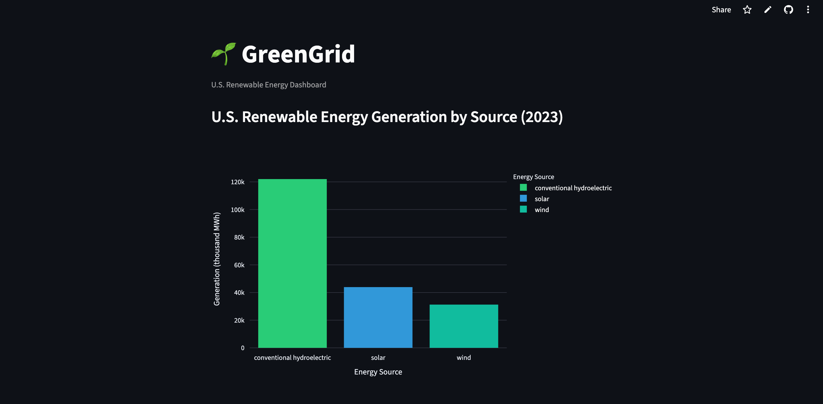
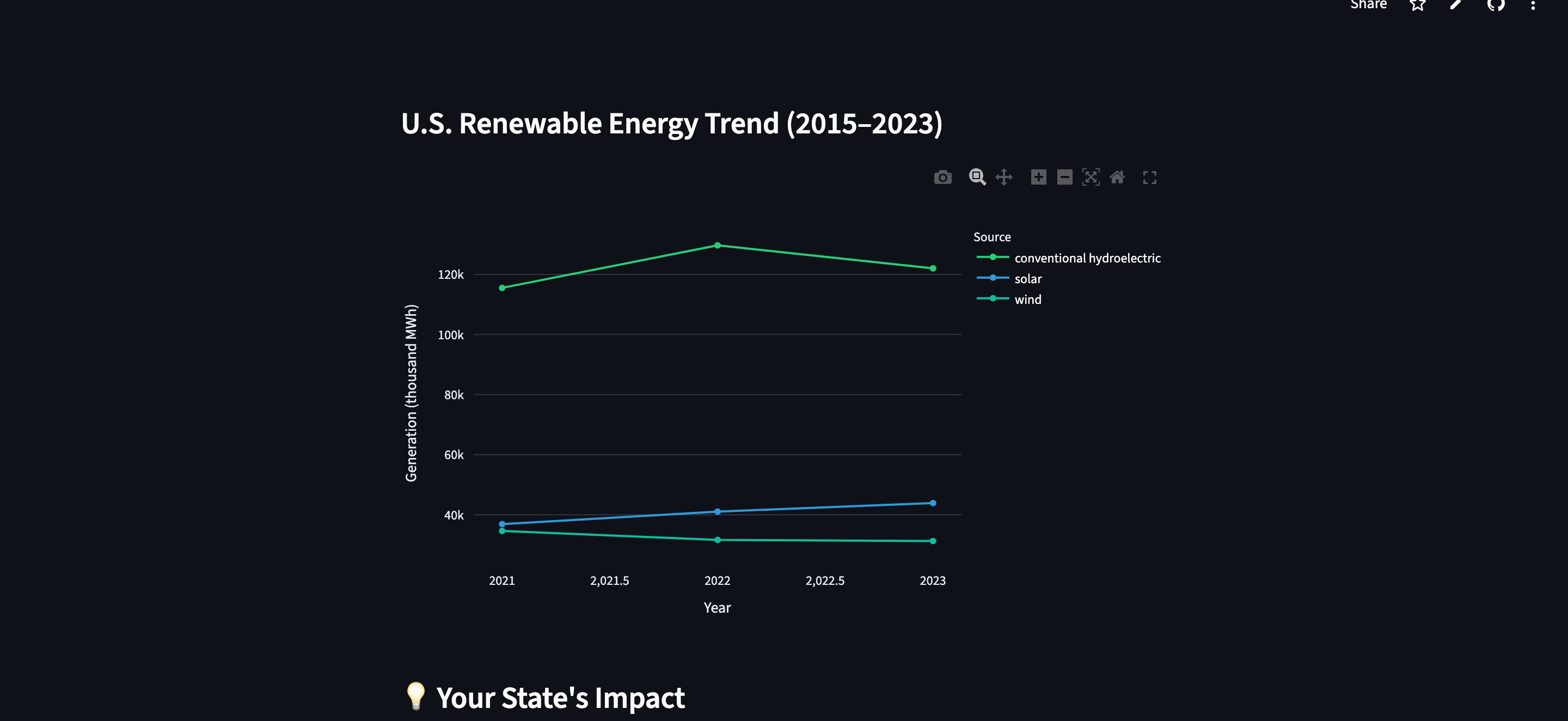
graph
Inspiration
I kept hearing about renewable energy growth in the news but never actually knew what the numbers looked like for my own state. When I looked it up I found the data existed but it was buried in raw API responses that the average person would never dig through. That gap is what inspired GreenGrid.
What I Learned
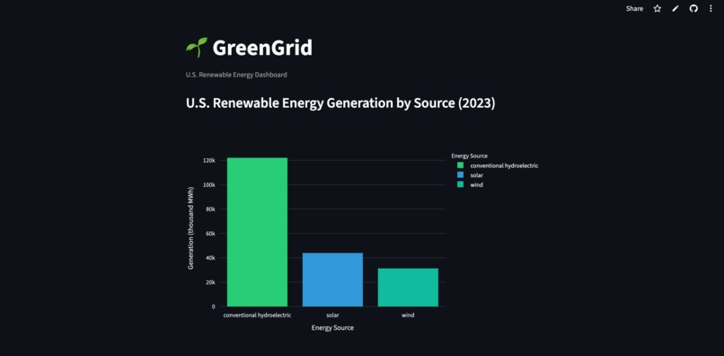
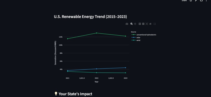
I learned how to work with a real government API from scratch, reading raw JSON, cleaning it with pandas, and turning it into something visual with Plotly. I also learned how fast Streamlit lets you go from a dataframe to a deployed web app. The data surprised me too. Solar generation in the U.S. was around 2,390 thousand MWh in 2015 and by 2023 it hit 43,900 thousand MWh which is nearly a $20\times$ increase in 8 years.
How I Built It
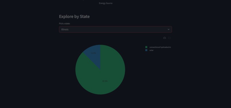
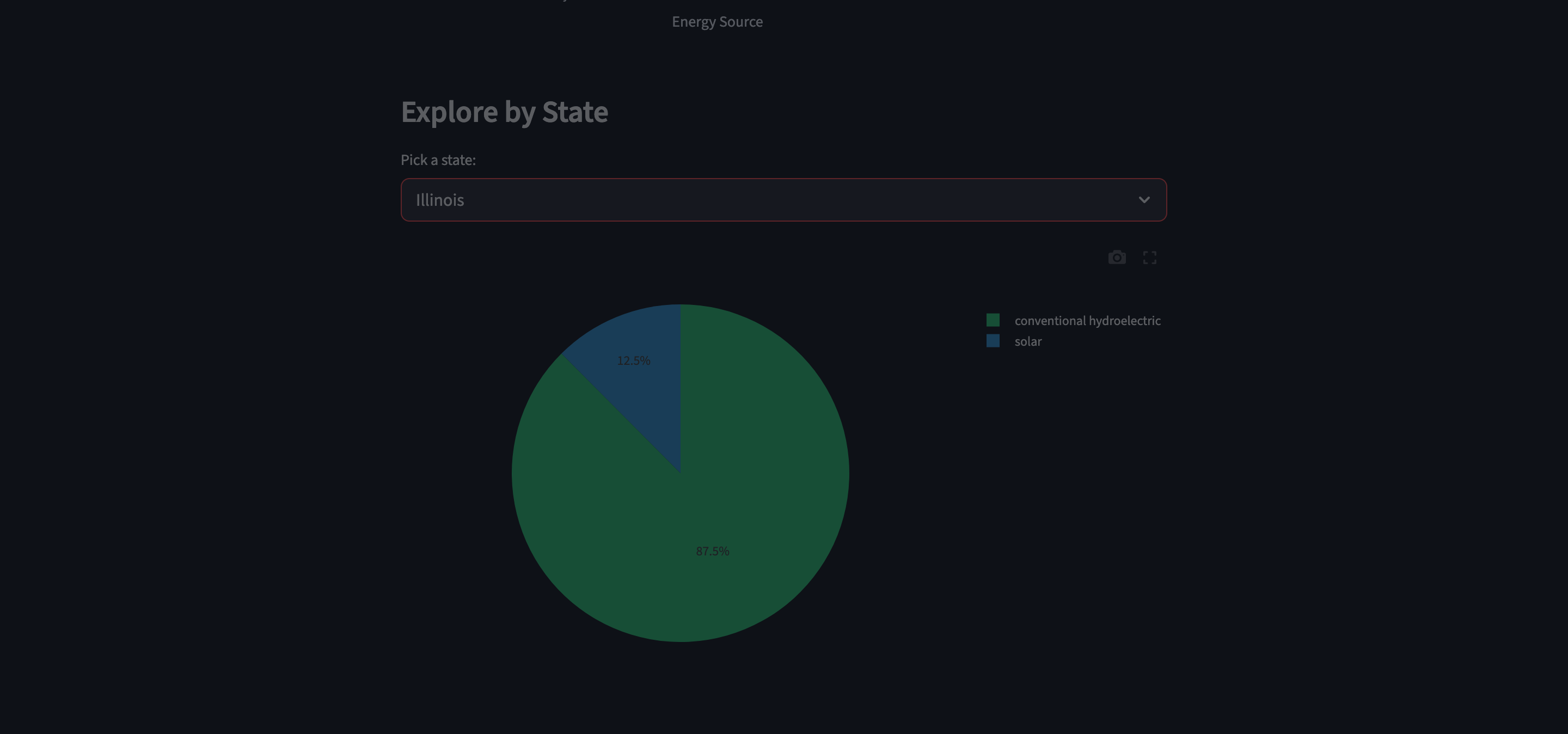
The project has two files. data.py fetches and cleans the data by calling the EIA API and pulling annual generation numbers for solar, wind, and hydro across all 50 states from 2015 to 2023. app.py is the Streamlit dashboard that takes that data and renders four interactive views using Plotly.
The CO₂ impact estimate uses the EPA average emission factor:
$$\text{CO}_2 \text{ avoided} = \text{Generation (kWh)} \times 0.386 \text{ kg/kWh}$$
Challenges
The EIA API response was nested in a way I didn't expect and several columns came back as strings instead of numbers so I had to figure out the type conversions. State code 90 represents the national aggregate which I had to filter separately depending on which chart I was building. Setting up the virtual environment on my Mac and dealing with Git conflicts during deployment also took more time than I expected but that is honestly where I learned the most.


Log in or sign up for Devpost to join the conversation.