-
-
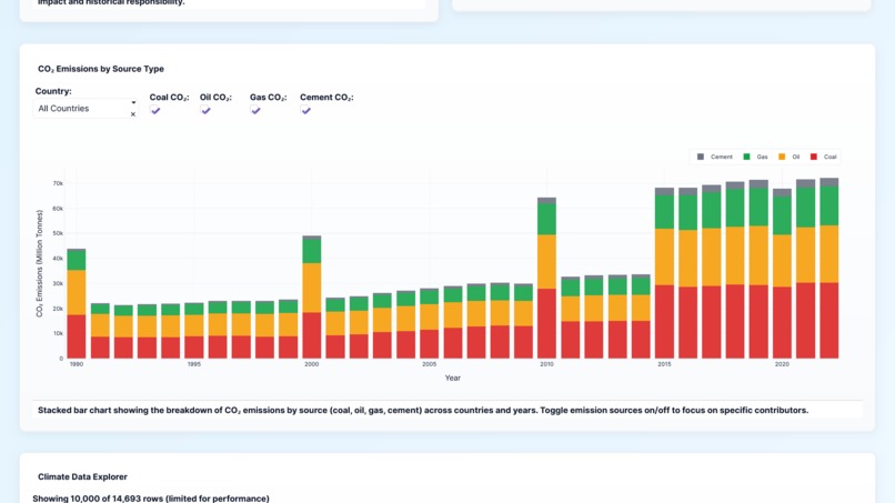
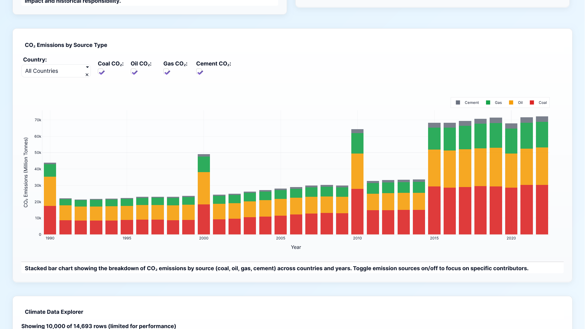
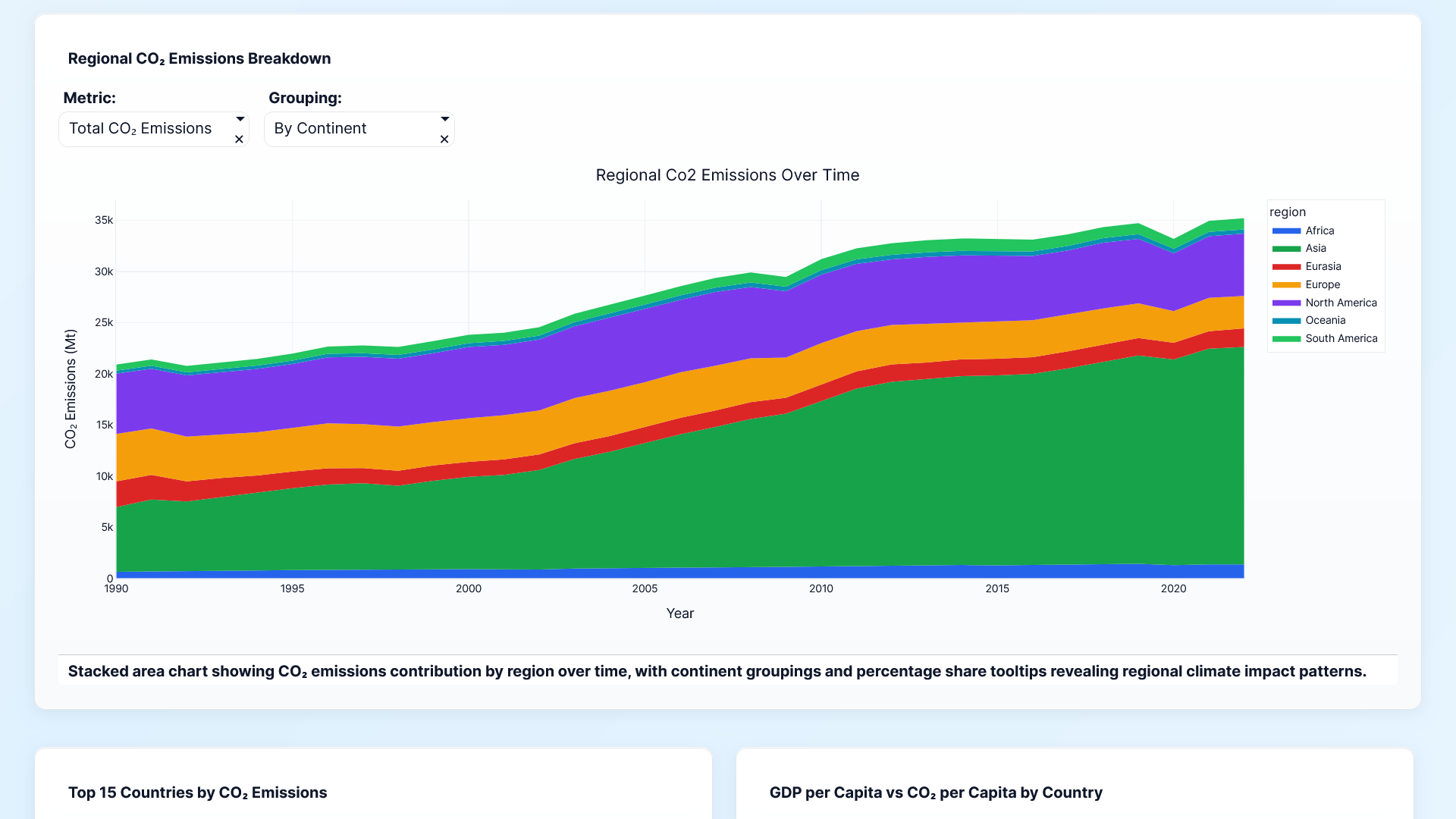
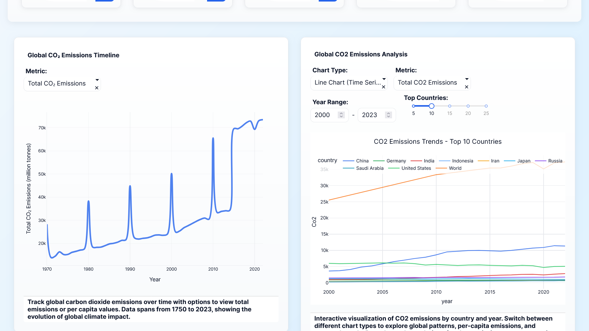
stacked barcharts for showing the co2 emission data
-

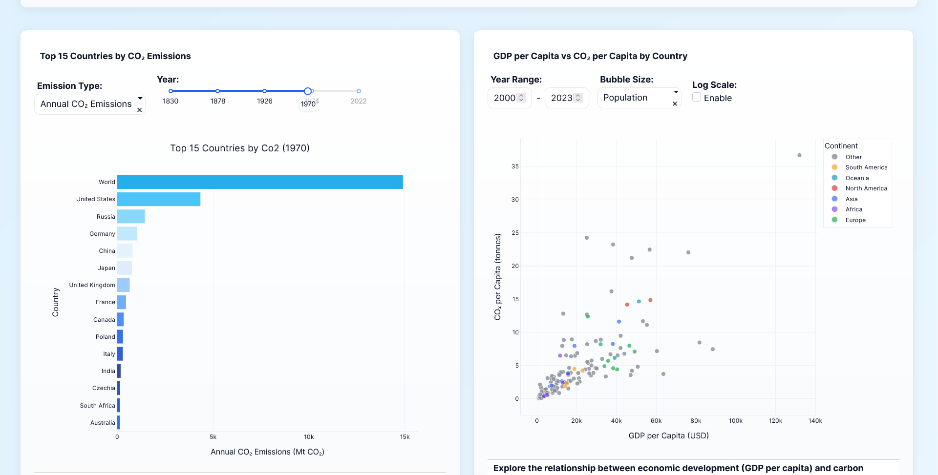
co2 emission by gdp and land
-
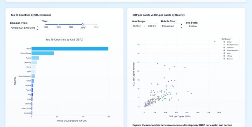
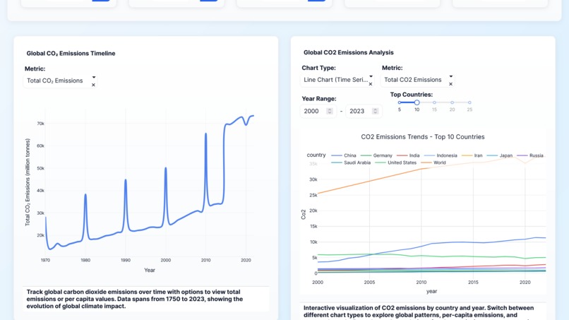
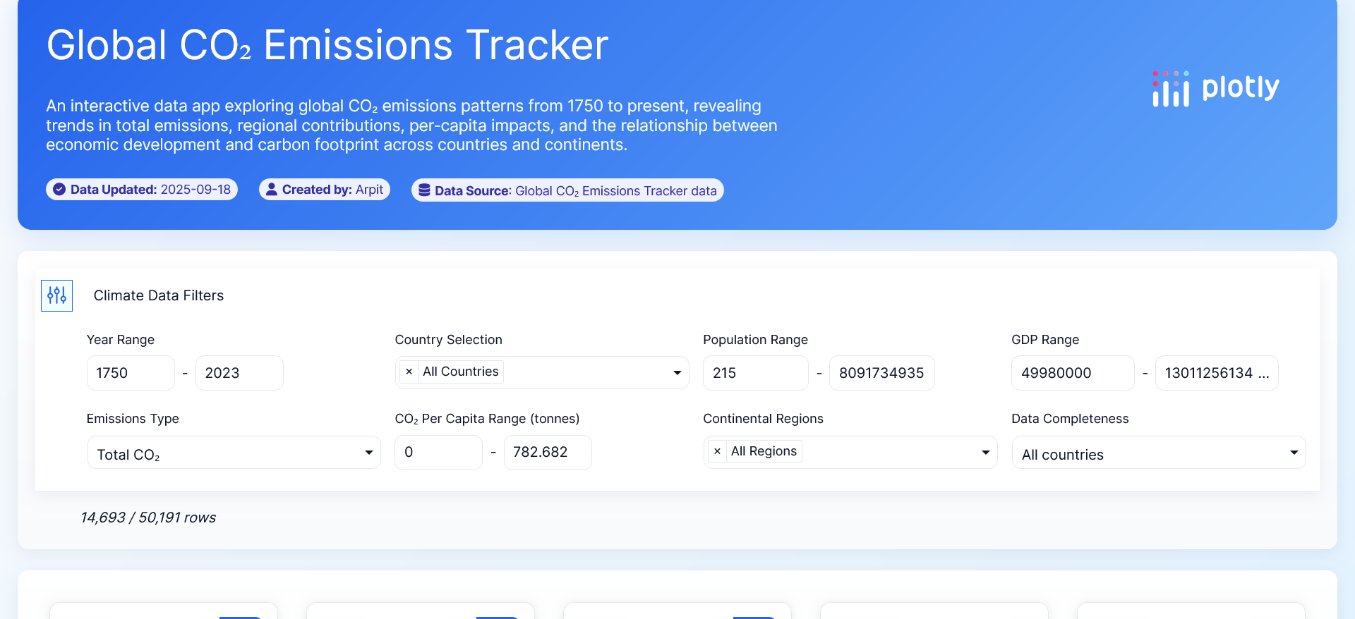
different filter option for data showcase
-
-
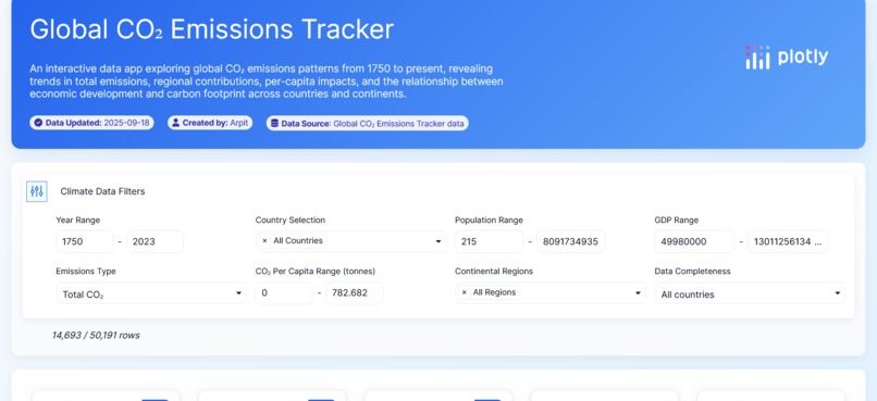
Screenshots of the plotly project
Inspiration
What it does
CO2 Emissions Data Visualization
Why I Chose This Dataset
Climate change is one of the most pressing challenges of our generation. CO2 emissions data tells a powerful story about human industrial activity, energy consumption patterns, and our collective impact on the planet. I chose this dataset because it transforms abstract environmental concerns into tangible, visual insights that can drive awareness and inform better decisions.
What It Does
This interactive visualization explores global CO2 emissions patterns across countries and time periods. Users can discover trends, compare regional differences, and understand which sectors or nations contribute most to atmospheric carbon levels.
How I Built It
Built with Plotly for dynamic, interactive charts that make complex climate data accessible and engaging. The visualizations allow users to explore the data from multiple angles—temporal trends, geographic distributions, and sectoral breakdowns.
Impact
By making emissions data visually compelling and easy to understand, this project aims to bridge the gap between raw climate statistics and public awareness, empowering individuals and policymakers to make informed environmental choices.
Challenges we ran into
Designing and prompting Desired charts were not in the output
Accomplishments that we're proud of
the result we achieved from simple prompt enhancements
What we learned
the output and the process is more important than anything else

Log in or sign up for Devpost to join the conversation.