-

-
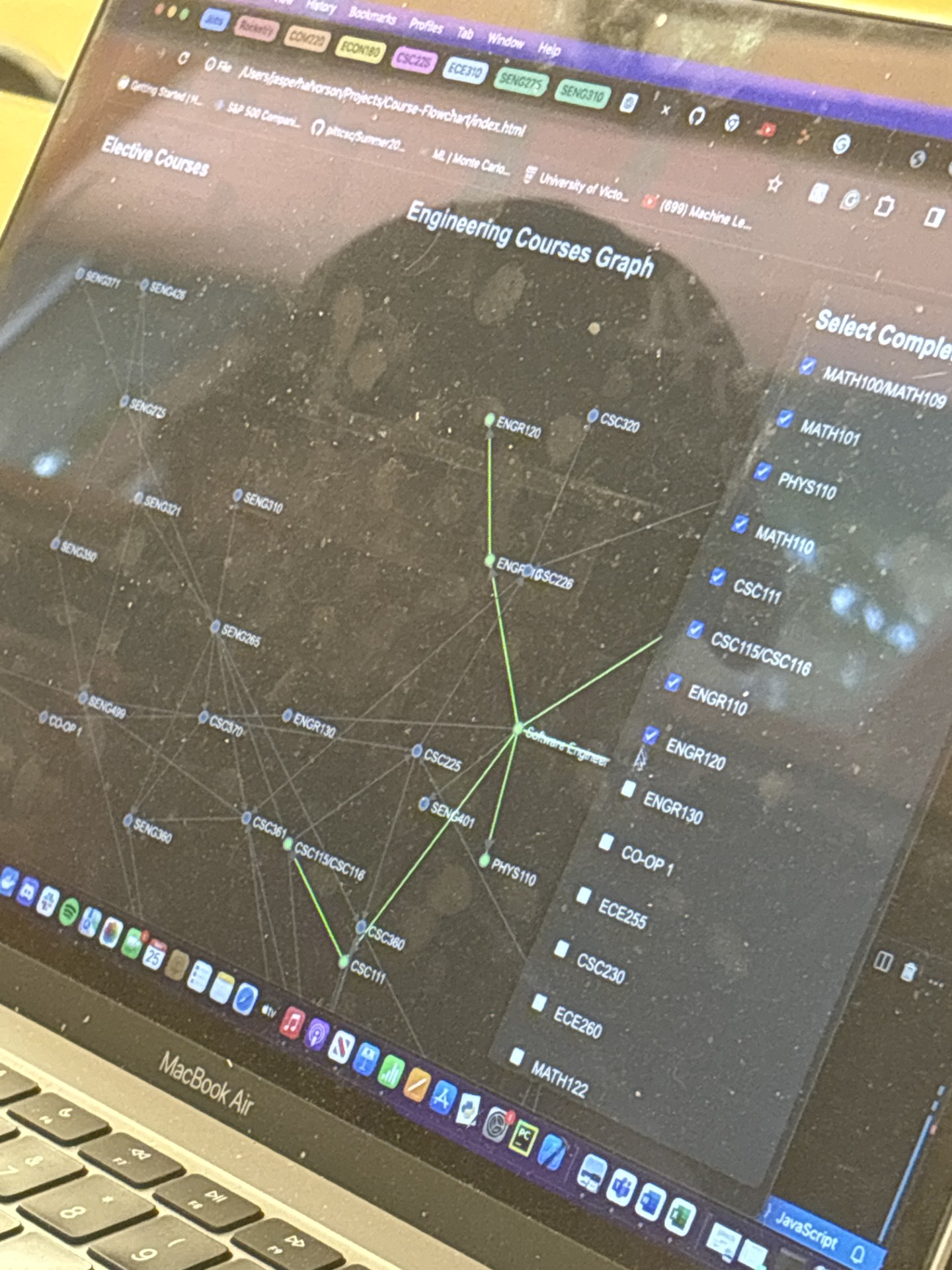
Quinn organizing the nodes
-

-
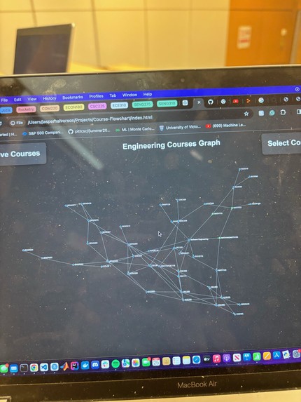
Flow-Chart pre organization
-
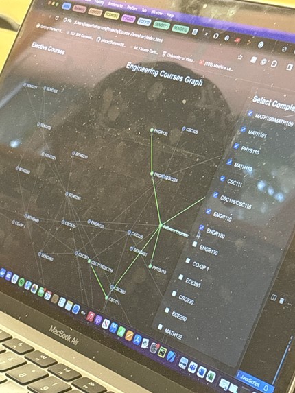
Green lining completed courses
-

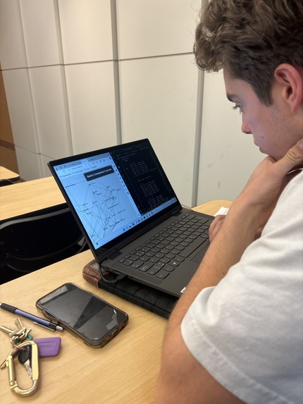
Effective communication by Youssuf and Jasper


Inspiration
Every engineer I know has had difficulties setting up their course schedules and understanding the prerequisites and corequisites required for their degree. This often leads to confusion and unnecessary stress, especially for new students. We wanted to create a tool that simplifies this process and provides a clear visual representation of course dependencies and progression. We want people to save time, effort, and money, so they can focus more on studying and less on structuring their degree.
What it does
The Program Course Flow-Chart helps students visualize their academic journey. It maps out all courses required for your degree, automatically updates when you input changes like course completions or fails, shows prerequisites, co-requisites, and helps you plan each semester of your degree efficiently. It has a course drag and drop functionality so you can personalize the flow chart to look the way you want it to.
How we built it
With effective teamwork, we were able to brainstorm a great idea that we genuinely think can help students lives. Using the software engineering program as the base program to showcase our project, we talked about the flow we wanted, being pre-requisites, co-requisites, completion, course availability, and more, and split the work among the group. We implemented the ability to move the flow chart any way the use wants, so they can customize their experience to make the flow chart as visually helpful as possible. We implemented a menu to select completed courses, that highlights courses green when complete. We used a graph data structure to connect different courses, showing the connections with lines and arrows - directing the user's attention to the flow of their academic journey.
Challenges we ran into
We ran into a few challenges, including the use of an API, the courseup API to be specific. After some technical trouble getting it running, we decided to input the software engineering schedule ourselves, since the API would be fetching the same information each time it ran; proving to be a bit pointless in our current state of our design.
Another challenge we ran into was finding the best data structure to use to connect our courses. We first used a tree, then quickly learned that it would not work due to co-requisites and multiple connections. Then, we decided to use a graph. A graph allowed for multiple connections, however, at first it was not easy to interpret, since it initially appeared as a big spider web of connections. We then spent some time formatting, and decided on a structure that worked best, but is still easily movable by users.
Accomplishments that we're proud of
We are proud of our communication. We had no problems with communication; we all understood our design, what we were supposed to do, and talked to each other kindly about differing opinions and advice. Our time management was significantly better than what we had during the UTTT hackathon in February. We are very proud of our overall design and idea. We think with more time, this can be a great tool for any student.
What we learned
We learned about what a specific user would want, and how to approach problem solving with clients in mind. We learned about d3.js, html, css, and javascript. We learned about each others strong suits, weaknesses, and how to work together as a team.
What's next for Program Course Flow-chart
Next, we want to implement the ability for different programs to structure their courses, too. We also want some additional functionality, like information when courses are offered, and maybe a semester generator based on amount of classes wanted, what classes are complete, and when they are offered.

Log in or sign up for Devpost to join the conversation.