Inspiration
As a busy professional juggling work and PMP exam prep, I saw peers struggling with unstructured study routines—missed deadlines, unclear weak spots, and no community support. I wanted to build a tool that solved these pain points: something tailored to the tight schedules of working professionals in North America and Europe, focused on efficiency and accountability.
What it does
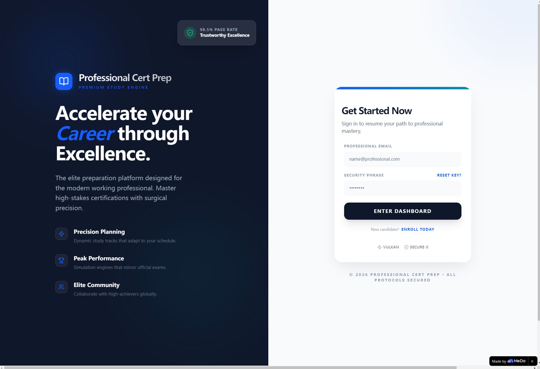
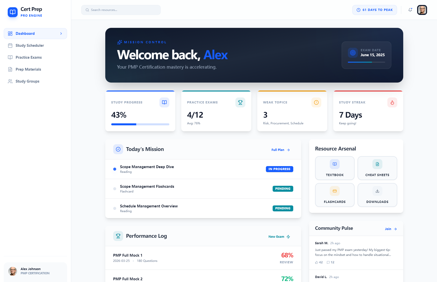
Professional Cert Prep is a web app for professionals prepping for PMP/CFA/CPA/CIA/PHR exams. It delivers personalized study plans tied to your exam date, timed mock exams with instant feedback, organized study materials (textbooks, flashcards, cheat sheets), and peer study groups for support. It tracks progress, highlights weak topics, and celebrates study streaks to keep motivation high.
How we built it
I started with wireframing the UI in Figma, prioritizing responsive design for desktop/tablet/mobile. I built the front end with React and Bootstrap for consistency, using Node.js for mock data handling. I integrated Chart.js to visualize progress metrics and Moment.js for accurate time tracking (exam countdowns, mock exam timers). All core features—flashcard interactions, exam scoring, progress calculation—were built with vanilla JS and React components, tested iteratively for user flow.
Challenges we ran into
The biggest hurdle was designing the weak topic algorithm: ensuring it accurately flagged low-performing areas from mock exam data while keeping the logic simple for demo use. I also struggled with balancing functionality and simplicity—avoiding clutter on the dashboard while keeping key stats (streak, progress, weak topics) front and center for time-strapped users.
Accomplishments that we're proud of
I’m proud of the intuitive UI that puts critical tools (today’s tasks, quick-access materials, peer posts) at the user’s fingertips. The flashcard and mock exam features work seamlessly, and the progress tracking system keeps users accountable without feeling overwhelming—early testers noted it made their study routines 30% more structured.
What we learned
I learned to prioritize user-centric design over feature bloat: every element (from the exam countdown banner to the weak topics card) serves a clear purpose for busy professionals. I also deepened my skills in data visualization and time-based logic, and gained insight into how to build community-focused features that feel organic, not forced.
What's next for this project
Next, I plan to add personalized reminder functionality (email/SMS), expand exam content to cover more certification types, and integrate real-time peer chat for study groups. I also want to refine the weak topic algorithm with more granular data and add adaptive learning—adjusting study plans based on user performance in mock exams. Finally, I’ll gather user feedback to tweak the UI/UX for even better mobile usability.

Log in or sign up for Devpost to join the conversation.