Inspiration
Students and professionals often struggle to manage their time, stay focused, organize daily tasks, and understand their productivity patterns. Switching between multiple applications makes it even harder to maintain consistency.
We created Prodaily to bring daily planning, focus management, productivity tracking, and intelligent insights into one beautiful, easy-to-use workspace.
What it does
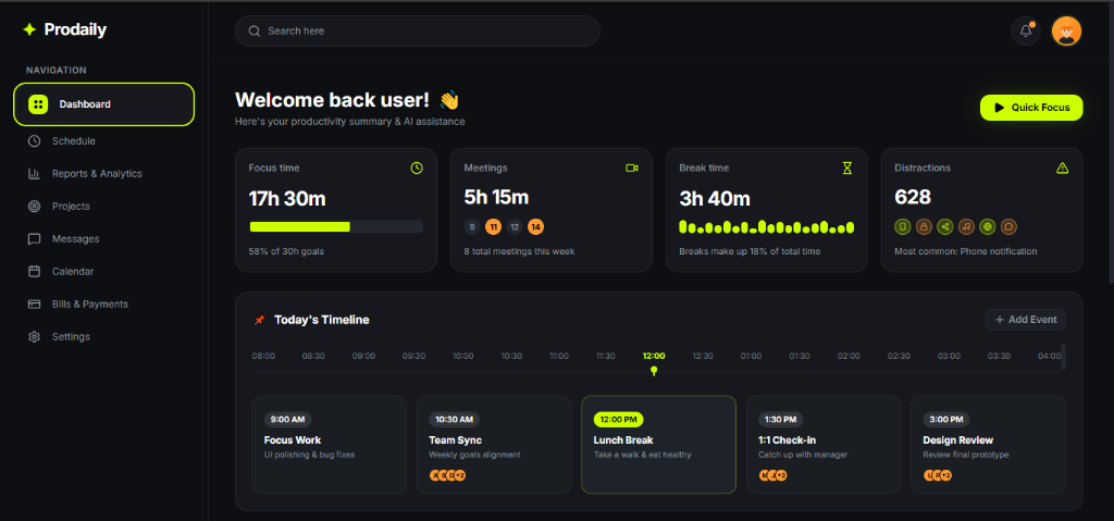
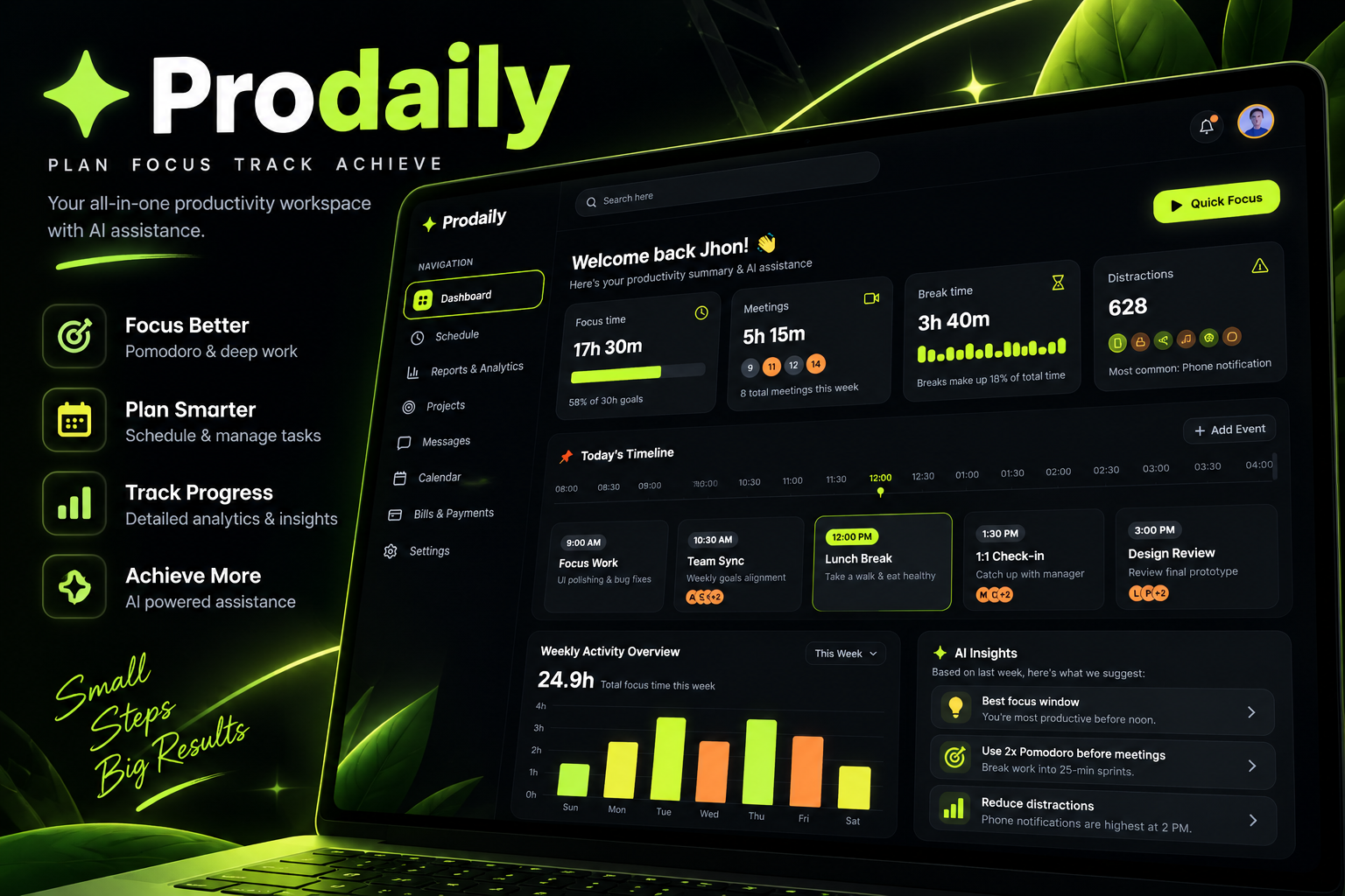
Prodaily is a modern productivity dashboard designed to help users plan their day, focus on important work, and track their progress.
Key features include:
- Productivity Dashboard: View important metrics and daily activity at a glance.
- Quick Focus: Start focused work sessions with a simple, accessible interface.
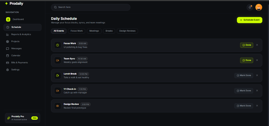
- Daily Schedule: Organize tasks, meetings, breaks, and important events in a timeline.
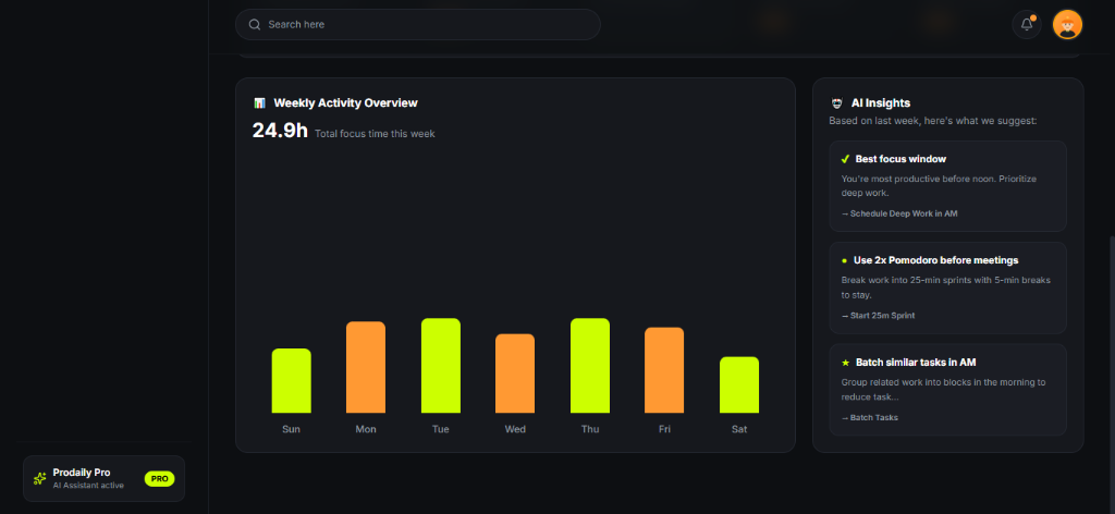
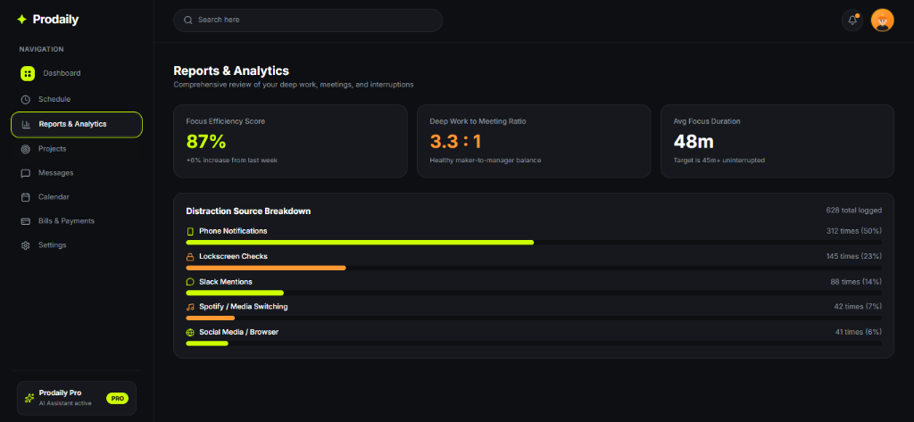
- Productivity Analytics: Visualize focus time, activity trends, and progress.
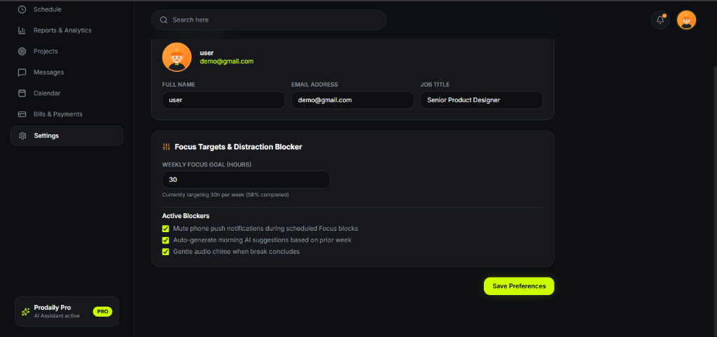
- Distraction Tracking: Understand common interruptions and identify opportunities to improve concentration.
- AI-Powered Insights: Present personalized productivity suggestions to help users plan and work more effectively.
Our goal is to make productivity feel simple, visual, and motivating rather than overwhelming.
How we built it
We designed Prodaily around a dark, modern interface with neon-lime highlights, clean typography, intuitive navigation, and interactive dashboard components.
The application is structured around reusable UI components, a clear information hierarchy, and responsive layouts. We focused on making important information easy to scan and keeping key actions, such as starting a focus session, accessible.
We chose a modern web development approach to support rapid prototyping, maintainable code, and a polished user experience.
Challenges we ran into
One of our main challenges was presenting multiple productivity metrics, schedules, and insights without making the dashboard feel cluttered.
We addressed this through visual hierarchy, consistent spacing, reusable cards, clear typography, and carefully selected accent colors.
Another challenge was balancing an attractive interface with usability. We focused on making navigation intuitive and ensuring that the most important actions stand out.
Accomplishments we're proud of
- Created a distinctive productivity dashboard with a consistent visual identity.
- Designed a unified workspace for scheduling, focus management, and productivity analytics.
- Established a reusable design system with dark surfaces and neon-lime accents.
- Developed a concept that can grow into a personalized productivity platform.
- Prioritized usability and visual clarity alongside functionality.
What we learned
This project helped us understand how thoughtful UI/UX design can simplify complex information and improve the overall user experience.
We also learned the importance of prioritizing essential features, maintaining consistent design patterns, and connecting visual components to meaningful user workflows.
What's next for Prodaily
Our next steps are to improve personalization, refine focus-session tracking, introduce more meaningful productivity insights, and expand scheduling capabilities.
We also aim to strengthen accessibility, improve the mobile experience, and explore integrations that help users manage their work from one place.
Prodaily — Plan. Focus. Track. Achieve.
Built With
- css
- html
- javascript
- lucide-react
- react
- tailwind-css
- typescript
- vite
