-

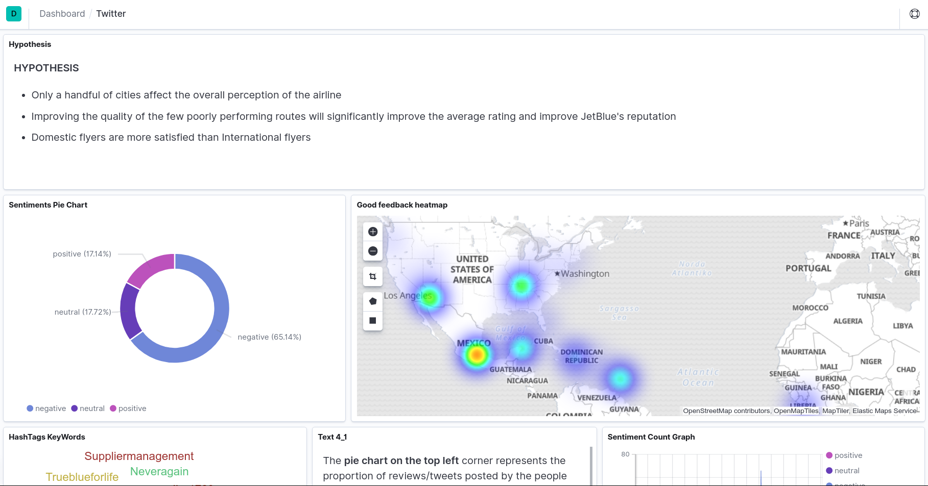
Pie Chart representing neutral, positive and negative tweets. Heat Map showing areas where company has been performing well
-
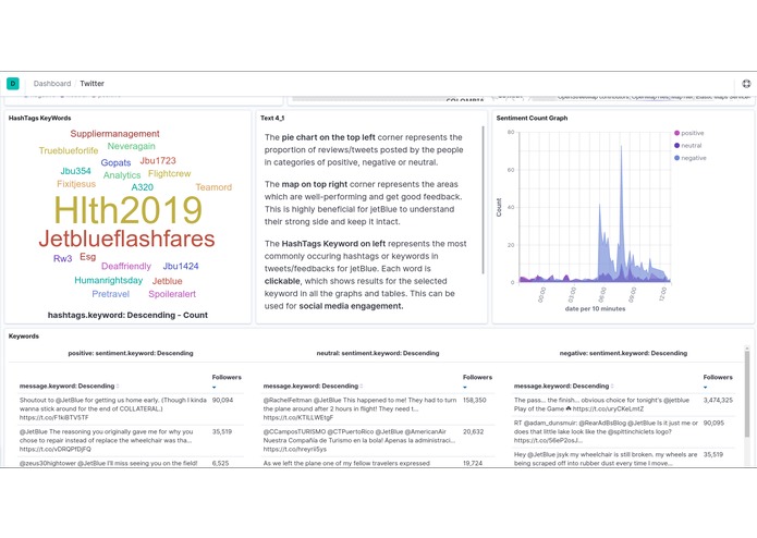
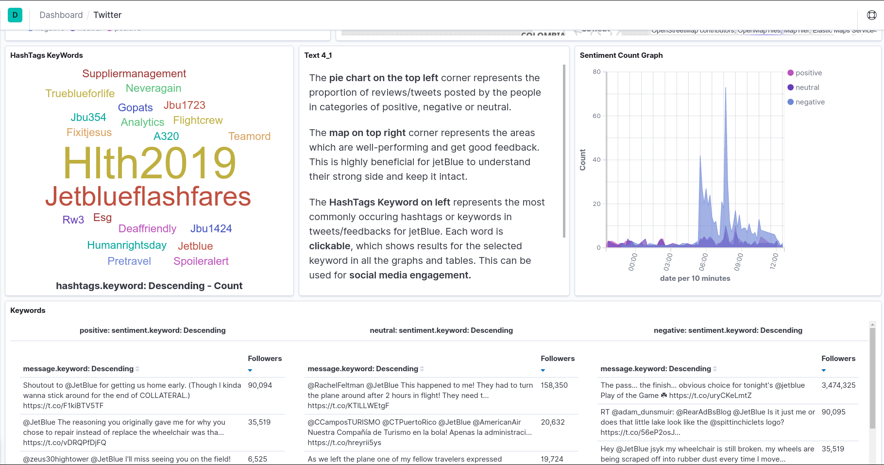
WordMap on the left which can be clicked to filter results and Sentiment Count Graph
-
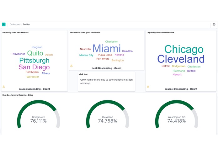
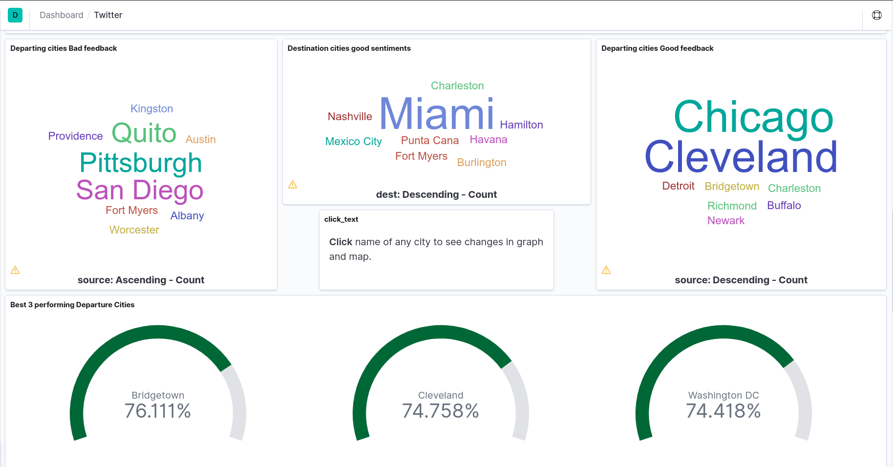
WordMaps for good and poor reviews, Dials representing best performing cities
-
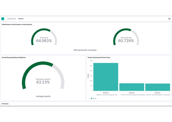
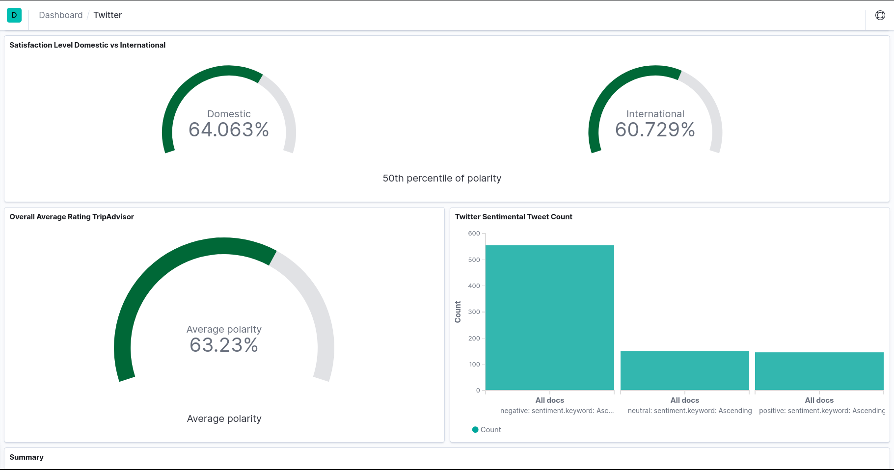
Domestic vs International Satisfaction Level
-
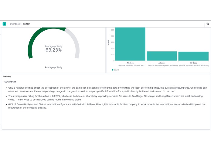
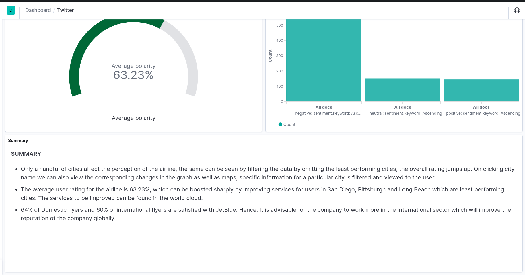
Average Rating, Twitter Sentiment Tweet Count
What it does
Our platform scrapes the data from multiple sources, filters extraneous anomalies and cleans the data, then it runs sentimental analysis also while collecting important metadata and geotagging necessary fields. Then it stores everything on elasticsearch instance for further processing in Kibana Dashboard.
The data is processed and displayed interactively using a bar graph, pie chart, heatmap, word map and dials which makes visualising and viewing experience smoother.
The collected data is analyzed and categorized whether it is positive, negative or neutral. The hashtags used and most commonly occurring words are extracted and added to the WordMap. An extensive search can be made for reviews containing the words on the WordMap simply by clicking the word, the changes are reflected in all the representations. The HashTags Keyword can represent the most commonly occurring hashtags or keywords in tweets/feedbacks for JetBlue.This can be used to track social media engagement.
The combination of heatmap with a geographical map gives a good realisation of areas in which the company has been performing well and has a good demand.
The pie chart represents the proportion of reviews/tweets posted by the people in categories of positive, negative or neutral. The Sentiment Count graph represents how people reacted on a particular day. It is useful to figure out what makes customers happy and satisfied. Similarly, It can also be used to figure out why people were not satisfied on a particular day.
The dials are used to represent the best performing cities for the company ie. which had the best customer satisfaction reviews. We also use dials to show the comparison between the domestic and international sector of the company.
How we built it
Our platform scrapes the data from multiple sources, filters extraneous anomalies and cleans the data, then it runs sentimental analysis also while collecting important metadata and geotagging necessary fields. Then it stores everything on elasticsearch instance for further processing in Kibana Dashboard.
Challenges we ran into
Transferring Data from UiPath using Http was a herculean task. Eventually, we had to rebuild the whole crawler. Data Inconsistency Managing multiple API keys and rate limit
Accomplishments that we're proud of
Live streaming of tweets and updating of graph Can filter on any parameter for eg. a polygon on a map Dynamically generated WordGraph highlighting problem and important keywords ELK stack was deployed on docker hence it is scalable GeoCoding destination and source city names from review text to coordinates on a map
What we learned
Working with the ELK stack and streaming tweets from the Twitter API Kibana GeoCoding destination and source city names from review text to coordinates on a map Error handling on web scraping
What's next for crawlX
Analyzing financial data and applying regressional analysis to predict future financial moves, integrating more social platforms and make it adaptable for multiple companies.
Built With
- docker
- elasticsearch
- kibana
- selenium
- textblob
- tweepie


Log in or sign up for Devpost to join the conversation.