-
-
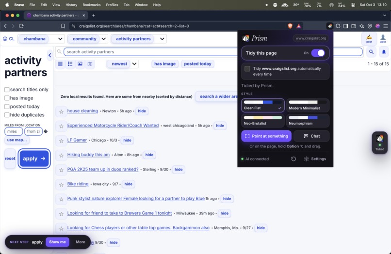
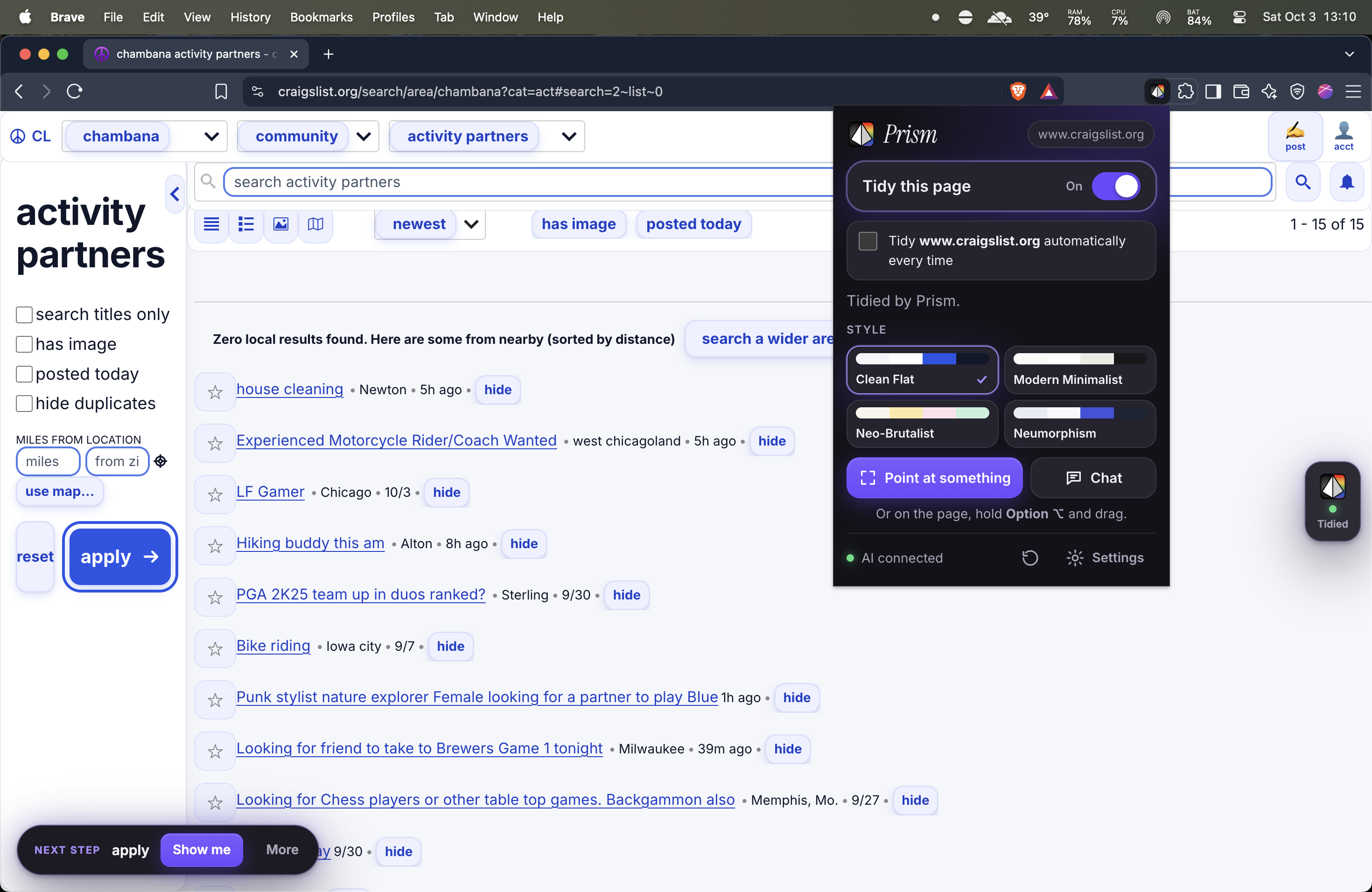
AFTER Prism effect
-
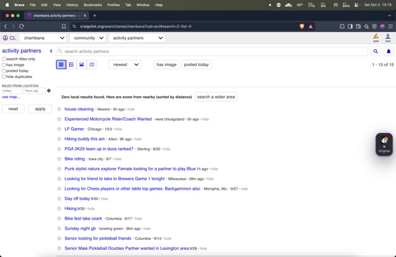
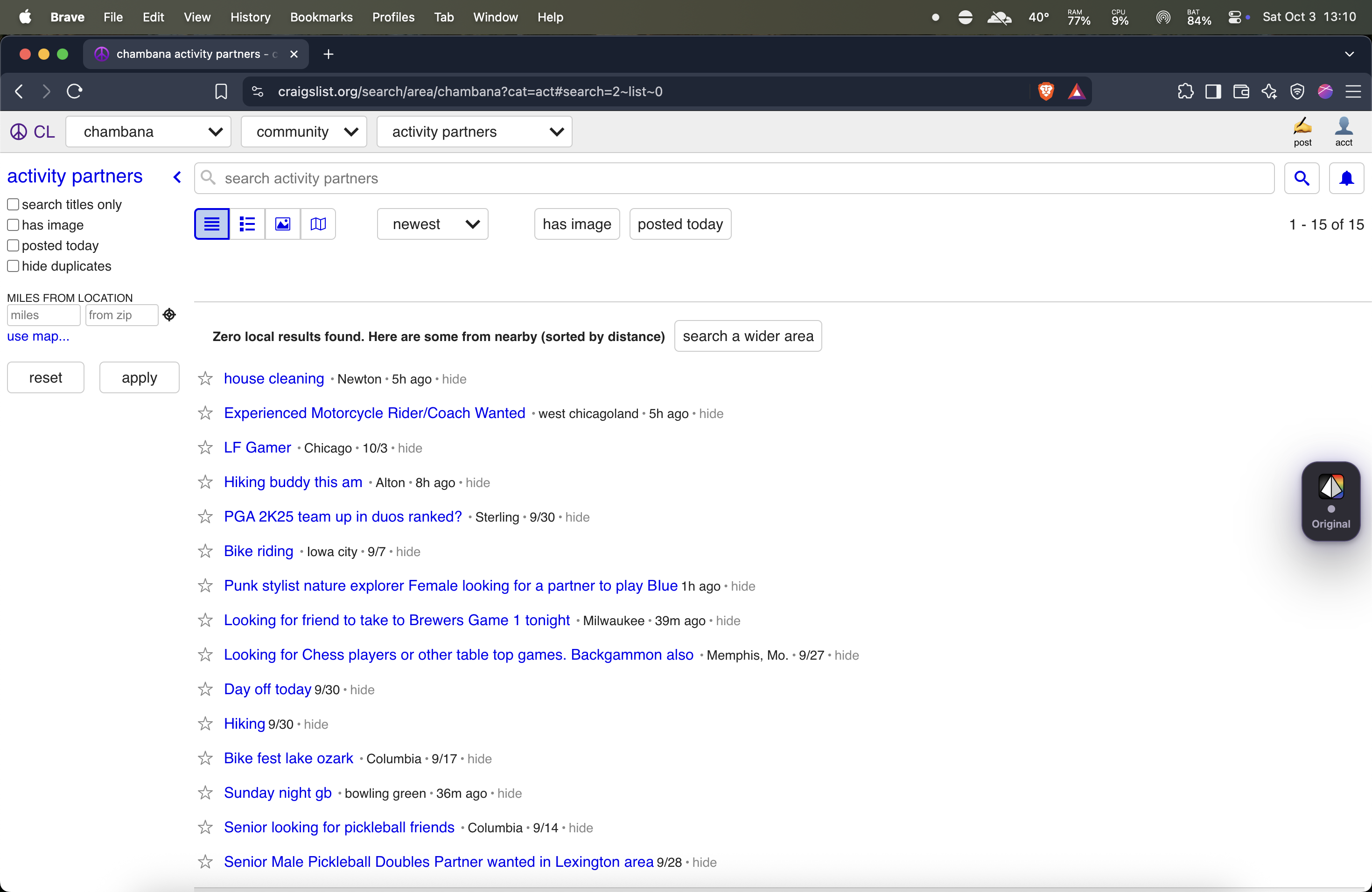
BEFORE Prism page
-
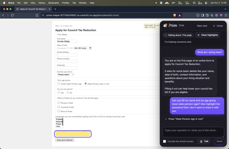
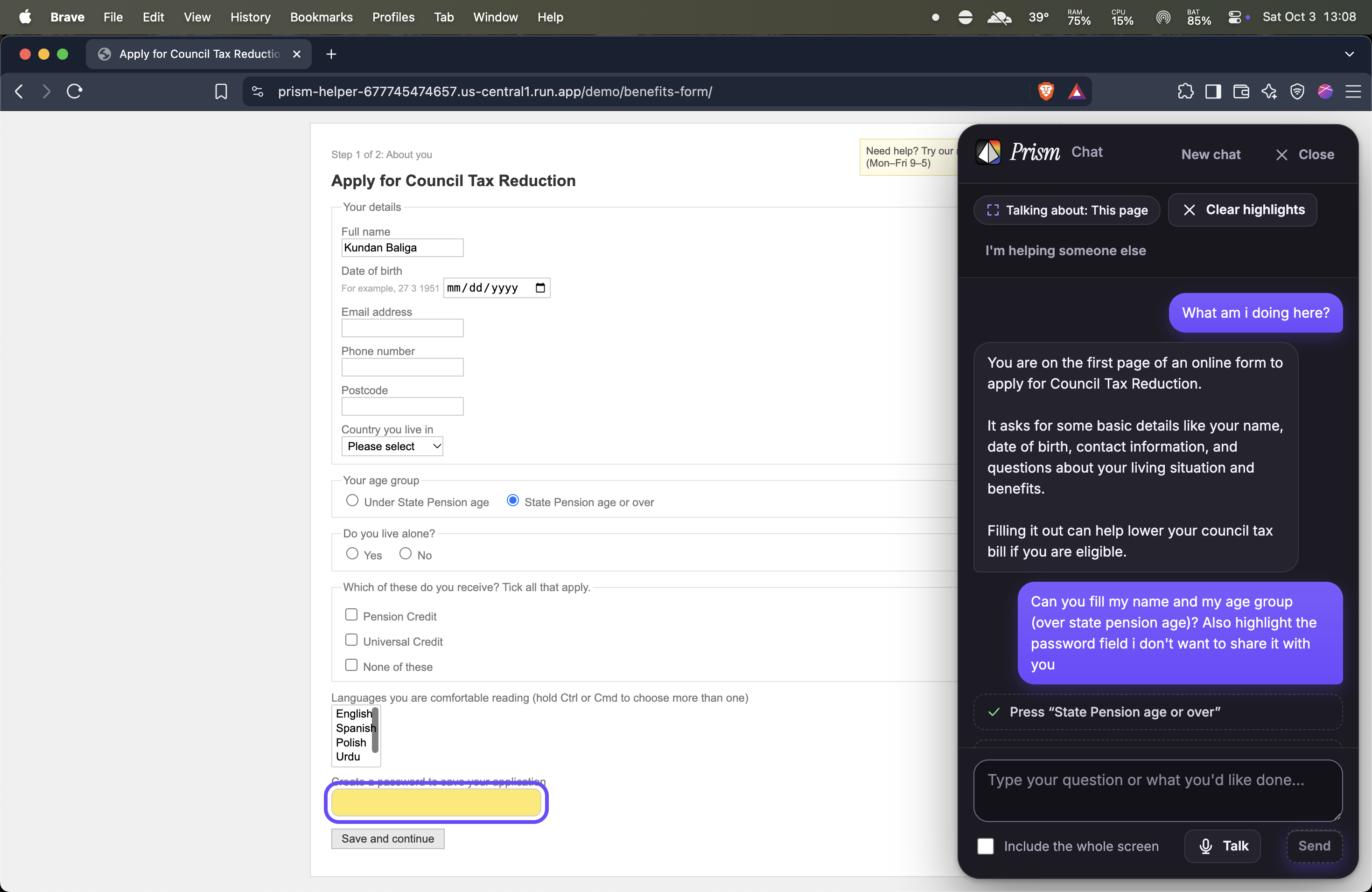
Chat to Navigate feature
-
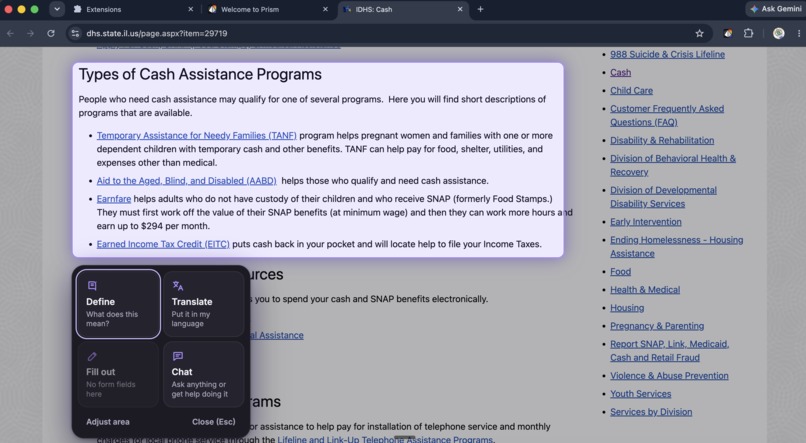
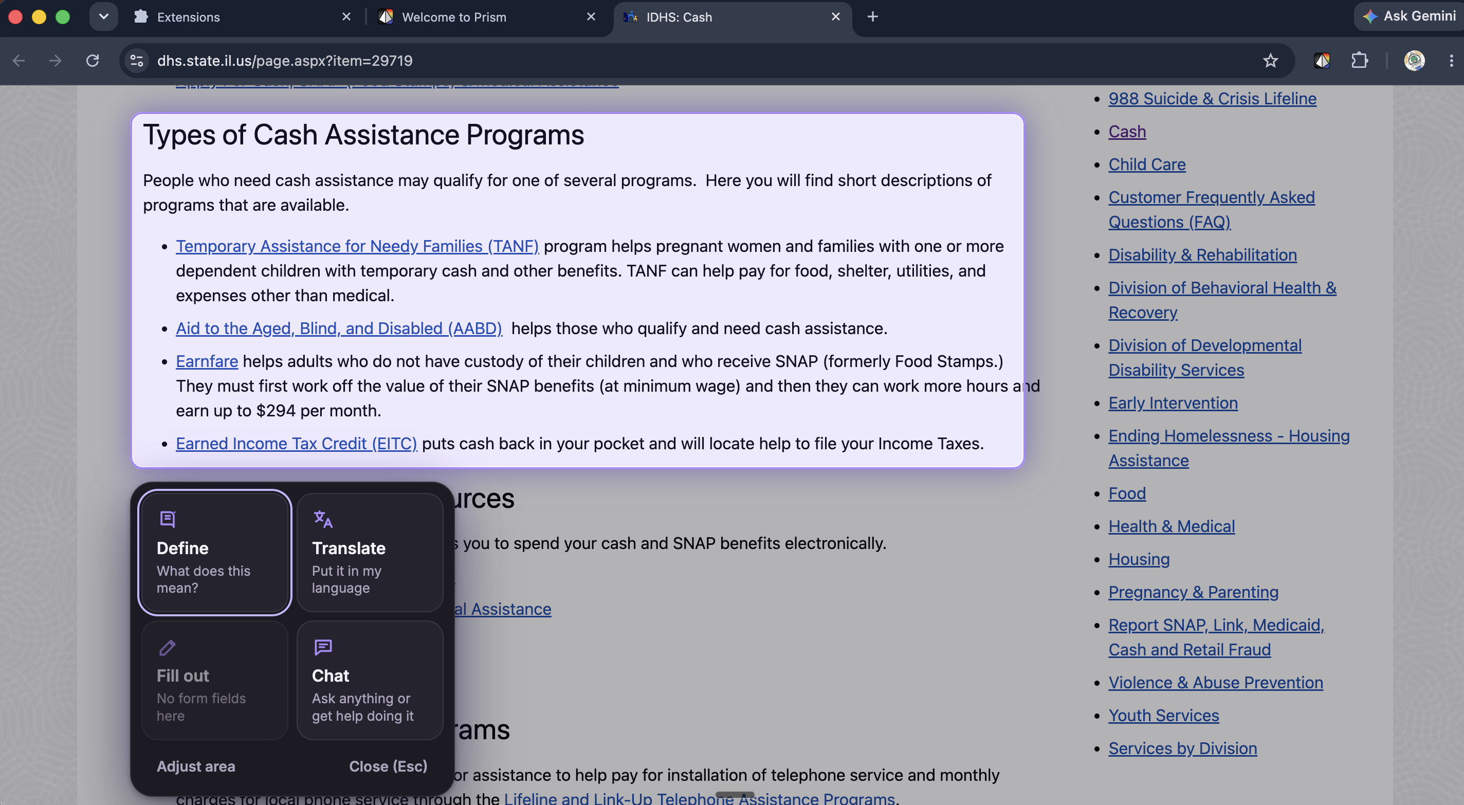
Select and Drag feature
Q1: What did you build and how does it address the prompt?
Inspiration:
For years my grandmother refused to use Blinkit, India's grocery delivery app. She felt discouraged, like these things weren't made for her: the icons were tiny, the steps were unclear, and she was sure it would be too complicated. So I sat with her and explained each screen. She still uses it to this day.
She never needed a simpler app. She needed someone next to her explaining it. Prism is that someone, on every website.
Target user and barrier:
We have two main target user groups:
- Older adults using the websites that matter most: benefits, healthcare, courts and banking. These are usually the hardest sites on the internet to use. The barrier isn't ability; it's that the pages work against them:
- cluttered layouts and tiny text
- low-contrast colours
- the one thing you need to do is buried
- jargon nobody explains
- the fear of clicking the wrong thing
- Young adults, who hit the same wall with complex terms on official forms. When we booked appointments at the DMV, the government pages kept looping us back to where we started, and we couldn't tell which parts of the forms applied to us.
What our research showed:
We screened 85+ real government, healthcare and banking websites, comparing each one BEFORE and AFTER Prism. The same problems came up over and over:
- The main action is hidden: on one state portal, the "Start your application" button was the smallest thing on the page.
- Text you can't read: grey on grey, white on white, and links that turn invisible once visited.
- Clutter competes for attention: banners, carousels, cookie pop-ups and long link lists all fight the main task users came for.
What Prism does:
For the first time, websites adapt to the person using them. Prism is a Chrome extension that restyles any page to tidy it up and lets each person view it in the way that works for them.
- Tidy this page. One switch turns any site calm and readable: bigger text, strong contrast, clear buttons, clutter tucked away. The site keeps working, and refreshing brings the original back exactly.
- Never lose your place. The most important next step, like Apply for Medicaid, gets a gently breathing outline. A Next step bar takes you there with Show me, or you can type or say "What do you want to do next?"
- Point at anything. Hold Option and drag a box around something confusing to Define, Translate, Fill out or Chat about it, in plain words.
- Chat that shows you. Ask "emphasize the link for pro guitarists" on craigslist, and the musicians link becomes big, bold and highlighted. Chat can also do tasks step by step, but it always stops and asks before submitting, paying or sending anything.
- Talk instead of typing. Press Talk beside any box and say what you want to write.
- "I'm helping someone else" mode. It's built for the grandkid on the other end of the phone call, because that's how help actually happens.
Q2: How did you build it? What tools did you use, what issues did you run into, and how did you overcome them?
How we built it:
Stack:
- Extension: TypeScript and Preact (Chrome Manifest V3)
- Backend: a Python/FastAPI service on Google Cloud Run
- AI: Gemini on Vertex AI
- Website: hosted on Vercel
- Testing: Playwright end-to-end tests that run the real extension against live Gemini (69 passing), plus Vitest and pytest
Key tradeoffs:
- The AI decides, normal code acts. Gemini only labels what's already on the page (the main button, an advert, a form), and Prism's own styling does the rest. We gave up more dramatic redesigns, but sites keep working, nothing is ever rewritten, and restoring the original is exact.
- Speed over perfection. Prism tidies the page instantly with basic rules, then the AI layout arrives a few seconds later. Layouts are saved, so pages look the same every visit and repeat visits need no AI call. We use fast Gemini Flash models with automatic fallback, because older users won't wait 20 seconds for a page to change.
- Safety over autonomy. Chat can only use a small, fixed set of actions, and the confirmation step is enforced in code, so the AI can't skip asking. It never types passwords, card or ID numbers.
- One-time microphone permission. Spoken words take about 3 seconds to appear, in exchange for no confusing permission pop-up on every website.
Challenges we ran into:
- Restyling made some text vanish: white on white, and visited links that disappeared on Berkshire Hathaway's site. We built a pass that measures the colours actually drawn on screen and fixes anything below accessibility contrast (WCAG AA).
- Picking the "next step" was harder than expected. Early versions kept choosing the search box, a slideshow arrow or "Accept cookies". Screening real sites taught us what not to pick.
- Some pages are chaos. Some sites pin everything in fixed spots, so restyling changed nothing. We added a restructure mode that rebuilds the page in reading order.
What we learned:
Asking before acting, one-tap undo, and the original always being one refresh away mattered more for trust than any clever feature.
Q3: How can you implement this further?
How we'll measure success:
So far, all four styles pass WCAG AA contrast audits on our test pages, 69 end-to-end tests pass on the real extension with live AI, and spoken words are written down in about 3 seconds. Next, we'll test with older adults on real tasks, like applying for Medicaid, with and without Prism. We'll compare task completion, time to finish, wrong clicks, and how often they call family for help. The number that matters most is the one my grandmother proved: do they keep using it on their own?
What's next:
Beyond English. The first time someone opens Prism, it asks which language they speak, with large buttons for the world's main languages: English, Español, 中文, हिन्दी, العربية, Tiếng Việt, Tagalog and more. From then on, Prism's buttons, explanations and the tidied page itself appear in that language. Prism can already translate and explain anything you point at; the next step is translating whole pages. Anyone who has moved to a new country could then get through government, medical and banking sites that aren't in their language.
Beyond the browser. My grandmother's struggle was in an app, not a website. On Android, accessibility services let an app read another app's screen and draw on top of it. Prism could highlight the next button in apps like Blinkit, enlarge tiny labels and explain each screen. That's even more important in India, where Blinkit, UPI payments and the Aadhaar ID system are all phone-first.
Getting it into people's hands. A Chrome Web Store listing, reading pages aloud, a way for family to help remotely from their own phone, and user testing with older adults and caregivers.
Try it: prism-helper.vercel.app
It takes less than a minute to install!
Built With
- chrome
- css
- docker
- esbuild
- fastapi
- fflate
- gemini
- google-cloud
- google-cloud-run
- google-genai
- html
- javascript
- manifest-v3
- playwright
- preact
- pydantic
- pytest
- python
- typescript
- uvicorn
- vercel
- vertex-ai
- vitest
- zod


Log in or sign up for Devpost to join the conversation.