-
-
-

-
Article two
-
article 3
-
Article one

Inspiration
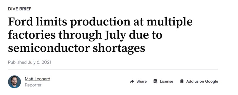
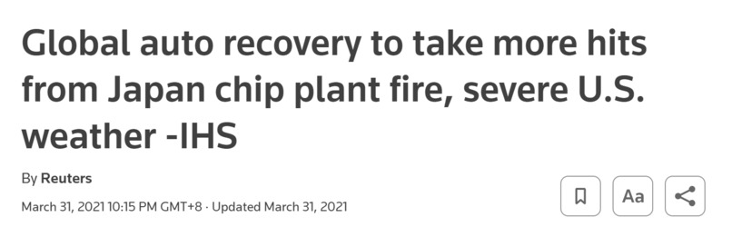
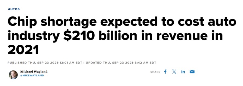
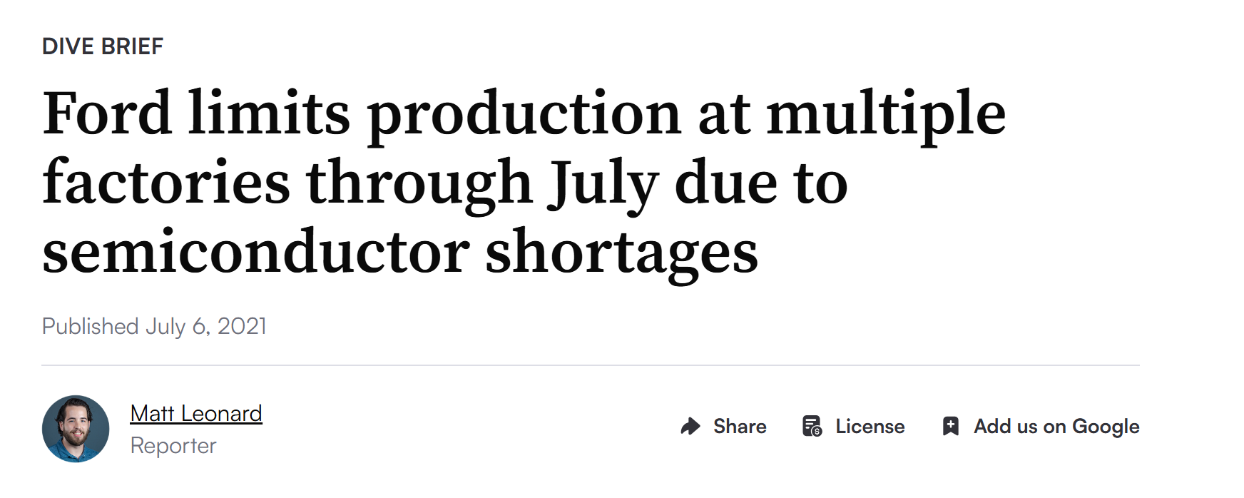
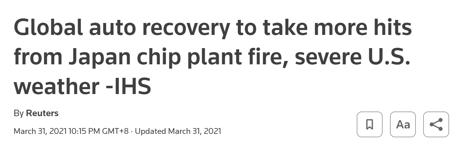
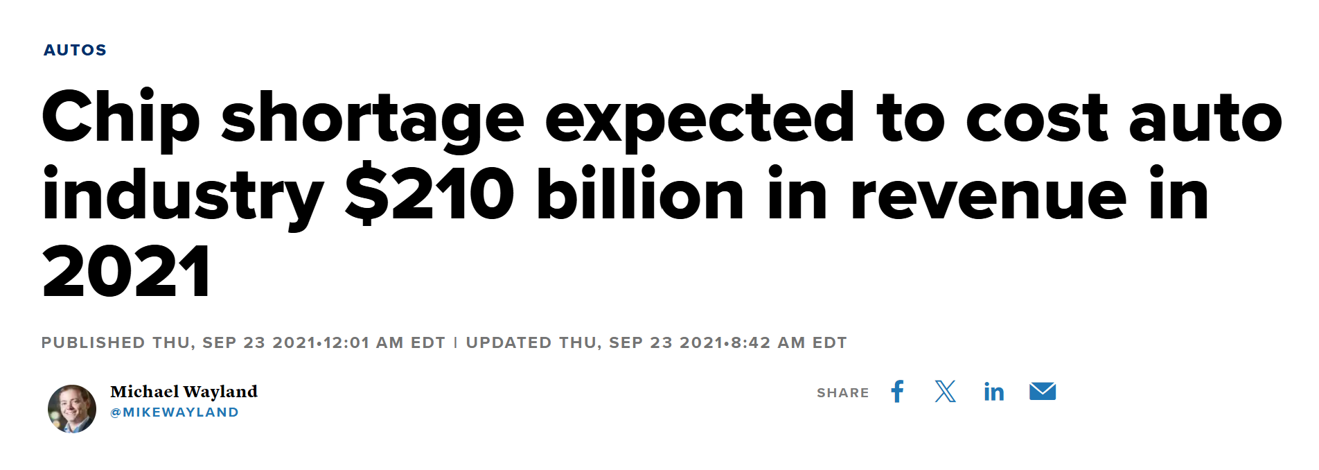
Supply chains break in ways nobody sees coming until it's too late. A fire at one TSMC fab in 2021 rippled all the way out to Ford and GM losing over a million vehicles of production. Companies were reacting to disruptions weeks after they had already cascaded. I wanted to know: could a graph-based AI model see that ripple coming instead of explaining it after the fact?
What it does
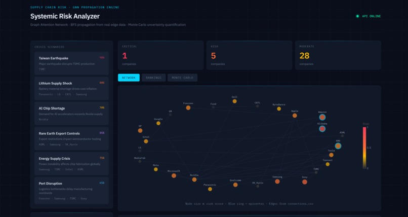
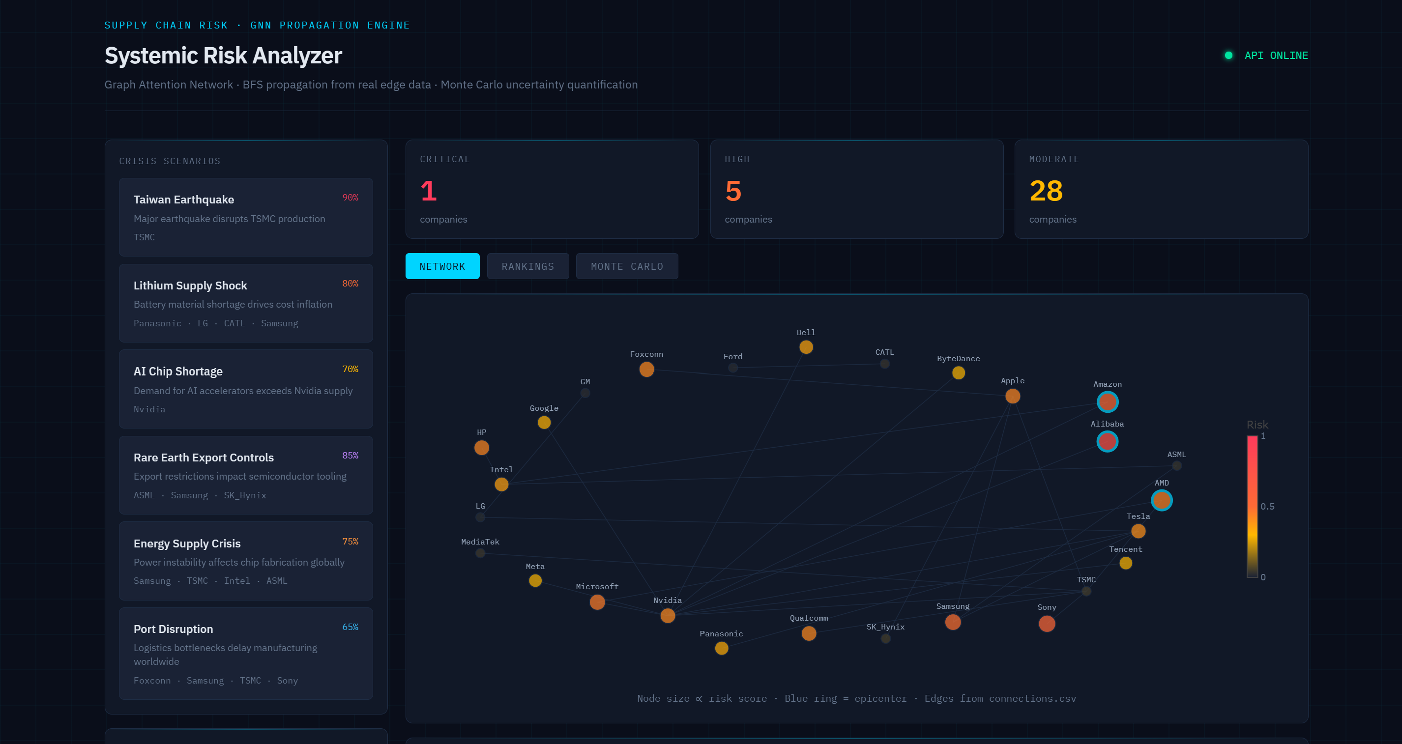
RippleGraph models global supply chains as a graph, with companies as nodes and supplier/customer relationships as edges. I use a Graph Attention Network (GAT) to predict how a shock at one node, such as a factory shutdown, shortage, or war, propagates outward through the network. Paired with 1,000+ Monte Carlo simulations, it turns "what happens if TSMC goes down" into a quantified risk score across every connected company, visualized on a live dashboard, in under 100ms.
How I built it
Graph construction: I built a company-relationship graph from supplier/customer data using graph_builder.py and connections.csv.
Model: I built a 3-layer Graph Attention Network with multi-head attention in model.py, trained on BFS-simulated shock-propagation labels.
Simulation: I implemented Monte Carlo stress testing in stress_test.py to generate distributions of outcomes rather than single-point predictions.
Serving: I built a FastAPI backend in api_server.py to expose the model for real-time scenario queries.
Dashboard: I built the frontend to visualize risk scores and propagation paths interactively.
Challenges I ran into
The biggest challenge wasn't training the model. It was validating it. I built validate_historical.py to backtest my model against real ground-truth data from the 2021-22 chip shortage, coded from actual Q3-Q4 2021 earnings calls and filings. The results were humbling: my model correctly flagged direct semiconductor players, with Apple, Qualcomm, and MediaTek all landing in the top 15, but completely missed Ford and GM. These companies lost over a million units of production in reality but ranked 62nd and 67th out of 97 in my model. This taught me that my graph was missing rich enough cross-sector edges, such as chip supplier to automaker relationships. My GAT had learned graph-distance propagation patterns well, but it had no signal for indirect, cross-industry dependency chains.
Deployment introduced a completely different challenge. When I deployed both the frontend and FastAPI backend on Render's free tier, the backend could go cold or asleep and take noticeably longer to wake up. My frontend initially checked the API health only once when the dashboard loaded. If the backend was still starting up, that single request would time out and the UI would mark the system as offline, even though the backend could become available moments later.
I initially thought the deployment itself was failing, but I eventually identified the actual issue as a timing and retry problem. Since the frontend only checked the API once, it could permanently remain in local mode or show the backend as offline even after the API had finished starting. I fixed this by increasing the API timeout and adding repeated health checks so the frontend continues polling the backend until it becomes available instead of giving up after one failed request.
This taught me that deploying an ML system isn't just about getting the model to work. The surrounding infrastructure also needs to handle startup latency, timeouts, and temporary connection failures.
Accomplishments that I'm proud of
Most hackathon ML projects never get validated against real-world ground truth. I did, and I didn't hide the results even when they weren't flattering. Getting a statistically directional signal (Spearman ρ = 0.40) against real 2021 earnings-call data, on a model trained purely on synthetic propagation labels, felt like proof that the core idea has legs. I'm also proud of shipping the full stack, including the GNN, simulation engine, API, and dashboard, rather than just a notebook.
What I learned
I learned that "does the model make plausible-looking predictions" and "does the model match reality" are two very different bars, and only backtesting against real events tells me which one I've cleared. I also learned about the limits of BFS and synthetic training labels versus real financial impact data. Most importantly, I learned that graph structure alone can underweight certain real dependency chains, such as semiconductors to automotive manufacturing, unless I explicitly encode them.
What's next for RippleGraph
- Enrich the graph with real cross-sector supply edges, such as chips to automotive and chemicals to pharma, to close the Ford/GM-style gap.
- Train on real financial-impact data, such as revenue and production loss, instead of only BFS-simulated labels to improve the near-zero Pearson correlation.
- Backtest against more historical shocks, including the Suez Canal blockage and COVID port closures, to build a broader validation suite.
- Add a "confidence" score per prediction based on how well-covered a company's edges are.
ps im using free tier render so pls expect it to spin down after inactivity!!
Built With
- html
- javascript
- matplot
- montecarlostimulation
- networkx
- numpy
- pytorch
- scikit-learn


Log in or sign up for Devpost to join the conversation.