-
-
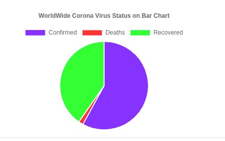
Pie Chart showing ratios
-
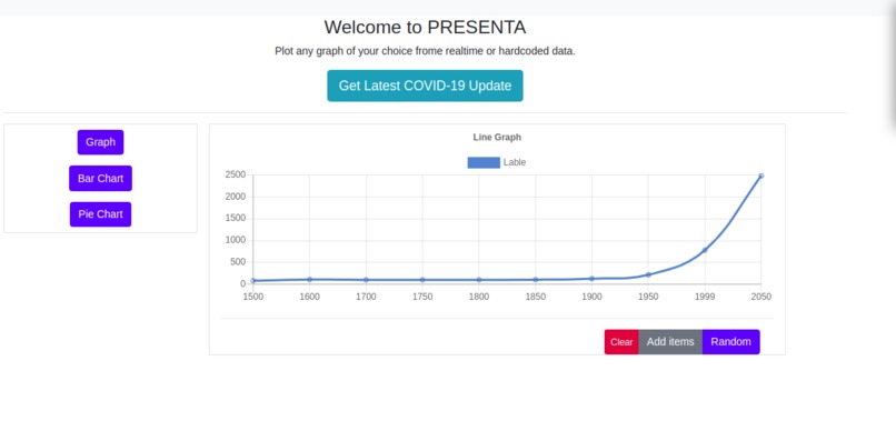
Editable line graph
-
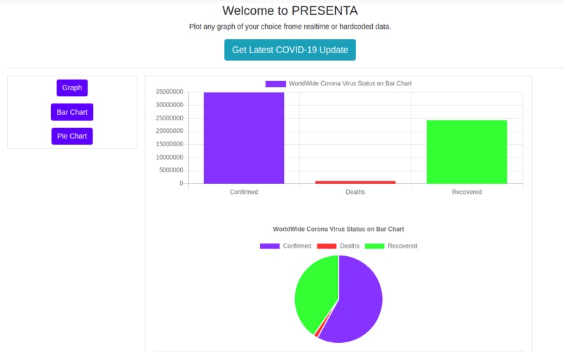
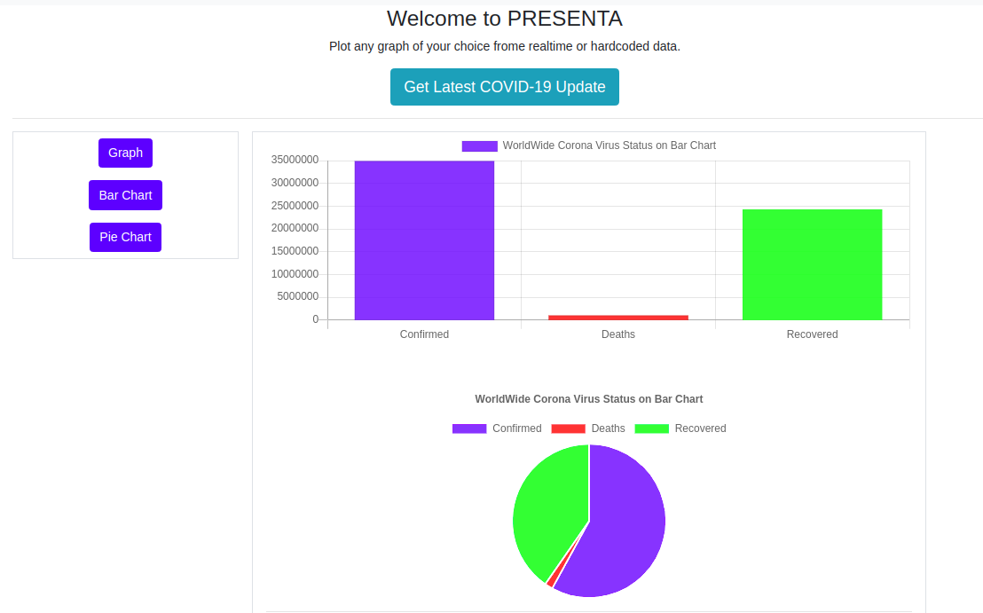
Live COVID-19 representation


Introduction
Collecting data is very demanding and at times not east. After collection, how do you present the data in a way that can be easily understood or interpreted? We have CHARTS, GRAPHS and PLOTS
Description
Using graphs/plots can simplify data representation and ease interpretation. Most hardware projects that deal with real-time data collection can be easily displayed on graphs. Statistical data also well structure on plotted diagrams and thus doesn't need any special expertise in understanding what the data represents.
Presenta provides an interface to display whatsoever data in an easy and simple format with varieties of charts.
For Hardcoded data: It's possible to customize bar charts, pie charts and line graphs.
For Realtime data: Display of Covid-19 Statistics worldwide on a pie chart and bar chart.
Tecnologies
This sample is built with HTML, CSS and JavaScript. With good use of chart.js
Importance
- Can be a goto tool for students.
- In the medical field, it can be used to display sophisticated data.
- For hardware projects that make use of real-time data collection, Presenta is perfect for customization.
- Presenta can basically scale to any domain.
Challenges | Difficulties
- Unable to use Google Cloud platform(I don't have a Credit Card to setup).
- Finding Covid-19 API endpoint to use.
- 24 hours working time (very stressful)

Log in or sign up for Devpost to join the conversation.