Inspiration
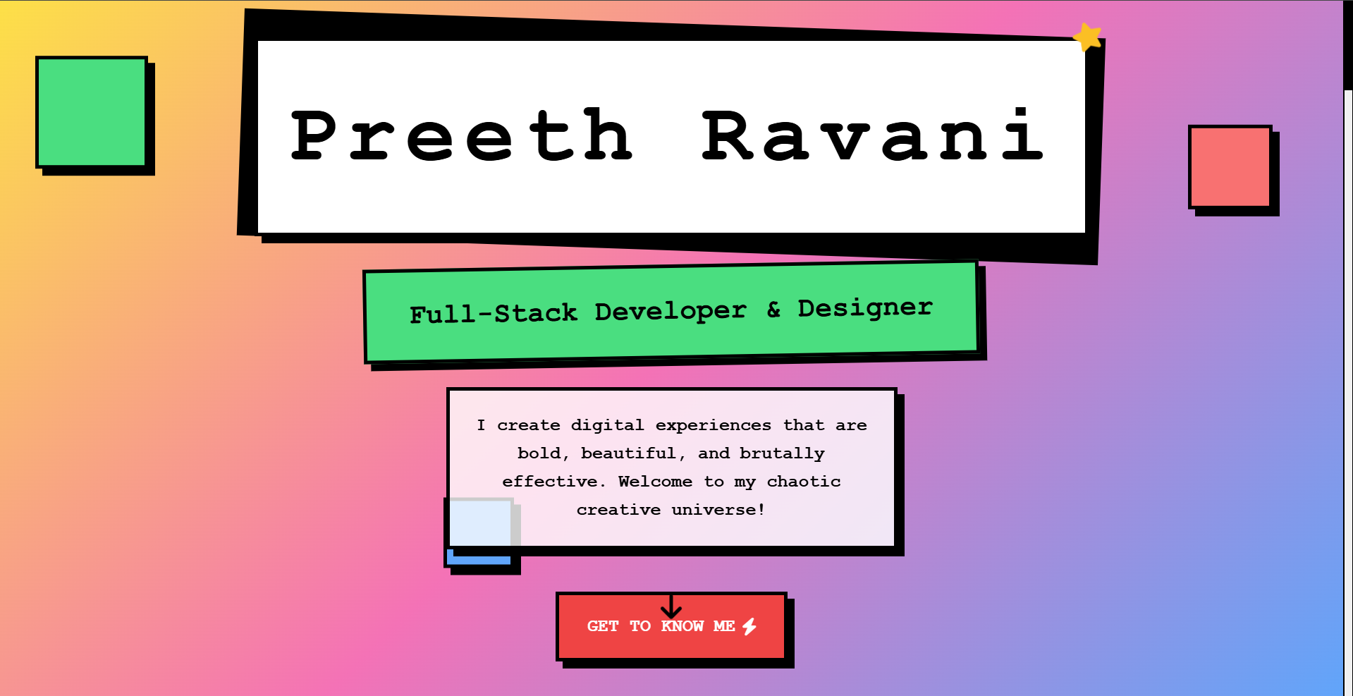
My inspiration for Portfolio came from a desire to create a bold, authentic digital presence that reflects my identity as a developer and creative thinker. I was drawn to the neobrutalist design aesthetic—its raw, unpolished look, bold typography, and striking contrasts felt like the perfect way to stand out in a hackathon. I wanted a portfolio that not only showcases my skills, education, and projects but also tells my story in a way that’s visually memorable and true to my personality. The idea was to blend functionality with a gritty, modern aesthetic to leave a lasting impression.
What I Learned
Building my Portfolio was a crash course in balancing design and functionality. I deepened my understanding of neobrutalism, learning how to use high-contrast colors, chunky fonts, and asymmetrical layouts without sacrificing usability. I honed my skills in HTML, CSS, and JavaScript to create interactive elements, like a dynamic education timeline and a responsive "Connect Me" section. I also learned about accessibility, ensuring my bold design choices didn’t hinder user experience. The hackathon pushed me to optimize performance and manage time effectively under pressure.
How I Built It
I built my Portfolio using a combination of HTML, CSS, and JavaScript, with a focus on neobrutalist principles. The site includes key sections: an intro with a punchy bio, an education timeline with animated milestones, a certificates gallery, a projects showcase with hover effects, an achievements section with bold visuals, and a "Connect Me" form for networking. I used CSS Grid and Flexbox for the layout, ensuring responsiveness across devices. For interactivity, I added JavaScript for smooth scrolling and dynamic content loading. The neobrutalist aesthetic was achieved through heavy fonts, stark color blocks (like neon accents on a dark background), and intentionally raw edges. I hosted the site using a simple vercel deployment service.
Challenges Faced
The biggest challenge was balancing the bold, chaotic neobrutalist style with usability. Early designs looked striking but felt cluttered, so I iterated to improve navigation without losing the aesthetic edge. Another hurdle was optimizing the interactive timeline—initially, the animations lagged on mobile devices, requiring me to simplify the JavaScript and optimize CSS transitions. Time constraints in the hackathon made it tough to polish every section, especially the certificates gallery, which needed manual resizing for consistency. Finally, ensuring accessibility (like sufficient color contrast) while staying true to the neobrutalist look required careful testing and adjustments.

Log in or sign up for Devpost to join the conversation.