-
-
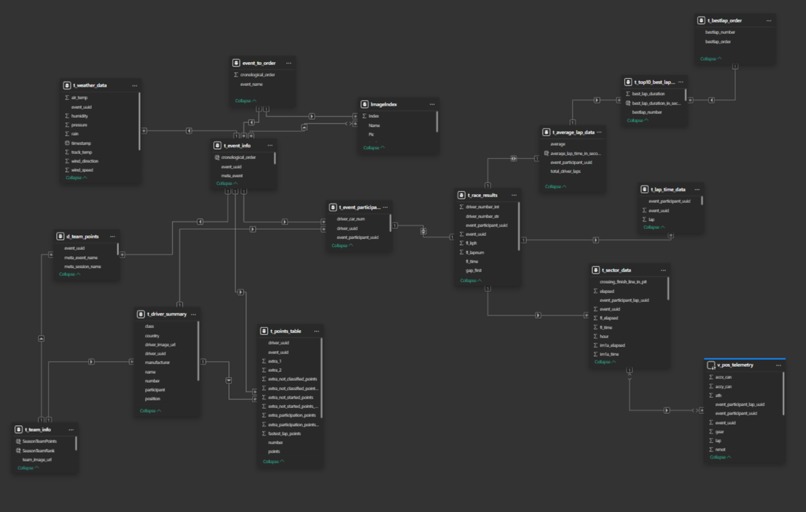
schema_image
What Inspired the Project
In the GR Cup, every millisecond matters, a single mistake on an exit can lead you to get overtaken by multiple drivers. So, to analyze this drivers, relies on post-race analysis which often comes in fragmented formats - laps, sectors, telemetry, and weather stored separately, making it difficult for drivers and engineers to quickly understand what truly happened during that specific lap.
This inspired me to build a Post-Race Analysis Dashboard that bridges the driver–engineer gap by turning raw timing data into clear insights.
How I Built It
The development process began long before Power BI. I built the dashboard through several data engineering steps to ensure accuracy, speed, and reliability.
1. Data Acquisition
I first downloaded all official race data—lap times, sectors, race results, driver standings, and event information—from the GR Cup North America website. These files came in mixed formats and required significant preparation.
2. Data Cleaning & Transformation
I standardized and transformed the downloaded datasets into clean, consistent CSV files.
This involved:
- Fixing inconsistent column formats
- Normalizing naming conventions
- Handling missing sector values and pit-lane flags
- Filtering invalid laps and duplicate records
The goal was to create a uniform structure across all events and races.
3. Driver & Team Image Scraping
To add richer visuals to the dashboard, I scraped driver and team images directly from the GR Cup website using requests and BeautifulSoup.
This included:
- Extracting image URLs
- Cleaning and validating broken or redirected links
- Downloading and organizing images into structured folders
These images later enhanced the UI/UX of the dashboard.
4. Data Modeling in PostgreSQL
Next, I imported all cleaned CSVs and scraped metadata into PostgreSQL, where I built a proper relational schema for accurate modeling.
Inside PostgreSQL, I:
- Designed tables for laps, sectors, sessions, events, drivers, teams, and images
- Created views to simplify commonly used filtering logic
- Added indexes on event, session, driver, and number fields to optimize query performance
- Ensured consistency across foreign-key–like relationships
This allowed the dashboard to operate on highly optimized, query-ready datasets.
5. Importing into Power BI
With a clean and efficient PostgreSQL backend, I imported the data into Power BI.
In Power BI, I:
- Built relationships among all core tables
- Added DAX columns and measures for custom measures, which i needed: lap deltas, sector improvements, cumulative points, and driver comparisons
- Created interactive visuals and slicers for race, driver, and team selection
- Designed the Championship, Race Analysis, and Driver Analysis pages on top of the structured model

This layered workflow—from raw data to engineering-grade backend to visual analytics—ensures the dashboard is accurate, fast, and easy to extend.
6. Structure of the Dashboard
The dashboard is organized into three core sections:
1. Championship (A season-wide overview)
- Driver and team standings
- Points progression
- Average points per race
- Contribution of each driver to team totals
2. Race Analysis (Focused on individual race dynamics)
- Fastest laps and average pace
- Position changes over the race
- Gap evolution between drivers
- Clean race results with time deltas
3. Driver Analysis (Built for precise comparisons)
- Telemetry and lap-by-lap comparison
- Sector improvements and time deltas
- Track layout with corner and sector overlays
- Weather context for deeper interpretation
What I Learned
- Structuring and merging motorsport datasets with high anomaly
- Modeling relationships without primary keys and duplicates
- Creating DAX measures for cumulative logic and comparisons
- Turning raw numbers into actionable patterns
Challenges Faced
- Cleaning inconsistent files from multiple events, in driver number, telemetry data etc.
- Synchronizing laps across drivers for fair comparison, as every one starts at a different timestamp
- Preventing circular dependencies in the data model
- Mapping telemetry onto track layouts while keeping visuals readable
What's Next for the Post-Race Analysis Dashboard
The roadmap expands the dashboard into a smarter, more automated analysis tool:
1. Deduction-Based Insights (Built-In Reasoning)
- Automatic detection of anomalies such as unusually slow sectors, overheating tires, or potential track incidents
- Auto-flagging laps affected by traffic or pit entry
- Highlighting consistency issues or improving trends
2. AI-Driven Suggestions
- AI-based coaching recommendations (e.g., braking points, sector focus areas)
- Predictive modeling to estimate performance gains if specific improvements are made
- Natural-language summaries of each race for drivers and engineers
- Automatic comparison against historical data to detect strengths and weaknesses
3. Extended Data Layers
- Incorporating tire usage, fuel load, and stint analysis
- Adding in-car sensor data (throttle, brake, steering) for deeper telemetry mapping
- Multi-race driver performance profiling powered by machine learning
The goal is to make the dashboard not just a post-race analysis tool, but a smart performance assistant that helps teams improve every race weekend.
Final Thoughts
This dashboard transforms raw GR Cup data into a clear, actionable narrative—helping teams analyze faster, coach smarter, and make confident decisions heading into the next race.
Built With
- postgresql
- powerbi
- python

Log in or sign up for Devpost to join the conversation.