-
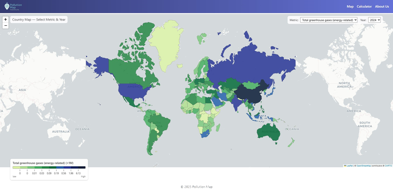
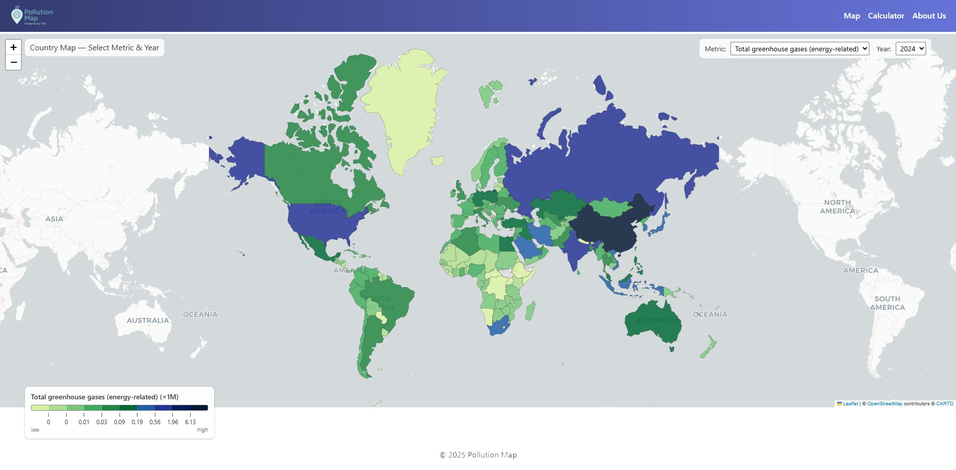
Total greenhouse gases
-
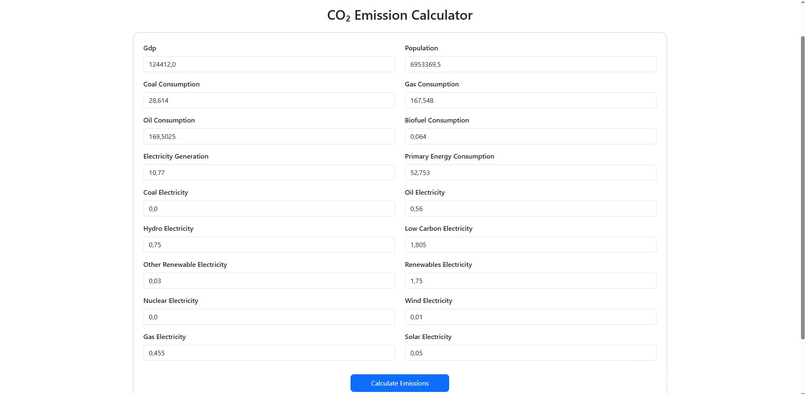
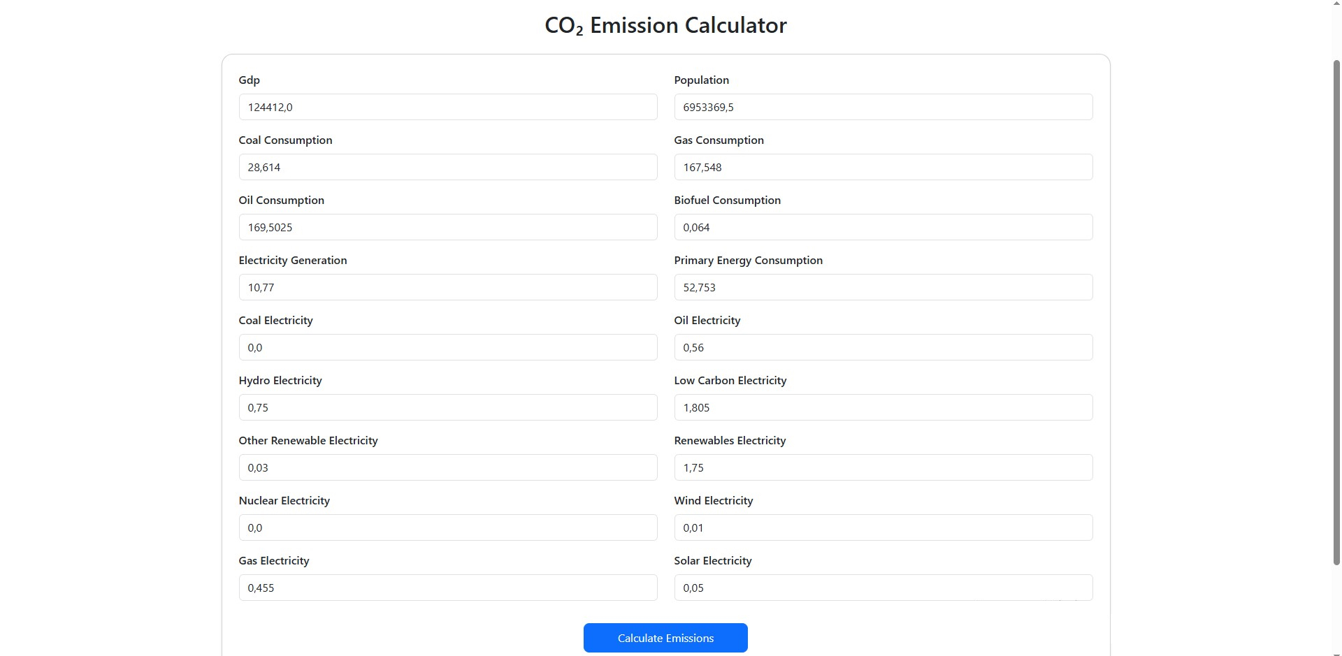
Prediction Calculator for Carbon footprint
-
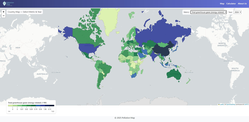
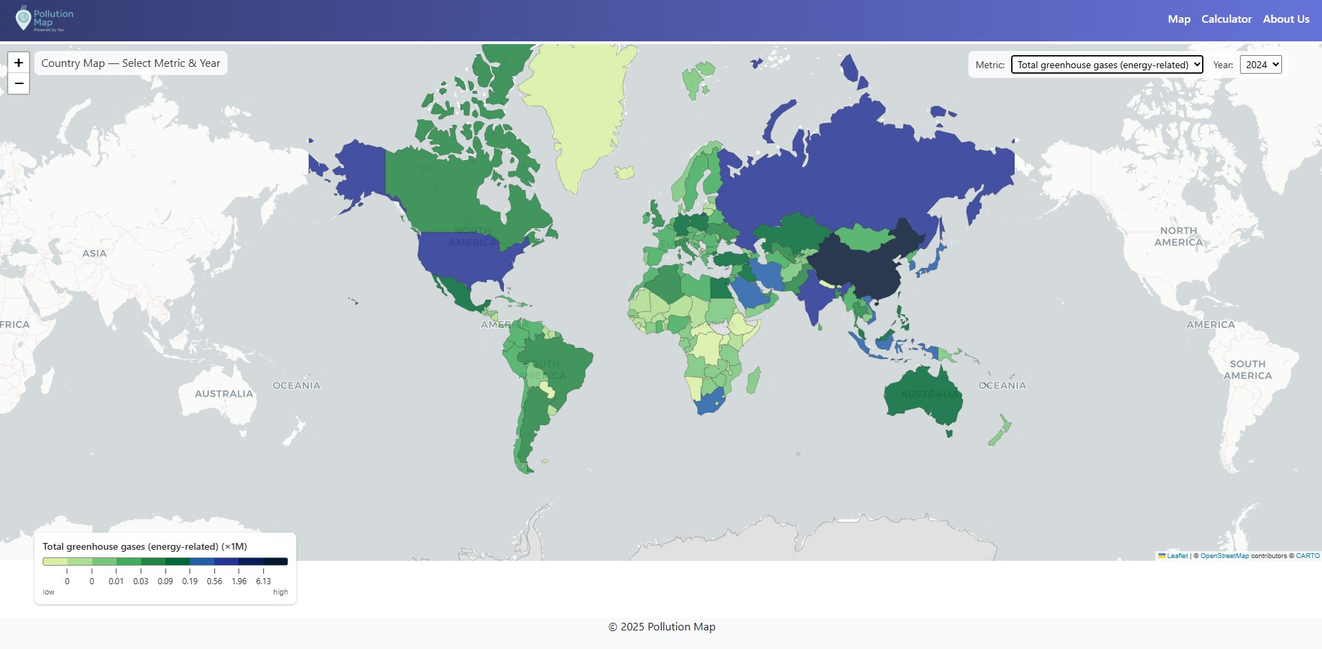
Per capita
-
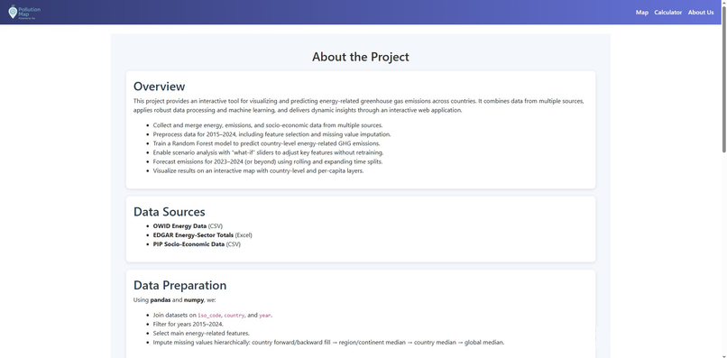
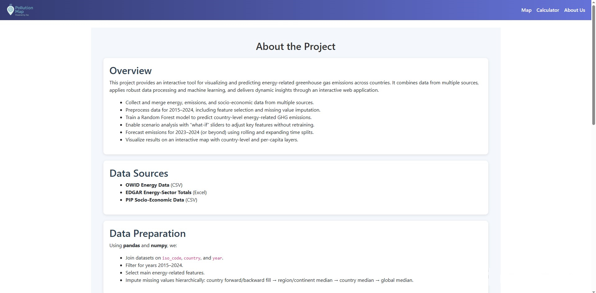
About us page
This project grew out of a simple question:
How can we better understand the relationship between a country’s energy choices and its greenhouse gas emissions?
There is no shortage of climate data available, but it often sits in large spreadsheets, difficult to interpret, compare, or experiment with. I wanted to create a tool that makes this information interactive — something that lets people not only explore how emissions vary across countries, but also test what-if scenarios, such as increases in renewable energy or changes in economic output.
What Inspired It
The inspiration came from observing how climate discussions often lack clear, data-driven context. Many policy and public debates talk about emissions in broad terms, but rarely show how specific factors — like coal consumption or population growth — actually change the picture.
We wanted a tool that could:
Help people see these relationships more clearly
Make emissions modeling accessible to those without a technical background
Encourage more informed decision-making and conversation
How the Project Was Built
The project combines data science and web development:
Data Collection & Preparation
We used an energy and emissions dataset spanning 2015–2024.
After cleaning, standardizing, and selecting features, We prepared it for modeling.
Model Training
We trained a Random Forest Regression model to predict CO₂-equivalent emissions based on energy consumption, electricity mix, GDP, and population.
Model performance was evaluated using R² and MAE, and the most influential features were identified.
Web Application
The model was integrated into a Django web application.
A CO₂ Calculator interface allows users to input values and get real-time predictions.
A Leaflet map view provides geographic exploration and visualization.
Challenges Faced
Feature Selection & Scaling: Ensuring the model received meaningful features without introducing noise required multiple iterations and careful statistical checks.
Balancing Accuracy and Interpretability: While complex models can perform better, they can also be harder to explain. We focused on a solution that performs well but still allows users to understand why the model makes certain predictions.
User Experience Design: Translating technical model outputs into an interface that feels intuitive to a non-technical user required thoughtful layout and labeling.
What We Learned
Working on this project reinforced the idea that data is most powerful when it’s understandable. Predictive models alone are valuable, but pairing them with interactive visualization can transform them from analytical tools into decision-support tools that inform real conversations about climate and policy.
Project Overview
This project builds a machine learning model to estimate annual energy-sector greenhouse gas emissions for countries worldwide and provides:
- A predictive emissions model based on historical energy and economic indicators.
- A carbon footprint calculator that allows users to input expected national-level energy use and estimate resulting emissions.
- A dynamic geospatial map that visualizes emissions:
○ Total emissions per country
○ Emissions per capita (population-normalized) The project supports scenario analysis, policy evaluation, and energy system planning
Interpretation & Policy Applications
This system allows users to:
● Model future emission scenarios (e.g., reducing coal use by 20%)
● Compare national energy mix strategies
● Identify high-impact levers (coal → renewables transition)
● Conduct per capita fairness comparison
● Support climate policy and national decarbonization planning
Conclusion
This project forms a complete analytical system:
- Data-driven emissions modeling
- Transparent, explainable feature influence
- Interactive user prediction tool
- Global visual analysis + per capita fairness visualization
It can support:
● Climate researchers
● Government agencies
● Investment strategy groups
● Energy transition policy design
Data Sources
EDGAR v2025 GHG Emissions European Commission JRC Historical greenhouse gas emissions by sector (IPCC classification), measured in kt CO₂-eq.
OWID Global Energy Dataset Our World In Data Annual national energy consumption and electricity production by source, in TWh.
Population & GDP Indicators (PIP) World Bank/OWID Macro indicators used for normalization and scaling.
All datasets were filtered to the period 2015–2024 to ensure consistency and modern relevance.


Log in or sign up for Devpost to join the conversation.