-
Sentiment Engine
-
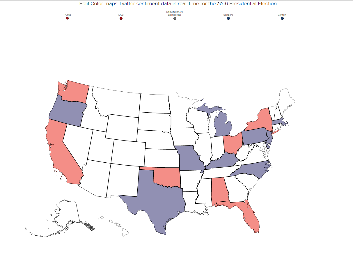
Data Map updating in Real Time
-
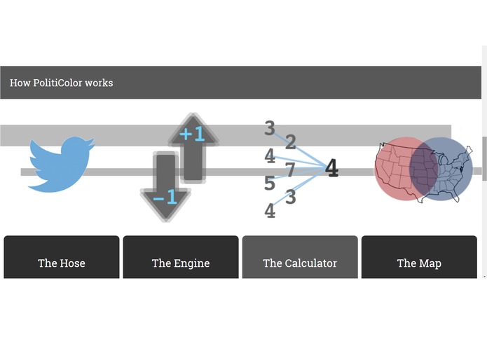
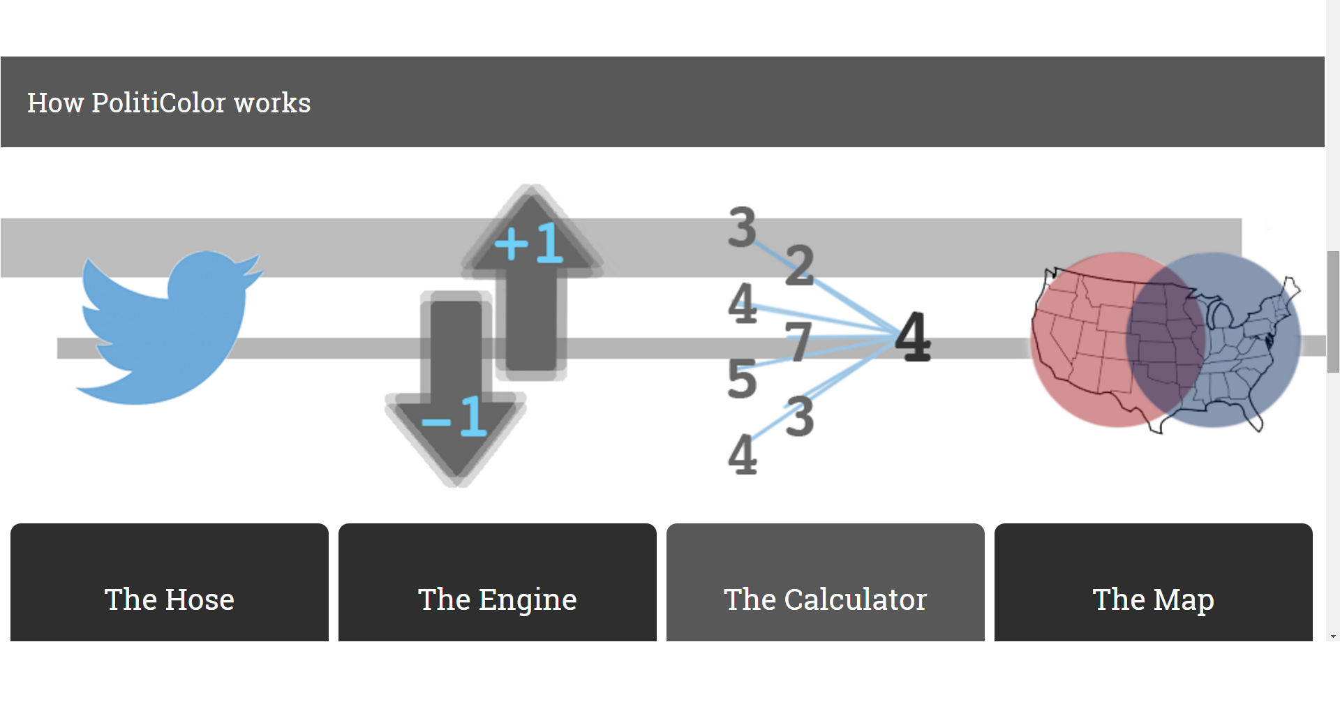
Data Pipeline and Architecture
Inspiration
The inspiration for PolitiColor came from the 2016 presidential election and the wealth of social media data that is related to it. We realized that by creating PolitiColor was a great way to tap into a data source that was readily accessible and perhaps more accurate than conventional forms of data gathering.
What it does
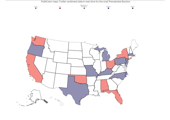
PolitiColor is an app that converts tweets into sentiment information on the 2016 Presidential Election. Using a choropleth map, Twitter opinions expressed in tweets are color coded and mapped by state. Users can quickly view sentiment data on their favorite candidates, or on general sentiment between the two major parties. When Twitter opinion in a state swings in favor of a candidate, their color appears more prominently; if the opposite occurs, the opposing color is displayed. Politicolor provides a unique outlet for information that is difficult to gather and arguably more accurate than the tried and true method of polls. Politicolor is real time and digital; it can be accessed everywhere and is constantly updating. As a result, even the most tireless of political junkies can get their fill of data and analytics.
How we built it
We used a Node.js and socket.IO backend, with jQuery, vanilla-JS, and CSS for the front-end. The map graphics are powered by D3.js.
Challenges we ran into
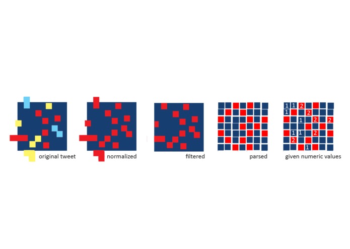
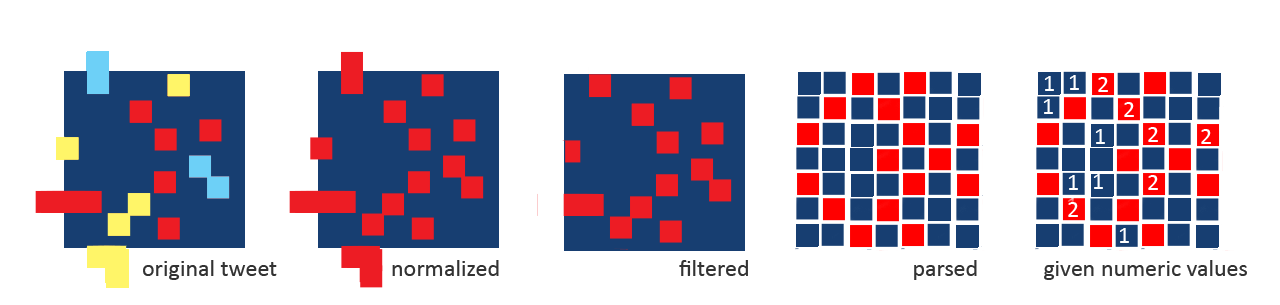
The biggest challenge we ran into was natural language processing. NLP is a field studied by Ph.D. students and people who have a far greater background in linguistics than we do. We started by building a part of speech tagger on our own (using brill), but quickly hit a wall when we realized none of us had the linguistic background to create the necessary rules over the part of speech. As a result, making the NLP work and figuring out the optimal way to parse sentence structure was a really large, really interesting challenge.
D3 was also library that we were unfamiliar with, and implementing it was a crucial part of our data visualization.
Accomplishments that we're proud of
We're extraordinarily proud of our system architecture. We modularized heavily and created a pipeline that was efficient and capable, allowing easy manipulation of parts and distinct, concrete data flow. This led to faster production and an all around polished app.
What we learned
We learned how to use the twitter API, how to work with natural language processing, and how to create interactive SVG data visualizations.
What's next for PolitiColor
Refining the app and it's specificity as to parsing data.

Log in or sign up for Devpost to join the conversation.