-
current prototype
Inspiration
Given the current political climate, we wanted to get a better understanding of how our media sites reflect and influence our views. A recent article by Vox talks about ways to understand and and communicate with people with opposing views by understanding their values. Through our project, we hope to make people aware of their biases, bridge the disconnect between the left and right, and spur more meaningful conversation.
What it does
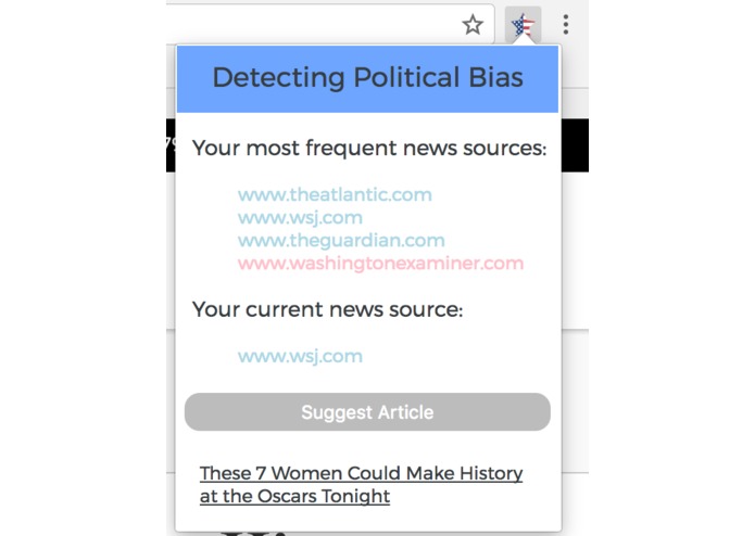
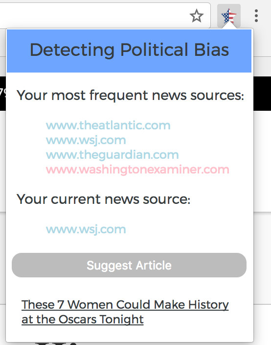
Draws from a data set of about 800 websites labeled as left, left-center, center, right-center, and right. These websites are then matched against the websites you've visited. We display your top 10 news sites and color code them based on the tagged leaning. It also checks what site you're on right now and suggests a contrasting media site.
Challenges we ran into
Initially, we wanted to use information from Facebook's Graph API so we could retrieve data on the media found in the user's newsfeed. However, we had issues retrieving the data and ended up switching to data collected from people's browser history. Also, asynchronous data calls in javascript.
Accomplishments that we're proud of
Merging the left, left-center, right, right-center data and color coding the type of articles as well as suggesting the opposing articles to the user regarding their dominant political views.
What we learned
Working with Chrome extensions and learning javascript
What's next for Political Bias Checker
Presenting this data in a more user friendly and visually appealing format. We hope to bring up visuals of suggested articles and show a split recommendation system like in the Wall Street Journal's Blue Feed, Red Feed project
Fun Web Name
agirlwalksintoa.com


Log in or sign up for Devpost to join the conversation.