Orbit 360° — Your Money, The Whole Picture
Inspiration
Most banking applications show us our finances in fragments. Checking accounts, savings, credit cards, investments, and loans often live in different places, making it difficult to understand our overall financial health.
We realized that having access to financial information doesn't necessarily mean understanding it.
Someone might have $10,000 in savings but also carry significant debt and upcoming financial obligations. Another person with the same savings balance might be in a completely different financial position.
This inspired us to ask:
What if banking could help people see the full picture instead of just individual numbers?
That's how Orbit 360° began.
Our goal was to create an intuitive financial experience that helps people understand where their money has been, where they stand today, and how their decisions could shape their future.
What It Does
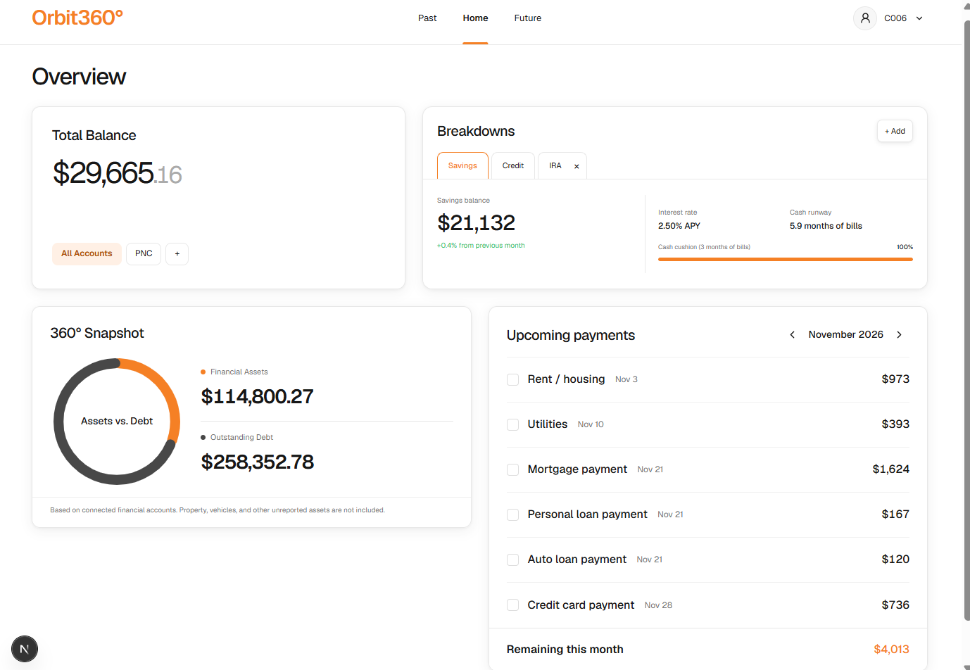
Orbit 360° is a financial health navigation experience designed to integrate directly into PNC's banking platform.
Rather than treating financial accounts as isolated pieces of information, our platform brings them together into one unified experience.
Our design focuses on three connected dimensions:
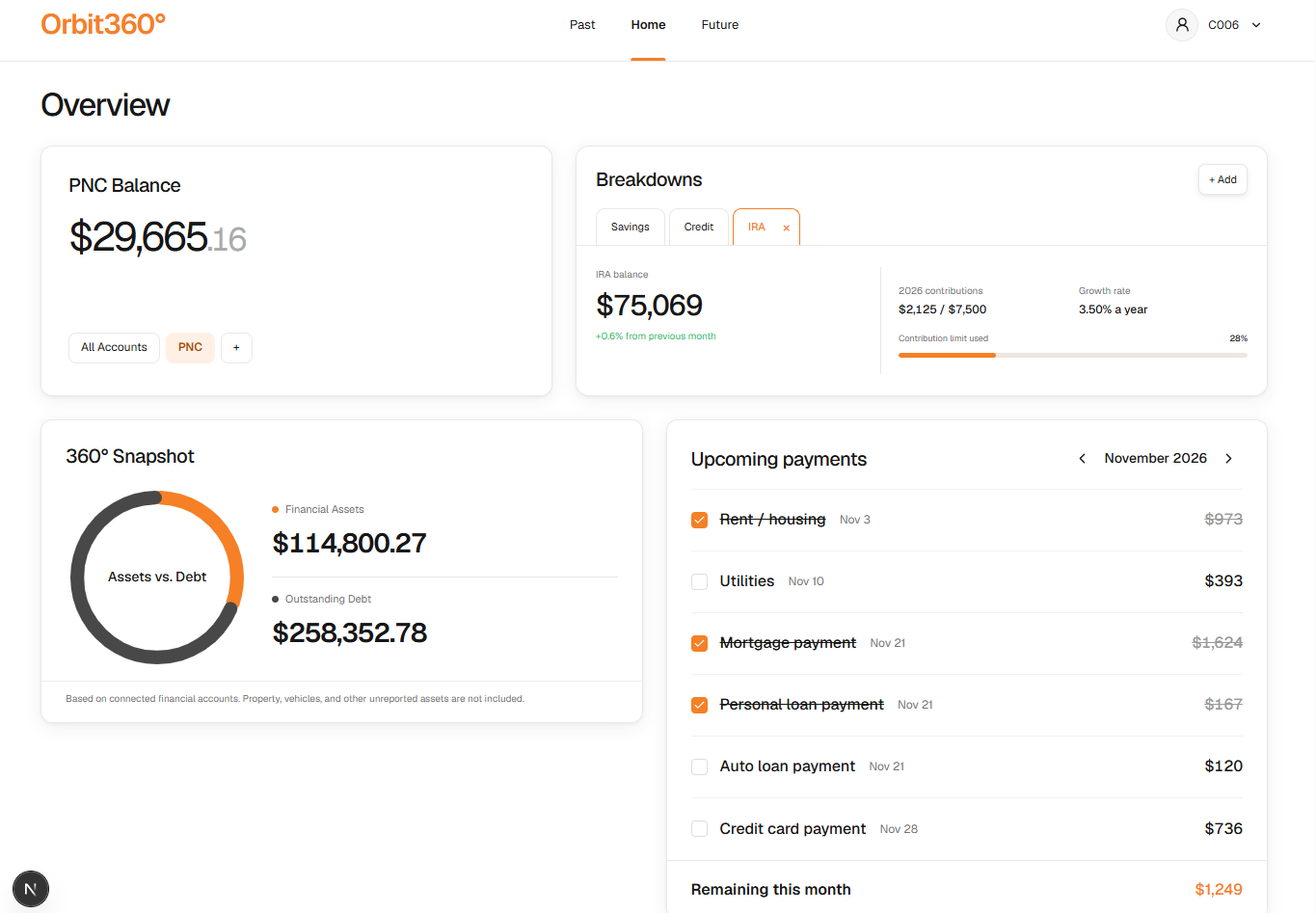
- Financial visibility: View balances and financial information across PNC and other connected institutions.
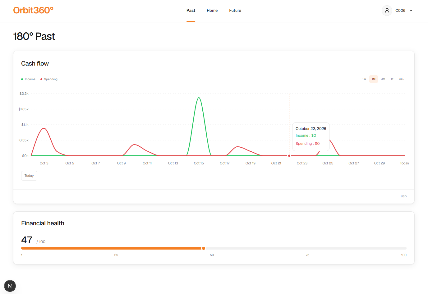
- Financial understanding: Explore spending patterns, savings, credit, debt, and other financial indicators through clear, interactive visualizations.
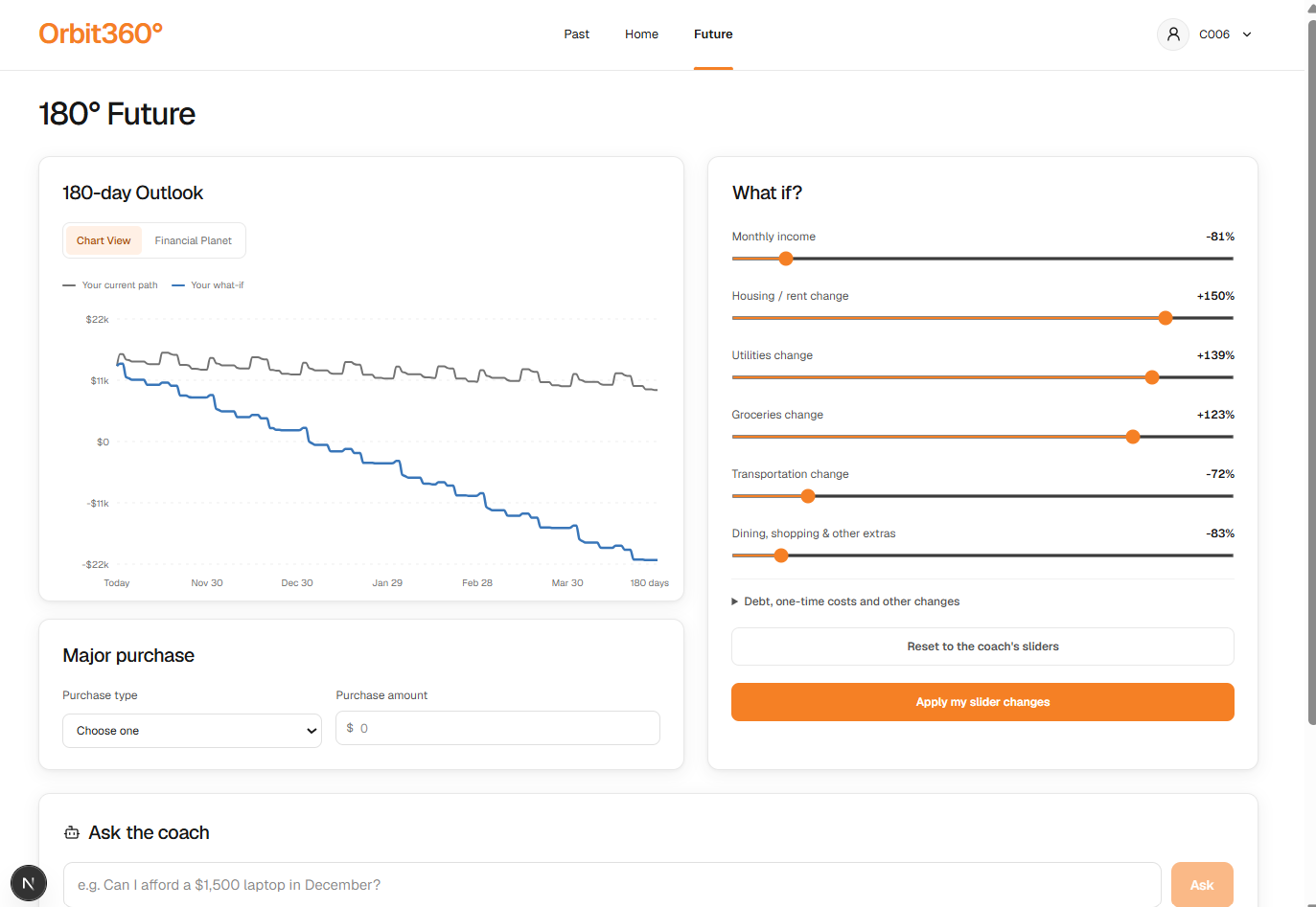
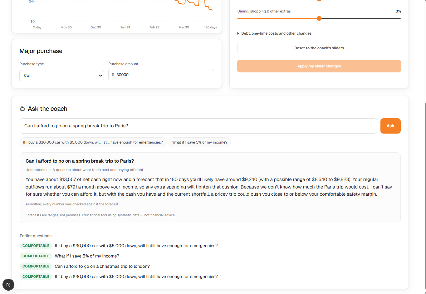
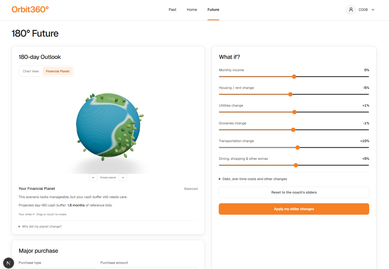
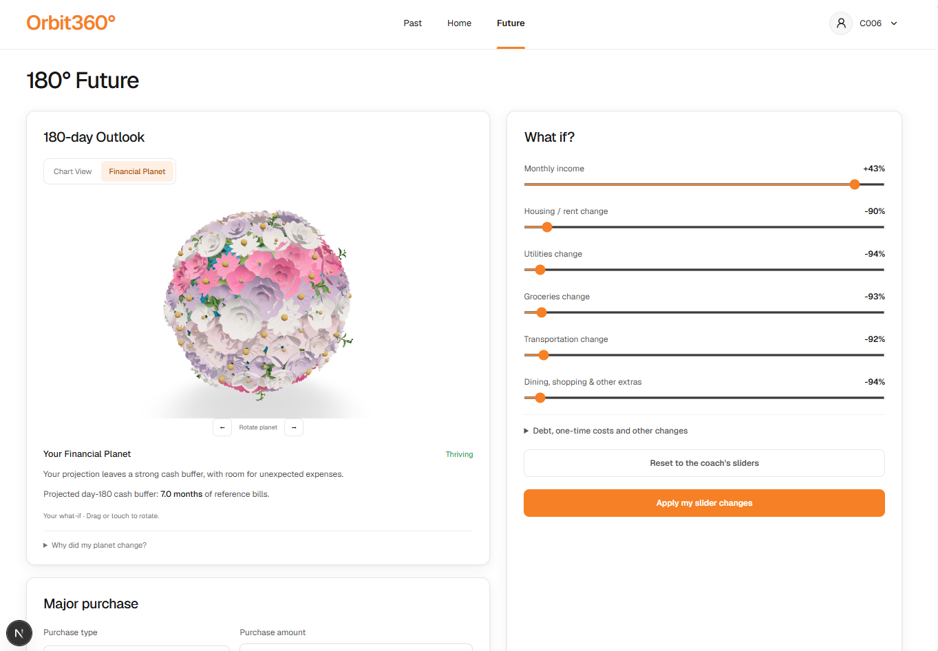
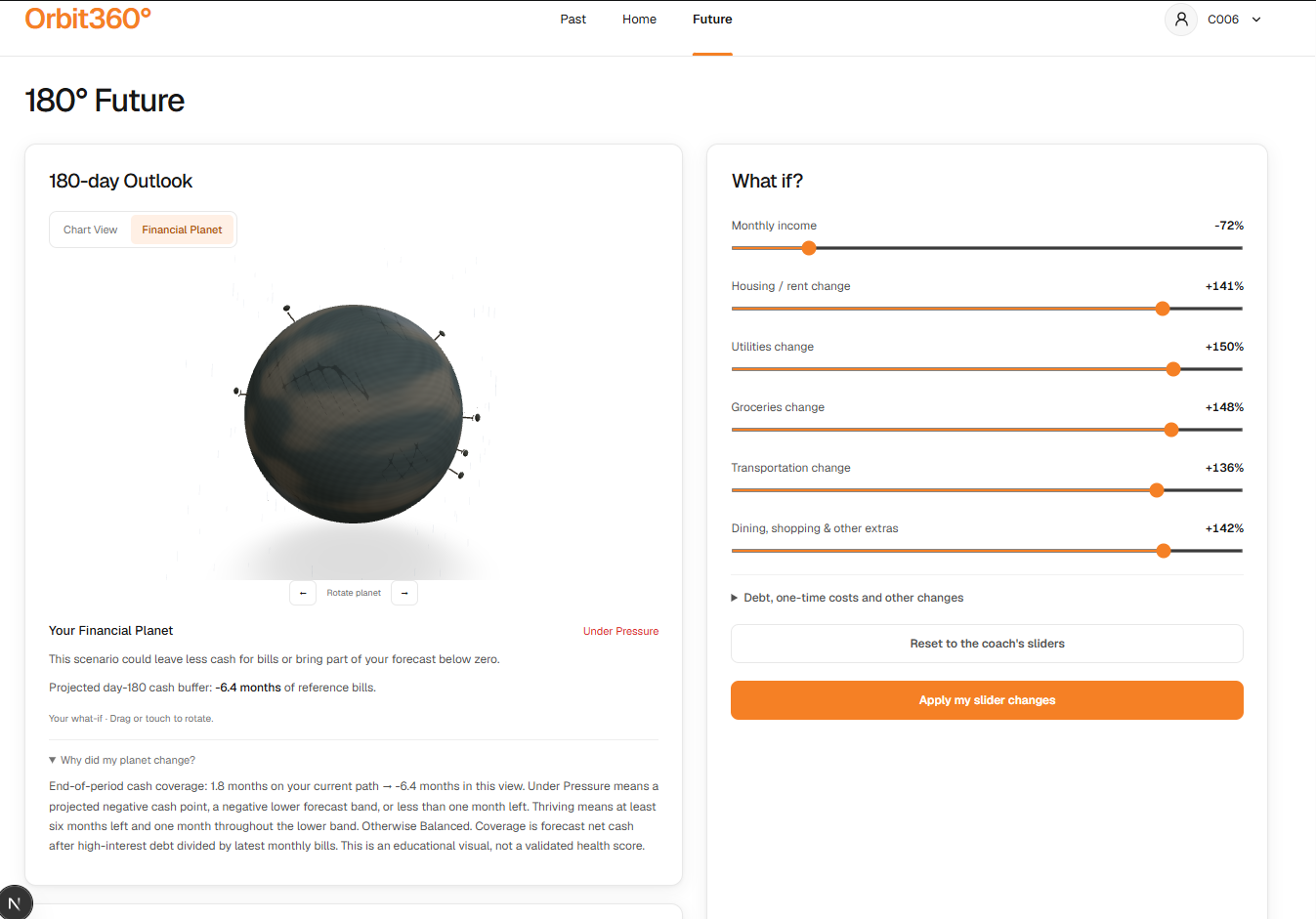
- Financial planning: Explore hypothetical scenarios to better understand how future decisions could affect financial well-being.
We placed particular emphasis on accessibility. Users shouldn't need a background in finance to understand their own financial situation.
How We Built It
We developed Orbit 360° using a modern full-stack architecture, building on the resources provided for the PNC hackathon.
Frontend
- Next.js, React, and TypeScript
- Tailwind CSS for a responsive, consistent design system
- Interactive financial charts and reusable dashboard components
Backend
- Python and FastAPI
- Financial data processing and calculation endpoints
- Synthetic financial profiles and transaction data provided through the hackathon resources
Our interface uses PNC-inspired orange, white, and black, with a minimal design focused on readability and ease of navigation.
We designed the dashboard around a consolidated financial overview, selectable account balances, category-based financial information, cash-flow visualizations, and upcoming payments.
A major design priority was making complex financial data feel approachable without sacrificing the accuracy or usefulness of the information.
Challenges We Faced
1. Making Financial Information Understandable
One of our biggest challenges was deciding how much information to display.
Financial products can easily overwhelm users with charts, percentages, balances, and technical terminology. We wanted to preserve meaningful financial details while making the interface intuitive even for someone with limited financial knowledge.
We addressed this by emphasizing clear labels, simple navigation, contextual information, and progressive disclosure.
2. Designing for a Complete Financial Picture
Different financial accounts represent different things. Savings and investments are assets, while outstanding loans and credit card balances represent obligations.
We had to consider how these categories should appear together without misleading users or treating every balance as interchangeable.
3. Balancing Innovation With Professionalism
We explored several creative directions before settling on a restrained, interactive design.
Our challenge was to create something memorable while maintaining the trust and clarity expected from a banking application.
Instead of adding unnecessary gamification, we focused on meaningful interactions that help users explore their financial information.
What We Learned
This project taught us that great financial technology isn't just about presenting more data. It's about helping people understand what that data means.
We also learned the importance of designing around the user rather than the underlying financial metrics.
A successful financial experience needs to be technically accurate, visually clear, accessible, and adaptable to different financial situations.
Working on PNC 360° strengthened our understanding of full-stack development, component-based architecture, financial data visualization, and collaborative product design.
What's Next
We envision expanding PNC 360° with deeper financial insights, more personalized scenario exploration, and secure integrations with external financial institutions.
We also want to further develop tools that help users understand how their financial decisions relate to their individual circumstances and long-term goals.
Our long-term vision is to make financial understanding more accessible, so people can approach important decisions with greater clarity and confidence.
Closing Thoughts
Financial health isn't about looking at one account, one number, or one moment in time. It's about understanding the whole picture.
With Orbit 360°, we're working toward a banking experience that makes that bigger picture easier for everyone to see.
Built With
- css
- next.js
- react
- spacetimedb
- typescript

