Inspiration
I traveled to Thailand for a month last year. While there, I went to an ice house, a place with ice baths and saunas. Despite 18 years of playing soccer and taking ice baths from the waist down, it was my first time doing a full-body one. The moment I made the decision to go in for a full 5 minutes stuck with me. That split-second is truly the "in-between" where action lives, hence the name: Plunge.
What it does
Plunge is built to stop productive procrastination. The less the user has to “take care of”, the better. It is designed to make you act, and action-taking is a muscle that needs to be trained through repetition.
Plunge aims to achieve this through:
- Engaging the user with the right communication tone
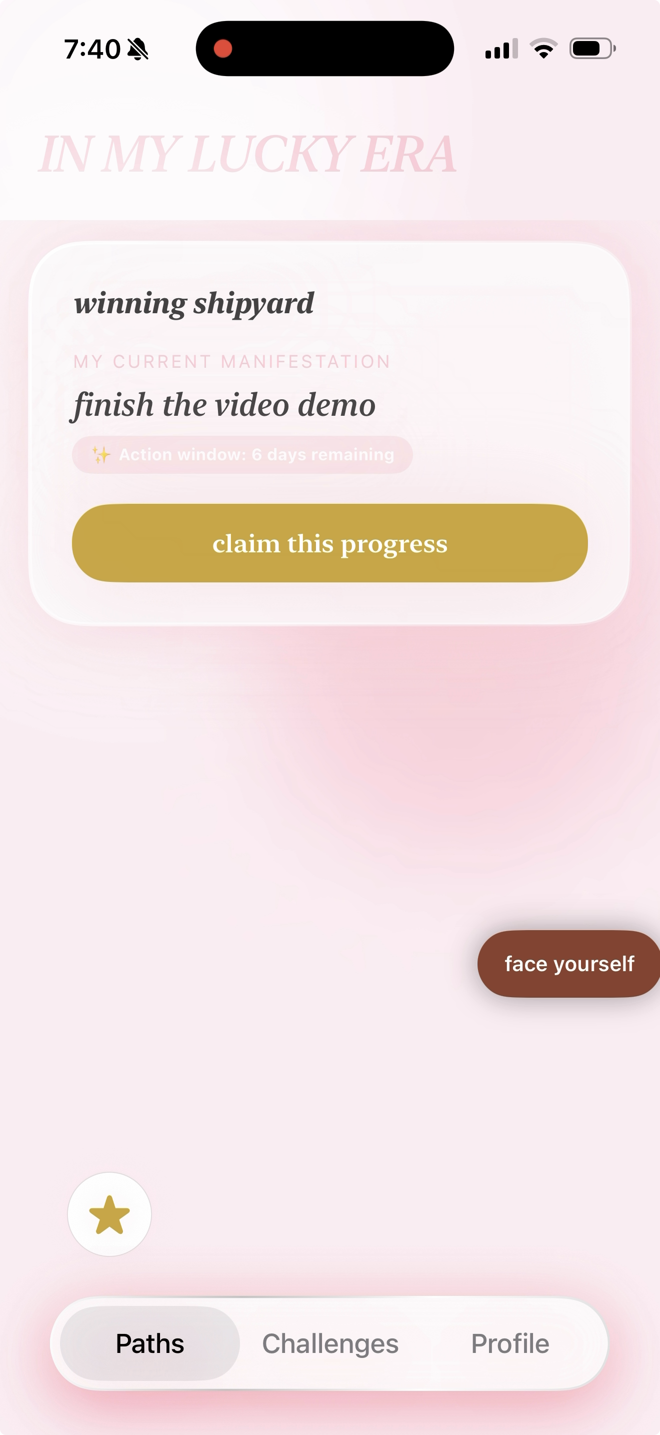
- A goal tracking system that:
- doesn’t turn into another procrastination method, and
- focuses on the highest ROI: the current task at hand
- A workout for action-taking, because momentum is a muscle
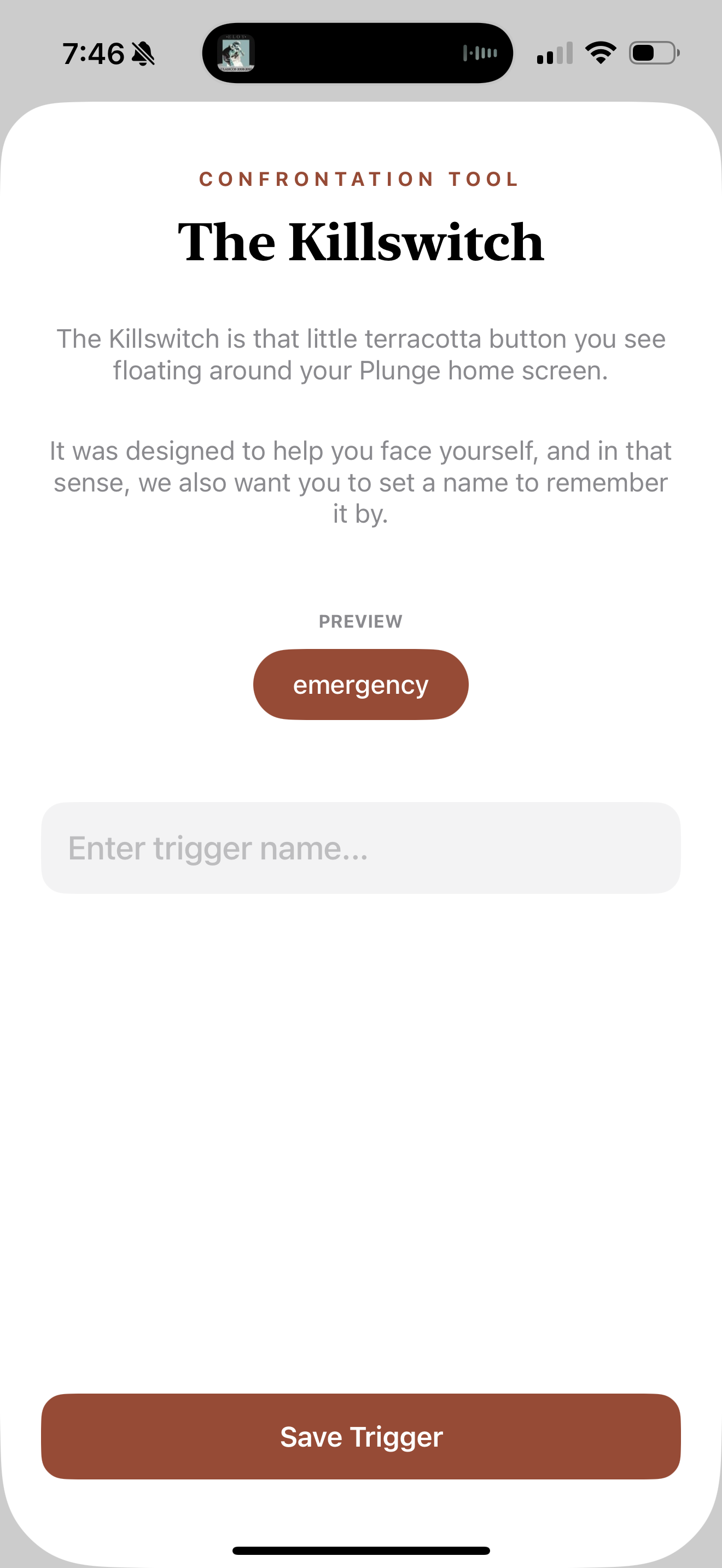
- Tools for self-confrontation and pattern interruption for when "stuckness" takes over
- An environment that forces focus on goals and the immediate next step
How we built it
Plunge is an iOS app only built with SwiftUI, AVFoundation and AVKit. We are using a postgresql database through Supabase to handle authorization, sessions, and storage through S3.
To manage access control, we integrated RevenueCat to implement both soft paywalls and feature-gated paywalls, which we are currently using to test two different conversion strategies.
For the UI and UX design process, we used a trial-and-error approach with Fastshot, GPT-5.2, and Gemini 3 Flash until the design finally clicked.
Challenges we ran into
Early on, I spent too much time on icons, colors, and typography, which killed my momentum because I’m not an experienced designer. I only found my flow once I focused strictly on the product requirements and the core UX.
Getting the UX right was the hardest part. For a lifestyle and productivity product where 86% of the users are women aged 24-35 in the US, the design and user experience are the ultimate differentiators: they are the margin between what works and what doesn’t.
Also, I came up with my strongest feature late, so I did not have enough time to fully build it out. It taught me that I probably needed to spend more time on product definition first to focus on the features that would make a difference.
Accomplishments that we're proud of
I’m super proud of the original features developed. The goal was to build a foundation of trust through these features, which then makes challenging the user and pushing them out of their comfort zone easier.
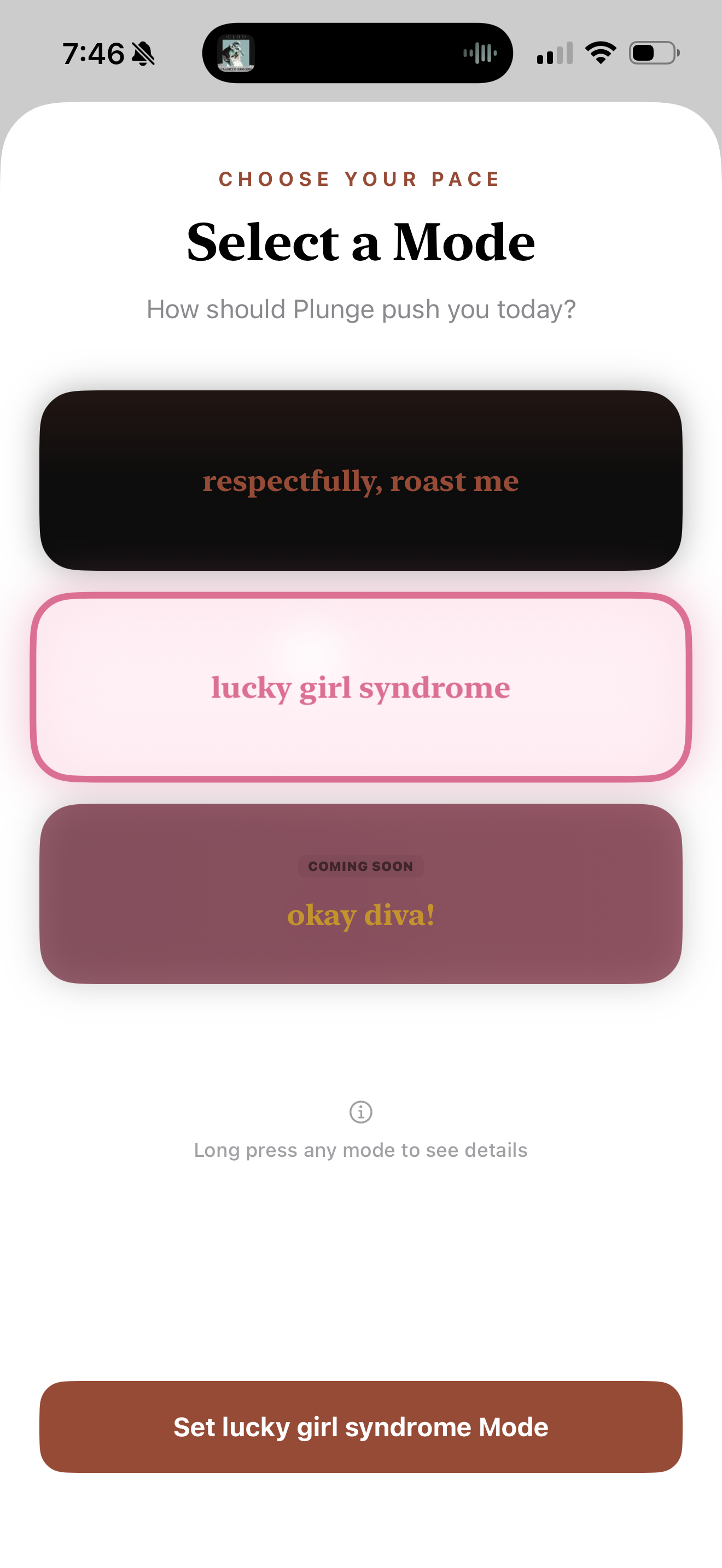
Specifically, I think the “modes” feature is a game changer. It allows the app to be customized in a way that works for different groups within the same demographic. I’m excited to see how this feature resonates with others.
What we learned
Define the product thoroughly first. Even though it might be slow at first, a couple wireframes will do to be able to nail down the product with clarity. Give it time and think outside the box for features (thinking about the psychology of the user will help with this).
Focus on one good thing and start early. You are going to have multiple iterations where the product definition changes, so it’s better to focus on one core feature and iterate as needed.
What's next for Plunge
The next step for Plunge is to integrate an AI coach to help with goal definition and to solve the problem of knowing what you want but not knowing how to get there.
We also want to increase the number of modes implemented to better fit different personalities, alongside more pattern interruption and self-confrontation tools.
Beyond the roadmap, we will focus heavily on the effectiveness of the features already implemented: gathering and analyzing data to draw insights that will guide the future of the product.
Built With
- avf
- avkit
- postgresql
- revenuecat
- s3
- supabase
- swift
- swiftui

Log in or sign up for Devpost to join the conversation.