-
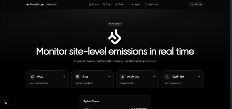
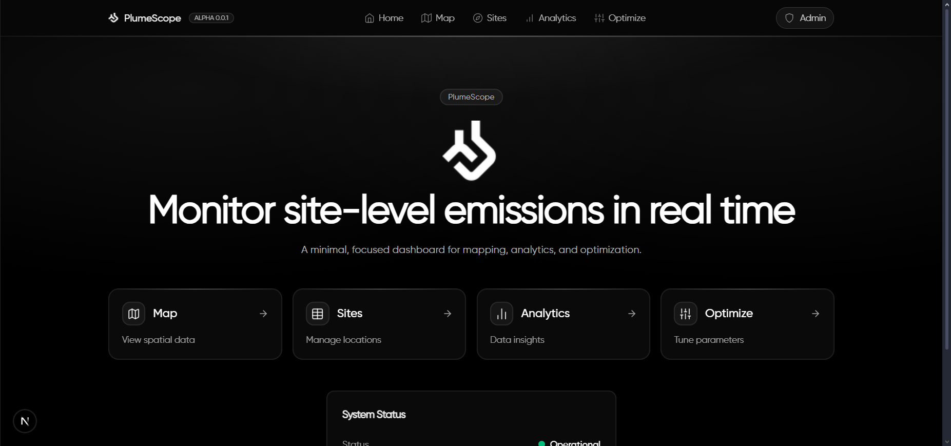
Home/Landing Page
-
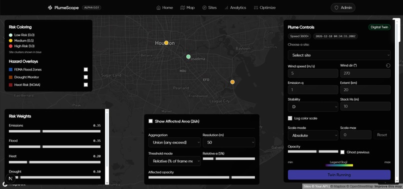
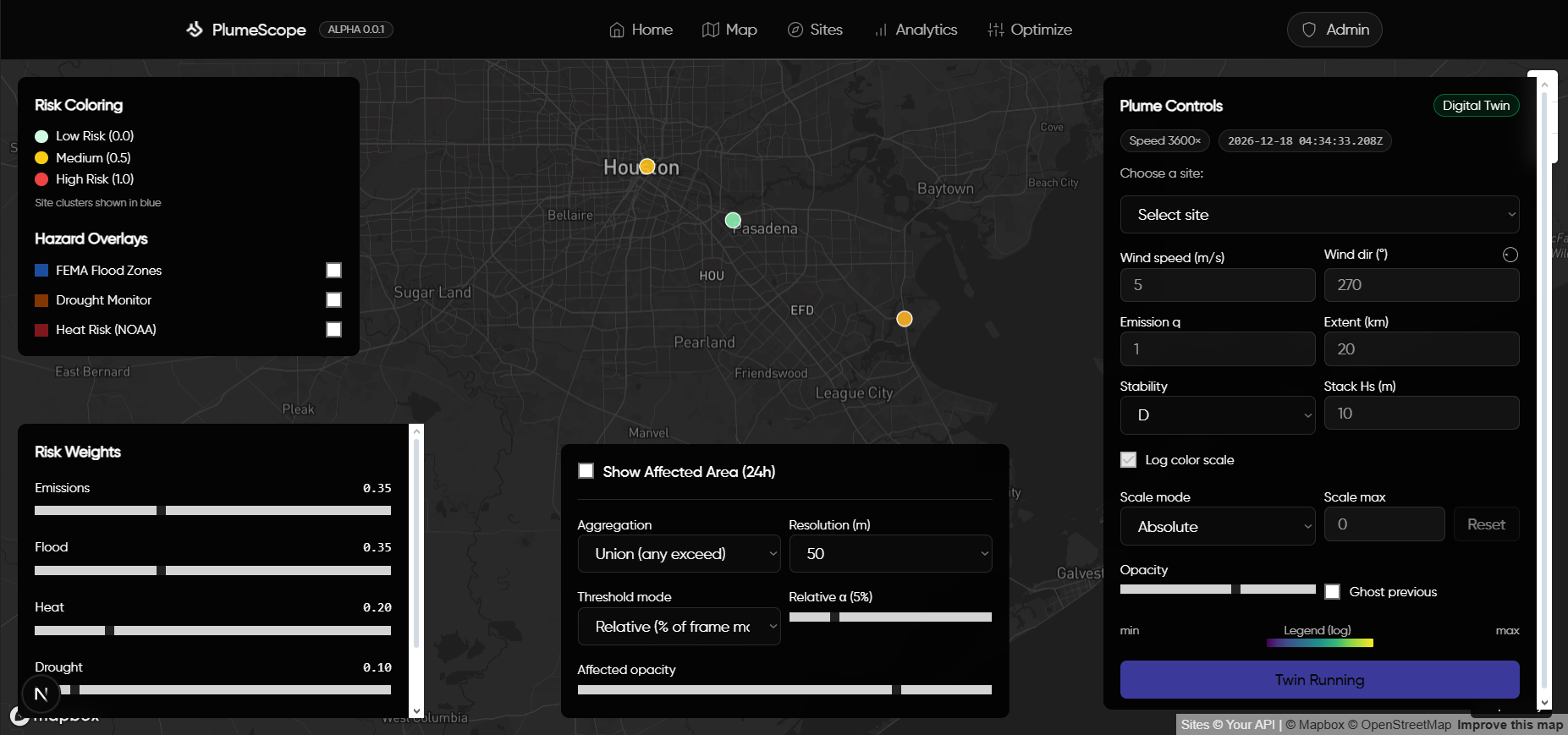
Mapping of Sites and Simulation Control Panel
-
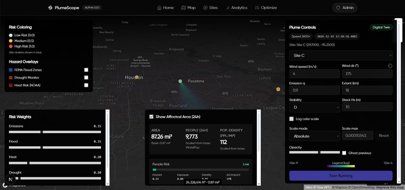
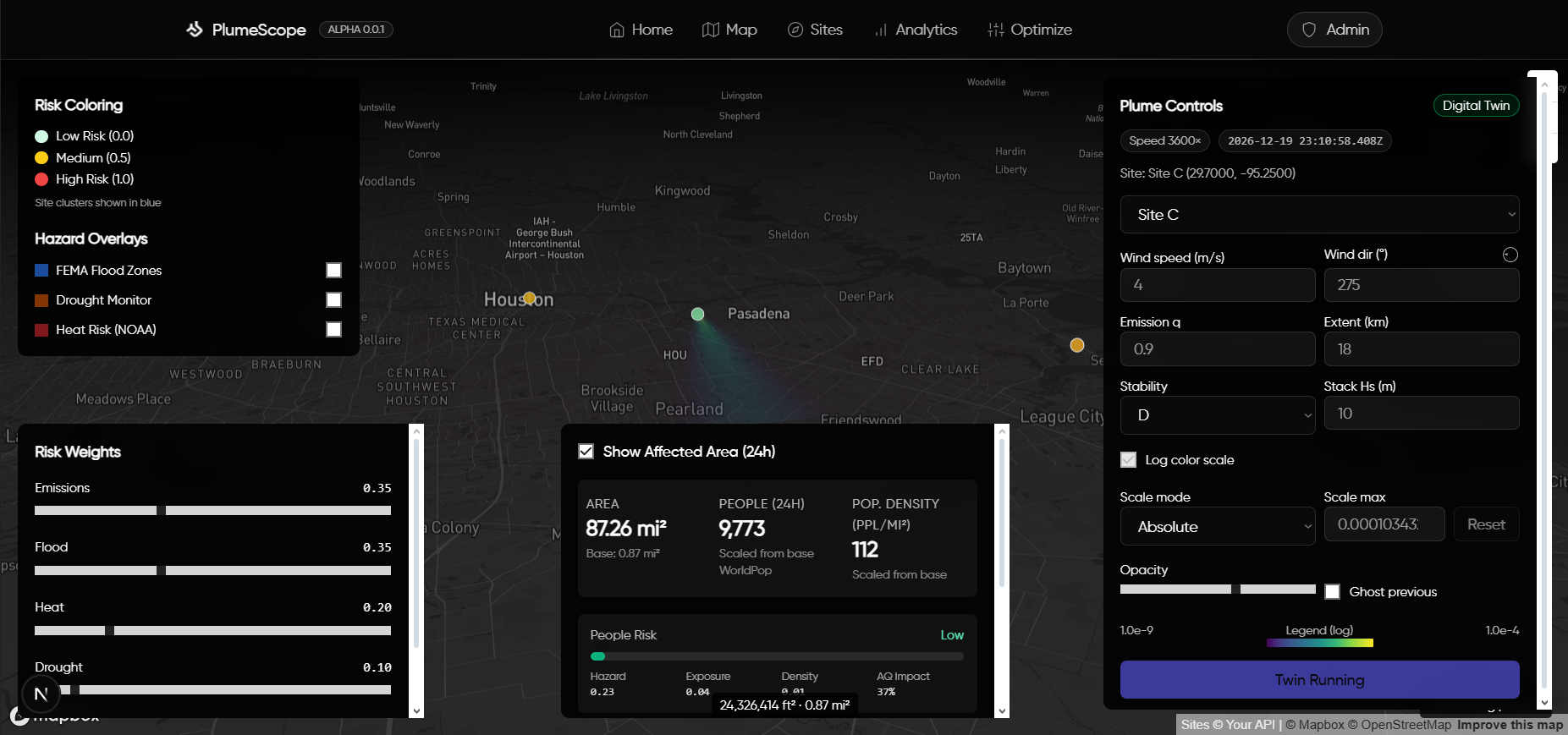
Digital Twin Simulation of Plume Patterns with Area Affected Calculations
-

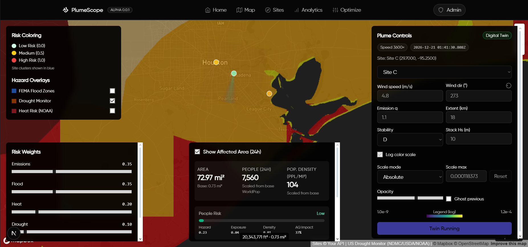
Environmental Factors Map Overlays for Additional Context
-
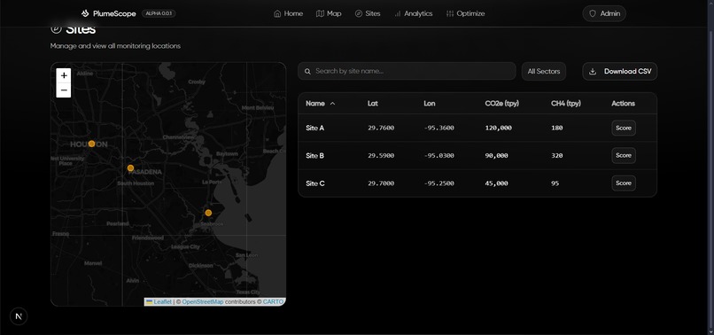
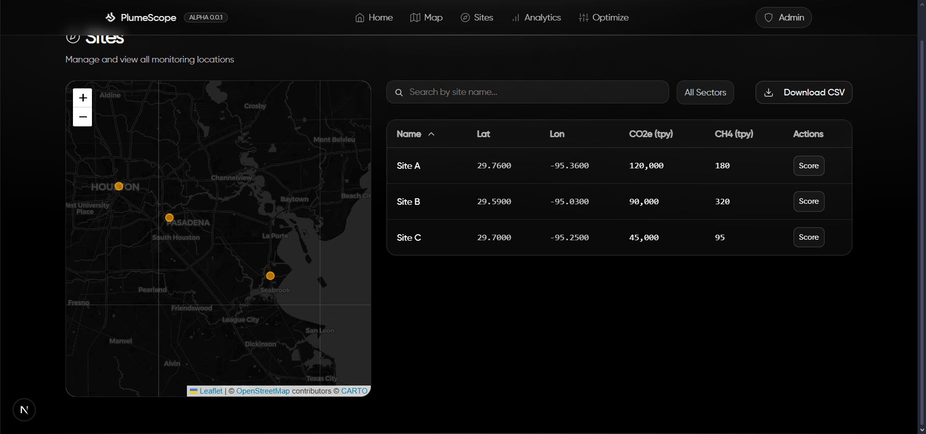
Site Management Page
-

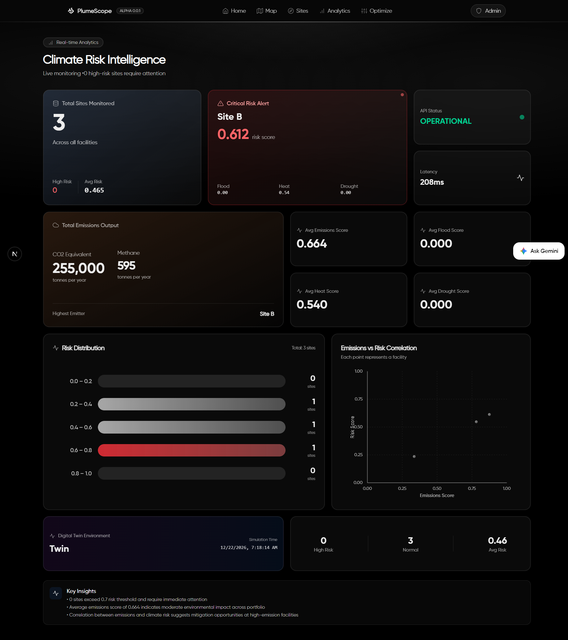
KPI and Analytical Dashboard
-
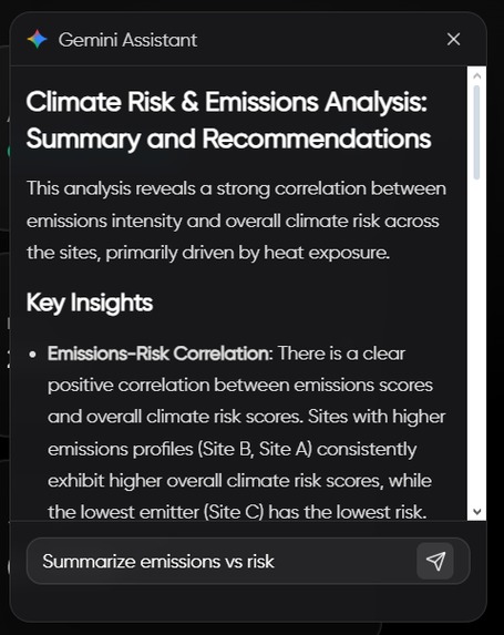
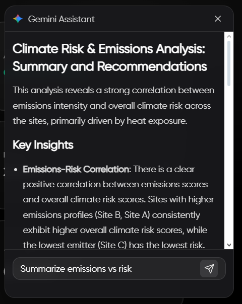
Gemini Powered Assistant to Support in Understanding Analytical Data.
-
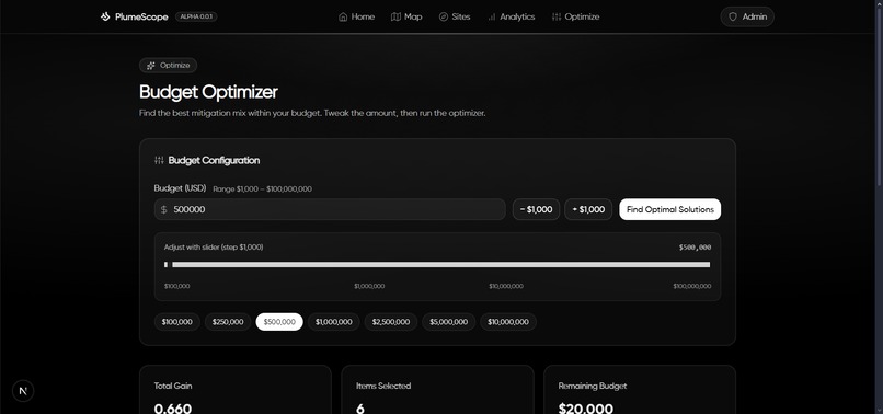
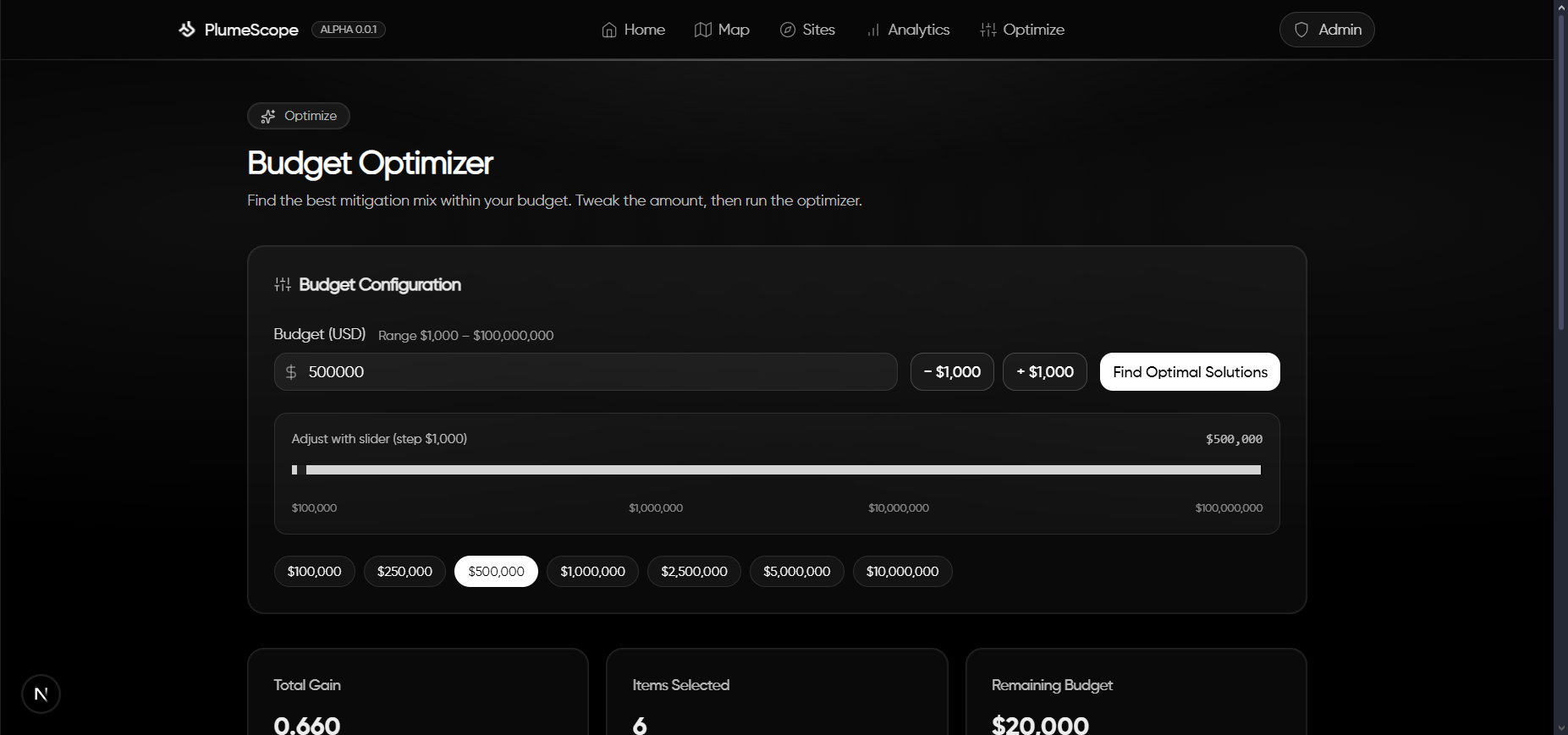
Budget Optimizer Input Controls
-
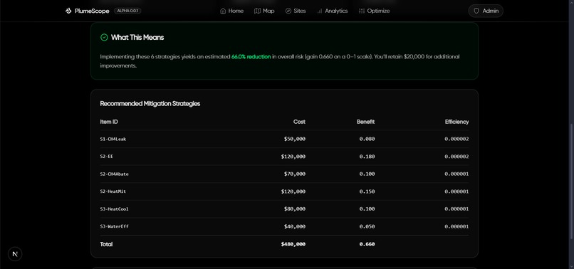
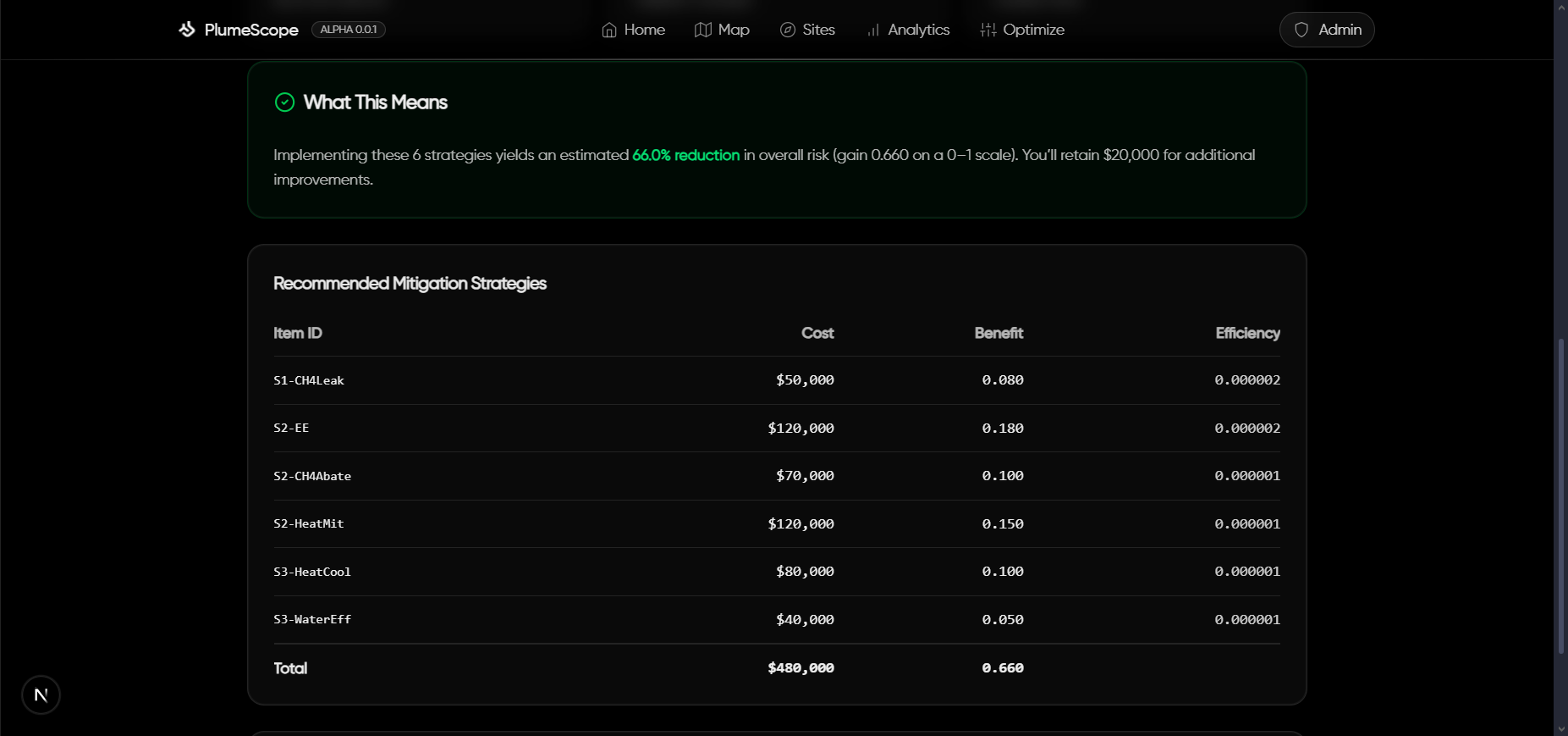
Mitigation Strategy Generation
-
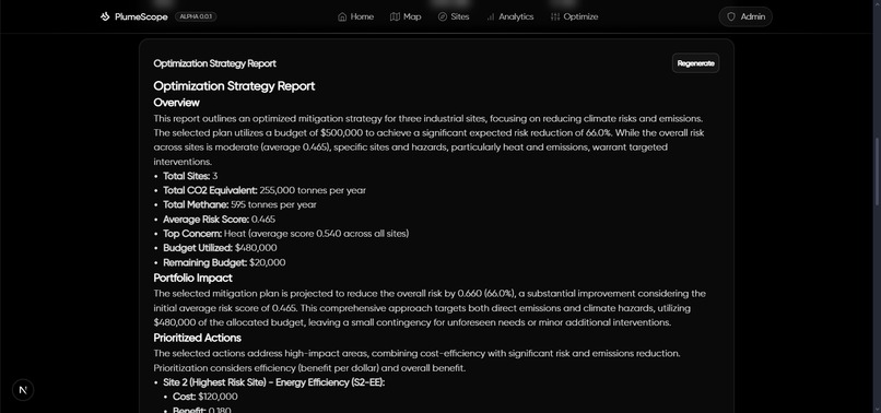
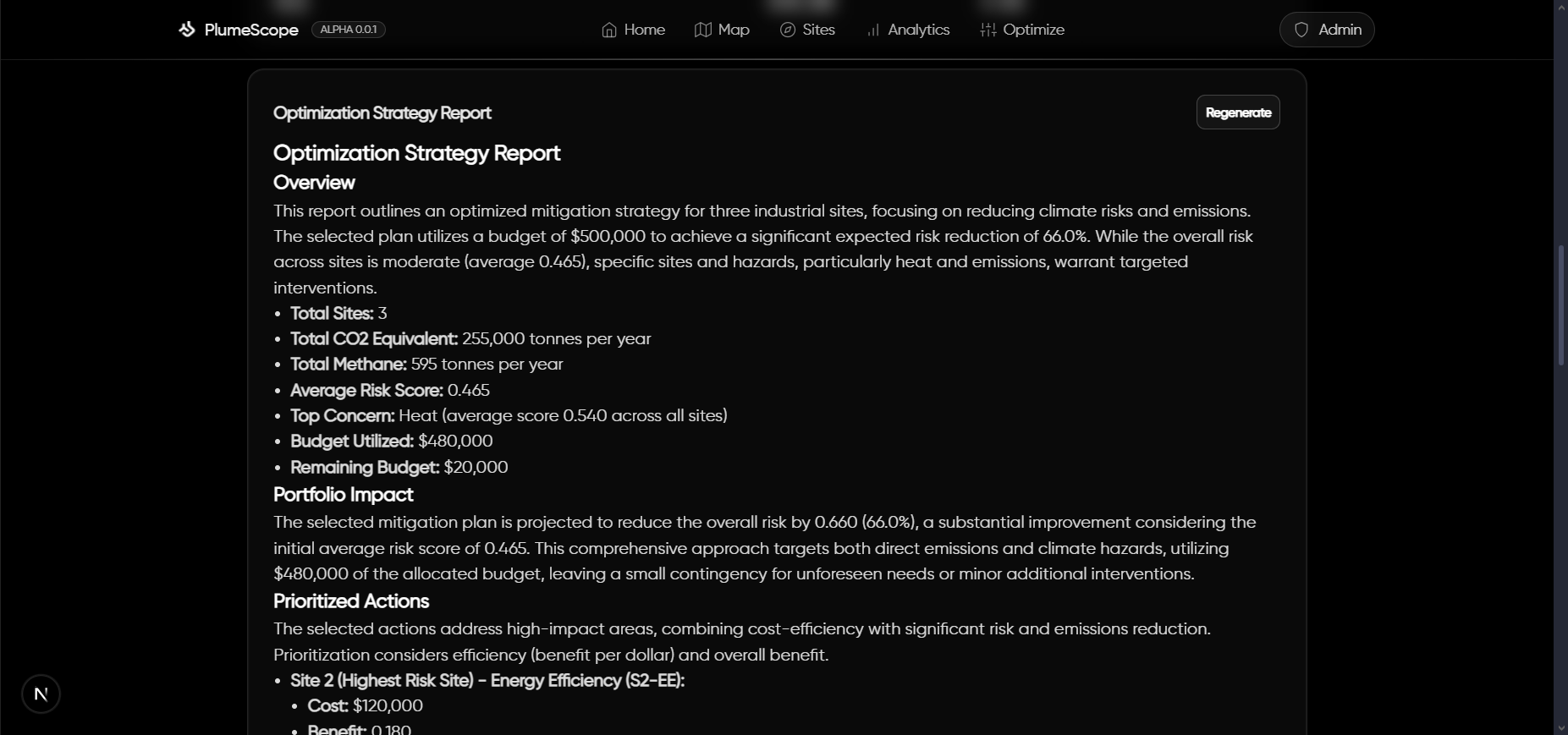
Optimization and Mitigation Strategy Deployment Plan Generation
Inspiration
What it does
An interactive AI-assisted map that helps operators visualize emissions plumes, understand local hazard risk, estimate exposed populations, and optimize mitigation spend for the biggest climate impact per dollar.
🧠 Inspiration
I’ve spent a lot of time thinking about how environmental decisions get made on the ground: not in abstract averages, but at specific sites with near-term trade-offs. Real-world sustainability needs: (1) a fast way to see risk and exposure, (2) a defensible way to prioritize action under a budget, and (3) a way to communicate the “why” clearly. That led me to build PlumeScope as a practical, operator-friendly tool: map, metrics, and optimization all in one place.
🌍 What I built
- Live plume visualization with wind, stack height, stability class, and extent controls, so decision-makers can see how an emission plume evolves over time.
- 24-hour affected-area overlays (union or exposure) derived from hourly plume frames, with area and population exposure estimates for quick impact triage.
- Hazard enrichment at each site: floodplain (FEMA), drought class (USDM), and a heat-risk placeholder fused with emissions into a single Risk score.
- Budget optimizer that picks mitigation items via a 0/1 knapsack to maximize sustainability impact for a given budget (reduce emissions and hazard risk).
- AI-generated visuals inside the Optimization Strategy Report. I use Gemini with a locally hosted Python MCP server to render context-aware charts. Charts are produced headlessly and embedded directly into the report for clarity and reproducibility.
- AI-assisted auto-thresholding for plume polygons: a small “co-pilot” that proposes defensible thresholds given precision/area constraints and recent conditions.
- Analytics & mini-climate panels: KPIs, distributions, scatterplots, plus an anthropogenic heat-flux sandbox to reason about micro-warming at the site scale.
These features help answer: Where is risk high? Who is likely exposed? Which actions buy the most impact per dollar today?
🛠️ How I built it
Architecture. A monorepo with a TypeScript Express API powering scoring, hazard enrichment, plume simulation, population estimation, and optimization; and a Next.js 15 app for map UX, analytics, and AI helpers. The API exposes clean endpoints and streams a lightweight digital twin for rapid “what-if” checks.
Core math. Gaussian plume with ground-level reflection for centerline concentration Dispersion grows with downwind distance and depends on Pasquill–Gifford stability.
24h affected area. I buffer up to 24 hourly frames, apply relative or absolute thresholding per frame, accumulate occupancy/exposure counters on a grid, compute area (m²/mi²), and extract a simplified polygon boundary for mapping.
Population estimate. Given the polygon and area, I call a population stats service (with a conservative fallback) to get exposed population and density. This is useful for prioritization when time matters.
Optimization. The mitigation catalog lists costs and expected deltas across emissions and hazards. I scale benefits with user-set weights and solve a 0/1 knapsack (DP by budget) to recommend a portfolio and note unused budget.
MCP-powered visualization for the report. I run a local Python Model Context Protocol (MCP) tools server to generate charts on demand. Gemini calls these tools with structured arguments; the MCP server renders headless plots and returns base64 image data for inline embedding
AI auto-threshold. A baseline (Otsu in log-space + high percentiles) is fused with a small LLM prompt that must return numbers-in, number-out. I rate-limit by session and require that suggested thresholds satisfy precision and area constraints before adoption.
Stack.
- API: Node.js, Express 5, TypeScript, Zod, Axios, caching & backoff, Server-Sent Events.
- Web: Next.js 15 (App Router), React 19, Tailwind CSS, React Query.
- Maps: mapbox-gl v3 with custom canvas overlays for heatmaps and affected-area masks.
- AI: Gemini for markdown insights and JSON-style threshold proposals (optional env-gate).
📚 What I learned
- Product thinking for sustainability: It’s not enough to plot a plume; people need ranked options under a budget with a clear rationale.
- Operational robustness > theoretical purity: External services can rate-limit or fail; resilient caching, retries, and safe fallbacks keep the tool usable.
- Explainability matters: Constraining AI to validate against physical/operational constraints (precision, area, hysteresis) keeps outputs trustworthy.
- UX for technical concepts: Small feature value probes on the map, exposure coloring, and one-click “Optimize” with notes turning math into action.
🧩 Challenges I faced
- Thresholding without guesswork. Picking a single (C_{\mathrm{thr}}) that is neither too “blobby” nor too brittle is hard. I combined log-space Otsu with percentile candidates and added a precision proxy measuring how tight the polygon is around a plausible corridor, then used AI only as a secondary vote and never the sole decider.
- Polygon quality vs. speed. Extracting a stable, CCW polygon from a live occupancy grid required careful vertex capping and simplification to avoid flicker and self-intersections at interactive frame rates.
- Data reality. FEMA and drought services can be slow or rate-limited; I built in caching, retries, and timeouts with graceful degradation so the UI keeps working.
- Right-sized AI. LLMs are great at proposing structured thresholds/strategies, but they must be fenced by constraints and hysteresis (to avoid jitter) and session caps (to keep costs and latency down).
- Clarity under pressure. As a solo hacker, keeping the scope cohesive, the map, math, AI, optimization meant prioritizing end-to-end reliability over edge features.
♻️ Environmental impact
PlumeScope turns site data into actionable plans: (1) see who and where is most exposed, (2) quantify risk across flood, drought, and heat at each site, and (3) allocate a fixed budget to the highest-impact mitigation items faster than spreadsheets, and easier to explain to stakeholders. This shortens the loop between detection and real emission reductions, especially in complex, distributed asset portfolios.
🧪 Selected formulas
Anthropogenic heat flux (AHF) and micro-warming: These help screen micro-scale warming contributions around facilities and neighborhoods.
🚀 What’s next
- Swap the placeholder heat index for a verified heat-risk dataset and add proximity-to-population into the risk model.
- Expand the mitigation catalog with cost curves and uncertainty bands to support sensitivity analysis.
- Add traceable strategy reports with embedded maps and math snippets for transparent regulatory and community communication.
Built With
- express.js
- gemini
- mapbox
- nextjs
- node.js
- react
- tailwind
- typescript


Log in or sign up for Devpost to join the conversation.