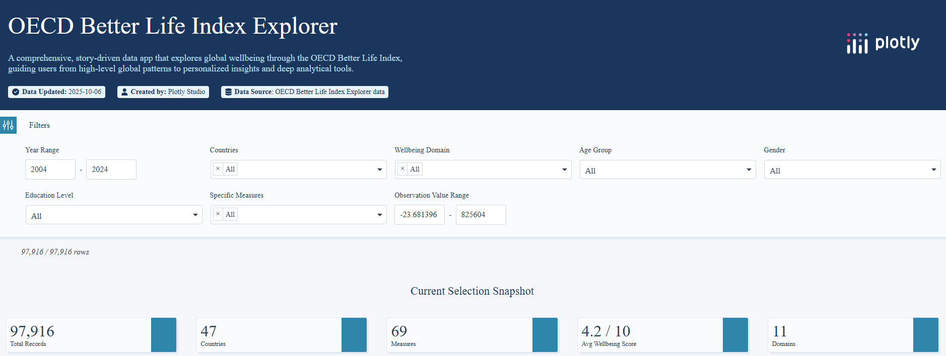
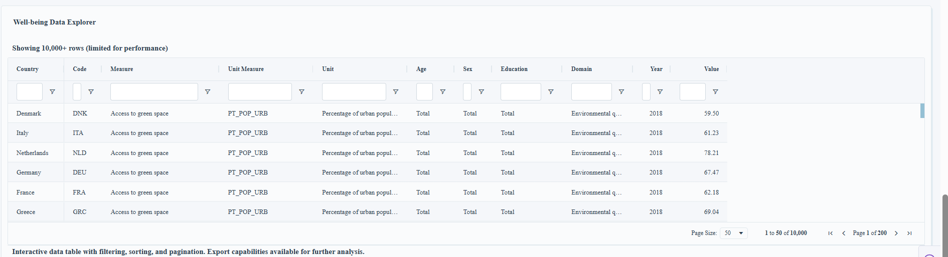
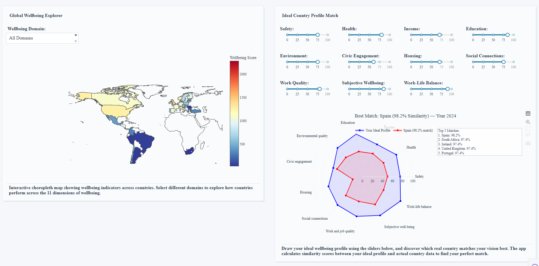
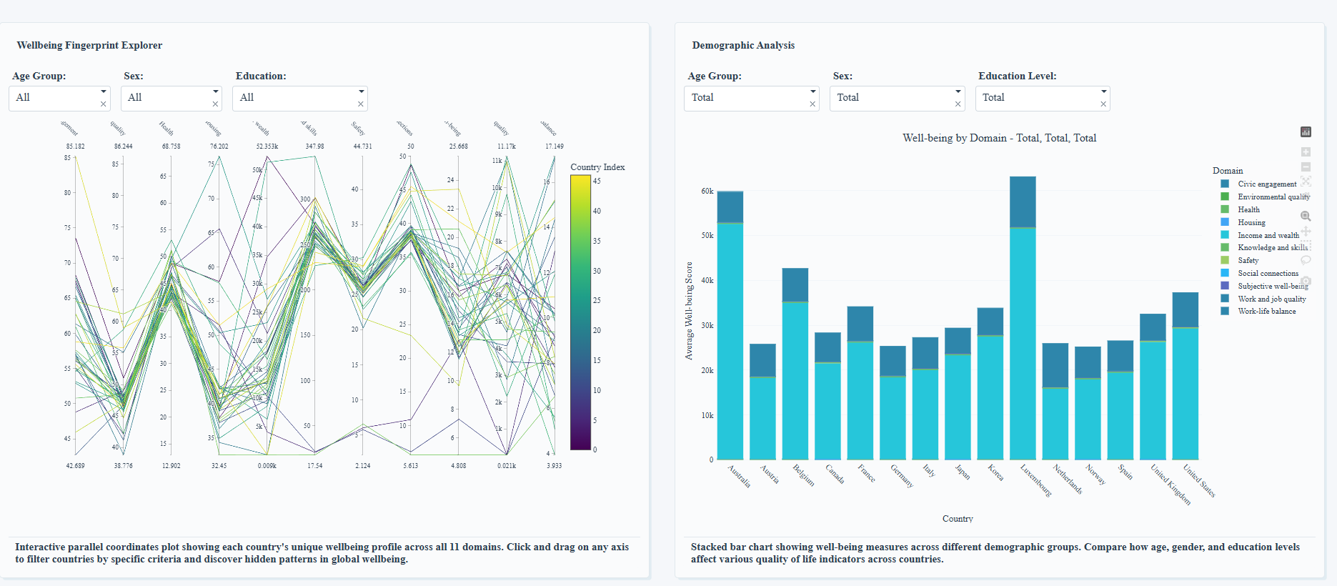
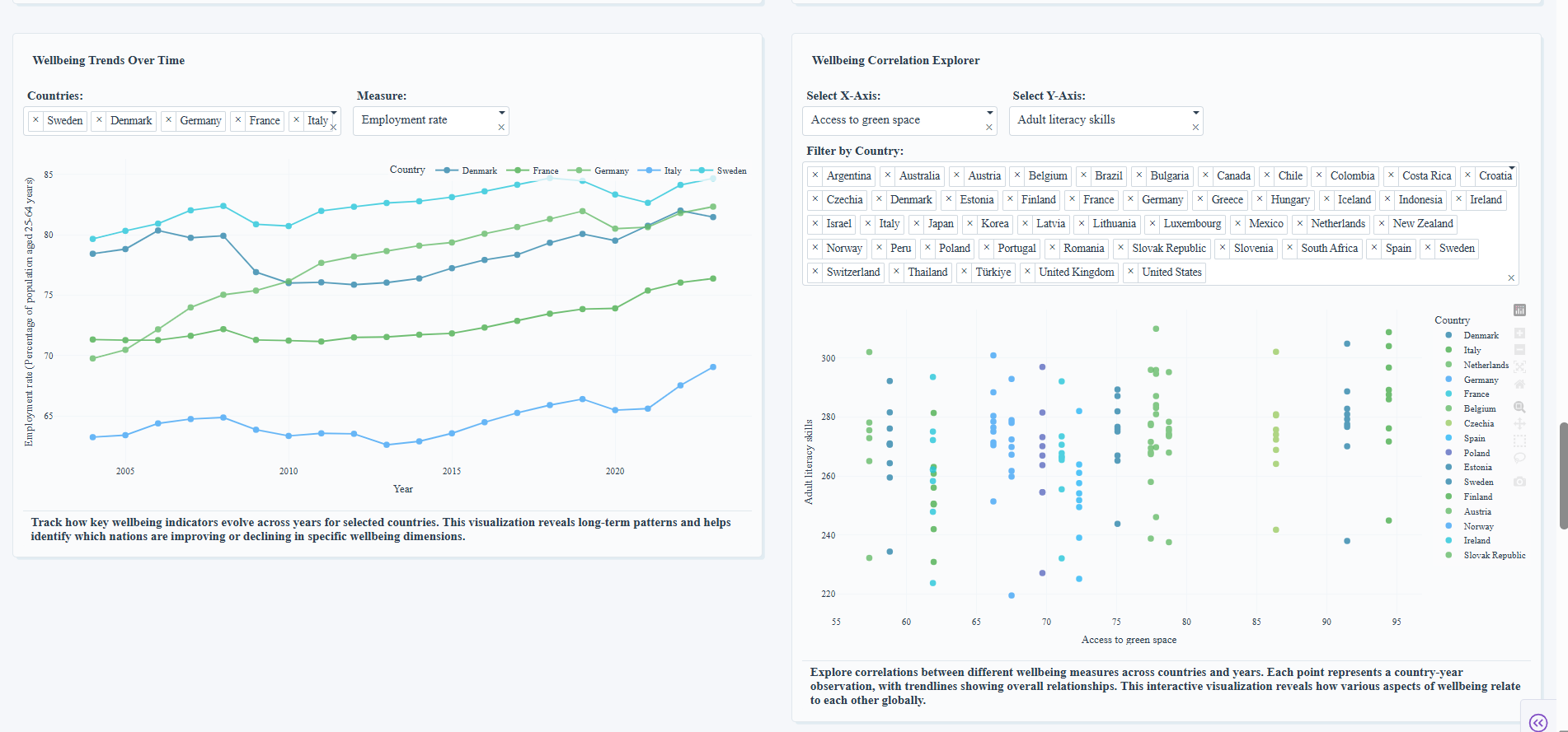
Inspiration

What it does

How we bauilt it

Challenges we ran into

Accomplishments that we're proud of

What we learned

What's next for Ploty_Submission_NJS

This project has so much potential, and I'm excited about where it could go next. Deeper "What-If" Analysis: I want to build a "Build-a-Country" scorecard using a waterfall chart, allowing users to see how a country's rank would change if they could hypothetically improve one of its scores (e.g., "How would the USA's rank change if its 'Safety' score improved by 10%?"). Dynamic Time-Series Animation: I plan to incorporate animated charts, like the 3D trajectory plot or an animated 2D scatter plot, to bring the story of how these countries have evolved over the past decade to life. Go Hyper-Local: The ultimate vision is to expand the app beyond national data. Integrating regional or even city-level wellbeing data would allow for an even more granular and personally relevant exploration, truly helping users find the best place for them to live.

Built With

  • plotlystudio
Share this project:

Updates

posted an update

The Wellbeing Lab — Build, Compare, and Simulate Better Countries with Plotly Studio

Inspiration

I wanted to do something new instead of just showing wellbeing dashboards that stop at “here are the numbers.” I wanted something that helps people decide—not just observe. That’s why I built a tool where anyone can sketch an ideal future, find real-world matches, and run what-if simulations to see what would actually move the needle.

What it does (at a glance)

  • Draw an ideal profile across 11 wellbeing domains and instantly see the Top 5 matching countries.
  • Reveal the strongest drivers of life satisfaction with sign-aware correlations.

- Compare two countries head-to-head and surface the biggest gaps first.

Key Charts I included & why

1) Radar (Polar) Chart — Ideal Country Profile Match
Why: A radar chart makes an 11-dimension “fingerprint” instantly visual. I let users draw their ideal with sliders, then I compute cosine similarity to every country and overlay the best match so you can see the shape match, not just a score.

2) Waterfall Chart — Build-a-Country Scorecard (what-if sandbox)
Why: When you apply ±% changes to domains, the waterfall shows the contribution of each change to the final composite score. It ends with a new total, and I annotate the rank change among peers, which turns simulation into a decision.

3) (Utility) Ranked List + Annotations
Why: After the similarity and correlation steps, I add ranked lists (Top 5 matches, top predictors) and concise annotations so the story is explicit without hunting through tooltips.


Log in or sign up for Devpost to join the conversation.