-
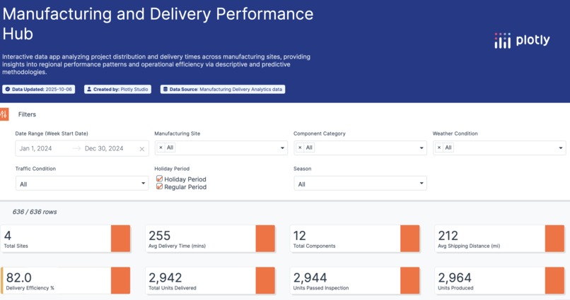
Key Performance Indicators
-
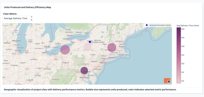
Geospatial Map
-
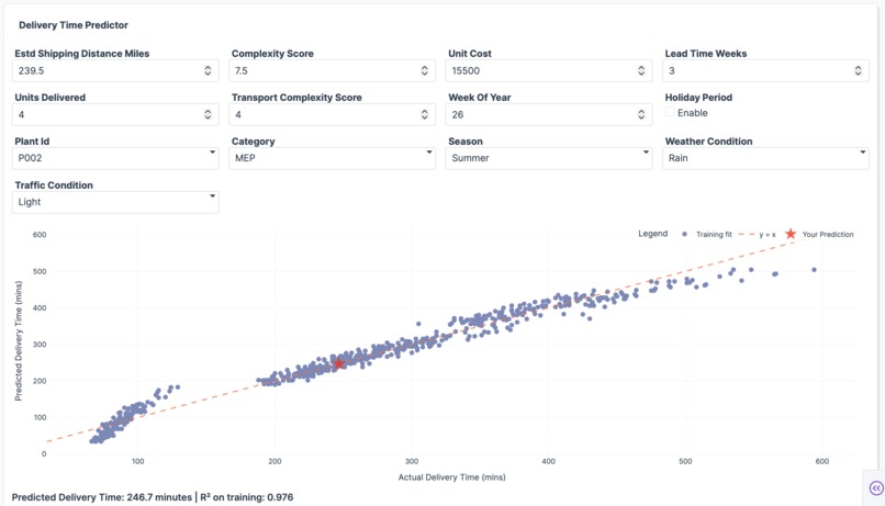
Predictive Model


Inspiration
We were inspired by the need to track production and delivery performance across industries - especially in logistics and construction. In the AEC industry, understanding where materials come from, how long deliveries take, and identifying patterns across projects can significantly improve planning and efficiency.
In general, this problem applies to any industry that involves production and logistics. We also wanted to explore more meaningful and engaging ways to visualize this information - moving beyond standard dashboards like Power BI. That led us to explore the capabilities of coding our own applications, which provided much more flexibility to build custom visualizations and experiment with creative data storytelling ideas.
What it does
Our project enables users to:
- Track production and delivery timelines
- Analyze performance using key indicators
- Predict future delivery trends using historical data and contextual factors (e.g., weather, date, units produced, season, holiday period, etc) It combines data visualization with machine learning to provide both insights and foresight.
How we built it
- We started with a general prompt to guide the structure of the app.
- Iteratively refined each chart and visualization to better align with our use case.
- Defined and added our own KPIs and custom metrics.
- Integrated a machine learning model to make predictions based on our selected features.
Challenges we ran into
- Plotly Studio’s integration with Python was sometimes limiting and inconsistent.
- UI refresh bugs made it difficult to validate updates (e.g., mislabeled filters).
- Error messages lacked clarity, making debugging more difficult.
- We were limited to one dataset per project, which restricted the ability to use more complex and informative data.
Accomplishments that we're proud of
- Successfully implemented a variety of Plotly visualizations, including:
- 3D maps
- Time series charts
- Predictive modeling outputs
- Built an interactive prototype rapidly - what previously took hours in Power BI was done in minutes.
- Fostered innovation and teamwork through a fast, iterative development process.
What we learned
- Creative visualization matters - LLM-generated prompts helped spark ideas we hadn't considered.
- Charting is more flexible when you’re not dependent on third-party tools - you can build exactly what you need.
- Good documentation is crucial. Defining chart specs clearly helped us translate ideas into functioning code.
- There's a balance between prompting and coding - sometimes it's faster to tweak code directly.
- You still need to understand the underlying codebase to debug and maintain quality.
What's next for STV DA Plotly Vibe-a-Thon Oct 2025
- Expand from descriptive analytics into predictive and prescriptive analytics.
- Continue improving the accuracy and flexibility of our models.
- Explore more real-time and interactive visualizations to better support decision-making.


Log in or sign up for Devpost to join the conversation.