-
Power BI Deck (Filters)
-

Power BI Deck

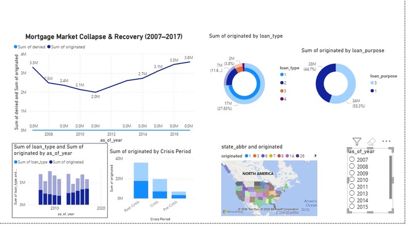
We were inspired by one core question: when the housing market broke, what actually changed afterward? Rather than treating the crisis as a single collapse, we wanted to show how it reshaped lending behavior for years through borrower choices, lender risk appetite, and uneven regional recovery.To build the project, we processed massive HMDA files from 2007–2017 using Python, filtering and aggregating the data into visualization-ready summaries. We then used Tableau to create an interactive dashboard highlighting five key narratives: the crash and recovery in mortgage originations, the shift from home purchases to refinancing, the growing role of government-backed loans, the dominance of major states in mortgage activity, and how state lending ranks changed over time.
Our biggest challenge was scale. The raw files were too large to load directly, so we had to engineer a lightweight preprocessing workflow under tight time constraints.What we learned was powerful: recovery was not just slow, it was structurally uneven. This project turns that complexity into a story decision-makers can see instantly.
Built With
- powerbi
- tableau

Log in or sign up for Devpost to join the conversation.