About the Project
What Inspired Me
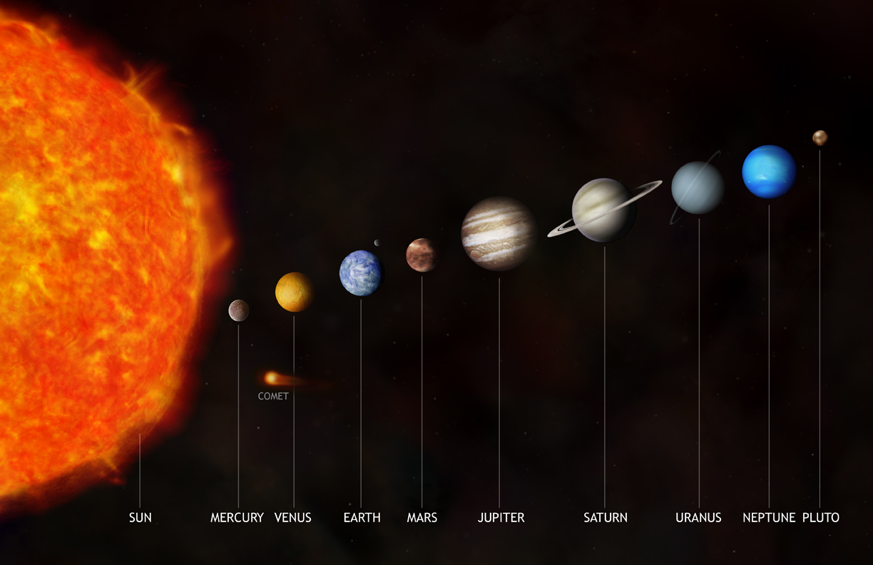
I've always been fascinated by space and the planets in our solar system. As a kid, I used to stare up at the night sky and wonder what those tiny dots of light really were. When I started learning web development, I knew I wanted to create something that combined my love for astronomy with my new coding skills. That's how this project was born - a simple but informative website about the planets that anyone could explore.
What I Learned
This project taught me so much about web design and CSS layouts. Before starting, I only knew basic HTML, but I wanted to make something that looked professional and modern. I learned:
- Flexbox layouts - Getting the planet cards to align properly was tricky at first, but once I understood how
flex-wrapandjustify-contentworked, everything clicked - CSS Grid - The types of planets page uses grid layout, which was completely new to me. Learning how to use
grid-template-columnsandgapmade the page look so much cleaner - Animations - Adding the fade-in effect made the pages feel more dynamic and engaging
- Gradients - I experimented with different gradient backgrounds to give each page its own unique atmosphere
How I Built It
I started by sketching out what I wanted on paper - two pages, one listing all the planets and another explaining the different types. Then I dove into the code:
- First, I created the basic HTML structure with semantic tags
- Next, I added the CSS styling, starting with simple colors and then adding gradients and animations
- I used NASA's website for the images since they're high-quality and publicly available
- I added navigation bars so users could easily move between pages
- Finally, I tested everything to make sure the layouts worked on different screen sizes
The hardest part was getting the CSS right. I had so many unclosed div tags at first that broke the entire layout! Debugging HTML structure taught me to be really careful with opening and closing tags.
Challenges I Faced
The Floating Image Problem: I wanted images to float alongside the text, but they kept breaking the layout. I learned that you need to clear floats properly or they mess up everything below them.
Flexbox vs Grid Confusion: At first, I tried to use flexbox for everything. But when I needed the three-column layout on the space page, grid made way more sense. Understanding when to use each layout method was a big learning moment.
Color Schemes: Choosing colors that looked good together was harder than I expected. The planet page needed a dark, space-like feel, while the types page needed something lighter and more educational. I went through probably 10 different gradient combinations before settling on these.
Responsive Design: Making sure the site looked good on phones and tablets required adding flex-wrap and adjusting the grid columns. I'm still learning about media queries to make it even better.
What's Next
I want to add more interactivity - maybe clickable planet cards that show more detailed information. I'm also thinking about adding a quiz section where people can test their knowledge about the solar system. There's still so much to learn, but this project gave me the confidence to keep building!
Built With
- css
- stylecss


Log in or sign up for Devpost to join the conversation.