-
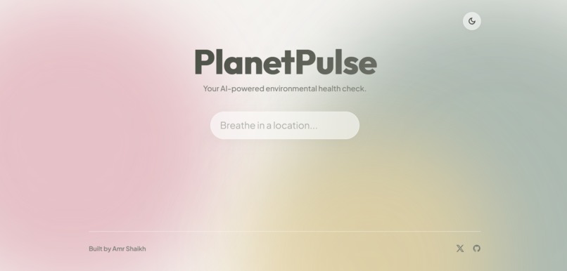
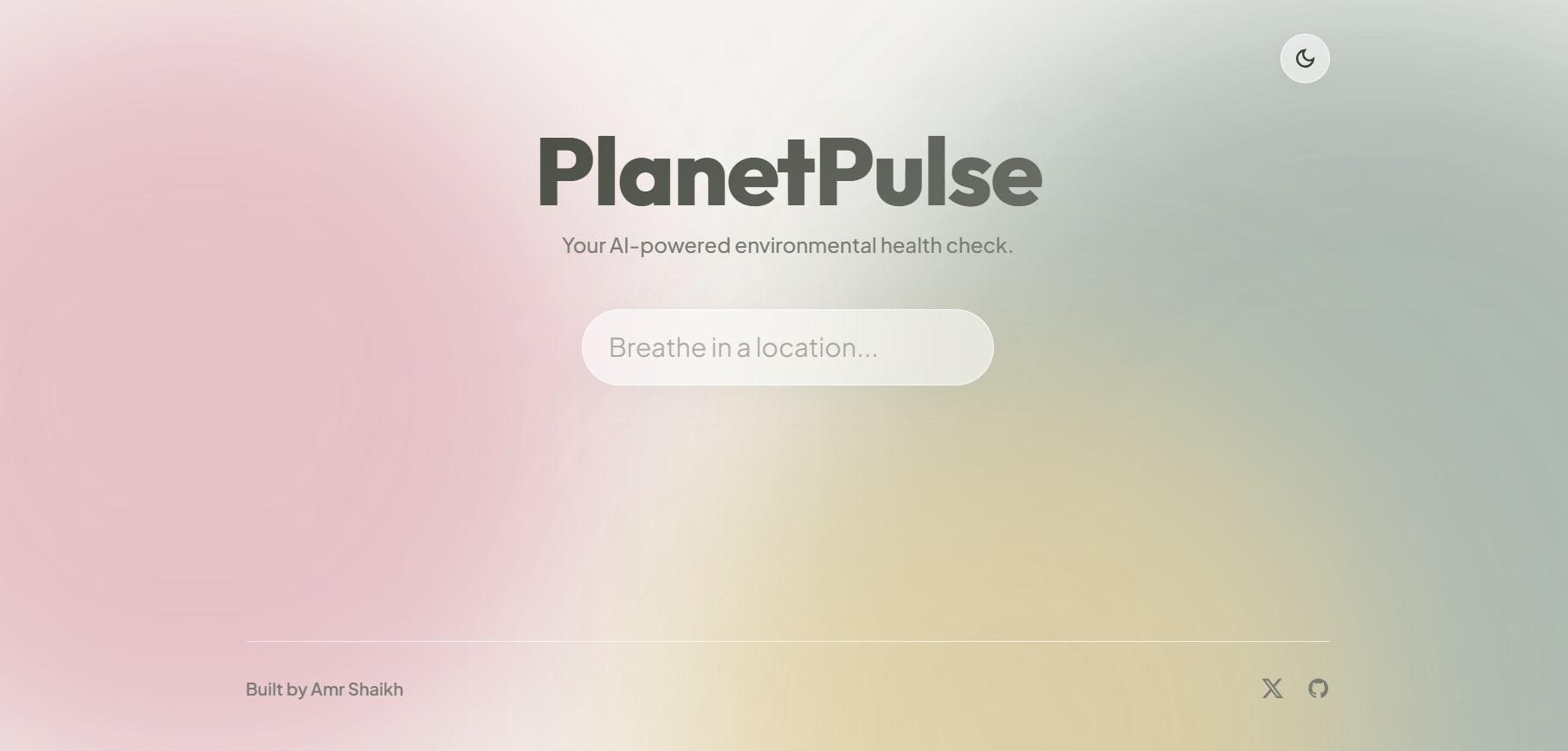
main screen
-
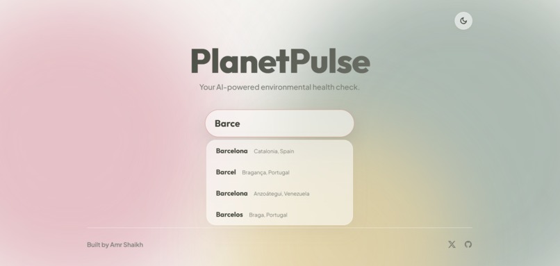
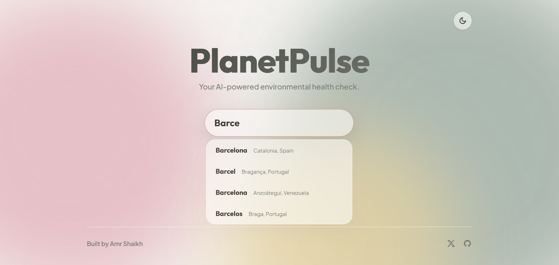
search bar
-
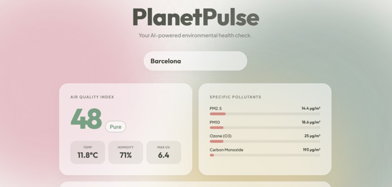
results
-
suggestions
-
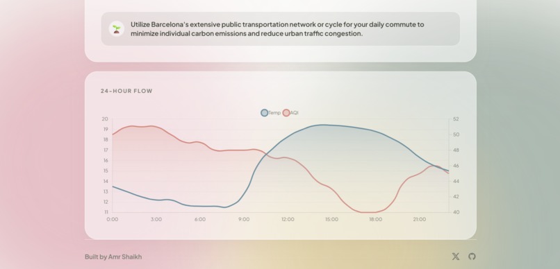
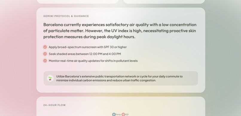
flow chart
Inspiration
I noticed that air quality and environmental data are usually presented as overwhelming charts, raw numbers, or alarming red warnings. For people with respiratory sensitivities, outdoor athletes, or climate-conscious individuals, checking the environment often induces anxiety rather than promoting mindful action. I wanted to build a way to make environmental telemetry calming, actionable, and easy to understand.
What it does
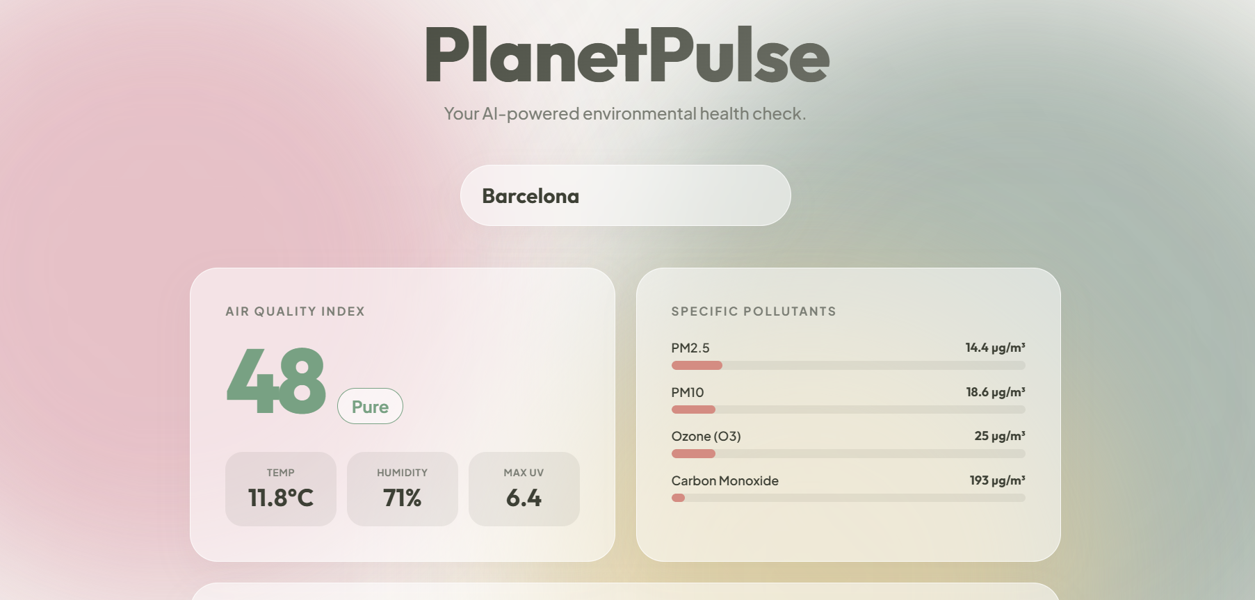
PlanetPulse is an organic telemetry system. When users search for any global location, the app instantly retrieves real-time weather, AQI, and specific pollutant data (PM2.5, PM10, Ozone, CO).
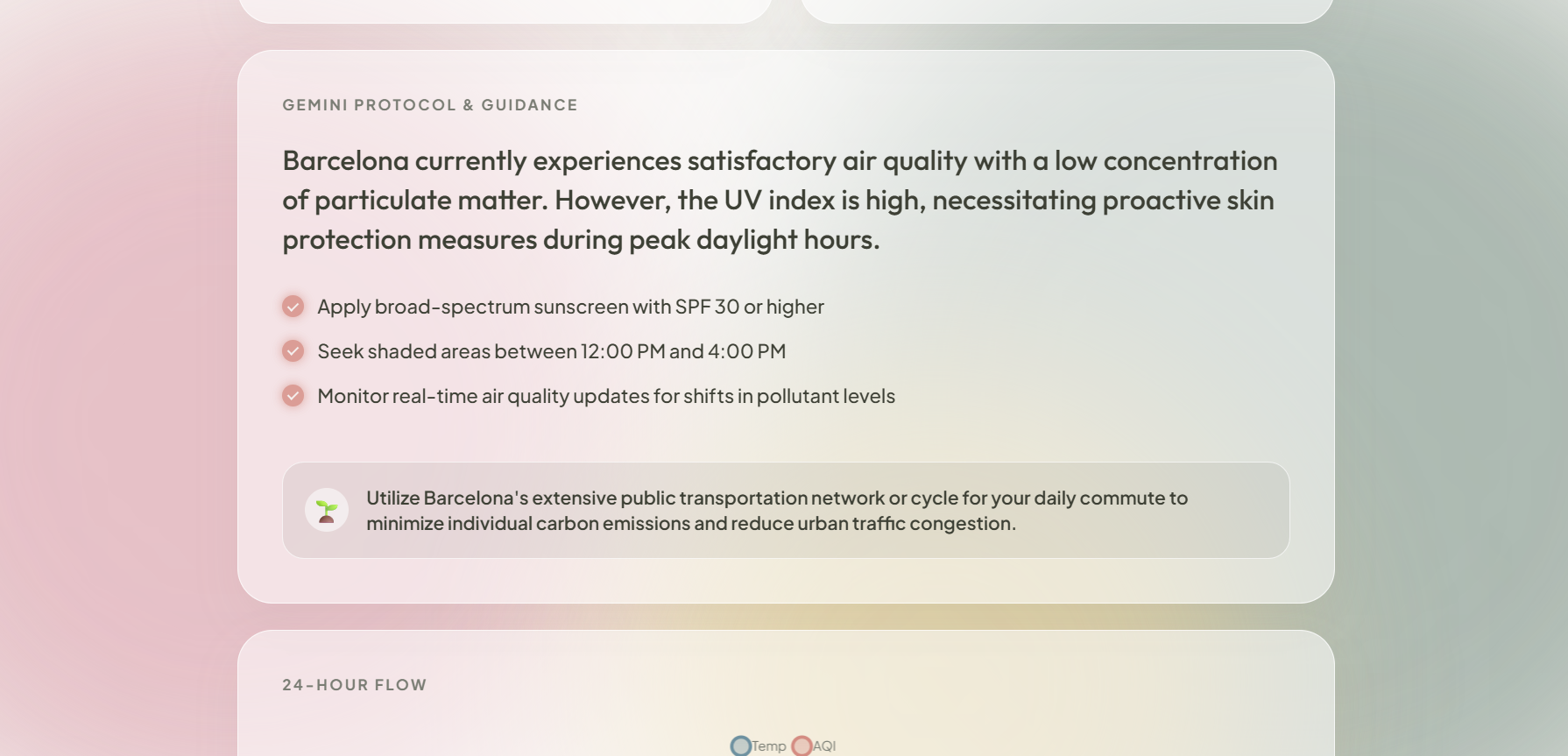
Instead of just showing raw numbers, I feed this data into a custom Gemini AI Protocol. Gemini analyzes the exact atmospheric makeup and outputs:
An objective synopsis of the air quality.
A strict, actionable health checklist (e.g., "Wear an N95 mask," "Avoid intense cardio").
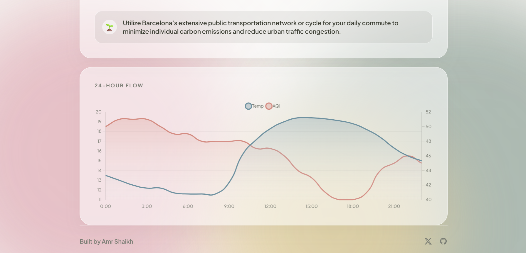
A targeted "Eco-Advice" tip to help the user reduce their carbon footprint that day.
I wrapped all of this in a custom "Organic Glass" UI, a glassmorphism-based interface featuring fluid, animated background orbs and a calming "Dawn/Dusk" theme toggle, transforming raw data into a mindful experience.
How I built it
Frontend: I built a completely custom, responsive Vanilla HTML/CSS/JS interface. I avoided generic CSS frameworks to achieve a highly specific "Organic Glass" aesthetic, utilizing heavy backdrop-filter blurs, CSS animations, and modern typography (Syne and Plus Jakarta Sans).
Data Visualization: I integrated Chart.js with custom bezier curves (tension: 0.5) and canvas gradients to create liquid-like 24-hour trend graphs for Temperature and AQI.
Backend / APIs: I deployed Node.js Serverless Functions via Netlify. The backend acts as the central nervous system (tying into the Octoverse theme). It reaches out with multiple "tentacles" to fetch geocoding, weather, and pollutant data from Open-Meteo, and then feeds that array of data into the Google Gemini API. I strictly prompted Gemini to return its analysis in a clean JSON structure so it could be predictably rendered in the UI.
Challenges I ran into
One of my biggest hurdles was getting Gemini to consistently output data that fit the UI. If it wrote a paragraph instead of a list, it broke the design. I solved this by using responseMimeType: "application/json" in the API call, mathematically forcing the AI to return a strict JSON object containing the exact synopsis, checklist array, and eco-advice string I needed.
Accomplishments that I'm proud of
I am incredibly proud of the UI/UX. I'm also really proud of successfully chaining multiple APIs (Geocoding -> Weather -> Air Quality -> Gemini AI) in a single, fast serverless function.
What I learned
I learned a massive amount about strict prompt engineering—specifically how to force an LLM to act as a reliable, structured data formatter rather than just a chatbot. I also deepened my understanding of advanced CSS properties to create performant glassmorphism and fluid animations without relying on heavy frontend frameworks like React.
What's next for PlanetPulse
I want to add a localized pollen API to track specific allergens (Birch, Grass, Ragweed) and implement a Web Speech API feature so users can click a button and have the AI softly read the environmental protocol out loud to them before they leave the house.

Log in or sign up for Devpost to join the conversation.