-
-
Plan2Ship
Project Story — Plan2Ship
Information for your public project page.
Inspiration
Product managers and founders often start with a PDF: a PRD, a pitch deck, or a feature brief. Turning that document into a full product plan—strategy, requirements, market research, prototypes, and go-to-market—usually means jumping between tools, templates, and spreadsheets. We wanted a single place where you upload once and get a structured, AI-guided journey from idea to ship.
We were inspired by stage-gate processes used in real product teams, but designed for speed: each stage has a clear scope and output format, so the AI stays focused and the artifacts are immediately usable. Plan2Ship is that pipeline in an app—Plan 2 Ship.
What it does
Plan2Ship is an AI-powered product lifecycle assistant. You upload a product document (PDF), and the app runs it through five stages:
Strategy & Ideation — Problem statement, idea clusters, solution concepts, light market sizing (TAM/SAM/SOM), scenario planning, and success metrics. You get a strategy snapshot, brainstorm more ideas, and see charts (market sizing, customer segments, scenarios) when Python metrics are enabled.
Requirements & Development — Epics, user stories, acceptance criteria in Gherkin, and backlog grooming (MVP vs Later, priority, effort). Output is tables and lists you can drop into Jira or Notion.
Customer & Market Research — Synthetic feedback themes, competitor comparison, industry trends, and actionable insights (opportunities, risks, next research steps). Again, with charts where applicable.
Prototyping & Testing — User flows, text wireframes (screens, components, microcopy), usability test script, test cases, and iteration (feedback → design changes). Wireframe images can be generated via AI for key screens.
Go-to-Market Execution — Personas, messaging (positioning, benefits, proof points, taglines), GTM plan (goals, channels, rollout, risks), release notes (customer + internal), stakeholder comms (execs, engineering, support), and Week 1 / Month 1 metrics.
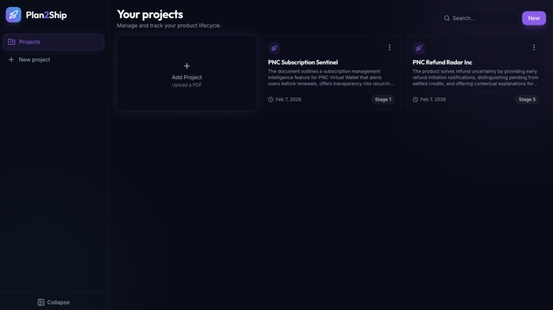
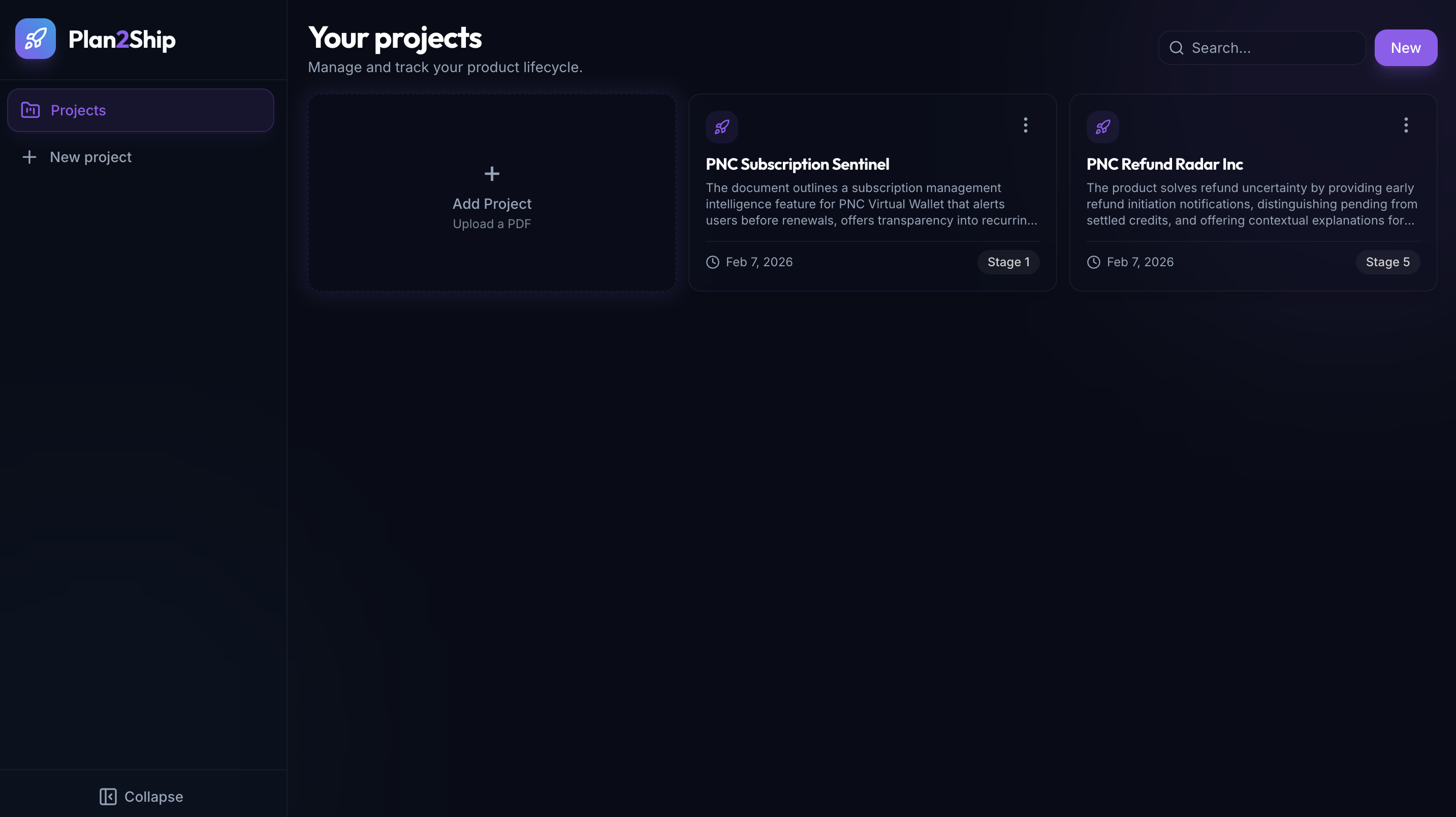
The UI is a dark-themed dashboard: project list, search, and per-project detail with tabbed stages. Each stage’s output is shown in readable blocks (not raw JSON): market sizing and GTM plan as labeled cards, tables for user stories and feedback themes, and expandable sections with icons. Charts and wireframe images are clickable to open in a lightbox. You can edit the project title and Stage 1 analysis, brainstorm more ideas, and regenerate later stages as you refine the doc.
How we built it
Backend (Node.js + Express + TypeScript)
- PDF upload and parsing (text extraction).
- Azure OpenAI for all analysis: we use a single GPT deployment with stage-specific system prompts (from
plan_readme-style specs). Each stage returns structured JSON that we validate and store. - Project and chart storage on the local filesystem (
server/data/projects/,server/uploads/). - Optional Python (matplotlib + seaborn) for metrics charts per stage; the Node server spawns Python scripts and saves PNGs, then references them in the project payload.
- PDF upload and parsing (text extraction).
Frontend (React 18 + TypeScript + Vite + Tailwind)
- Single-page app: Home (project list + search + “New”), Create (upload PDF), Project Detail (hero, stage tabs, one stage visible at a time).
- Framer Motion for page and card animations, stage transitions, and collapsible sections.
- Shared content blocks:
ContentSection,InsightCard,ListBlock,KeyValueCard,MarketSizingBlock,GTMPlanBlock,AccentCard, etc., so strategy/GTM/market sizing render as readable cards and lists instead of JSON. - WebGL (Three.js) background on the project detail page; toasts for delete; lightbox for charts and wireframe images; collapsible sidebar.
- Single-page app: Home (project list + search + “New”), Create (upload PDF), Project Detail (hero, stage tabs, one stage visible at a time).
AI design
- Prompts are scoped per stage (e.g. “ONLY strategy and ideation”, “ONLY user stories and AC”) to avoid scope creep. Output format is strict (tables, lists, sections) so we can parse and display consistently. Assumptions and synthetic data are called out in the prompts.
Challenges we ran into
Keeping the model on format — Sometimes the model returned extra sections or slightly different keys. We added clear “OUTPUT FORMAT (STRICT)” in prompts and lightweight parsing/fallbacks (e.g. optional fields, default strings) so the UI doesn’t break when a field is missing or named differently.
Storing and serving binary assets — PDFs, chart PNGs, and wireframe images are stored under the server; we had to design routes and URLs so the client can load images by project ID and filename without exposing the full filesystem. We also made the image lightbox respect viewport height so the close button and image stay visible.
Making dense outputs readable — Raw JSON for market sizing and GTM plan was hard to scan. We introduced dedicated components (
MarketSizingBlock,GTMPlanBlock) that turn key-value and list structures into labeled cards and bullets, and we humanize camelCase keys (e.g.highFrequencyShoppers→ “High frequency shoppers”) for section titles.Chart generation across runtimes — Charts are generated by Python while the main app is Node. We had to get the paths, env, and script invocation right so the server can call Python, read the generated PNGs, and attach filenames to the project JSON so the frontend can request them via the API.
Accomplishments that we're proud of
End-to-end pipeline — One PDF in, five stages out, with a clear mental model (strategy → requirements → research → prototyping → GTM) and no stage doing another stage’s job.
Readable, scannable UI — Strategy and GTM no longer look like config dumps. Sections have icons, cards have accents, tables have gradient headers and row hovers, and important bits (e.g. positioning statement, launch goals) are highlighted.
Optional Python metrics — Product managers get real charts (market sizing, segments, scenarios, backlog priority/effort, feedback themes, personas) without leaving the app; if Python isn’t installed, the app still works and just omits charts.
Consistent structure — The
plan_readmeand stage prompts act as a single source of truth for what each stage produces, so the backend and frontend stay aligned on fields and formats.
What we learned
Scoping prompts per stage dramatically improves consistency and makes it easier to evolve one stage without breaking others. “Do ONLY this; do NOT do that” in the system prompt is more reliable than one giant prompt for everything.
Structured output (JSON) plus display components gives the best of both worlds: the backend stays simple and the frontend can render the same data in a human-friendly way (cards, tables, bullets) instead of showing raw JSON.
Progressive enhancement works well: the app is fully usable without Python (no charts), without wireframe image generation, and with minimal env (just Azure OpenAI). Optional features can be toggled or detected and the UI adapts.
What's next for Plan2Ship
Export — Export a stage (or full project) to Markdown, PDF, or a Notion/Confluence-friendly format so teams can paste results into their existing docs.
Templates and presets — Predefined “project types” (e.g. B2B SaaS, consumer app, internal tool) that adjust stage prompts and default options (platform, timeline, regions) for faster first drafts.
Collaboration — Comments or annotations on sections, simple versioning (e.g. “before/after” for a stage re-run), and optional sharing via link (read-only public project page) so stakeholders can view the story without editing.
Richer Stage 4 — More wireframe screens, link flows between screens, and optional usability test result logging (pass/fail per test case) to close the loop from “test cases” to “what we changed.”
Built With
- azure
- css
- express.js
- framer
- node.js
- openai
- python
- react
- tailwind
- three.js
- typescript
- vite


Log in or sign up for Devpost to join the conversation.