-
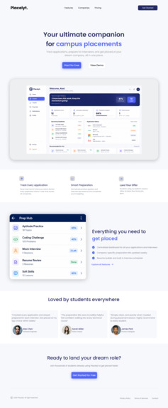
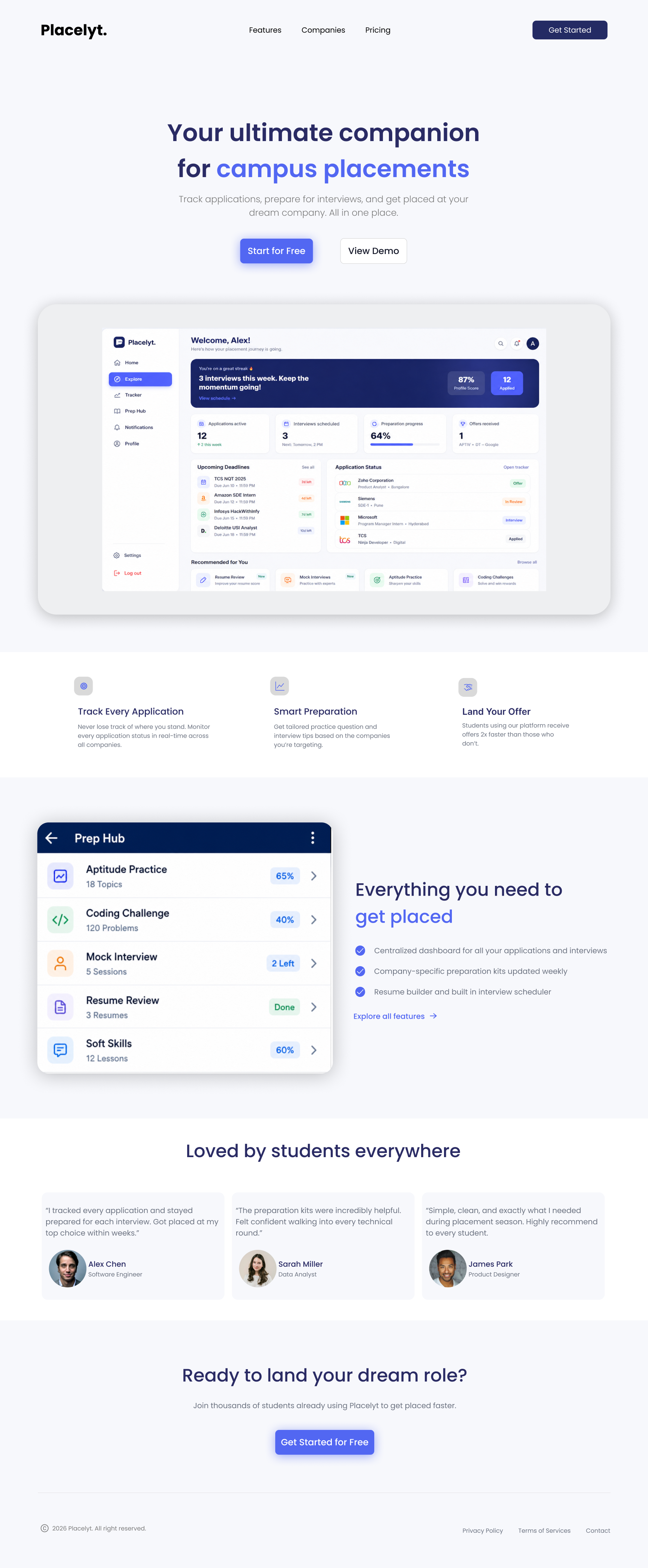
Landing page
-
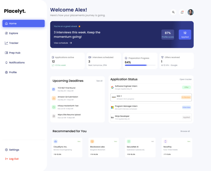
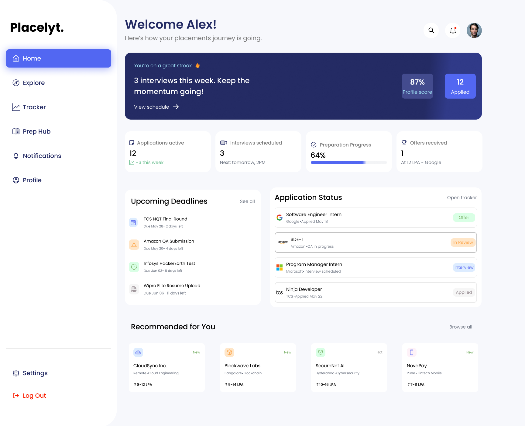
student dashboard
-
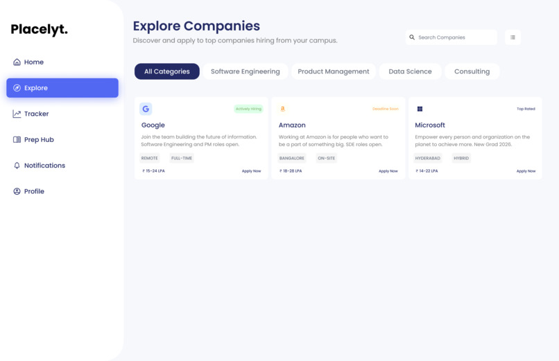
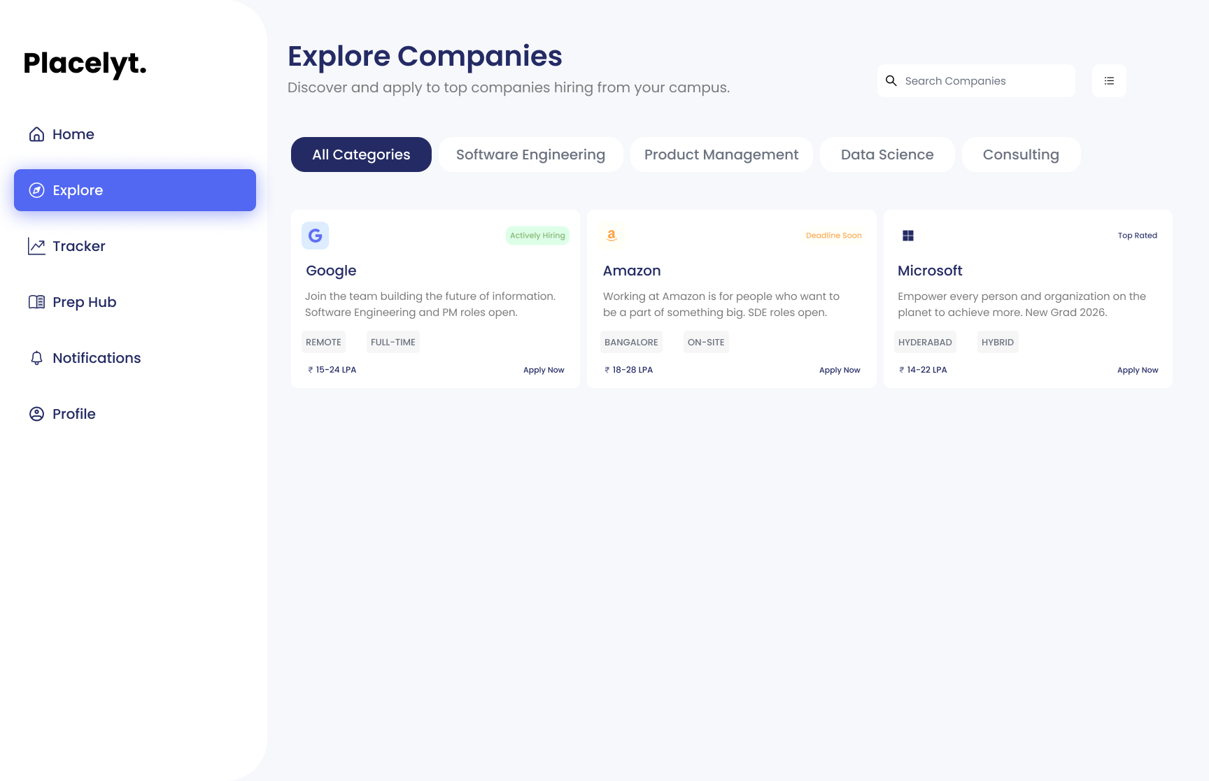
Explore Companies
-
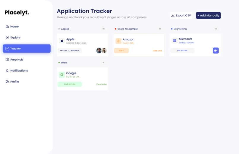
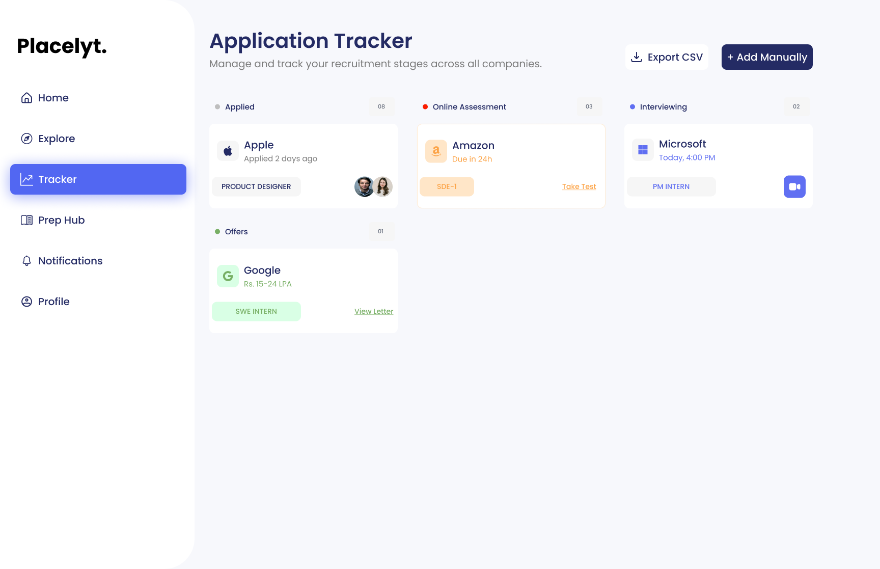
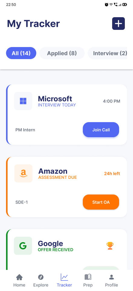
Application Tracker
-

Mobile Screen 01
-
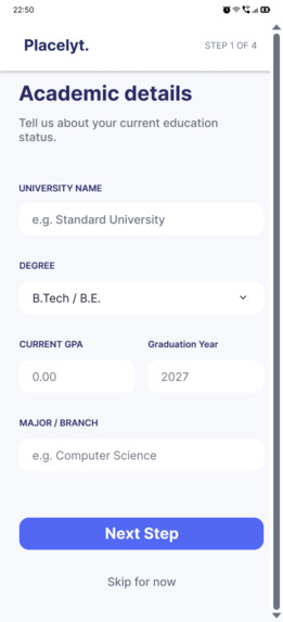
Mobile Screen 02
-
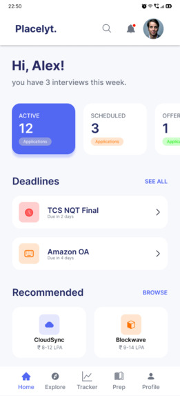
Mobile Screen 03
-
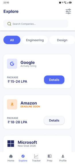
Mobile Screen 04
-
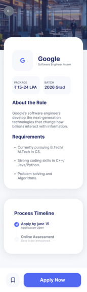
Mobile Screen 05
-
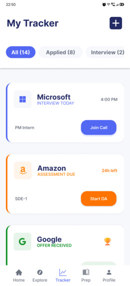
Mobile Screen 06
-
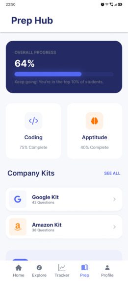
Mobile Screen 07
-
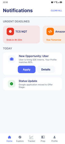
Mobile Screen 08
-
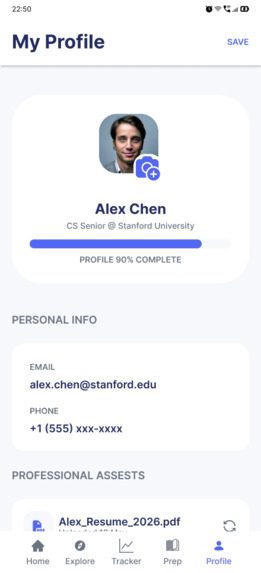
Mobile Screen 09

Inspiration
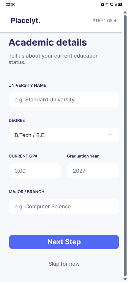
The campus placement journey can feel confusing for students. Job opportunities, eligibility criteria, application deadlines, interview preparation, and application updates are often spread across different platforms. Students may miss important opportunities or struggle to understand what they should focus on next.
This inspired us to create Placelyt — a student-focused placement companion designed to make the journey from discovering opportunities to preparing for a career more organized and manageable.
What it does
Placelyt brings essential placement activities together in one intuitive interface.
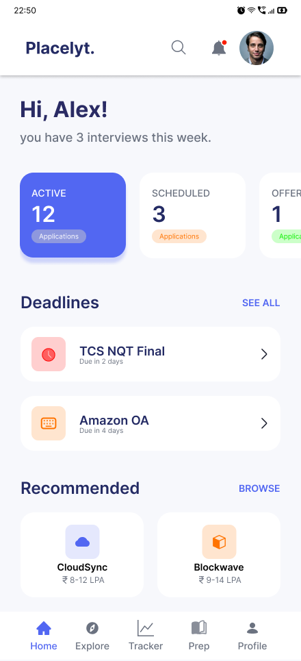
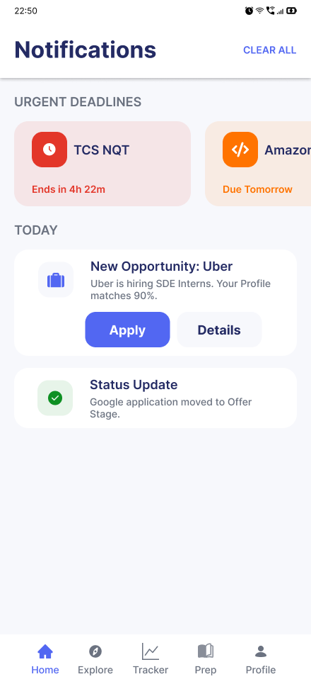
- Personalized Dashboard: View upcoming placement drives, deadlines, and important next steps.
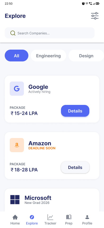
- Explore Opportunities: Browse companies and discover opportunities using relevant filters.
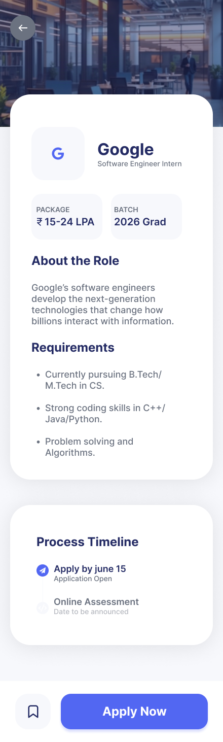
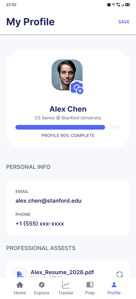
- Eligibility Insights: Review company requirements such as branch, CGPA, and other eligibility criteria.
- Application Tracker: Follow application progress through stages such as Applied, Assessment, Interview, and Result.
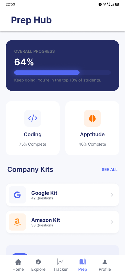
- Preparation Hub: Find a structured starting point for aptitude, technical interviews, DSA, and HR preparation.
Our goal is to help students spend less time managing scattered information and more time preparing for opportunities.
How we built it
We approached Placelyt as a UI/UX design project, focusing on usability, visual consistency, and clear user flows. We planned the key student journeys, organized the information architecture, and designed a consistent interface for exploring opportunities, tracking applications, and accessing preparation resources.
We are developing the concept as a high-fidelity, interactive Figma prototype. The prototype is intended to demonstrate how students could navigate the platform and complete key tasks through a simple, connected experience.
Challenges we faced
One of our main challenges was deciding how to bring several placement-related activities into one interface without overwhelming students with information. We focused on establishing a clear visual hierarchy, keeping important deadlines visible, and making application progress easy to understand.
Another challenge was designing eligibility information in a way that is easy to scan while keeping the interface clean. We also considered how the experience could remain consistent across desktop and mobile layouts.
What we learned
This project helped us think beyond individual screens and focus on the complete user journey. We learned the importance of information architecture, consistent components, meaningful status indicators, and designing around real user needs rather than adding features without a clear purpose.
What's next
Our next steps are to refine the interactive prototype, test the main user flows, improve the mobile experience, and explore how Placelyt could eventually evolve into a functional platform for students and placement cells.
Placelyt — Your placement journey, simplified.
Built With
- design
- figma
- prototyping
- responsive-design
- ui/ux-design
- user-research
- wireframing


Log in or sign up for Devpost to join the conversation.