Response to the Challenge Prompt
Our first response when the prompt was revealed was that it was extremely broad—our first step forward was defining what “creative expression” meant to people. We began the design process with research, employing the use of online resources found at CreatingConnection.org and a survey we made. Our goal with research was to find how we might create an inclusive platform for all forms of creative expression, foster a supportive community where people are comfortable enough to connect with each other, and provide resources for individuals who want to progress and improve the quality of their creative experiences.
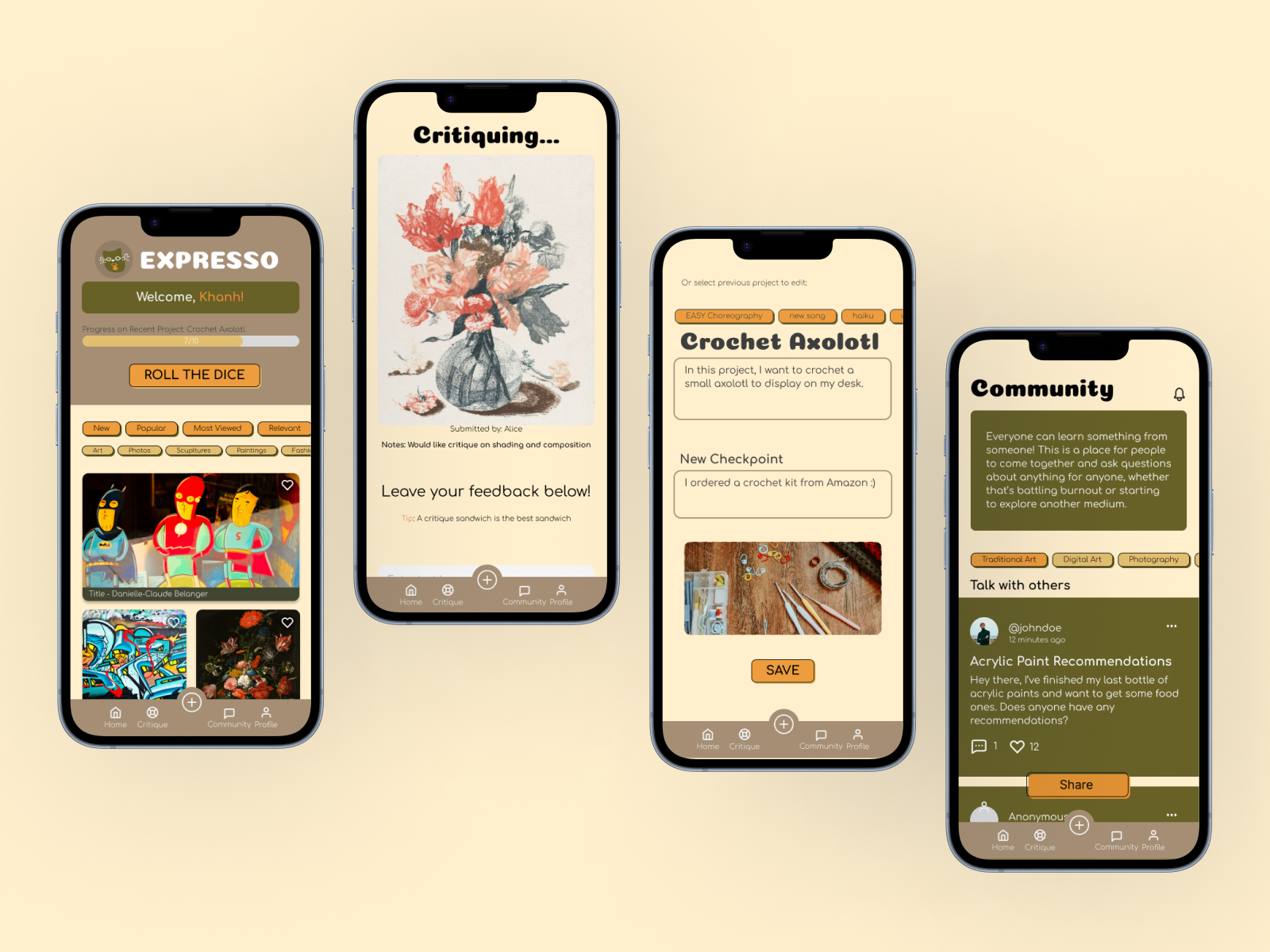
From CreatingConnection.org’s research studies, surveyees defined ‘creative expression’ as including everything from problem-solving at home/work to the inspiration that results in the creation of art. In our own survey, users defined creative expression similarly—the translation of identity, inner thoughts, or energy into a variety of art mediums. Expresso is a play on words with espresso and expression. We wanted to portray the comfort of a cafe and the effect of an espresso during a long night or early mornings when we have that burst of inspiration and energy.
Main Design Decisions
We chose to design a mobile app with the intention of everyday use, according to the findings from CreatingConnections where 59% of responses strongly agreed with the statement “It is important that everyone have the opportunity to express themselves creatively or to experience the creativity of others every day.” The mention of “others” reveals that community is an influential factor in creative expression. Exploring this, many responses to our question of “What empowers you to express yourself creatively?” also related to community in some way: being inspired by others’ creativity, the ability to make others smile and laugh, support from others, or the desire to inspire and support others in the same way.
Using this research, we wanted to incorporate as many community features as possible, resulting in our Community and Critiques pages. 91% of our respondents noted mental block as a hindrance to creative expression, so we wanted to address that with a community forum that provided firsthand experiences in addition to static resources on burnout. This forum would also be used for discussion of the art mediums themselves.
We decided on an earthy color palette with orange as a contrast color to give it a more grounded and warmer feeling for the user to feel more comfortable and feel like this was a community they belonged in. To keep the theme of coziness, we went for a simple, yet artistic sans-serif. We also tried to highlight the artistic side of our app and made our buttons more engaging with the use of strokes and drop shadows.
If we had more time, we would’ve liked to change the post page to show more progress visualization, since that was something our surveys showed users wanted. Also, we weren’t able to show in our prototype that users can add checkpoints to their current project.
Built With
- figma

Log in or sign up for Devpost to join the conversation.