-
-
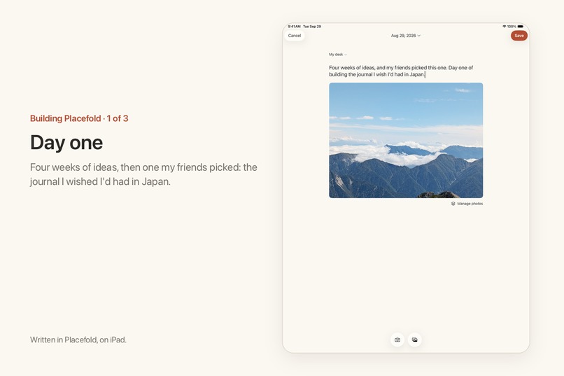
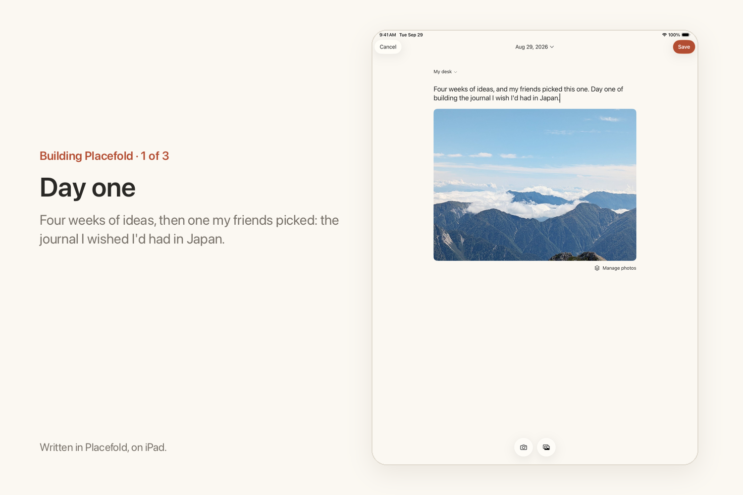
Aug 29. Halfway through Shipaton, I started building the journal I wished I'd had in Japan.
-
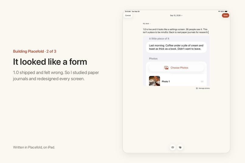
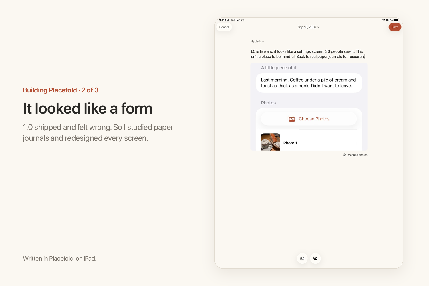
Sept 15. 1.0 was live and looked like a settings screen. So I started over, from real paper journals.
-
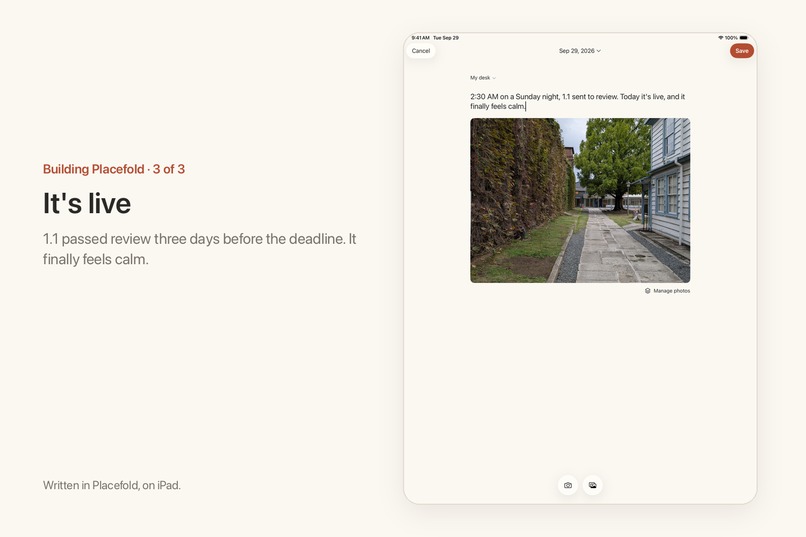
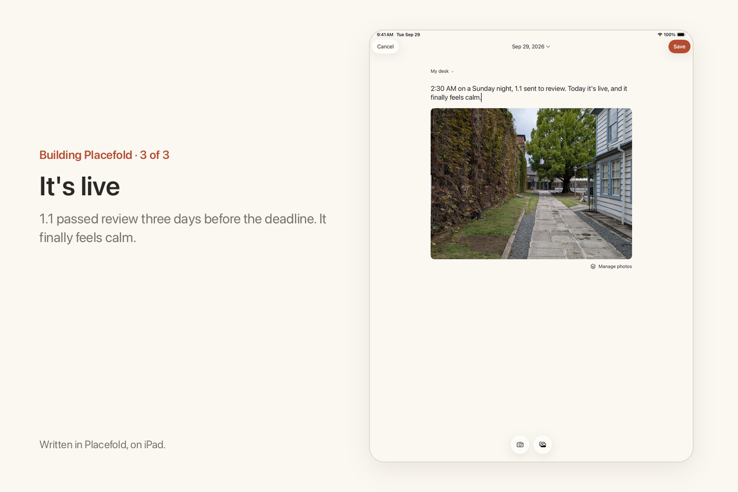
Sept 29. 1.1 passed review three days before the deadline. Calm, finally.
-
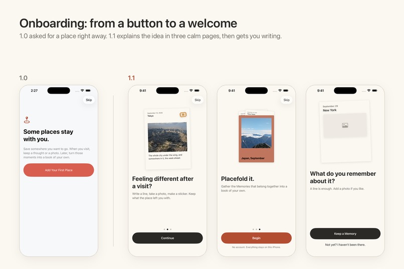
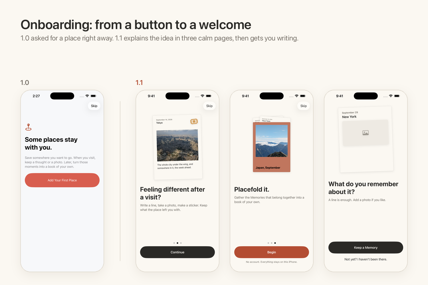
Onboarding went from one button to three quiet pages that explain the idea before asking for anything.
-
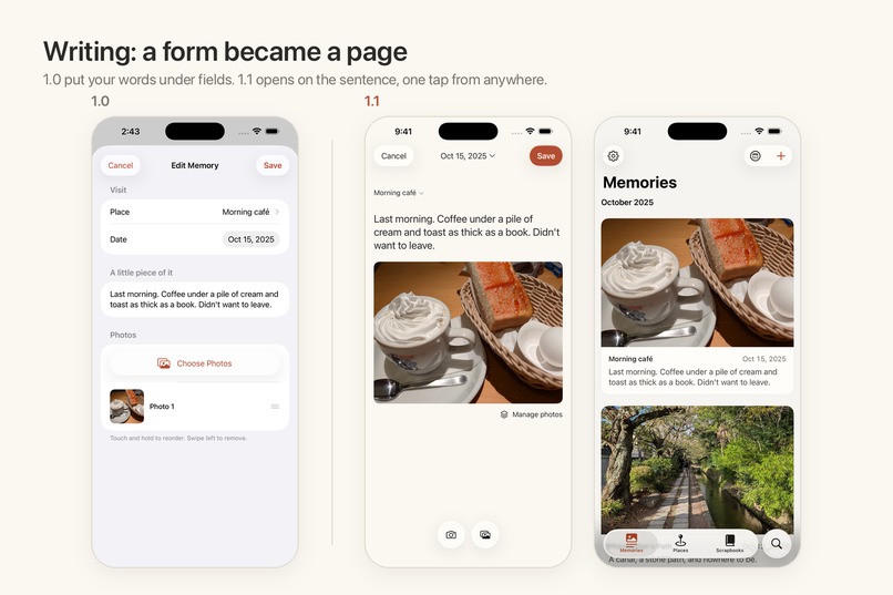
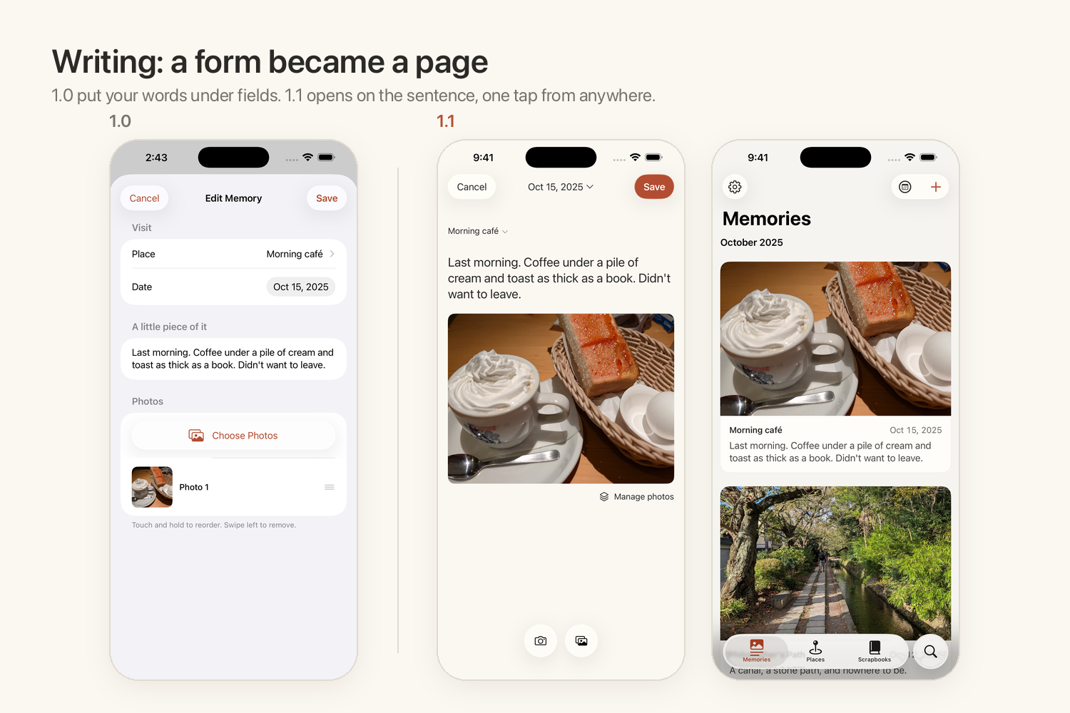
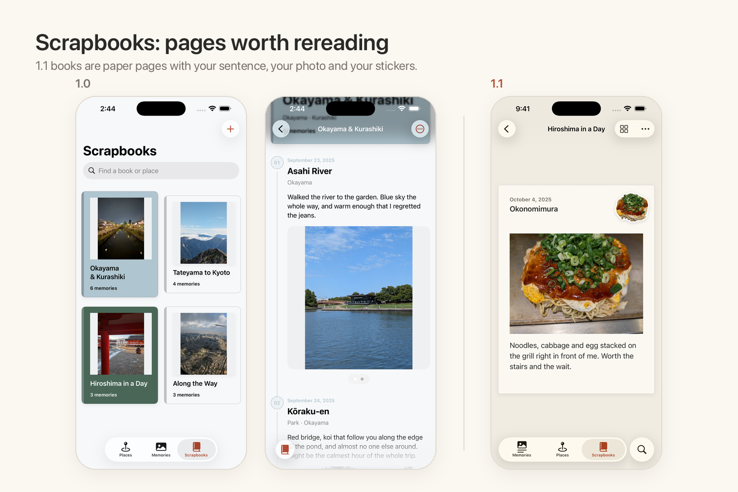
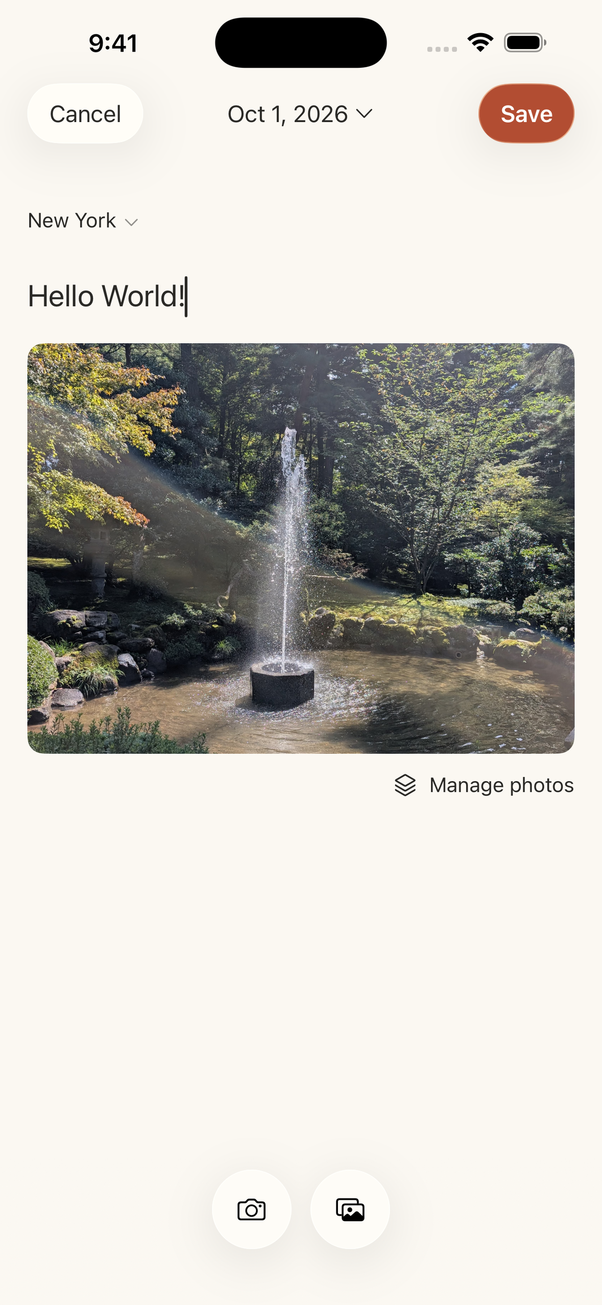
1.0 put your words under form fields. In 1.1 the sentence comes first, one tap from anywhere.
-
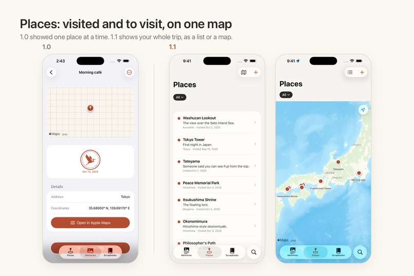
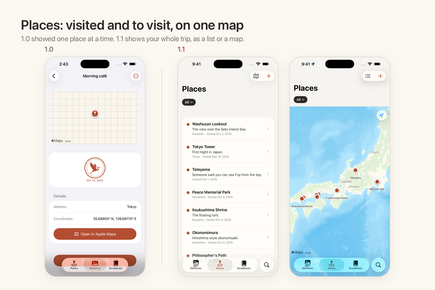
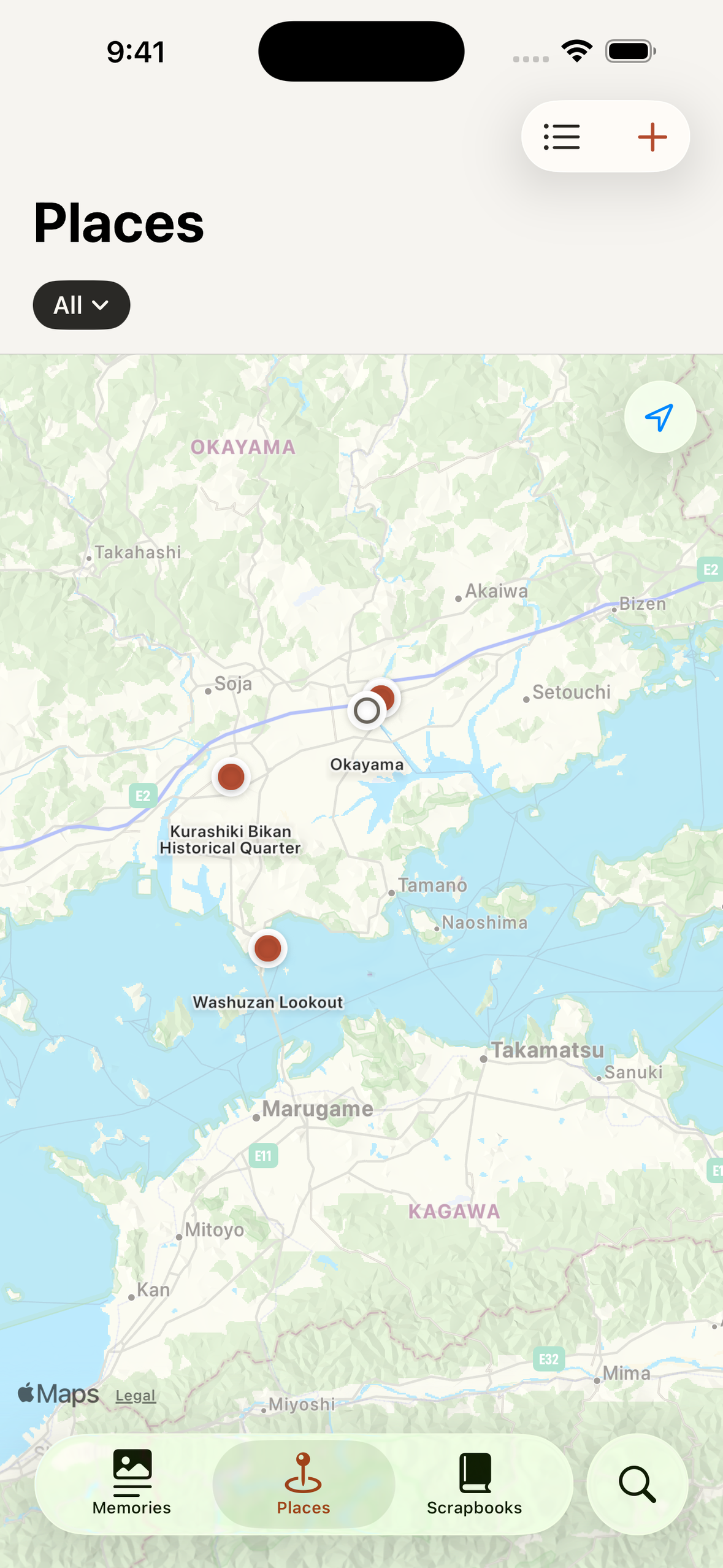
Every place you've been and want to go, as a list or on one map.
-
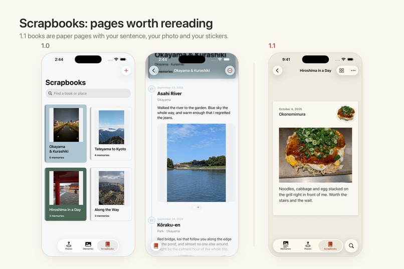
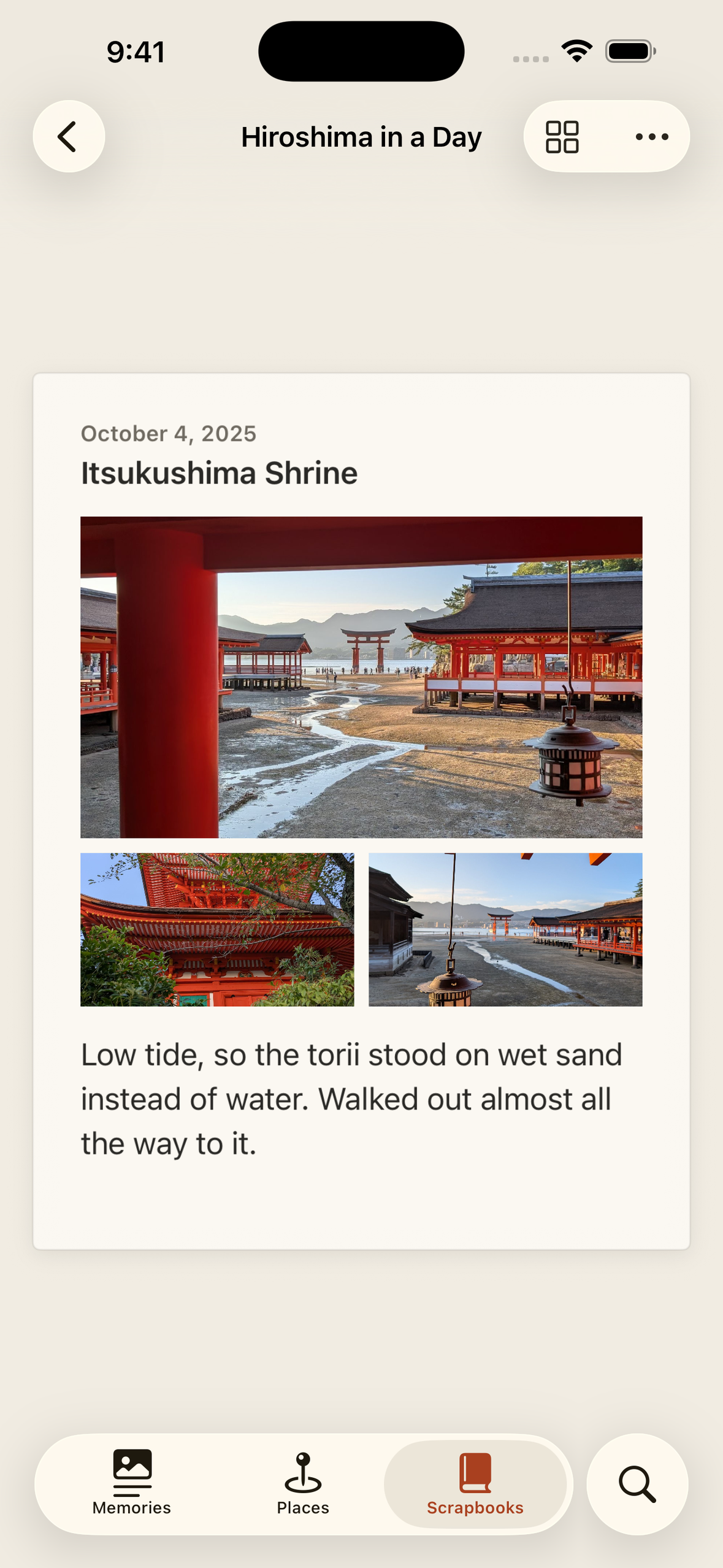
Memories become paper pages with your sentence, your photo and your stickers, and long thoughts never get cut off.
-
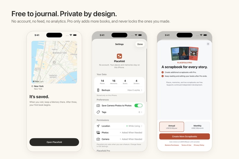
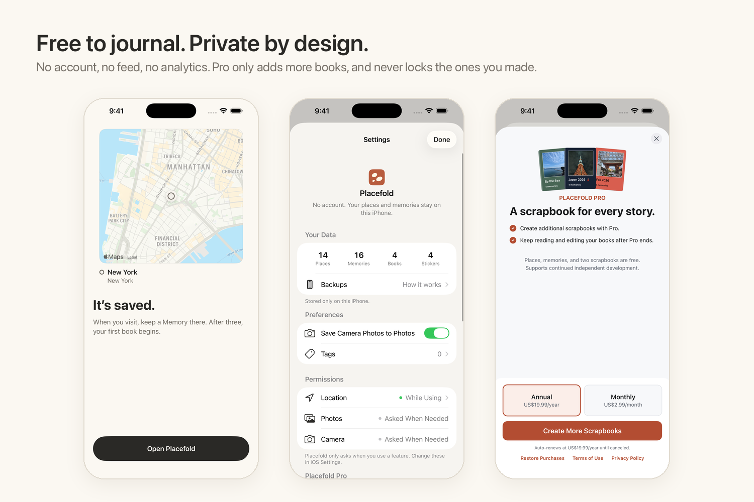
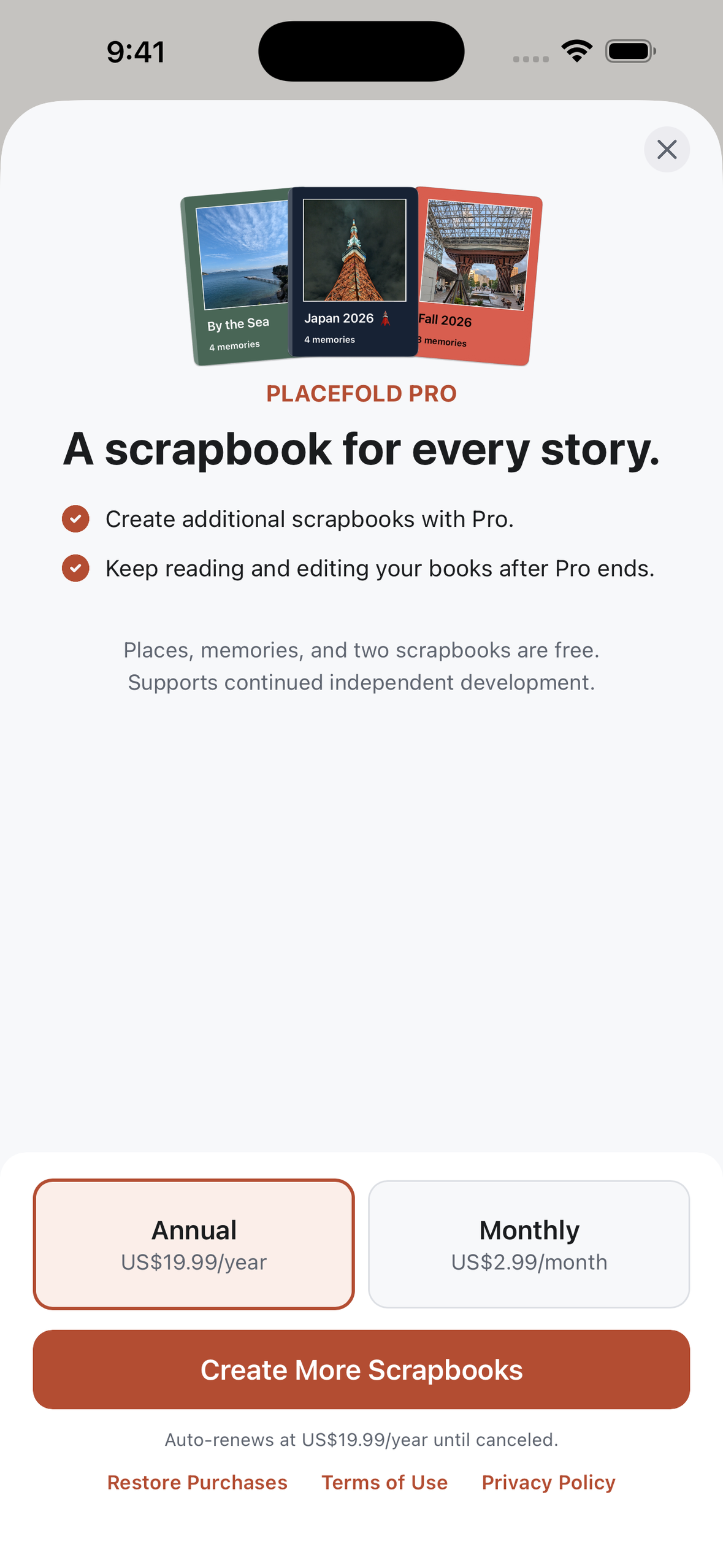
No account, no feed, no analytics. Free to journal; Pro only adds more books and never locks the ones already made.
-
App Icon
-
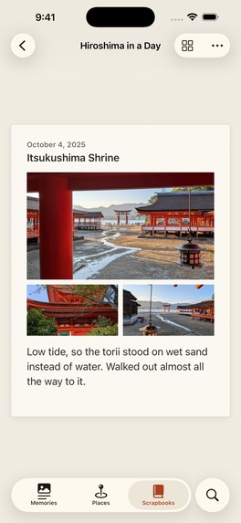
Scrapbook Page - A trip's memories, laid out like a real book.
-
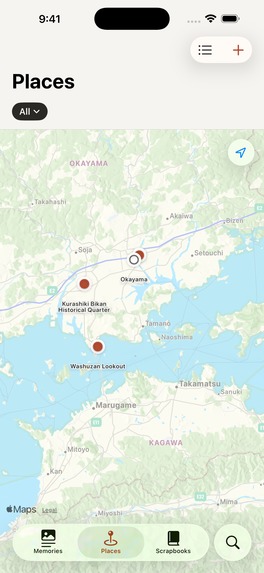
Places Map - Hollow dots to visit, filled dots visited.
-

Memory Editor - One tap, one sentence.
-
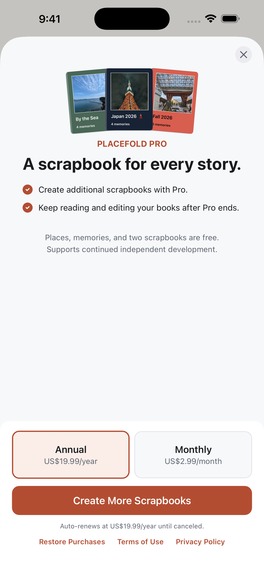
Paywall - Pro adds more scrapbooks.
-
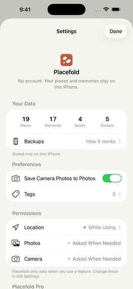
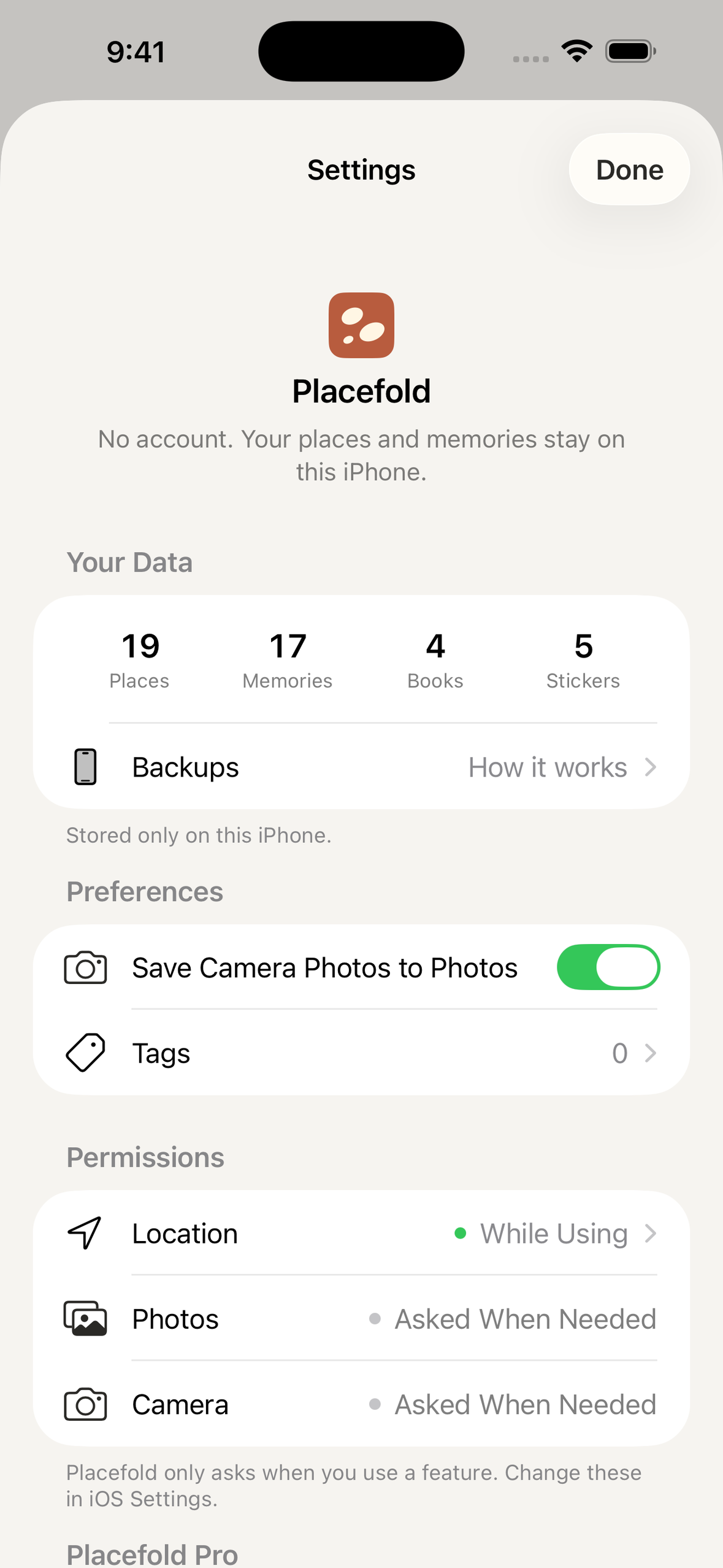
Settings - No account. Easy to understand permissions.
-
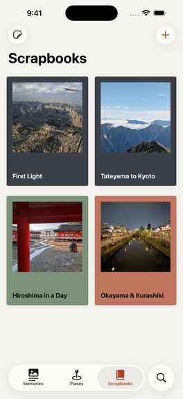
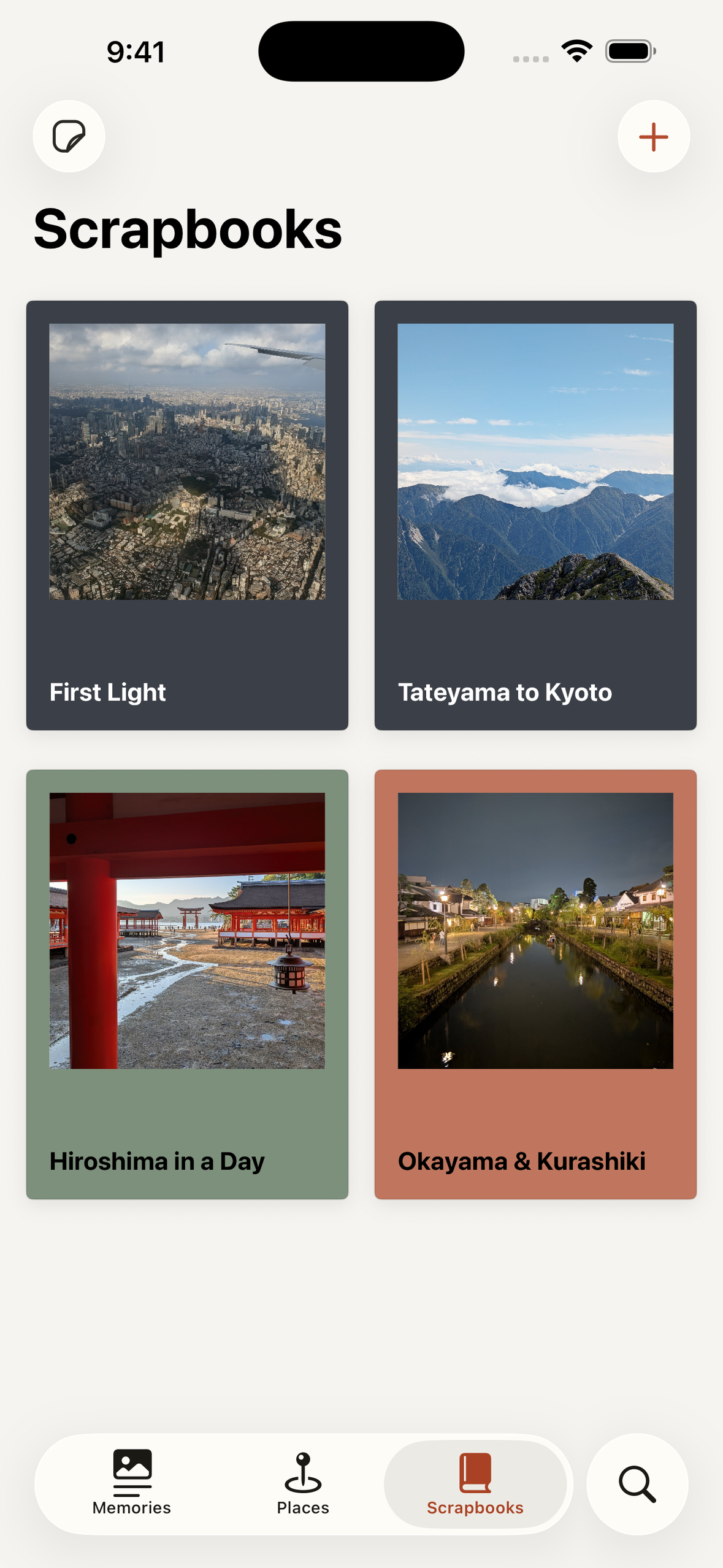
Scrapbooks - Turn trip/outing into a book.
Inspiration
Last year I spent five weeks in Japan and came home with hundreds of photos from my phone and my DSLR. A year later, I remember that Hiroshima was warm and beautiful, that the mosquitoes at Washuzan bit straight through my socks, and that I was scared of the climb down from Tateyama until I actually started. Almost everything else is gone. I tried keeping a journal in a Word doc, but opening a laptop after a long day of walking never happened. A Notes app is not really a journal either.
So I built Placefold: a one-line journal for travel and everyday outings. In under a minute you can write what a place felt like, and get back to enjoying the moment. The idea is a calm place to write, without the fluff and complexity other journaling apps have.
What it does
- Memories: open the app and start writing straight away. One sentence, up to three photos, and optionally the place it happened.
- Places: save places with Apple Maps (search, or press and hold to drop a pin) and see what you've visited and what you still want to visit on one map.
- Scrapbooks: gather memories into a paged book. Long thoughts flow onto new pages instead of being cut off, and your stickers decorate the pages without covering your words. After three memories, your first book, "First Light", makes itself.
- Stickers: cut the subject out of any photo, with a die-cut border, or scan paper keepsakes like tickets. Copy them into any other app, or put them in your scrapbooks.
- Private: no account, no feed, no analytics. Everything stays on your device.
How I built it
Solo, from August 29, in SwiftUI and SwiftData, with MapKit, PhotosPicker, AVFoundation, Vision and VisionKit. 91 commits over 22 days of work, most of them about 8 hours long.
Design. When I looked at 1.0 on the App Store, I realized it felt like a form. It was not a place to be mindful. So I researched what real paper journals look like and rebuilt every screen around three goals: calm, trustworthy and reliable. It's a notebook in spirit, not in costume: no paper textures or fake leather, just warm paper, soft ink and native iOS where it belongs.
- One tap to write. On a trip, an app that hides writing behind several taps makes journaling stressful. In 1.1 the writing area is the first thing you see, focused and always one tap away.
- Two layers. Pages, where you write and read, use warm paper and soft ink. Indexes, like lists, the map and Settings, stay native iOS, following Apple's Human Interface Guidelines.
- One accent colour. Terracotta is used only for the main action on each screen, so you always know what to do next.
- Books that look like books. The scrapbook reader uses fixed 3:4 paper pages and opens as a two-page spread on iPad.
The gallery shows 1.0 and 1.1 side by side.
Stickers. Stickers felt missing on phones: there's no easy way to keep them and paste them into other apps. Placefold's Sticker Book does that, and the stickers add character to your scrapbooks. They're also a fun way to keep something from a place, even when you don't feel like writing or taking a normal photo.
RevenueCat. Everything you need to journal is free: unlimited places, memories and stickers, plus two scrapbooks. Pro unlocks more books. I use RevenueCat Paywalls and Offerings to change the paywall copy per app version without a new build: 1.1 reads a pro_1_1 offering and falls back to default, so 1.0 users never see copy that doesn't match their app. Subscription state is owned by the app: a failed refresh is never treated as an expired subscription, and losing Pro never locks a book you already made.
Challenges
Product direction. It took me four weeks to settle on an idea, and by then it was August 29, halfway through Shipaton. What unblocked me was Perttu's post on building fast and its idea of a minimum lovable product: I showed my ideas to friends, and they picked this one. The next question was what a travel journal actually needs. I started with three tabs: Places, Memories and Scrapbooks, and shipped 1.0. It looked like a native form, not a journal, and it got almost no impressions or downloads. So for 1.1 I reworked every screen, prioritizing a frictionless start to writing, stability, and a calmer, mindfulness-focused design. I also optimized the App Store listing with AppFollow.
Organic marketing. We all scroll these apps every day, yet making a post that travels is hard. I started too late and should have been posting from day one.
Testing without an iPhone. My phone is a Pixel 8. I bought it before I had a Mac or thought I'd become an iOS developer. My iPad was my only real Apple device for testing, which is also why Placefold has proper iPad layouts. The Simulator covered almost everything else, and I borrowed a friend's iPhone once to check a TestFlight build. Throughout the hackathon I spent dozens of hours manually testing every feature.
What I learned
- Less is more. For this app especially, a clear interface sets the mood and removes friction. Refer to the Human Interface Guidelines often.
- Marketing isn't an afterthought. Leaving it to the end probably wasted my launch boost.
- Ship, then look at it honestly. 1.0 taught me more than any plan did, because I could finally see what was wrong.
- And staying up until 2:30 AM on a Sunday (well, Monday morning) to submit 1.1 for review three days before the deadline :)
What's next
Localization for more regions comes first. After that, I want to work closely with users to remove even more friction, and to explore customization for writing, memories and scrapbooks, cloud backup, and more ways to import places, mostly as Pro features, but only once users tell me what matters. 1.0 was the version I'm not proud of; 1.1 is the one I'm happy to put in front of people.
Entering: RevenueCat Design Award, #BuildInPublic, and HAMM.


Log in or sign up for Devpost to join the conversation.