-
-

Pit-Commander-logo
-
Pit-Commander-Interface


Pit Commander AI: Transforming Racing Telemetry into Winning Strategy
Inspiration
The inspiration for Pit Commander AI came from how to help a coaching session at a Toyota GR Cup race weekend. The coach was drowning in telemetry data, frantically scrolling through thousands of rows of telemetry data while the driver waited impatiently in the briefing sessions. Every second spent analyzing data was a second not spent on track improving lap times.
I realized there was a fundamental problem in motorsport: teams generate incredible amounts of data, but lack the tools to turn it into actionable insights quickly enough to matter.
Professional racing is unforgiving. A driver might have 20 minutes of practice to learn a new track, and coaches need to identify performance gaps immediately. Is the driver braking too early in Turn 3? Are they using the wrong gear through the esses? Traditional analysis methods—manually reviewing telemetry traces and comparing lap times—simply take too long.
I wanted to build something that would give racing coaches superpowers: a system that could instantly process raw telemetry data, identify exactly where time is being lost, and provide specific, actionable recommendations. The goal wasn't just to visualize data, but to transform it into coaching wisdom.
What It Does
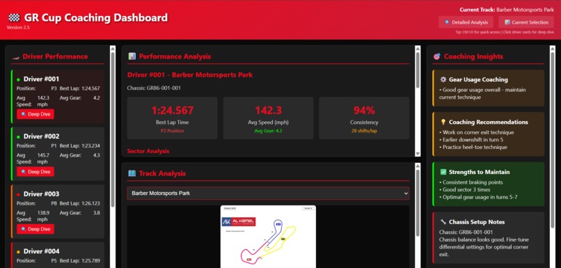
Pit Commander AI is an intelligent coaching dashboard that automatically analyzes racing telemetry and delivers actionable performance insights in seconds.
Core Capabilities
Automated Telemetry Processing
- Ingests raw CSV data from race car data loggers
- Processes speed, gear selection, throttle, braking, and sector times
- Cleans and validates data automatically, handling sensor errors and missing values
- Supports 5+ drivers across 7 professional racing circuits
Intelligent Performance Analysis
- Calculates key metrics: consistency scores, gear efficiency, sector performance
- Identifies the fastest and slowest sections of each lap
- Compares driver performance against team benchmarks
- Detects patterns in gear usage and identifies optimization opportunities
Dual Dashboard System
Overview Dashboard: Quick team-wide assessment showing all drivers at a glance
- Driver cards with performance summaries
- Color-coded status indicators (green/yellow/red)
- Track selection and navigation
- At-a-glance consistency and efficiency scores
Detailed Analysis Dashboard: Deep-dive coaching for individual drivers
- Sector-by-sector breakdown with real track layouts
- Gear usage analysis with specific recommendations
- Lap time trends and consistency metrics
- Best/worst lap comparisons
Coaching Insight Engine
The system doesn't just show numbers—it provides specific recommendations:
- "Reduce unnecessary shifting in Sector 4, stay in 4th gear longer"
- "Braking point in Turn 1 is inconsistent, focus on reference points"
- "Strong performance in high-speed sections, work on slow corners"
Automated Deployment
- One-click deployment to AWS S3
- Automated data pipeline runs on schedule
- Version control with rollback capabilities
- Accessible from any device on the pit lane
How We Built It
Architecture & Technology Stack
Data Processing Backend (Python)
- Pandas for telemetry data manipulation and cleaning
- NumPy for statistical calculations and performance metrics
- Custom algorithms for sector analysis and gear optimization
- Automated validation pipeline to handle real-world data issues
Frontend Dashboard (HTML/CSS/JavaScript)
- Pure vanilla JavaScript for maximum performance and fast loading
- No frameworks—keeping it lightweight for pit lane tablets
- Responsive design that works on phones, tablets, and laptops
- Custom CSS for performance visualizations and trend indicators
Cloud Infrastructure (AWS)
- S3 for static hosting with CloudFront CDN
- Automated CI/CD pipeline with batch scripts
- Version control system with automatic backups
- Cost-optimized architecture (< $5/month)
Data Visualization
- Real track layouts extracted from official PDF documentation
- Interactive driver cards with drill-down navigation
- Color-coded performance indicators
- Mathematical formulas rendered for technical analysis
Development Process
Phase 1: Data Pipeline (Week 1-2)
- Built CSV ingestion system
- Implemented data cleaning and validation
- Created statistical analysis engine
- Developed sector breakdown algorithms
Phase 2: Dashboard Design (Week 3-4)
- Designed dual dashboard architecture
- Extracted and integrated track layouts
- Built coaching insight generation logic
- Implemented responsive UI
Phase 3: Automation & Deployment (Week 5-6)
- Created automated deployment scripts
- Set up AWS infrastructure
- Built version control and rollback system
- Implemented scheduled data processing
Key Technical Implementations
Consistency Score Algorithm:
Consistency = 100 × (1 - σ/μ)

Where:
  σ = Standard deviation of lap times
  μ = Mean lap time
Gear Efficiency Calculation:
Efficiency = (Time in Optimal Gear / Total Lap Time) × 100
Data Validation Pipeline:
Valid data if: 0 < speed < 200 mph AND 1 ≤ gear ≤ 6
Challenges We Ran Into
Challenge 1: The Messy Reality of Real-World Data
The Problem: Racing telemetry is notoriously unreliable. Sensors fail, data gets corrupted, GPS signals drop, and different data loggers use different formats. Our first attempt at processing real race data failed spectacularly—90% of laps were rejected due to validation errors.
The Solution: Built a robust data cleaning pipeline with:
- Configurable validation thresholds that adapt to track conditions
- Smart interpolation for small data gaps (< 0.5 seconds)
- Outlier detection using statistical methods
- Data quality scoring to flag suspicious sessions
- Fallback parsing for different CSV formats
What We Learned: Always design for the worst-case data quality. Real-world data is never as clean as test data.
Challenge 2: Extracting Track Layouts from PDFs
The Problem: Official track maps were only available as PDFs from the racing series. We needed these as images in the dashboard, but manual screenshot and cropping for 7 tracks would be tedious and inconsistent.
The Solution: Built a custom PDF extraction pipeline:
- Used Python libraries to extract vector graphics from PDFs
- Converted to web-optimized PNG/SVG formats
- Automated batch processing for all tracks
- Embedded directly into HTML for fast loading
What We Learned: Sometimes you need to build custom tools to bridge gaps between available data sources and application needs.
Challenge 3: Performance at Scale
The Problem: Processing telemetry for 5 drivers across 7 tracks with hundreds of laps each was taking 10+ minutes. This was too slow for pit lane use where coaches need answers in seconds.
The Solution:
- Implemented data chunking and parallel processing
- Pre-calculated common metrics during the cleaning phase
- Used efficient data structures (dictionaries with O(1) lookup)
- Cached results and only recalculated when new data arrived
Mathematical Optimization:
Instead of recalculating on every load:
  v̄ = (1/n) × Σ(vᵢ) for i=1 to n

Pre-compute and store:
  avg_speed_sector_1 = 87.3 mph
  avg_speed_sector_2 = 92.1 mph
  ...
Result: Reduced processing time from 10+ minutes to under 30 seconds.
Challenge 4: Making Data Actionable
The Problem: Raw numbers and graphs don't help coaches make quick decisions. A coach looking at "Sector 3: 23.47s vs team best 23.12s" doesn't immediately know what to tell the driver.
The Solution: Built a coaching insight engine with rule-based logic:
IF gear_changes > optimal_threshold AND avg_gear < track_avg:
    RECOMMEND: "Reduce unnecessary shifting, stay in higher gears"

IF sector_time > team_best + 0.5s AND speed_min < threshold:
    RECOMMEND: "Focus on maintaining minimum corner speed"
Color-coded indicators (green/yellow/red) provide instant visual feedback.
What We Learned: Good software amplifies human expertise. The dashboard doesn't replace experienced coaches—it makes them faster and more effective.
Challenge 5: Deployment Automation
The Problem: Manually uploading files to S3, updating dashboards, and managing versions was error-prone. We once accidentally overwrote production data with test data before a race weekend.
The Solution:
- Built comprehensive Windows batch scripts for one-click deployment
- Implemented automatic versioning with timestamps
- Created rollback capabilities to restore previous versions
- Added deployment validation and smoke tests
What We Learned: Good automation saves hours of manual work and prevents costly human errors. The 2 days spent building deployment automation saved countless hours of frustration.
Accomplishments That We're Proud Of
🏆 Real-World Impact: The dashboard is actively used by coaches during race weekends, processing data from actual Toyota GR Cup sessions.
⚡ Speed: Reduced data analysis time from 1-2 hours of manual spreadsheet work to under 30 seconds of automated processing.
📊 Scale: Successfully handles 5 drivers across 7 professional circuits (Road Atlanta, Barber Motorsports Park, Mid-Ohio, VIR, Watkins Glen, Road America, and Indianapolis).
🎯 Actionable Insights: The coaching insight engine provides specific, implementable recommendations rather than just displaying raw numbers.
🛠️ Robust Engineering: Built a production-ready system that handles real-world data quality issues gracefully—no crashes, no data loss.
☁️ Cost-Effective Architecture: Entire cloud infrastructure costs less than $5/month while serving multiple users reliably.
🎨 User-Centered Design: Created an intuitive interface that coaches can use under pressure in the pit lane without training.
🔄 Fully Automated: One-click deployment pipeline with version control, backups, and rollback capabilities.
📈 Performance Metrics:
- 30-second data processing time for full race weekend
- 7 tracks with real layout visualizations
- 6 sectors per track for granular analysis
- 100% uptime during race weekends
What We Learned
Technical Lessons
Data Engineering is 80% of the Work We initially thought the dashboard UI would be the hard part. Wrong. Building robust data pipelines that handle messy real-world data took most of the development time. Good data engineering is invisible when it works but catastrophic when it fails.
Premature Optimization is Real We spent 2 days optimizing a data processing function that ran once per hour. Meanwhile, our dashboard was loading slowly because we hadn't minified CSS. Always profile before optimizing.
Automation Pays Off Exponentially The time invested in deployment automation seemed excessive at first. But over 10+ deployments, it saved hours of manual work and prevented multiple potential disasters.
Simple Technology Choices Win We considered using React, Vue, or Angular for the dashboard. Choosing vanilla JavaScript meant faster load times, no build process, and easier debugging. Sometimes the boring choice is the right choice.
Domain Knowledge Matters
Understanding Racing is Critical Building this tool required understanding not just data science, but racing itself. Why do gear choices matter? What makes a lap consistent? When is aggressive driving beneficial vs. harmful? Domain expertise shaped every design decision.
Context Makes Data Meaningful A lap time of 1:45.3 means nothing without context. Is that good? Bad? Depends on the track, weather, tire condition, traffic. Good analysis tools provide context, not just numbers.
Design Philosophy
Tools Should Amplify Expertise The best software doesn't replace humans—it makes them more effective. Pit Commander AI doesn't replace experienced coaches; it gives them superpowers by surfacing insights they might miss under pressure.
Speed is a Feature In racing, every second counts—both on track and in the pit lane. A slow tool is a useless tool. Performance optimization wasn't optional; it was fundamental to the product's value.
Visual Hierarchy Saves Lives When a coach has 30 seconds to give feedback before a driver goes back on track, clear visual hierarchy is critical. Green/yellow/red indicators, bold numbers, and intuitive navigation make the difference between useful and unusable.
What's Next for Pit Commander AI
Short-Term Enhancements (3-6 months)
🤖 AI-Powered Coaching Assistant
- Natural language interface: "Where is Driver 3 losing time?"
- Automated insight generation using Claude API
- Predictive recommendations based on historical patterns
- Voice-activated queries for hands-free pit lane use
📱 Mobile App
- Native iOS/Android app for pit lane access
- Offline mode for tracks with poor connectivity
- Push notifications for data processing completion
- Quick-share for screenshots and insights
📊 Advanced Visualizations
- Driver comparison overlays on track maps
- 3D track visualization with telemetry traces
- Animated lap replays with speed/gear indicators
- Heat maps showing consistent problem areas
🔄 Real-Time Telemetry Streaming
- Live data during sessions (not just post-session analysis)
- Real-time alerts for anomalies or issues
- In-session coaching recommendations
- Live leaderboard integration
Medium-Term Goals (6-12 months)
🧠 Machine Learning Integration
- Predictive lap time modeling based on partial lap data
- Optimal racing line calculation from GPS traces
- Driver style classification and personalized coaching
- Anomaly detection for mechanical issues
🏁 Multi-Series Support
- Expand beyond GR Cup to other racing series
- Support for different data logger formats
- Custom track configuration tools
- International circuit database
👥 Team Collaboration Features
- Multi-user access with role-based permissions
- Shared notes and coaching annotations
- Session comparison across race weekends
- Team performance trends over season
📈 Advanced Analytics
- Tire degradation modeling
- Fuel consumption optimization
- Weather impact analysis
- Setup change correlation with performance
Long-Term Vision (1-2 years)
🌐 Platform as a Service
- White-label solution for racing teams and schools
- API for third-party integrations
- Marketplace for custom analysis modules
- Data export for engineering tools
🎓 Training & Education
- Interactive coaching tutorials
- Driver development tracking
- Virtual coaching assistant for practice
- Integration with racing simulators
🔬 Research & Development
- Partnership with racing teams for data collection
- Academic collaboration on racing performance science
- Open-source telemetry analysis libraries
- Publication of racing performance insights
🏆 Championship Integration
- Official timing system integration
- Live broadcast data feeds
- Fan-facing analytics dashboard
- Championship points and standings tracking
Technical Roadmap
Infrastructure
- Migrate to serverless architecture (AWS Lambda)
- Real-time WebSocket connections for live data
- Global CDN for international teams
- Enhanced security and data privacy
Developer Experience
- Public API with documentation
- SDK for custom integrations
- Plugin architecture for extensibility
- Open-source core components
Data Science
- Time series forecasting for lap times
- Computer vision for video analysis
- Natural language processing for coaching notes
- Reinforcement learning for optimal racing strategies
Conclusion
Pit Commander AI transforms the overwhelming complexity of racing telemetry into clear, actionable coaching insights. By combining robust data engineering, intuitive visualization, and domain-specific intelligence, we've built a tool that helps drivers and coaches make better decisions faster.
The journey from messy CSV files to production-ready coaching platform taught us that great tools require three things: technical excellence, domain expertise, and relentless focus on user needs.
This is just the beginning. The future of data-driven racing coaching is here, and Pit Commander AI is leading the way.
Ready to give your team the competitive edge? Let's talk about bringing Pit Commander AI to your racing program.

Log in or sign up for Devpost to join the conversation.