-
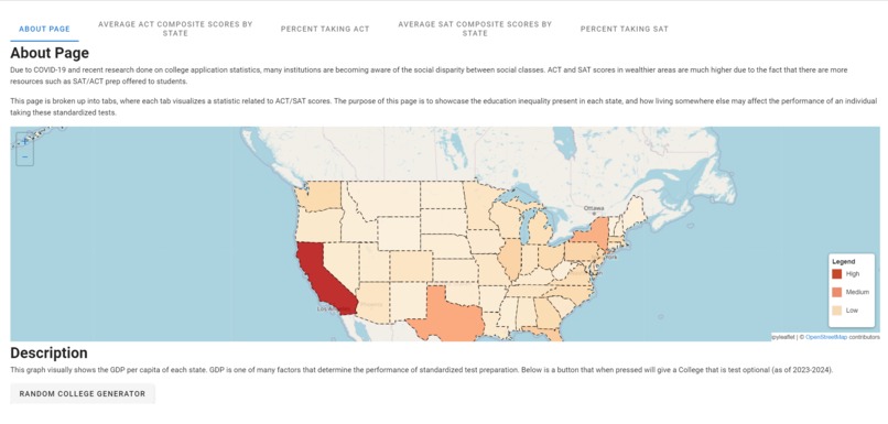
homepage
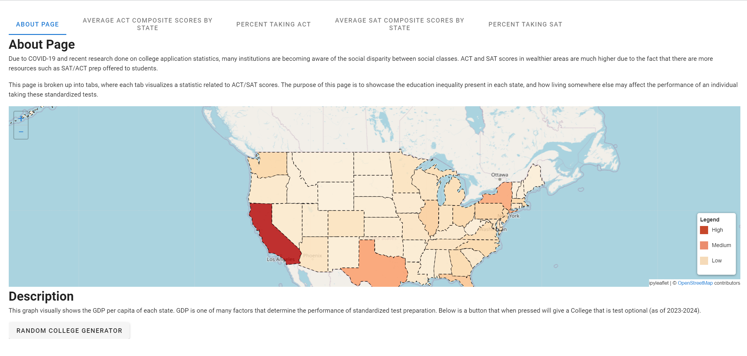
Inspiration
the disparity in education levels
What it does
This page is broken up into tabs, where each tab visualizes a statistic related to ACT/SAT scores. The purpose of this page is to showcase the education inequality present in each state, and how living somewhere else may affect the performance of an individual taking these standardized tests.
For Each map, including the map below, red corresponds to a larger value, and white corresponds to a smaller value.
How we built it
we built it using jupyter notebook and miniconda off the template
Challenges we ran into
- getting tabs to display unique information
- creating the button with randomized colleges
- acquiring and parsing data
- visualizing data using ipyleaflet
Accomplishments that we're proud of
- creating the button
- creating the map -finishing our project on time
What we learned
-how to use jupyter notebook -how to implement python into graphics and jupyter notebook
What's next for pink
- prepare for next hackathon
Built With
- jupyternotebook
- python


Log in or sign up for Devpost to join the conversation.