-
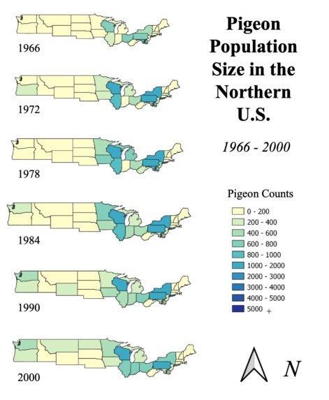
Pigeon Spread: 1966-2000
-
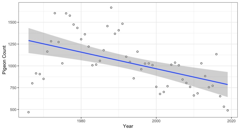
Pigeon Counts in New York (linear regression)
-
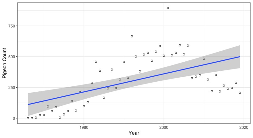
Pigeon Counts in Washington (linear regression)
-
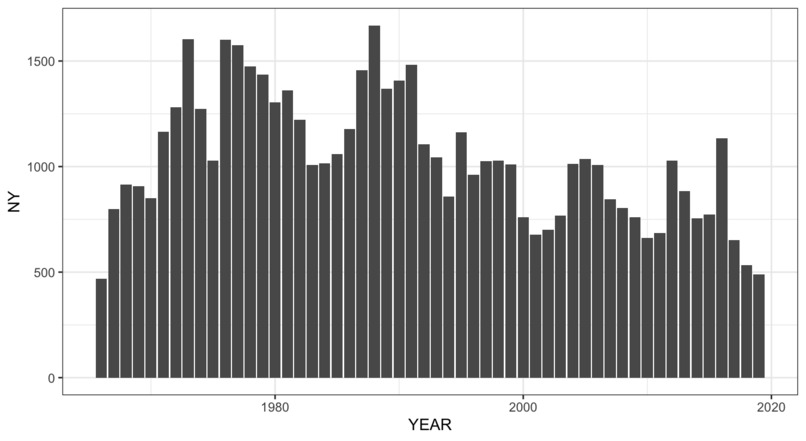
Pigeon Counts in New York (bar chart)
-
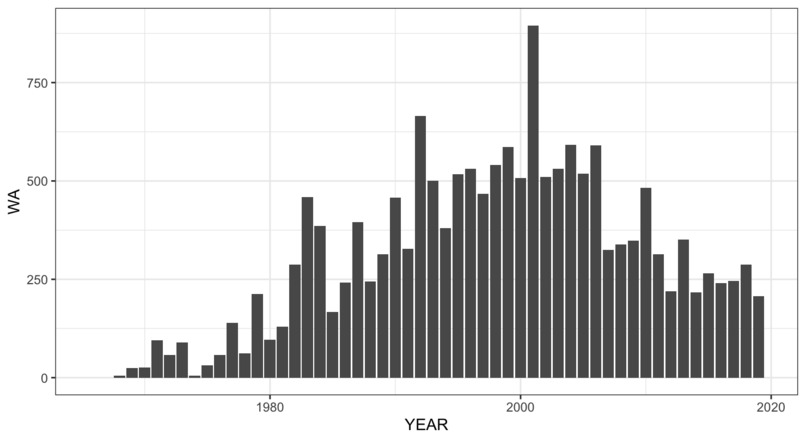
Pigeon Counts in Washington (bar chart)


What it does
Visualizes pigeon population changes in WA and NY as well as across the entire United States. The timeframe is 1966-2000.
How we built it
I used R (specifically ggplot) to generate the bar charts and scatter plots/linear regressions. I used QGIS for making the maps.
Built With
- gis
- r

Log in or sign up for Devpost to join the conversation.