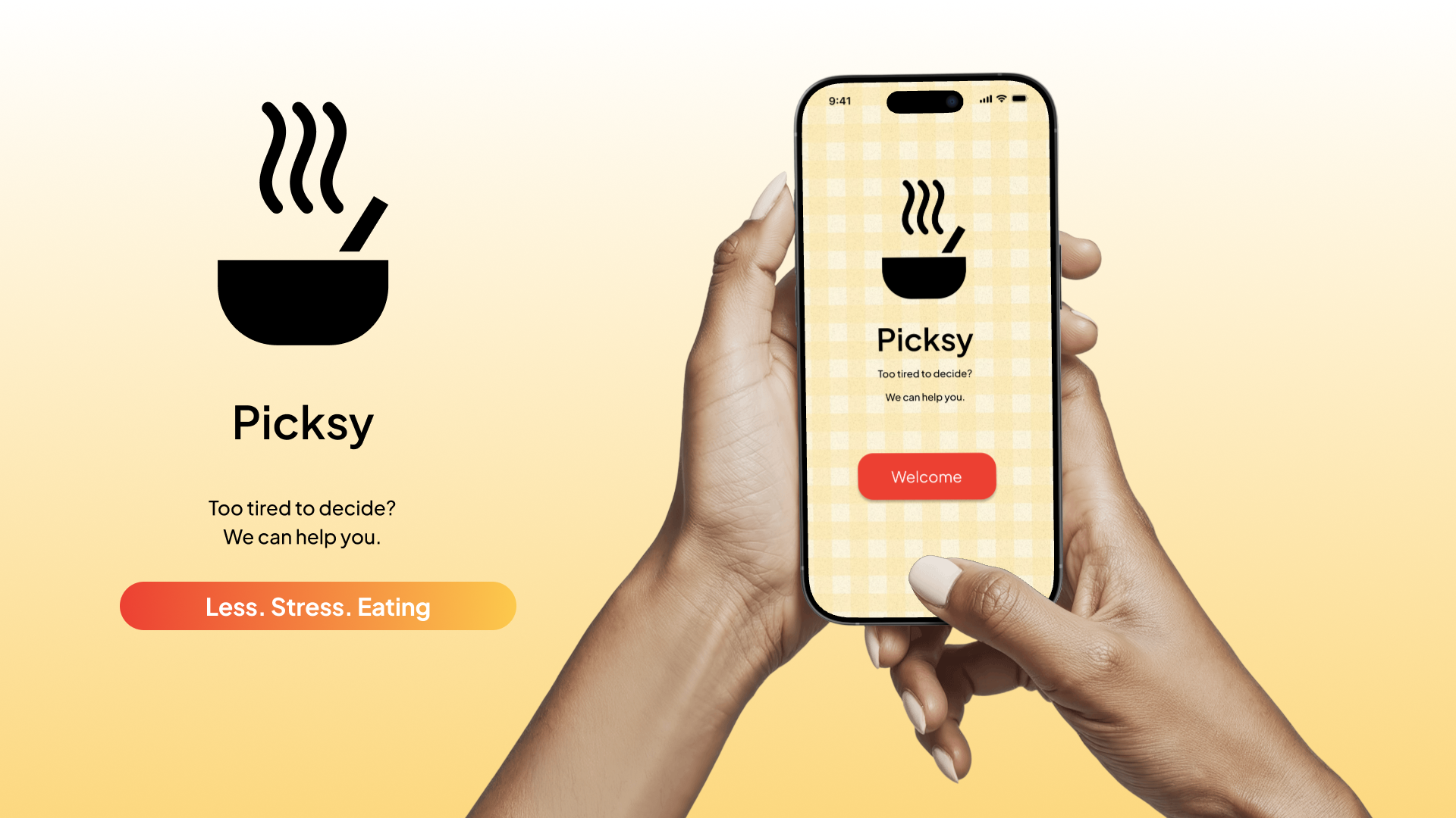
Picksy is a meal decision app designed for people who are too tired, hungry, or overwhelmed to figure out what to eat, and end up skipping meals entirely as a result.
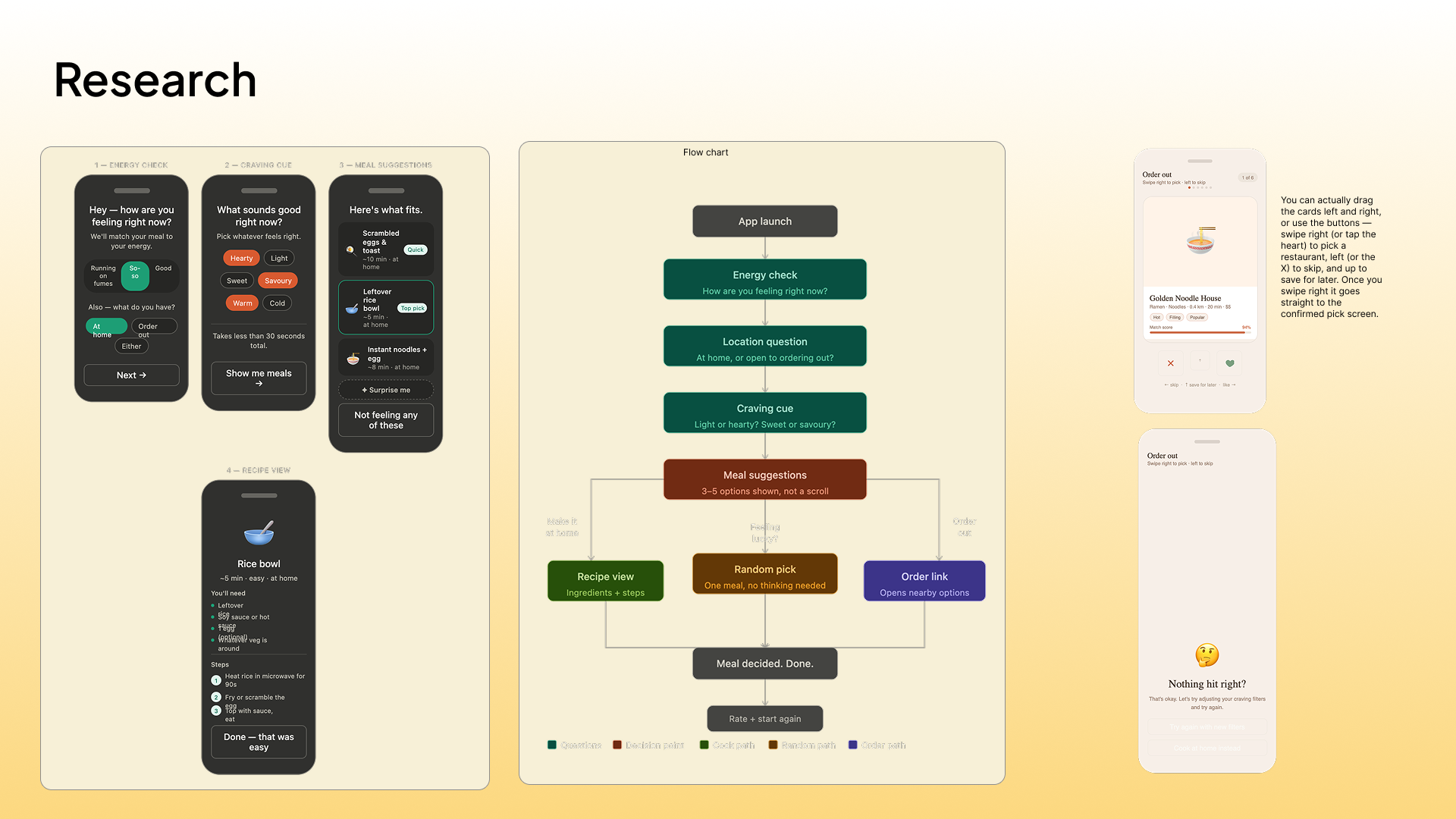
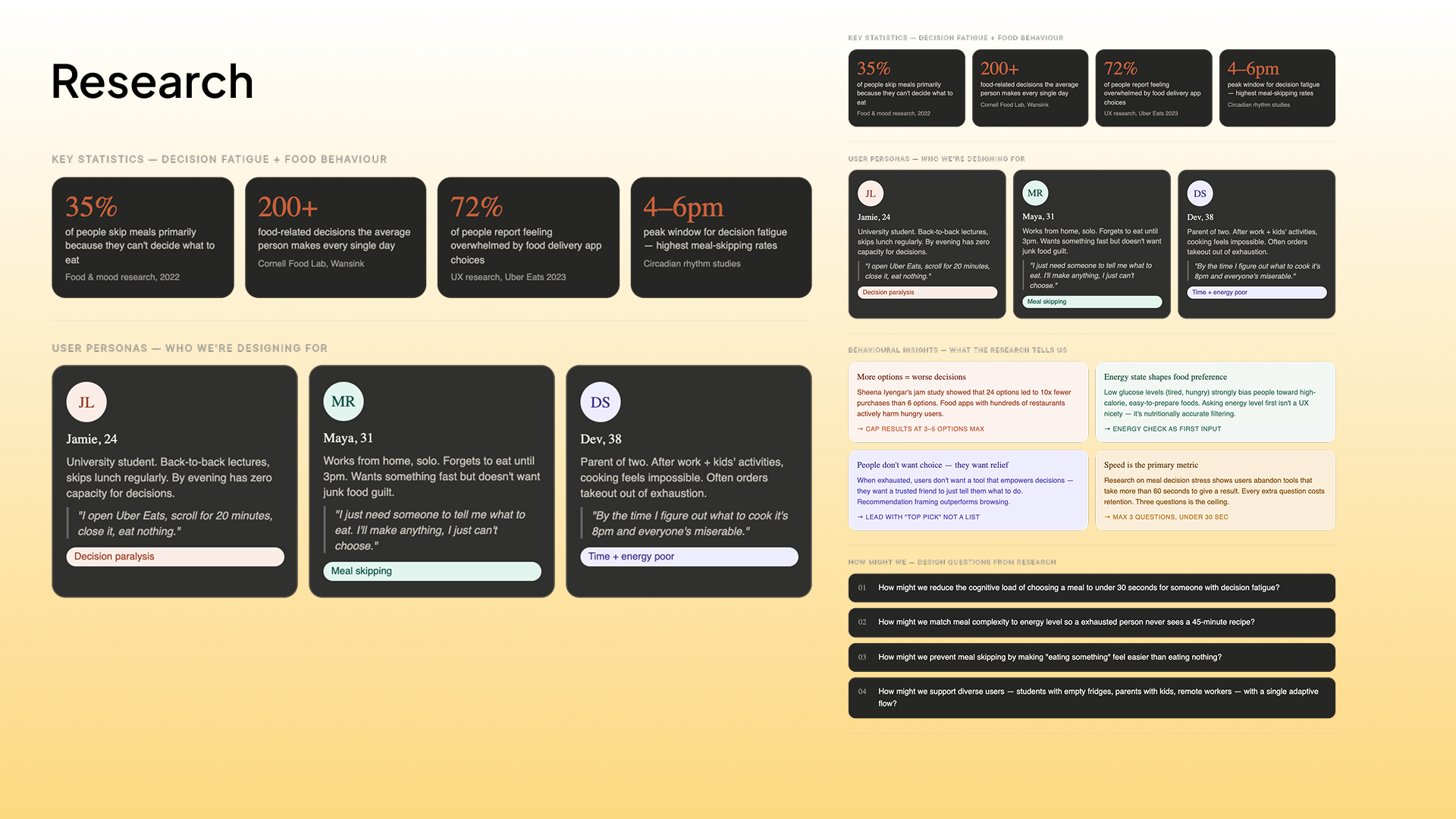
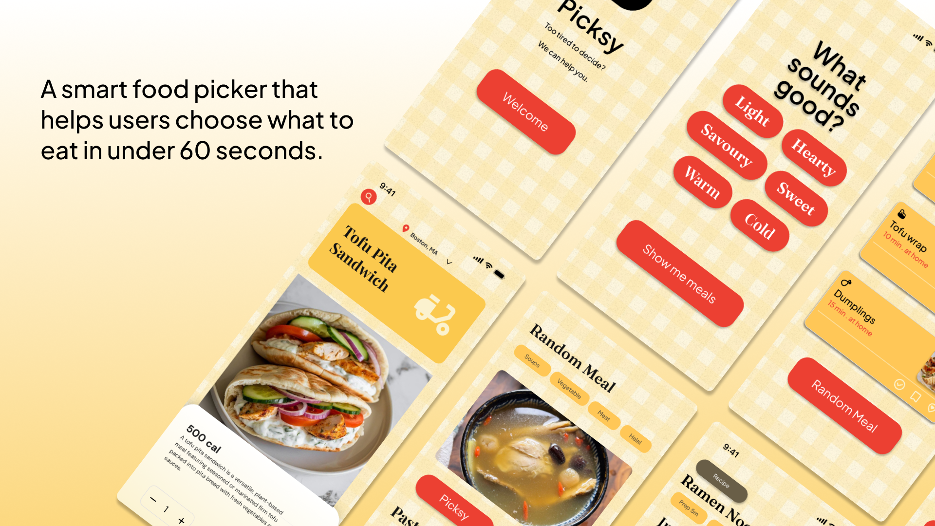
Every day, people face over 200 food-related decisions. By late afternoon, when energy is lowest, even choosing what to eat can feel paralyzing. Existing food apps make this worse: endless scrolling, hundreds of restaurant options, and no guidance. Picksy does the opposite. It asks three quick questions: how are you feeling, where are you eating, and what sounds good, and returns three to five tailored meal options in under 30 seconds. For ordering out, a Tinder-style swipe feature replaces overwhelming lists with a single, low-effort decision.
Picksy is designed for students, remote workers, and anyone who has ever opened a delivery app, scrolled for twenty minutes, and eaten nothing.
Inspiration:
Picksy was born in the most fitting way possible. I was sitting with some friends after the opening ceremony, brainstorming ideas on an empty stomach, and we all needed food, but none of us could agree on what to eat. We each had suggestions, we each had objections, and twenty minutes later, we still hadn't eaten anything. Someone said, "We need an app that just tells us what to eat," and we all immediately knew that was the idea. The frustration I felt in that moment was real and universal. Later, I talked to my group, and we all agreed because being hungry and tired at the same time makes even the smallest decision feel impossible. We didn't have to imagine our user; we were our user. That clarity drove everything that came after, from the three-question flow to the five-option limit to the swipe feature. Picksy is the app we wished existed when we needed it most.
What it does:
Picksy is a meal decision app that gets you from hungry and overwhelmed to knowing exactly what to eat in under a minute. It asks three quick questions: how are you feeling, where are you eating, and what sounds good right now, then returns three to five personalized meal suggestions based on your answers. If you're cooking at home, it shows you a simple recipe with stripped-back steps. If you want to order out, it replaces the usual overwhelming restaurant list with a Tinder-style swipe feature, one restaurant at a time, swipe right to pick it, left to skip. Every results screen highlights one "Top pick" so you never have to compare options if you don't want to. Picksy is designed to make eating feel easy again.
How we built it:
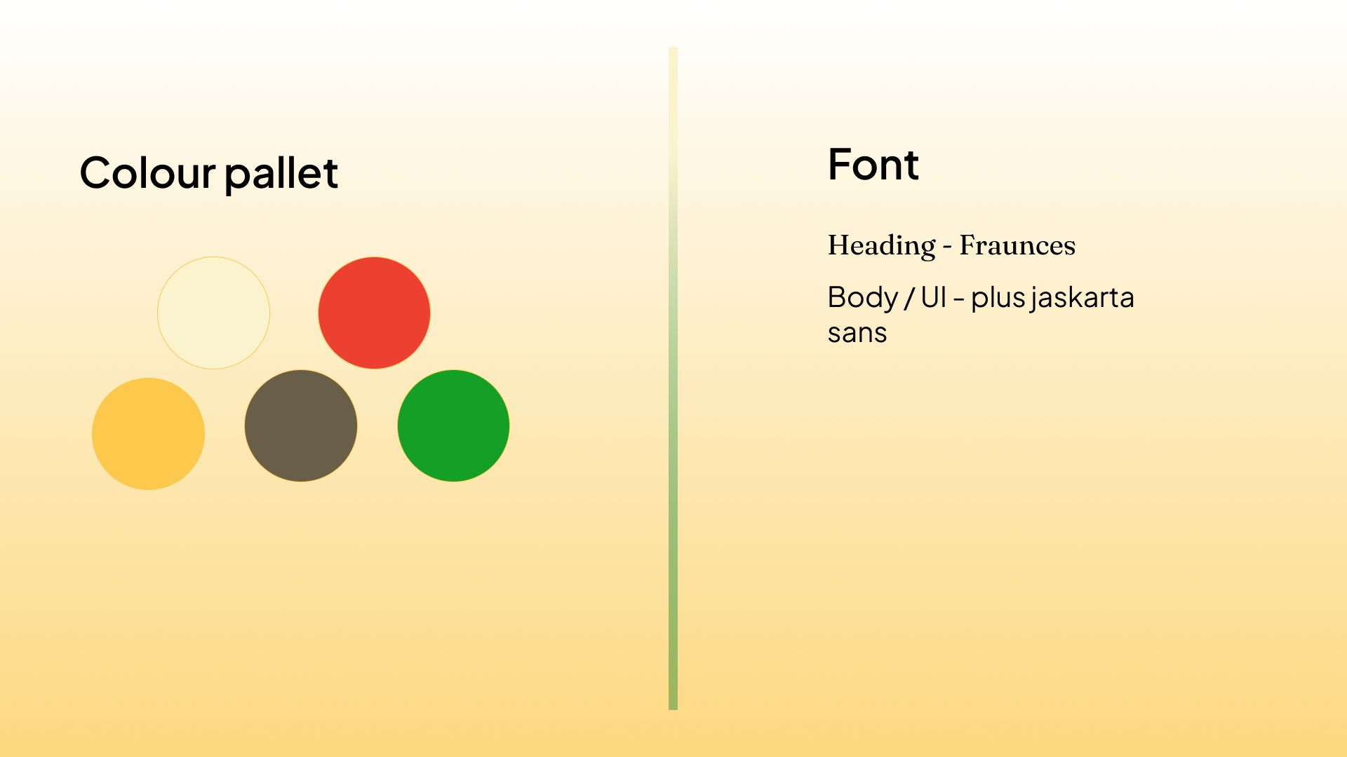
We built Picksy as a high-fidelity mobile prototype in Figma. We started with user research, short interviews, and secondary research into decision fatigue and food behaviour before sketching the user flow and defining our core design principles. From there, we built a component/asset library in Figma covering energy bars, meal cards, and a button system, all using a consistent warm palette. We designed many different screens covering the full user journey from the splash screen through to the recipe view and swipe-to-order flow, with a working prototype linking all screens together. Typography uses Fraunces for headings and Plus Jakarta Sans for UI text, chosen to give the app a warm, human feel that reflects its purpose.
Challenges we ran into:
The biggest challenge we ran into was designing the swipe feature for ordering out. The concept sounds simple: swipe right to pick a food, left to skip, but making it feel intuitive and frictionless in practice took far more iteration than we expected. We had to rethink what information actually needed to be on each card; too much, and it became another overwhelming menu, too little, and it didn't give people enough to make a confident yes or no call. We landed on showing just the cuisine, distance, and estimated time, based on their earlier answers. We also had to think carefully about what happens when a user swipes left on everything, making sure the fallback felt supportive rather than like a dead end. Getting the swipe feature to feel calm, fast, and genuinely useful rather than just novel was the hardest problem we solved.
Accomplishments that we're proud of:
We're proud that Picksy feels genuinely calm to use the palette, typography, and interaction design, all of which work together to lower stress rather than add to it, which was our central goal. We're proud of the swipe feature for ordering out, which reframes a typically overwhelming interaction as something almost playful. And we're proud that we built a full, coherent, clickable prototype in a single day that tells a complete design story from the problem through to the solution.
What we learned:
We learned that designing for overwhelmed users means your biggest enemy is your own instinct to add more. The features that feel most satisfying to design, filters, customization, and settings, are often the ones that make the experience worse for someone who is already depleted. We learned that tone of voice is as important as visual design: two apps can have identical screens but feel completely different based on how they talk to you. We also deepened our understanding of decision fatigue and realized how few digital products are actually designed with it in mind. Most apps are built for engaged, motivated users. Picksy is built for everyone else.
What's next for Picksy:
The next step for Picksy is real-world user testing, putting the prototype in front of people at the exact moment they're trying to decide what to eat, and measuring whether it actually reduces the time and stress of that decision. Longer term, Picksy could expand beyond meals to other daily micro-decisions that cause disproportionate stress, such as what to wear, what to watch, and what to do this evening. The problem Picksy solves isn't really about food. It's about what happens to decision-making when people are tired, and how design can quietly carry some of that weight.
Built With
- figma

Log in or sign up for Devpost to join the conversation.