-
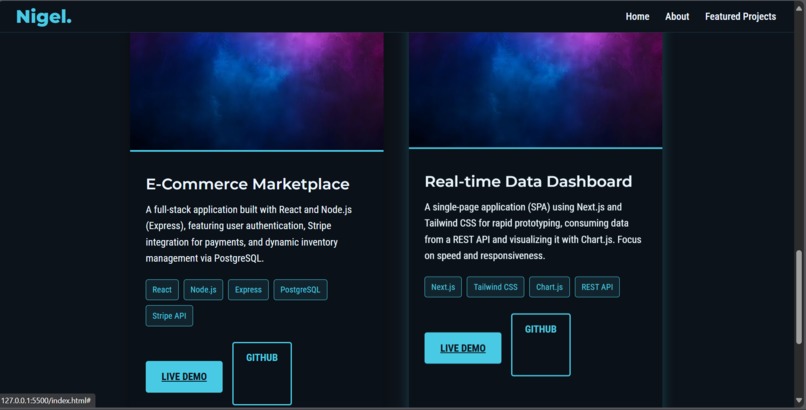
Projects section
-
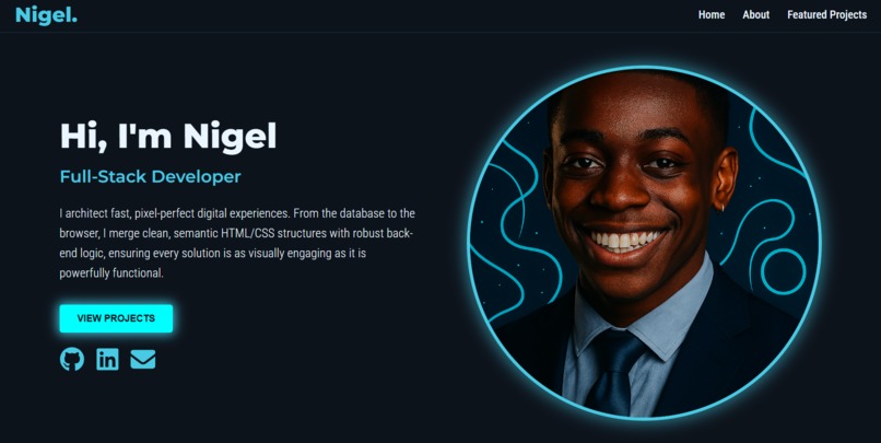
hero section of my project
Inspiration
My inspiration was to move beyond standard templates and build a fully custom, high-contrast dark-mode theme that immediately conveys professionalism and a technical aesthetic. I wanted to prove that complex, visually striking layouts could be achieved using pure, clean HTML5 and Flexbox/Media Queries without relying on external frameworks. The goal was to make the portfolio itself a testament to my skill in foundational web development.
What it does
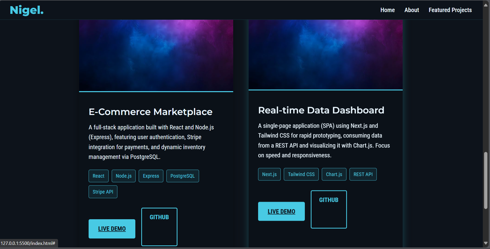
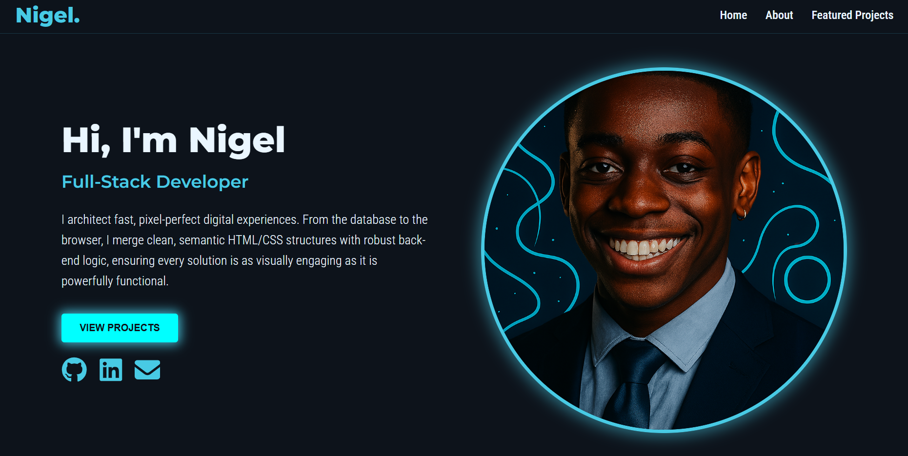
The Personal Portfolio serves as my comprehensive, single-page digital resume. It efficiently directs visitors (recruiters, potential clients) through key information: Introduction: Highlights my core role and unique value proposition (Hero section). Biography: Provides context on my background and passion (About Me section). Showcase: Displays my best work in an easily digestible, card-based format (Featured Projects). Contact: Offers multiple channels for connection and communication (Fixed Header & Footer). Crucially, it is fully responsive, ensuring a consistent and optimal experience across mobile, tablet, and desktop devices.
How I built it
Semantic Structure (HTML5): We used modern, semantic HTML (e.g.,
, , ) to create a logical document flow, prioritizing accessibility and maintainability. Thematic Styling (CSS): We established the high-contrast dark theme using CSS Custom Properties (:root), defining the primary background, dark accents, and the signature cyan glow (--accent-cyan: #48CAE4).Layout and Responsiveness (Flexbox & Media Queries):
Fixed Header: Used position: fixed and z-index to pin the navigation to the top, ensuring persistent access. Main Layout: Utilized Flexbox for the two-column layouts (Hero, About) and the project card grid, ensuring flexible spacing. Responsiveness: Custom @media queries were implemented at 992px and 600px breakpoints to reflow the layout into single-column stacks for mobile viewing. Visual Polish: Subtle CSS animations were added to buttons and social icons (box-shadow and transform) to provide dynamic feedback without requiring JavaScript.
Challenges I ran into
The Fixed Header Offset: A major initial challenge was the fixed header overlapping the content upon scrolling. Solution: This was solved by precisely matching the header's height (≈50px) with a padding-top: 50px rule on the element, pushing all subsequent content down. Image Alignment on Mobile: When the Hero section shifted to a vertical stack on mobile, the profile image often appeared below the text. Solution: We used the Flexbox order property in the mobile media query to explicitly force the image component to display above the text component, maintaining a logical visual hierarchy. Cross-Browser Consistency for SVGs: Ensuring the embedded social media SVGs (GitHub, LinkedIn) adopted the accent color and hover effects consistently required stripping out any conflicting inline SVG styling and managing the fill property solely within the external CSS file.
Accomplishments that I'm proud of
100% Custom CSS: Achieving a complex, responsive design without relying on any external CSS framework, demonstrating complete mastery of fundamental styling properties. High Visual Contrast: Successfully implementing a visually stunning dark mode with a signature cyan glow that draws attention to key elements like the profile image border and project cards. Efficient Responsiveness: Implementing a fluid layout that scales seamlessly, from the three-column footer on desktop to the vertical content stacks on mobile, ensuring all elements remain legible and usable.
What I learned
The Importance of CSS Architecture: Learning how to effectively use CSS Custom Properties (:root) was invaluable for managing the dark theme's color variables, making global changes quick and preventing errors. Flexbox for Everything: This project solidified the principle that Flexbox is the superior tool for almost all modern one-dimensional layouts, streamlining the process of creating components like the skill tag grid and the project links.
