Penny — Building a Financial Co-Pilot for the Anxious Generation
What inspired us
It started with a conversation most of us have had.
A friend gets their first real paycheck. They know they should save — everyone says so. But save how much? Save where? For what, exactly? So they do nothing. The paycheck comes in, the paycheck goes out, and the anxiety stays.
We kept seeing the same pattern: young adults who weren't broke, weren't irresponsible, and weren't unintelligent — they were just nobody had ever given them a clear next step.
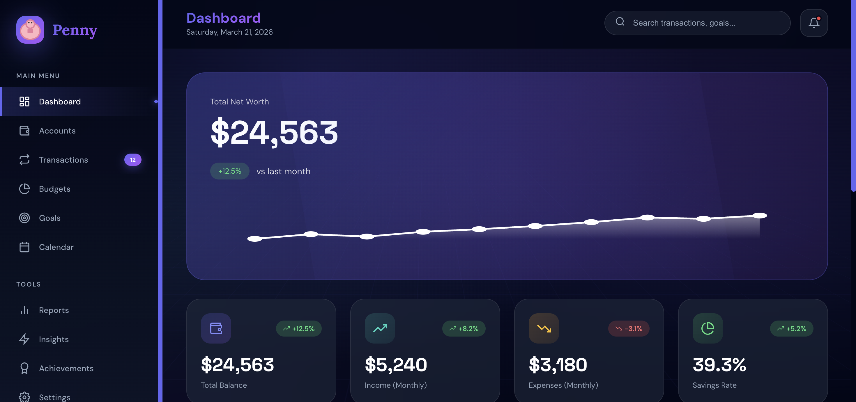
The existing tools weren't helping. Mint, YNAB, every budgeting app we tried assumed a baseline of financial literacy that most 19–25 year olds simply don't have yet. They handed you a dashboard and expected you to know what to do with it.
We wanted to build the thing we wished existed at 20: not a tracker, not a course, not a calculator — just something that looked at your situation and said "here's what to do this week".
What we learned
1. Shame is a design problem
Our biggest research insight wasn't about features — it was about emotion. Users don't open finance apps when they're behind on their goals. The act of checking in feels like opening a report card you know is bad.
Every design decision in Penny had to answer the question: does this make the user feel judged? If yes, we cut it or reframed it.
2. Optionality is the enemy of action
There's a concept in behavioral economics called choice overload. The more options you present, the less likely someone is to choose any of them. We saw this play out in our user research immediately.

Log in or sign up for Devpost to join the conversation.