-
-

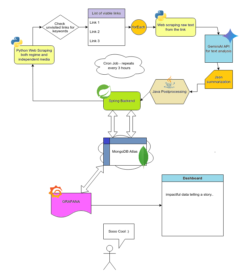
Project Workflow
Inspiration
In Serbia, following the tragic Novi Sad railway canopy collapse in November last year, where 16 lives were lost, widespread student-led protests erupted. The confusion caused by completely different stories emerging from various media outlets intrigued us. We felt inspired to use our skills in web dev, AI, and a passion for data visualization to try and bring some clarity.
What it does
Our solution is a dynamic dashboard presenting how the situation unfolded up to the present, thanks to near real-time data updating based on the latest news, from both regime-controlled and independent media outlets. On our Grafana dashboard, you can:
- See a semi-live map pinpointing reported protest locations across Serbia.
- Explore sentiment analysis: How are students or protesters being portrayed?
- Compare keyword usage: How often do protest related terms like "justice" appear in different media spheres in comparison to pure propaganda?
- Directly visualize the "Headlines vs Reality" contrast through comparative charts and stats
How we built it
We pieced together a pipeline designed to automatically gather, understand, and display this information:
- News Gathering: We started with Python and the BeautifulSoup library to scrape articles from both independent and pro-government Serbian news websites. We had to build in some flexibility to handle different website layouts.
- AI Brains: The raw article text then gets sent off to the Gemini 2.5 Flash API. We spent time crafting prompts to tell the AI exactly what we needed: Is this article about a protest? Where did it happen? Who was mentioned? And, crucially, what's the sentiment towards the protesters/students? It sends back structured JSON data.
- The Control Room: A Spring Boot backend acts as the central coordinator. It uses Cron jobs to trigger the scraping process automatically every couple hours. It handles communication with the Gemini API through a Python script, tidies up the data, and makes it ready for Grafana via a simple REST API.
- Storing the Goods: All the structured info coming back from Gemini gets stored in MongoDB Atlas. We picked Mongo because it excels at handling the kind of slightly messy, ever-evolving JSON data you often get from web scraping and AI analysis.
- Making it Visual: Grafana is where the magic happens for the user. We hooked it up to our MongoDB Atlas. Then we went to town building dashboards using different Grafana panels – Geomaps for locations, Time Series for trends, Stats for key numbers, and Tables for an easy view of the protest schedule.
Challenges we ran into
Although each part was challenging on its own, designing the complex yet logical system architecture and connecting the pieces together posed the largest challenge, especially given the wide array of technologies used.
Accomplishments that we're proud of
We're proud of our decision to raise awareness of a very personal and important topic. Furthermore, we take pride in our persistence and determination to bring such a seemingly complex and "36h impossible" idea to life. Apparently, sleep deprivation and potato chips can take you so far.
What we learned
None of us had previously worked with Grafana, nor had any experience with web scraping, yet we not only managed to complete the imagined task, but to learn in the process as well. We'll all likely use these technologies extensively in the future. There was also a lot of opportunity to learn the intricacies of our stack from each other, and also exchange knowledge with peers and mentors on site.
What's next for Peaceful Protest Tracker: Headlines vs Reality
Who knows what the future holds. Assuming the websites we scraped from don't change their format soon, our project is very self-maintainable, so we'll probably keep it running and keep adding features as novel ideas arise.


Log in or sign up for Devpost to join the conversation.