-
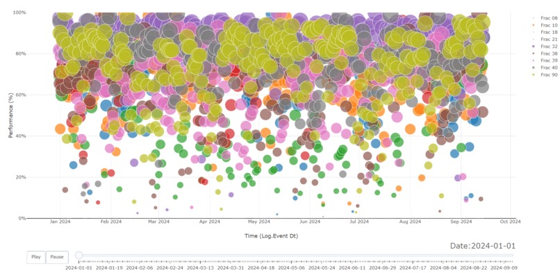
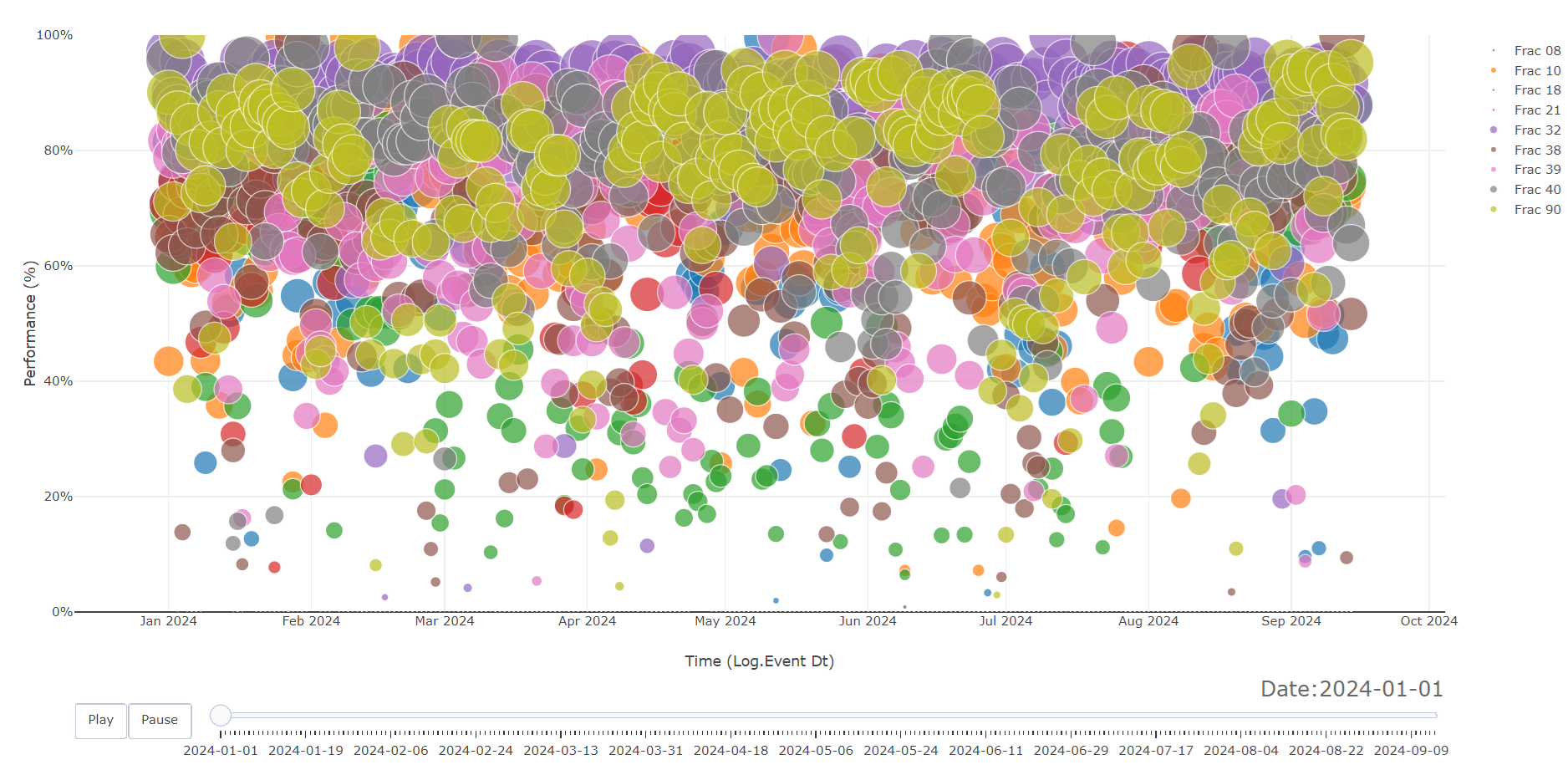
Racing Bubble Plot
-

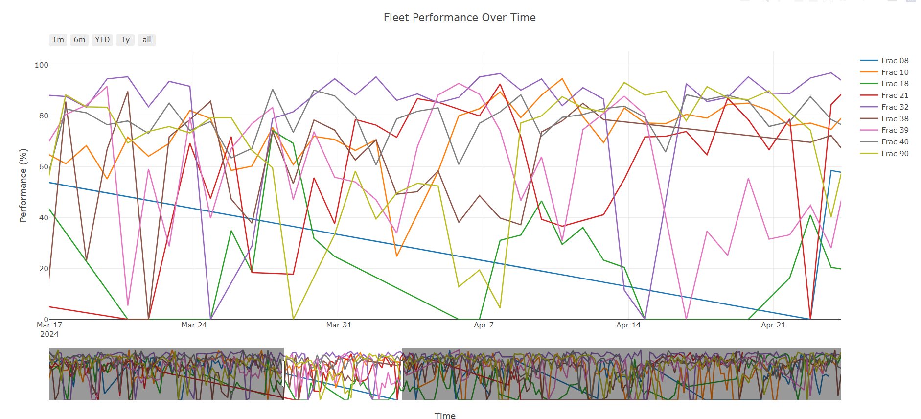
Line Plot
-
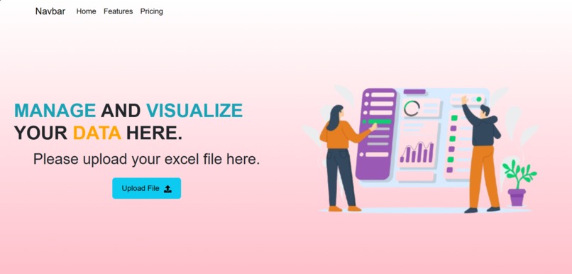
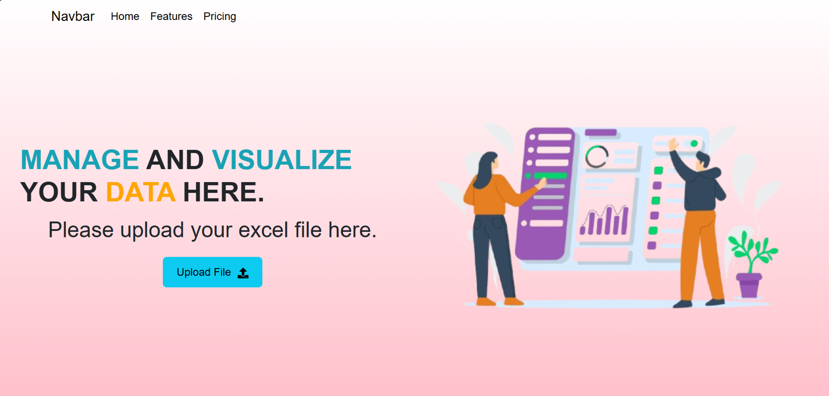
Landing Page
What it does: Our platform gamifies team performance tracking for Patterson UTI by visualizing and comparing key performance indicators (KPIs) of frac fleets. It ranks teams based on a dynamic scoring algorithm that incorporates various KPIs, such as pumping hours, efficiency, and safety metrics, and displays the results on an interactive leaderboard. The system promotes competition by introducing daily challenges, insights for improvement, and performance-based rewards, motivating teams to continuously perform better.
How we built it: We developed the front end using React, which allowed us to create a smooth and responsive user interface. The back end was built with Python and Django, providing robust data management and processing. For data visualization, we integrated Plotly JS to create real-time, interactive charts and graphs that present team performance in an engaging and intuitive way. This stack enabled us to handle daily KPI changes efficiently while delivering a seamless user experience.
Challenges we ran into: One of the biggest challenges was designing a scoring algorithm that fairly evaluates teams based on different KPIs that change daily. Balancing the weights of various performance metrics to ensure fairness while maintaining competitiveness was complex. We also encountered technical challenges integrating real-time data updates into our visualization components and ensuring that the data was presented in a clear and engaging way.
Accomplishments that we're proud of: Successfully developing a dynamic scoring algorithm that fairly incorporates multiple KPIs and adjusts to daily changes. Building a responsive and interactive dashboard that visualizes team performance in real time using Plotly JS. Creating a gamified experience that motivates teams to improve daily while promoting healthy competition. Efficiently managing the back-end data handling with Python and Django, ensuring smooth communication between the front end and back end. What we learned: This project taught us a lot about balancing complex performance metrics in a way that is both fair and competitive. We also gained deeper insights into optimizing real-time data visualization and ensuring that it is both user-friendly and impactful. On the technical side, integrating React with Django and Plotly JS challenged us to ensure smooth communication between the front end and back end, giving us a deeper understanding of full-stack development.
What's next for Patterson UTI Visualization Challenge: Moving forward, we aim to introduce more advanced features, such as machine learning algorithms to predict future team performance based on historical data. Additionally, we plan to implement deeper customization options for the KPIs so that users can prioritize metrics based on their operational goals. We also envision expanding the gamification elements by adding team competitions, long-term achievement tracking, and more detailed performance reports.
Built With: React for front-end development Python and Django for back-end development Plotly JS for interactive data visualizations HTML/CSS for styling and responsive design SQLite/PostgreSQL (depending on your choice) for database management

Log in or sign up for Devpost to join the conversation.