Pathfinder — Project Story Inspiration The college admissions process is one of the most consequential experiences a student will face. It's also one of the most unequal. Students at well-funded schools get dedicated counselors, test prep resources, and alumni networks. Students elsewhere navigate alone — piecing together guidance from fragmented Google searches, outdated handbooks, and word of mouth. That gap has real consequences. Research consistently shows that first-generation students are far less likely to apply to selective colleges — not because they're less capable, but because they lack information. One study found that when high-achieving, low-income students received a single mailing with application guidance, their enrollment at selective colleges increased by over 40%. That statistic stuck with me. The information exists. The tools exist. The barrier is access. Pathfinder is an attempt to put a knowledgeable, always-available advisor in every student's pocket — regardless of zip code, school budget, or family background.
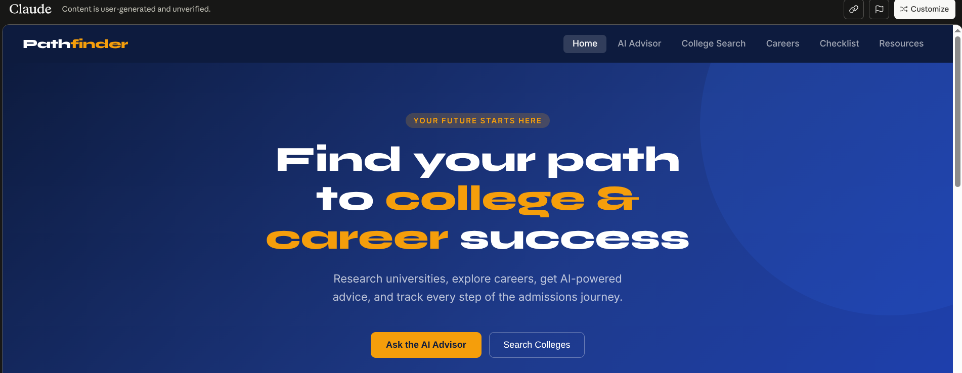
What It Does Pathfinder is a web-based guidance platform with five core features:
AI Advisor — A Claude-powered chatbot with deep admissions and career knowledge, available 24/7 for any question a student might be too nervous to ask a counselor. College Search — Filter thousands of schools by type, cost, acceptance rate, and location to build a balanced list. Career Explorer — Browse 12+ career paths with salary ranges, growth outlooks, required skills, and degree requirements. Application Checklist — A full 9th-grade-to-decision-day timeline with automatic progress saving. Resource Hub — Curated links to the tools that matter most: FAFSA, Common App, Khan Academy, and the BLS Occupational Outlook Handbook.
How I Built It The entire application is a single HTML file — no frameworks, no build step, no backend. This was an intentional choice. A self-contained file can be saved to a phone, shared via email, or hosted on any static server, making it as accessible as possible. pathfinder.html ├── CSS (custom design system — navy/blue/amber palette, Syne + Inter typefaces) ├── HTML (6 page sections, toggled via JS) └── JavaScript ├── College search + filtering logic ├── Career explorer + modal rendering ├── Checklist with localStorage persistence └── AI chat → Anthropic API (claude-sonnet-4-6) AI Integration The chat feature calls Anthropic's /v1/messages endpoint directly from the browser. Each request includes a carefully crafted system prompt scoping the model to college and career guidance, and the full conversation history is sent with every request — the standard stateless-API pattern for coherent multi-turn dialogue.
Checklist Persistence Completion state is stored in localStorage as a JSON map. Progress is computed as a simple ratio of checked items to total — instant, offline-friendly, no server required.
Challenges Information density without clutter. Admissions data is heavy — acceptance rates, deadlines, costs, salary ranges. The solution was a layered approach: cards show the essential summary; modals reveal full detail on demand. Making the AI feel trustworthy, not generic. The system prompt went through many iterations to push the model toward specificity. Quick-start chips ("FAFSA explained," "ED vs EA") also lower the activation energy for students who don't know where to begin. Zero dependencies. No React, no Webpack, no npm. More verbose in places, but the file loads instantly, works offline once cached, and has zero supply-chain attack surface. Salary visualization without a charting library. Instead of importing D3 or Chart.js, salary ranges are rendered as proportional CSS bars. A bar that's twice as wide communicates "this pays more" — which is exactly the intuition a 17-year-old needs when comparing career paths.
What I Learned Information design is harder than engineering. The trickiest decisions weren't technical — they were about what not to show, and in what order. Stateless APIs are surprisingly powerful. Sending full conversation history on every call produces remarkably coherent multi-turn guidance, with no backend state management at all. Friction kills good intentions. Every extra click or login wall is a student who gives up. Ruthless simplification is a feature, not a compromise. The equity lens sharpens every decision. Asking "would a student at an under-resourced school actually find this useful?" kept the feature set focused on what genuinely matters.


Log in or sign up for Devpost to join the conversation.