-
-
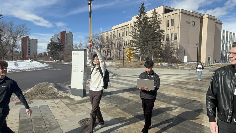
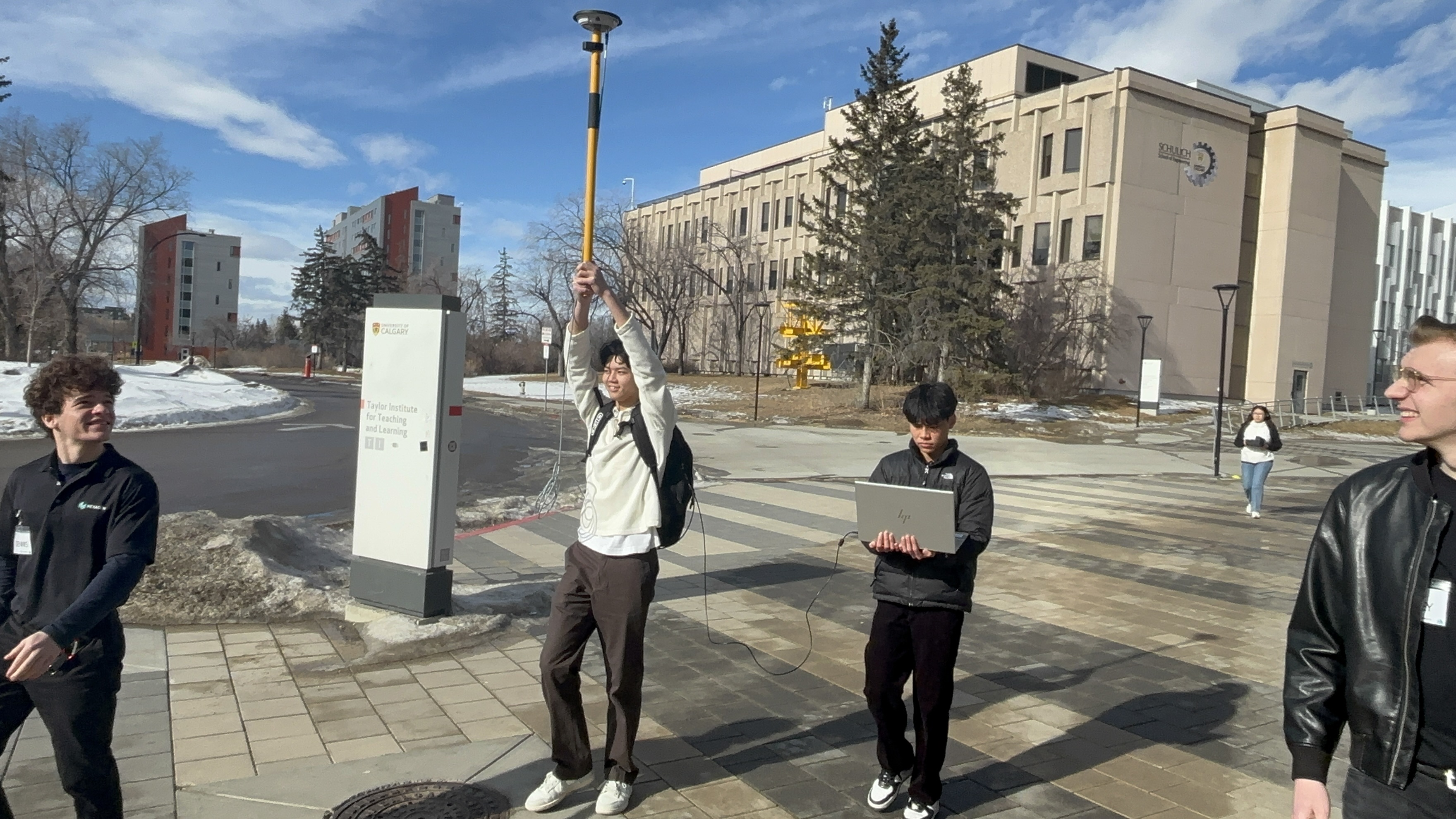
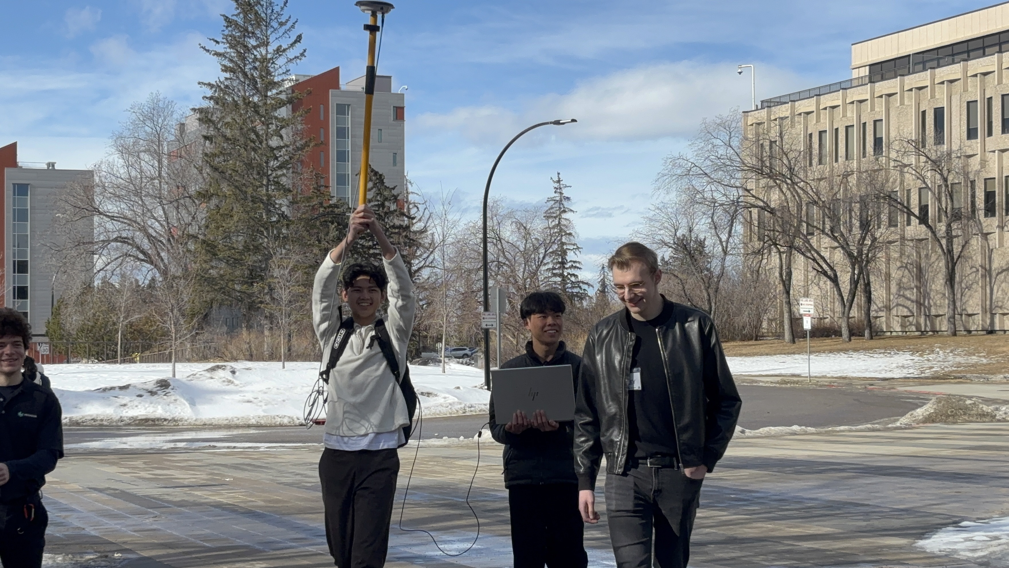
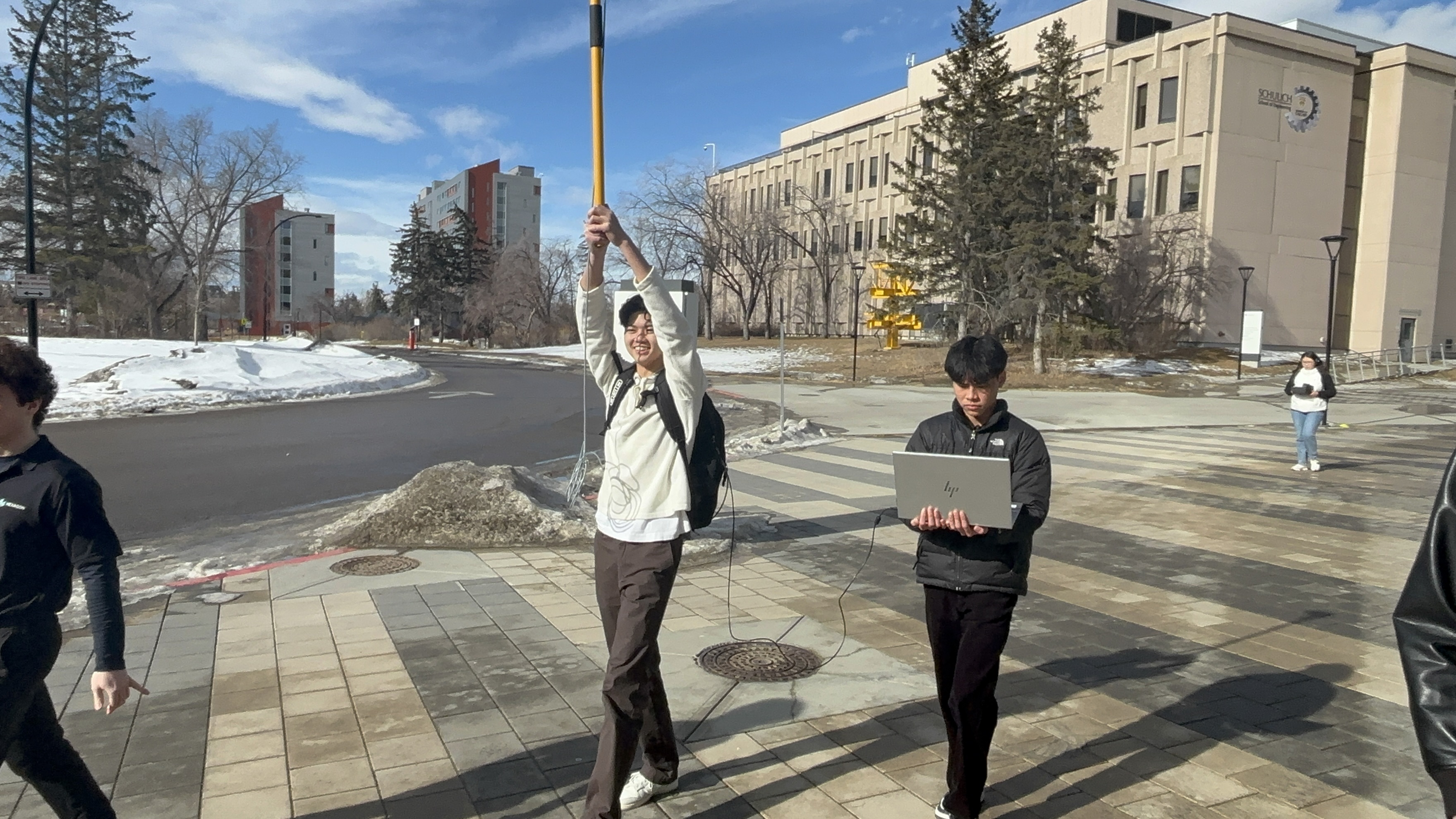
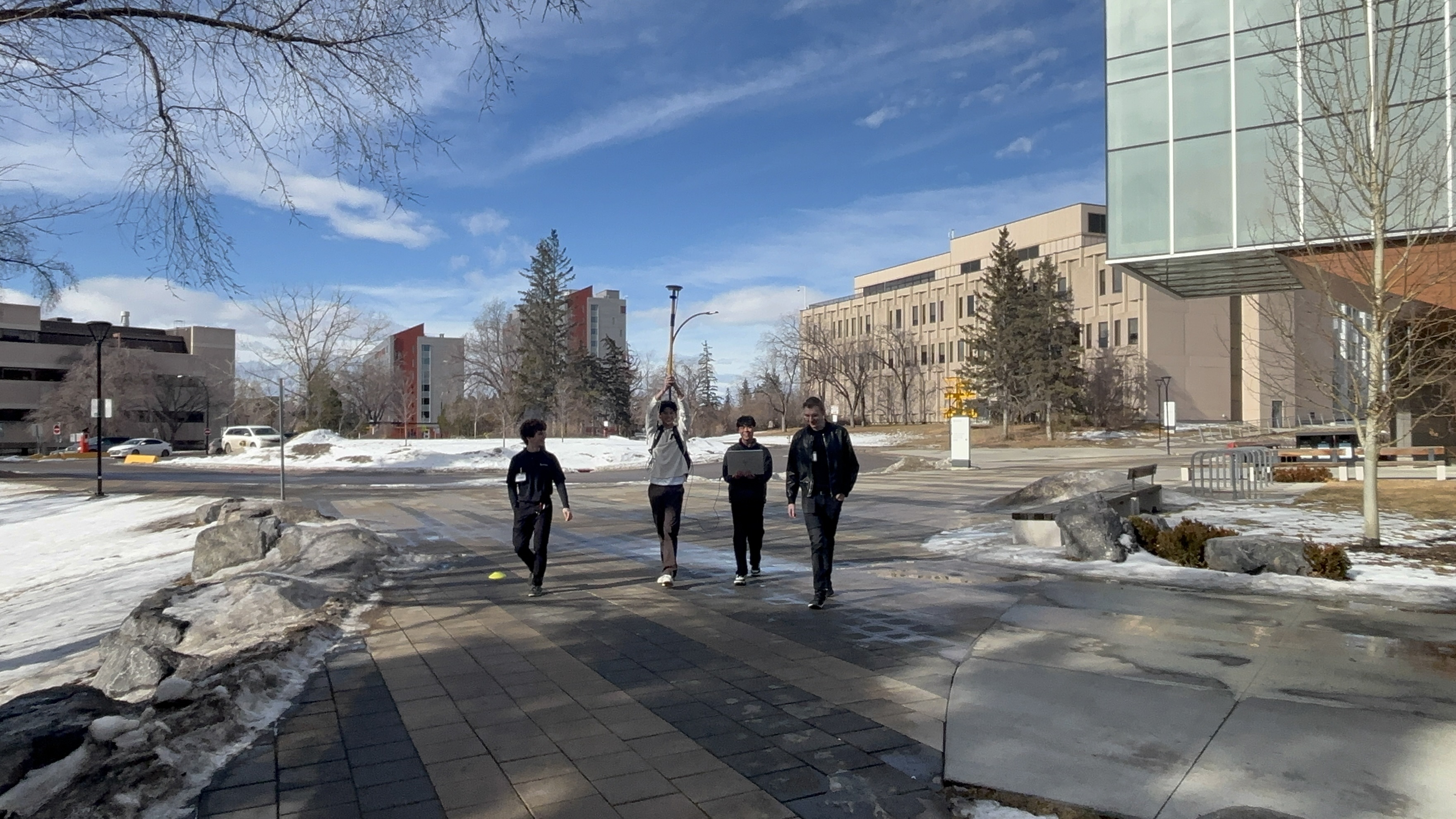
Data Collection
-

Data Collection
-
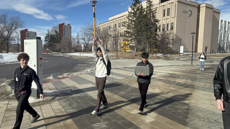
Data Collection
-

Data Collection
-

Data Collection
-

Data Collection


Inspiration
Our project was inspired by apps that are used to track your running progress; in short, those apps would track the path that you would run and overlay it on Google Maps, and it would show different colours along the path based on the speeds you were running at. Instead of overlaying a coloured velocity path on Google Maps, though, we decided to take it one step further by plotting the coloured velocity path in a 3D cartesian plane to also show altitude.
What it does
Our program first converts geodetic information collected by the satellite receiver into Cartesian XYZ coordinates. Through a user-friendly terminal, the user can then type in the data file that they want to parse (making our program compatible with any future data collected by a satellite receiver), and they can select the data visualization that they want to see. If they choose the Google Maps option, they will be automatically redirected to a URL containing the path overlaid on Google Maps. If they choose the 3D plot option, three interactive 3D plots will automatically show up: one displaying the raw data, another displaying the smoothed data, and a third displaying a graph that changes colour as velocity changes at certain points. These plots are also saved as image files afterwards.
How we built it
First, we found the specific indices that contained latitude, longitude, height, and velocity, and extracted them in order to move them to a 2D list containing position information and a 1D list containing velocity information. We set up a simple terminal prompt to ask the user what data visualization they would like to see, with functions being called upon based on the one they select. For the Google Maps function, the latitudes and longitudes from the 2D position list were imported as a string into a Google maps URL in order to generate a path. For the 3D plot, the geodetic information for position was first converted to Cartesian XYZ coordinates using the equations provided, and then separate functions generated the 3D plots using matplotlib. Specifically, we applied a Savitzky-Golay filter to generate the smoothed data, and we used the colour map function in matplotlib to generate the coloured velocity plot.
Challenges we ran into
This hackathon was quite a challenge for us as it was our first one. That being said, some challenges we ran into were picking logs to give to the receiver and analyzing logs that the novatel receiver returned. As for input logs, we were quite confused on what kind of data we wanted, along with how to get the smoothest data possible to increase our chances of having a smooth path in the end. On the other hand, output logs were giving huge portions of data that were being returned per log so deciding where to find what we wanted proved tricky even with the log manual. Furthermore, smoothening the graph after data collection was hard as we decided to use the Savitzky-Golay filter; an effective method for smoothing out continuous data. The challenging part was to understand how it worked as it involved complex mathematical arithmetic.
Accomplishments that we're proud of
One of our major accomplishments was the smooth data we received in our data collection stage. This was because we used the pdp filter, and enabled it into glide mode. Using this filter made our path visualization much more smooth and accurate. Another part of our program that worked surprisingly well was our implementation into google maps. Basically, we provided a URL in google maps with all our logged points’ longitude, latitude, and altitude and it traced out the exact path we took when holding the receiver. We also tried using 3D matplotlib, to get an accurate visualization of our path in the x,y, and z directions and surprisingly, it worked out really well. We had a visualization of a graph that we could rotate and zoom in/out of; like a 3D model.
What we learned
We learned how to use a Novatel Receiver and the Novatel Application, along with its different logs, in order to collect position data along a path. Furthermore, we learned about different positional data types, such as geodetic and cartesian coordinates, and we learned how to generate 3D plots within matplotlib. Learning about curve smoothening filters and coloured maps within matplotlib was also very interesting. Additionally, we learned about the inner workings of Google Maps links. As a bonus, we also learned about the different real world uses of geomatics engineering from a conversation with Dr. Paul Alves.
What's next for Path Visualization based on Novatel Receiver
We can always work on making the data collection more accurate by reducing interference caused by outside buildings, whether it be through better equipment or different data collection techniques. We could also try implementing different filters to research if some are better than others in terms of data smoothening, and we could experiment with different types of path visualizations that we could generate (e.g. a 3D topology overlaid on Google Maps to show altitude).


Log in or sign up for Devpost to join the conversation.