Inspiration
We were inspired by the everyday “in between” moments such as waiting for class to start, standing in line, riding the bus, or taking short mental breaks. These small pockets of time often lead to mindless scrolling.
Platforms like Webtoon offer amazing content, but many users express frustration with the UI feeling cluttered, unintuitive, and not optimized for quick, casual reading.
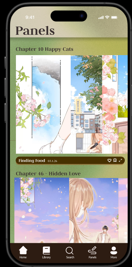
We wanted to redesign the webcomic experience to be calmer, simpler, and more intuitive, something that feels like flipping through paper, which we implemented via horizontal scrolling rather than vertical.
What it does
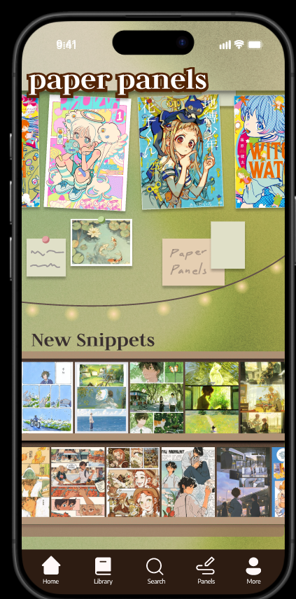
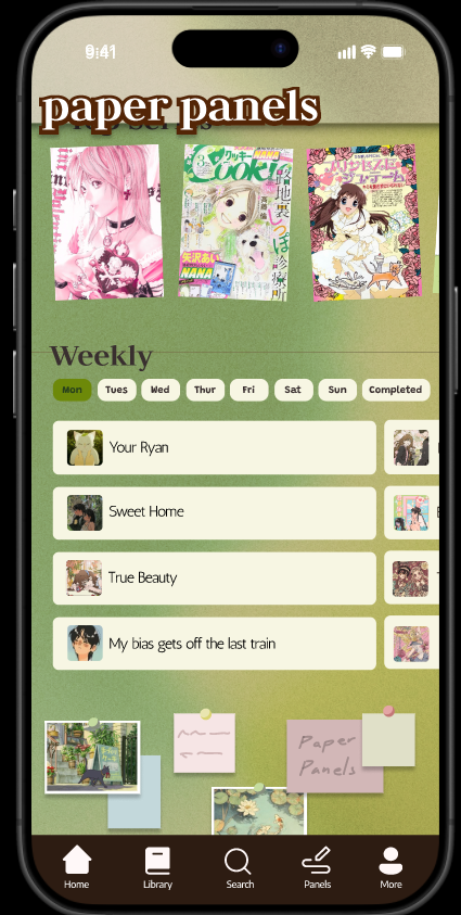
Paper Panels is a redesigned webcomic app focused on:
A cleaner more intuitive interface
Quick access for short reading sessions
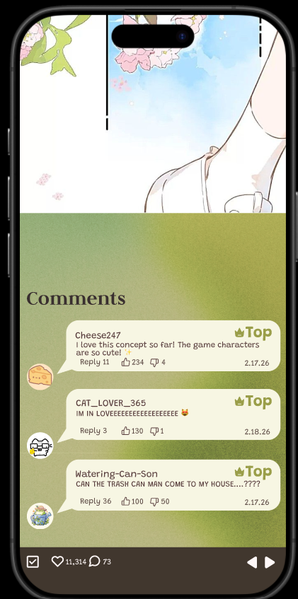
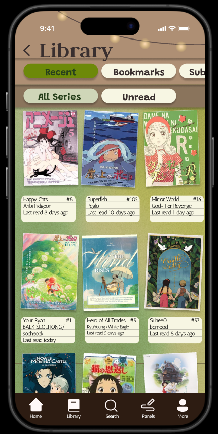
Contains horizontal scrolling
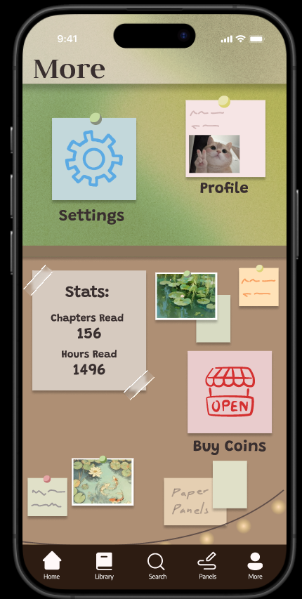
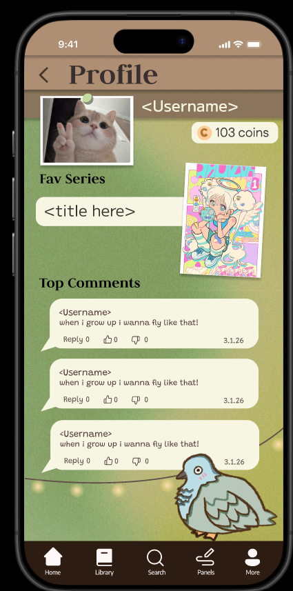
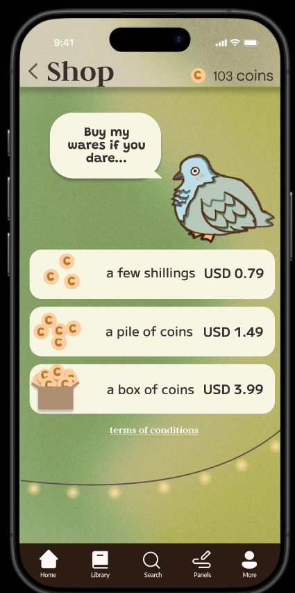
Has a home , library, chapters, panels, panel view, shop, profile, settings, login
How we built it
We designed Paper Panels entirely in Figma focusing on:
Doing research on the UI gap of common comic apps
Designing UI components
Iterating on navigation structure
Ensuring most buttons simulate real functionality
We started with planning out the layouts and progressively refined the visual system, typography, spacing, and interaction design.
Challenges we ran into
Buttons initially being too small or hard to tap
UI elements not feeling consistent across pages
Overdesigning individual pages before establishing a consistent low-fidelity structure
Balancing aesthetic coziness without making it look too gamelike.
Through iteration we resized interactive elements, spacing and refined the overall visual hierarchy.
Accomplishments that we're proud of
Most buttons in the prototype are interactive and lead somewhere meaningful
We created a soft UI system inspired by cozy room decor
We redesigned a familiar concept in a way that directly addresses user complaints
What we learned
Build and solidify the low fi structure first before adding heavy visual detail
Functionality and user flow matter more than aesthetic polish at early stages
Consistency in spacing, sizing, and typography makes a huge difference in quality
Designing for short real life use cases requires simplicity over complexity
What's next for Paper Panels
Turning the Figma prototype into a fully functional application
Adding real backend logic to power all buttons and features
Implementing user accounts and saved reading history
Developing a recommendation system optimized for short reading sessions
Conducting usability testing to validate our UI improvements
Built With
- figma


Log in or sign up for Devpost to join the conversation.