-
-
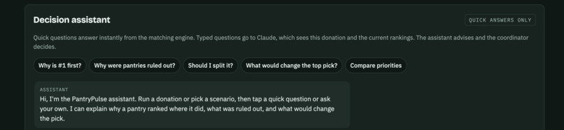
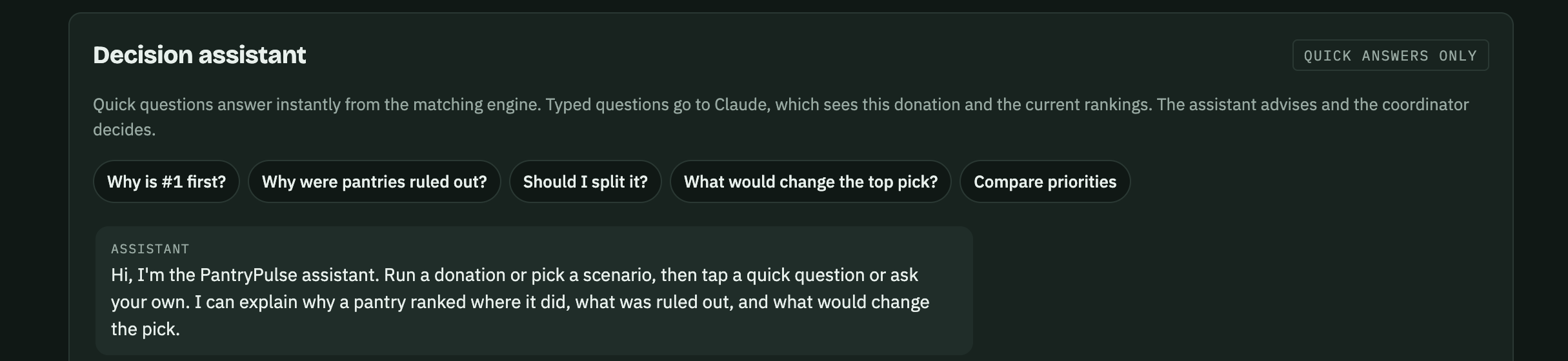
Decision Assistant
-
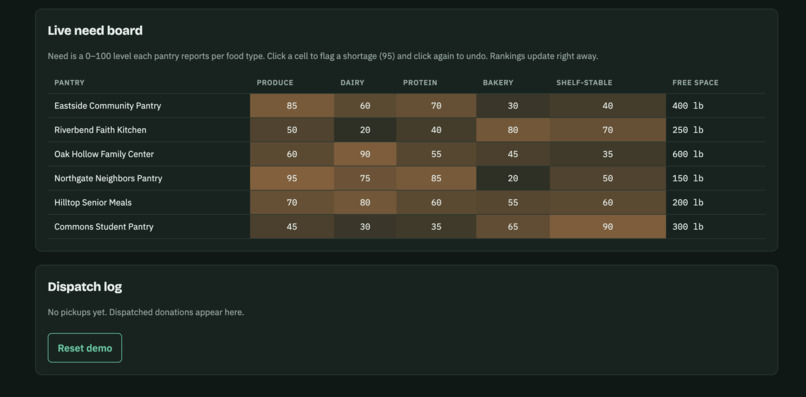
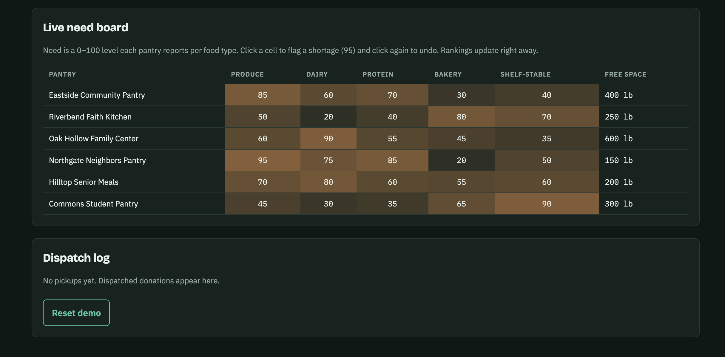
Live need board
-
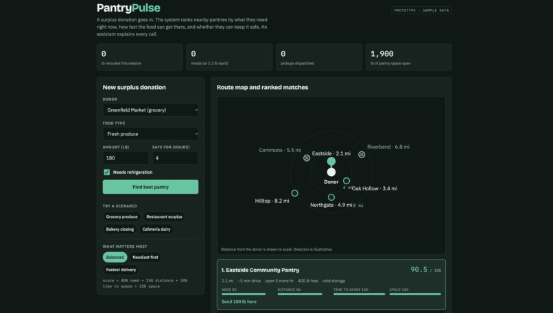
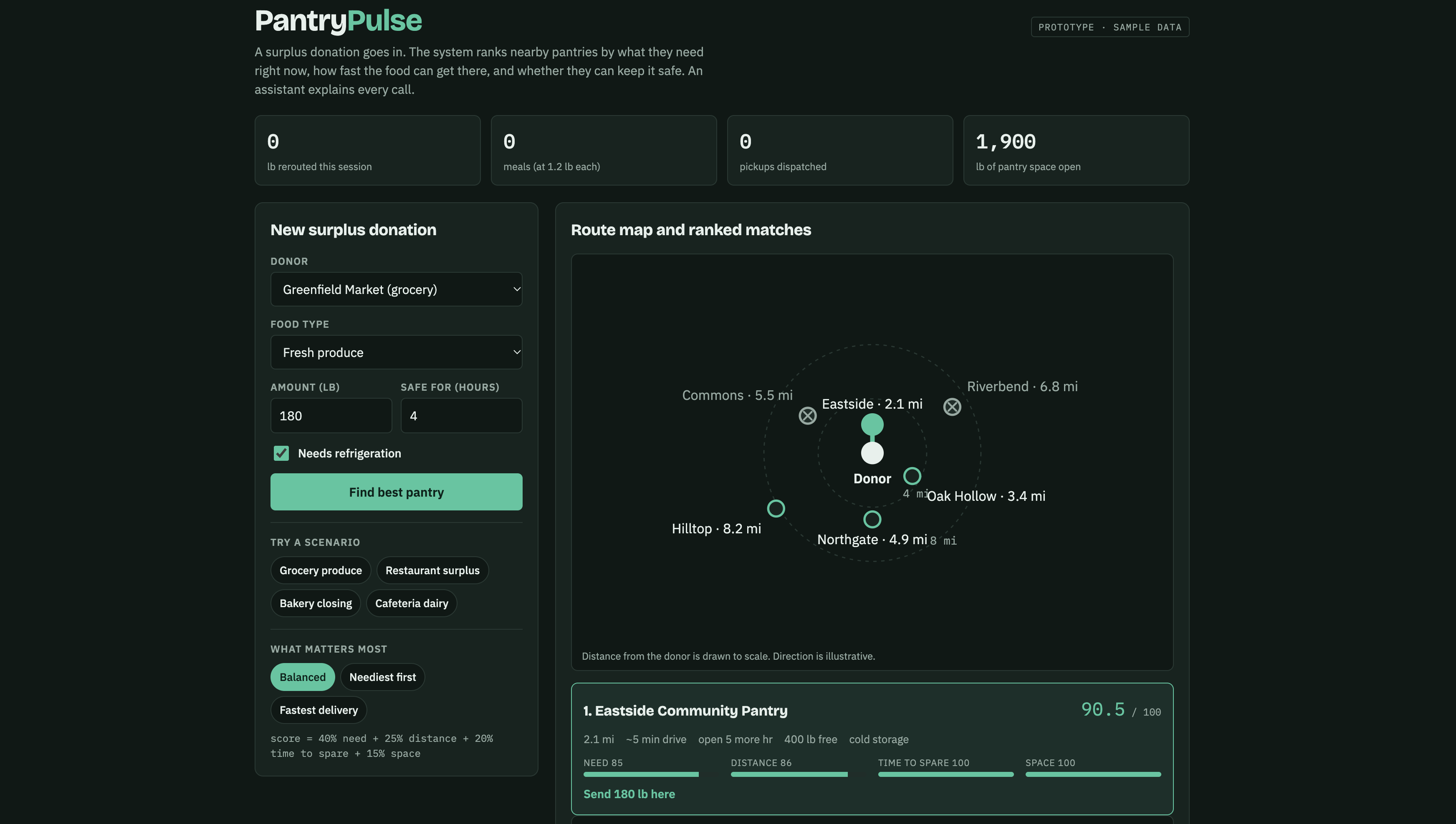
The Main Dashboard
Inspiration
Roughly 30-40% of the US food supply is wasted, according to USDA. Meanwhile, food pantries run short, often of the exact things that spoil fastest: produce and dairy. Donors like grocers, restaurants and school cafeterias want to give, but calling around to find a pantry that can take 200 lbs of milk before tonight costs time they don't have. We wanted to close that gap. I really saw places that want to give food away should be able, and that no food should not be able to go to food pantries which can help out others in need.
What it does
PantryPulse is a matching layer between surplus food and real need.
- Post: a donor logs the food type, amount, and how long it stays safe.
- Match: pantries are ruled out if they lack cold storage, can't be reached before the food spoils, close too soon, or are full. The rest are scored.
- Dispatch: large donations split across pantries, and everyone gets one clear pickup plan.
Each eligible pantry \( i \) gets a score out of 100:
$$S_i = 0.40\,N_i + 0.25\,D_i + 0.20\,T_i + 0.15\,C_i$$
where \( N_i \) is the pantry's reported need for that food type, \( D_i = 100\cdot\max(0,\,1 - m_i/15) \) rewards short distance \( m_i \) (miles), \( T_i \) rewards time to spare before the food is unsafe, and \( C_i \) is the share of the load the pantry has space for. Meals are counted as pounds \( \div 1.2 \), the convention Feeding America uses.
The decision assistant
To make choices easier, the demo includes an assistant. Quick questions such as why is #1 first?, why were pantries ruled out?, should I split it?, what would change the top pick? and compare priorities are answered instantly from the matching engine. Typed questions go to Claude, which sees the live donation and rankings. It advises and the coordinator decides. It never rules on food safety.
Other demo features
- Scaled route map showing distance from the donor to each pantry
- Priority modes: Balanced, Neediest first, Fastest delivery (the top pick can change)
- Scenario buttons, a live need board where you click to flag a shortage, a dispatch log, and a copyable pickup plan
How we built it
The prototype is a single-page web app in HTML, CSS and JavaScript. The matching engine is a transparent rule-and-score system, so every ranking can show its reasons. The map is drawn in SVG. The assistant's typed answers use Claude, with the donation and rankings passed in as context. All pantries, donors and need levels in the demo are sample data.
Challenges we ran into
- Deciding what should be a hard rule versus a weighted score. Safety limits had to be filters, not trade-offs.
- Making the assistant trustworthy: it only sees what's on screen, answers briefly, and never declares food safe or unsafe.
- Keeping the map honest: distances are to scale, but direction is illustrative.
- Building something realistic without real pantry data.
What we learned
Matching problems are less about clever math than about timing and trust. A simple, explainable score that volunteers can read beats a black box. We also learned how much the right question, "why did it pick that?", helps people decide.
What's next
A six-week pilot with three pantries and five donors using a web form and text alerts, then volunteer-driver routing and live inventory, then county-wide scale with a shared dashboard. We'd measure pounds rerouted, meals provided, time to match, and how often food goes to a pantry that reported high need.
Sources: USDA Food Loss and Waste FAQ · Feeding America, About Our Claims
Built With
- claude
- claude-artifacts
- css3
- google-fonts
- html5
- javascript
- svg

Log in or sign up for Devpost to join the conversation.