Inspiration
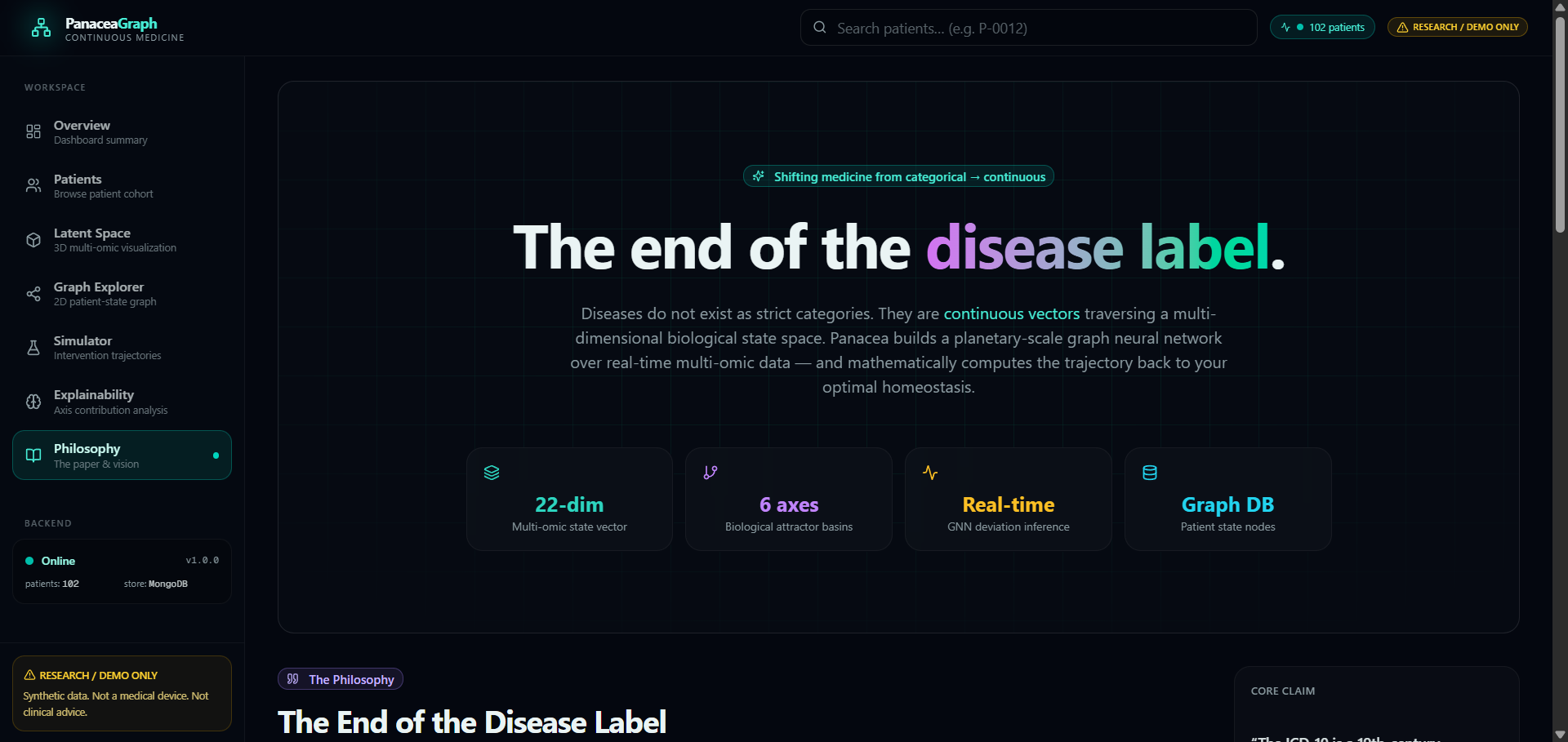
Modern medicine looks at health as a bunch of fixed labels. Our bodies are really more like changing systems. We wanted to think about a different way of doing things: what if we could show health as a continuous state instead of just saying someone has a particular disease? Panacea Graph was inspired by the idea that the future of medicine might depend on understanding how our bodies change and move away from a state.
What it does
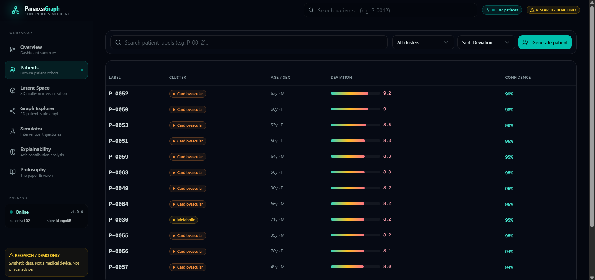
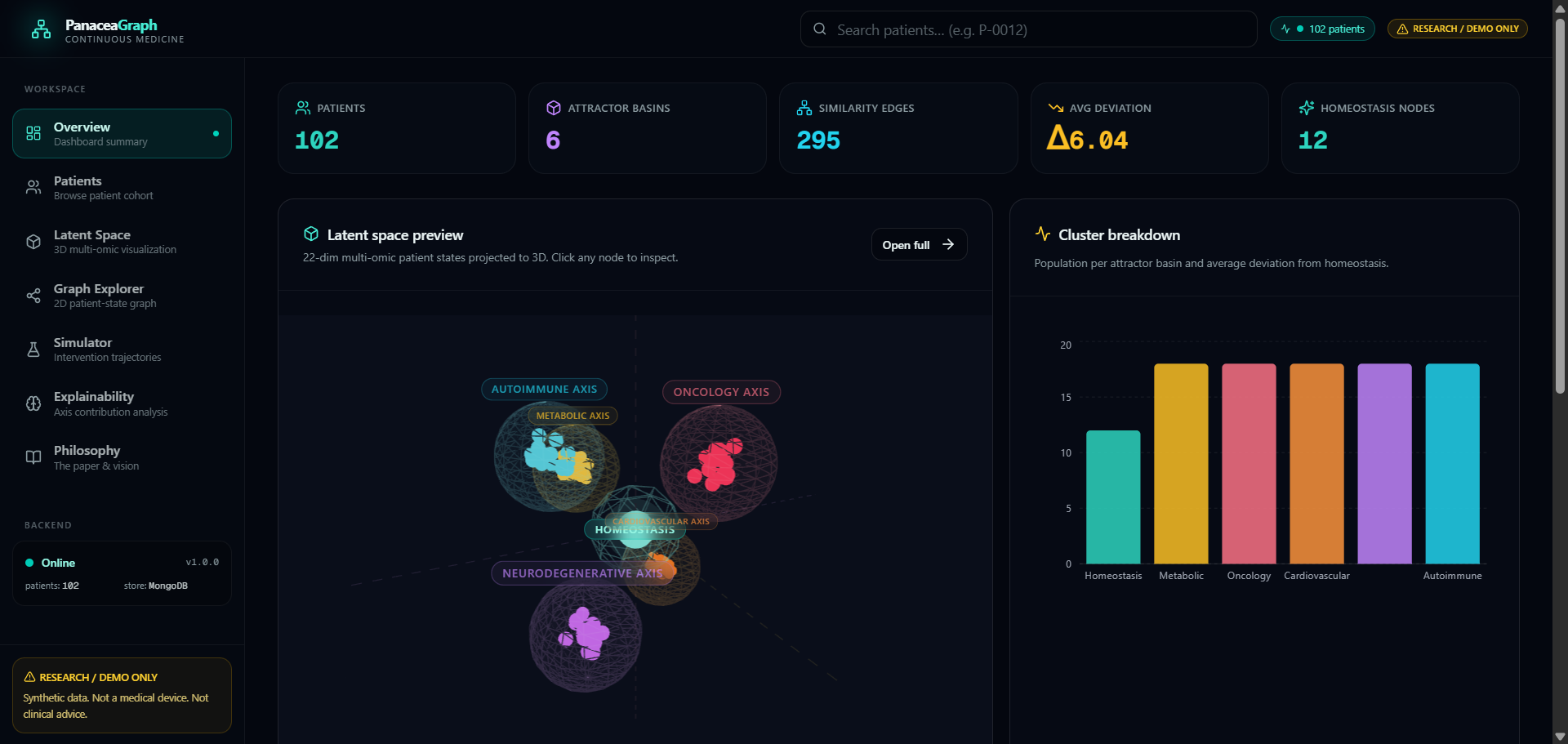
Panacea Graph is a research tool that uses patient data to model health as a continuous system. It takes information and maps it into a special kind of space groups similar patterns together and shows how a patients state can move towards a normal state. The system has a database, a machine learning part and a 3D visualization layer to help us understand these changes. Panacea Graph is about looking at health in a new way.
How we built it
We built Panacea Graph as a system with a pipeline for fake data, backend services, a database and a modern frontend for visualization. The system generates patient profiles stores information about how different biological features are related and computes special kinds of maps. Then it shows the results as a 3D map. We wanted to make the system flexible so we can add features later.
Challenges we ran into
One challenge was trying to balance our big ideas with what we could actually do in a short amount of time. We could not build a system so we had to use fake data and simpler methods to show our concept. Another challenge was designing a visualization that looked serious and scientific but was also easy to understand and nice to look at. We had to make some choices to get our idea across.
Accomplishments that we're proud of
We are proud that Panacea Graph takes an idea and turns it into something real. Of just talking about the idea we built a system that can actually generate patient states organize them and show how they change. We also designed the project to show a way of thinking: challenging the usual way of looking at disease thinking about health in a more dynamic way and looking at medicine as a changing system. Panacea Graph is about looking at health in a new way.
What we learned
We learned that combining ideas with practical engineering is really powerful. When you pair an idea with a working system and a clear explanation it becomes more convincing. We also learned that really complex scientific ideas can be explained in a simple way with strong visualization and a clear story. Panacea Graph taught us a lot about how to communicate ideas.
Whats next for Panacea Graph
Next we want to make Panacea Graph more advanced by adding realistic fake data, better machine learning and more ways to explain what is going on. We would like to add features to help us understand how health changes, over time and how we can use this to improve healthcare. Term Panacea Graph could become a tool for researchers to explore new ways of understanding health and disease. Panacea Graph has the potential to change how we think about medicine.
Built With
- api
- node.js
- python
- rendering
- typescript

Log in or sign up for Devpost to join the conversation.