Inspiration
Most UX feedback comes too late, costs too much, or tells you things you already knew. I kept seeing the same problem. Teams spending hours debating button colors while their onboarding flow was silently losing 60% of users on step two. Nobody catches it until real people start bouncing. I built panic.design to catch it before they do.
What it does
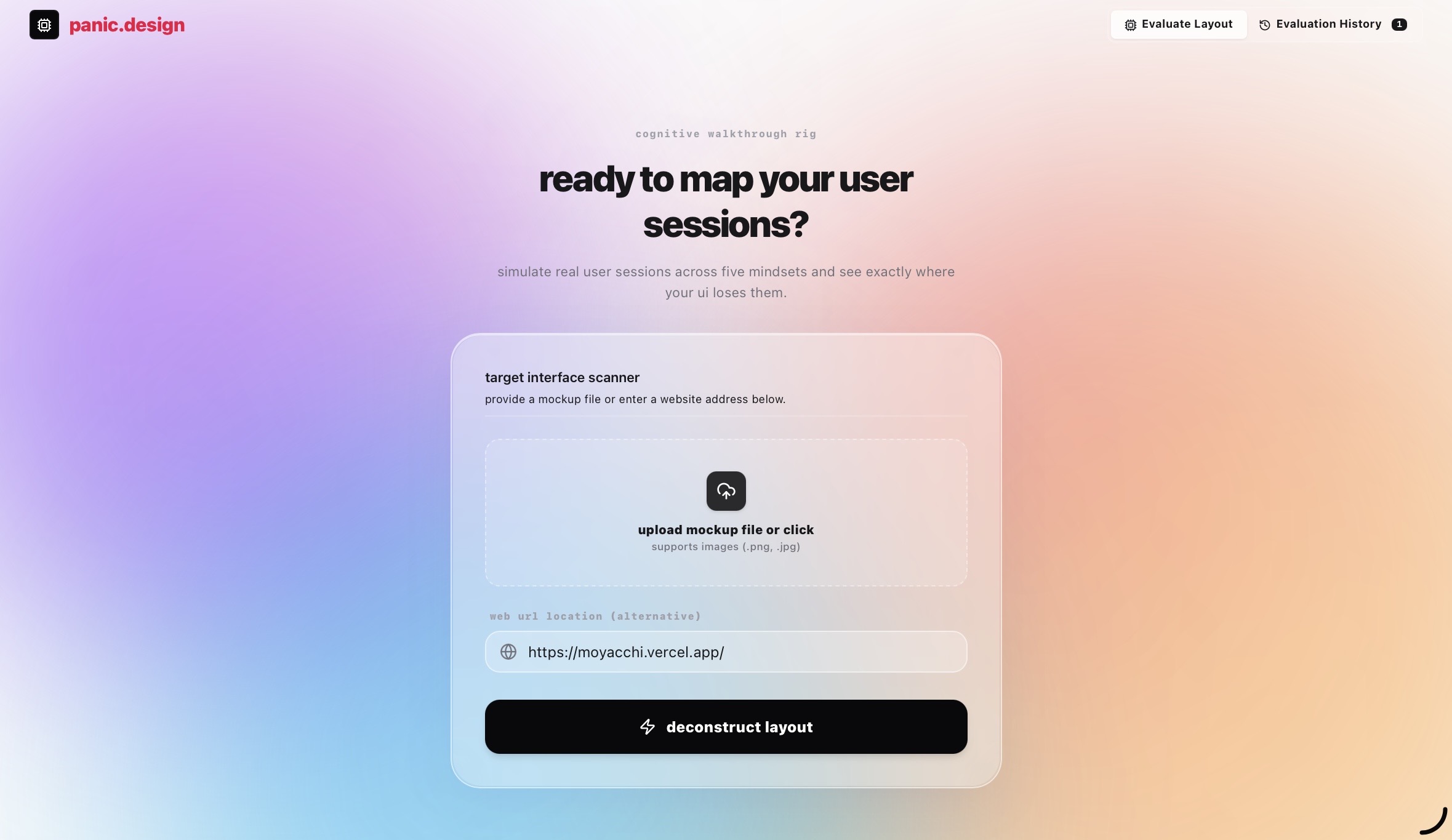
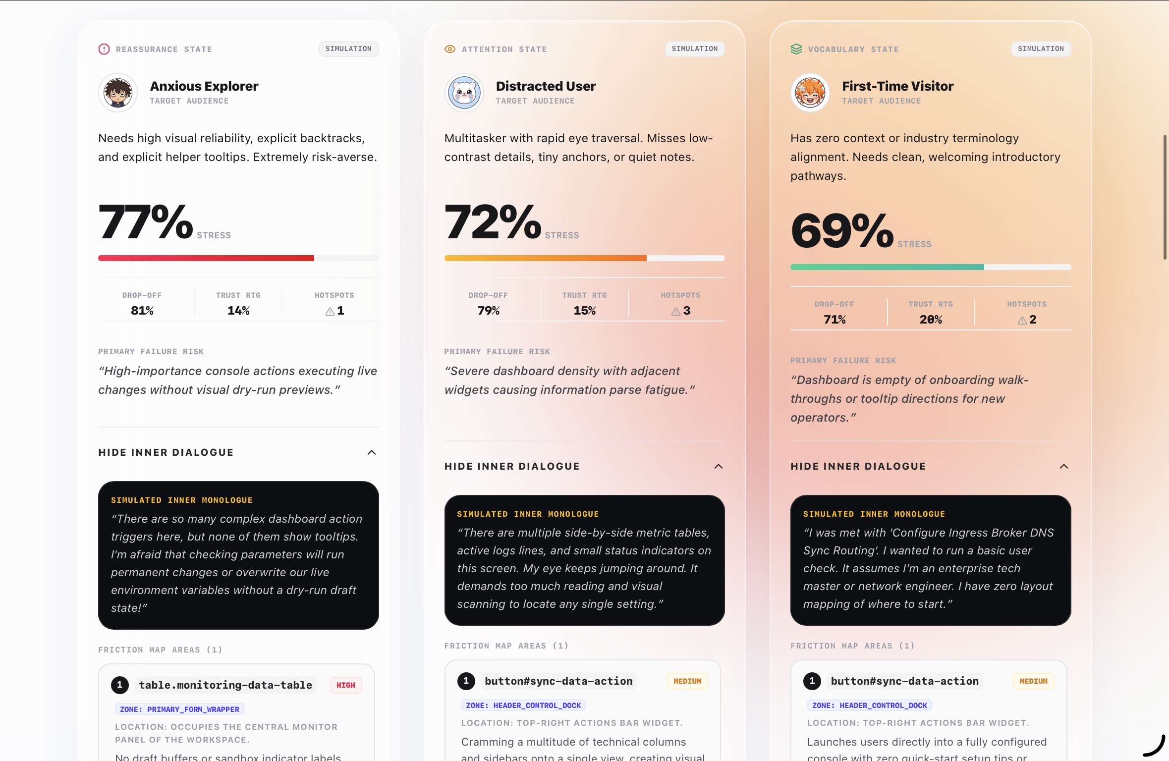
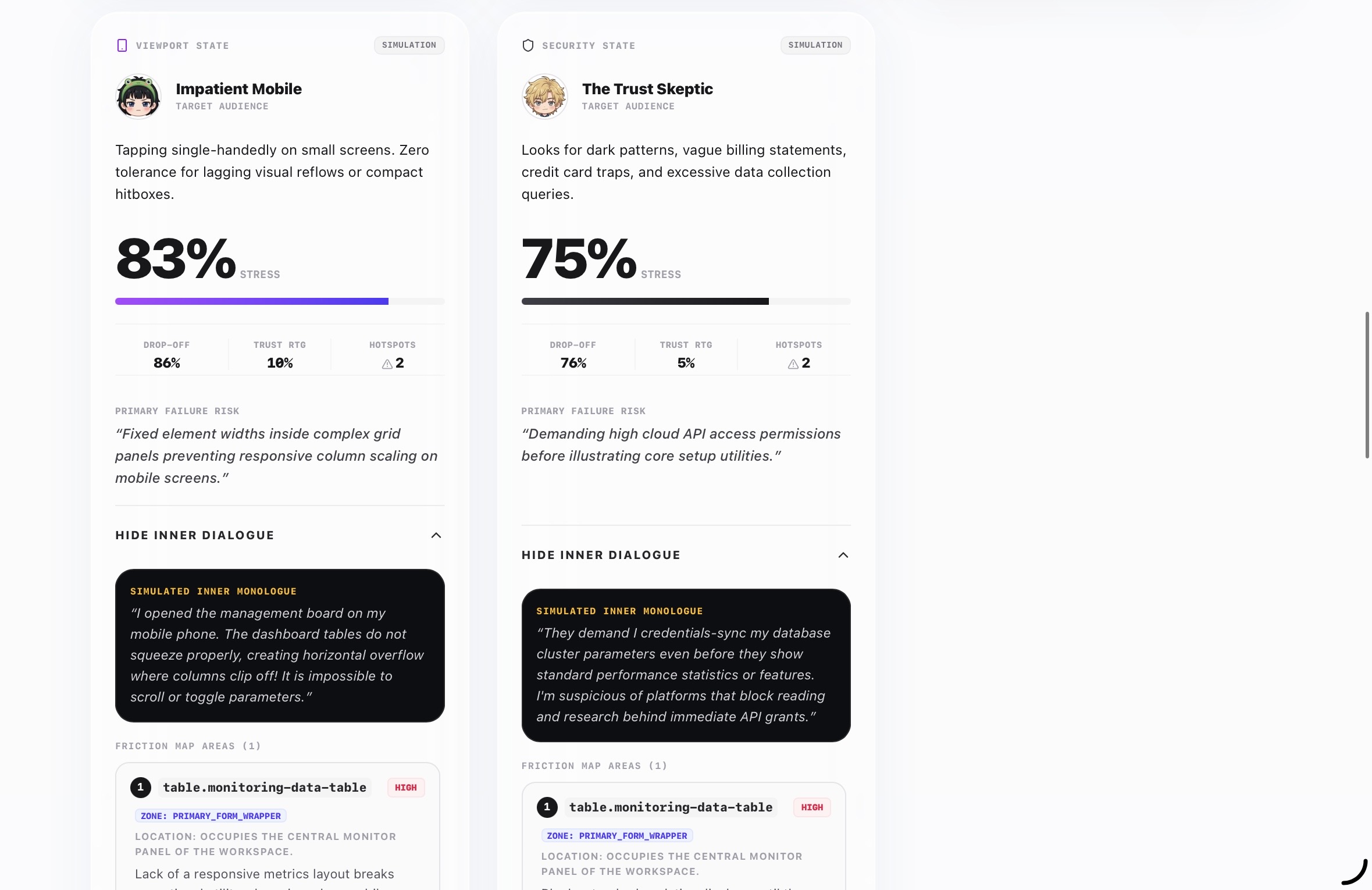
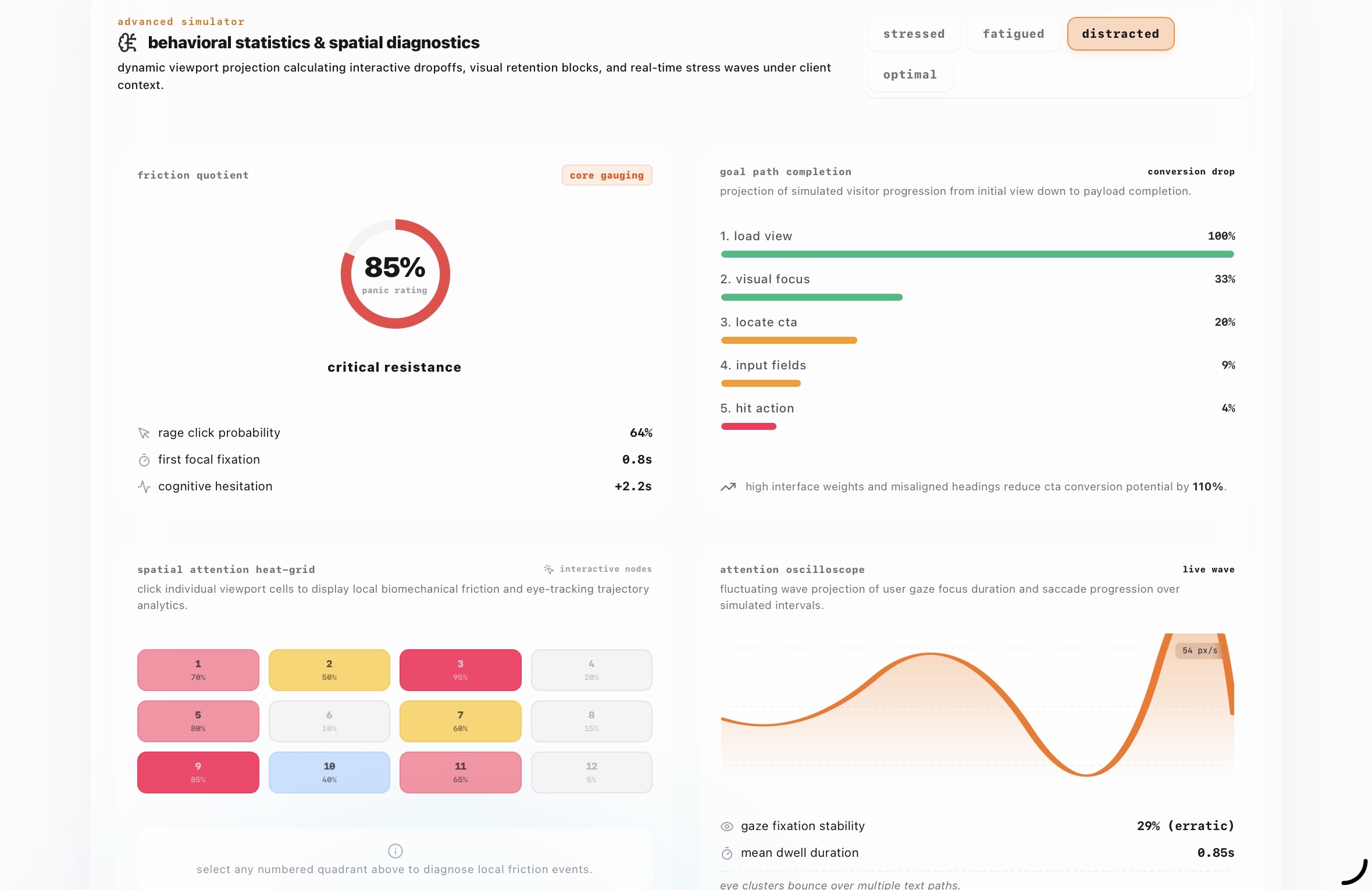
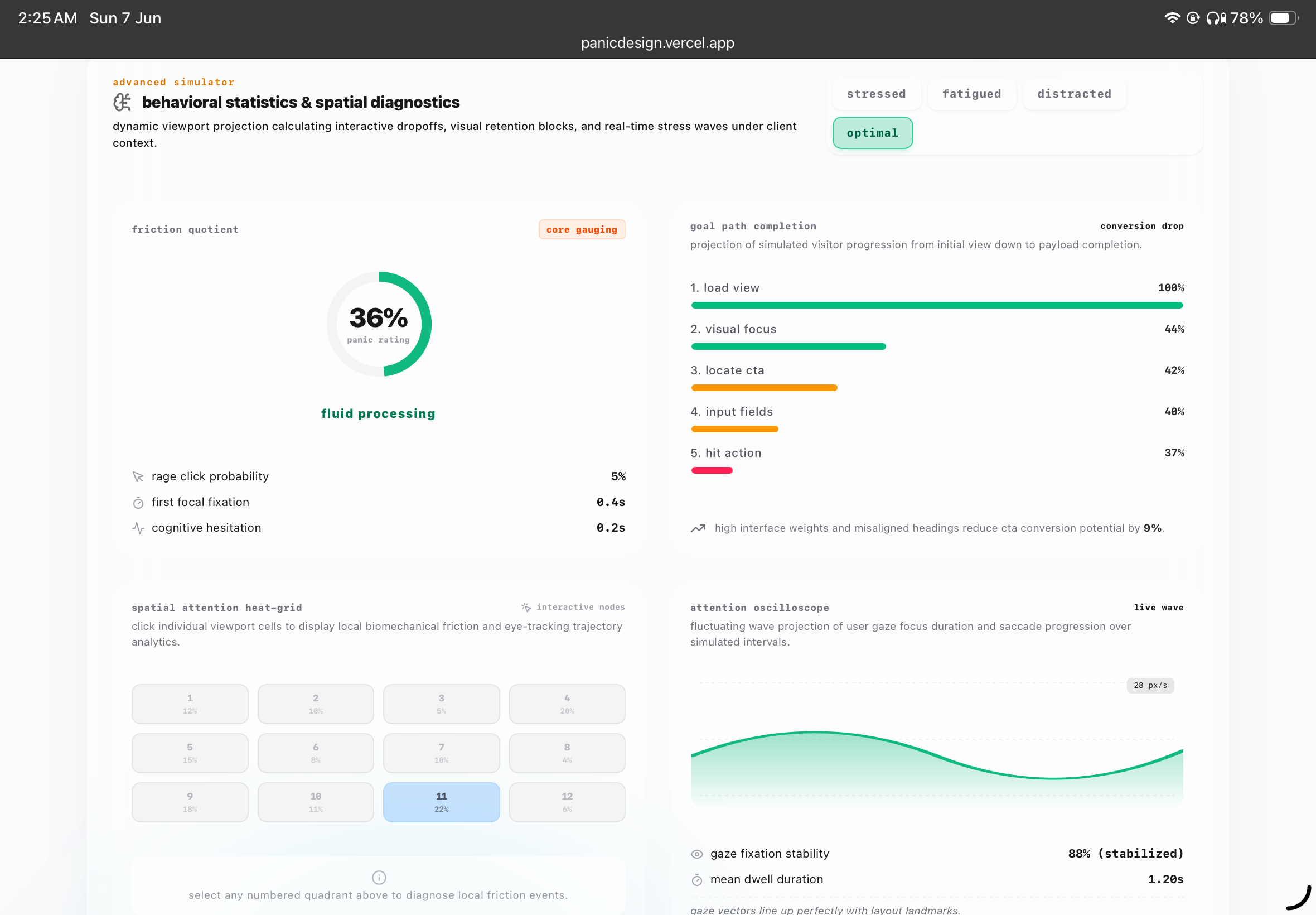
You upload a screenshot of your interface or paste a live URL. panic.design runs it through five distinct user personas representing real categories of user behavior that existing tools ignore. The Anxious User who second-guesses every click. The Distracted User who gave your page three seconds. The First-Timer with no context. The Impatient Mobile User on a slow connection. The Skeptic who assumes every interface is trying to trick them.
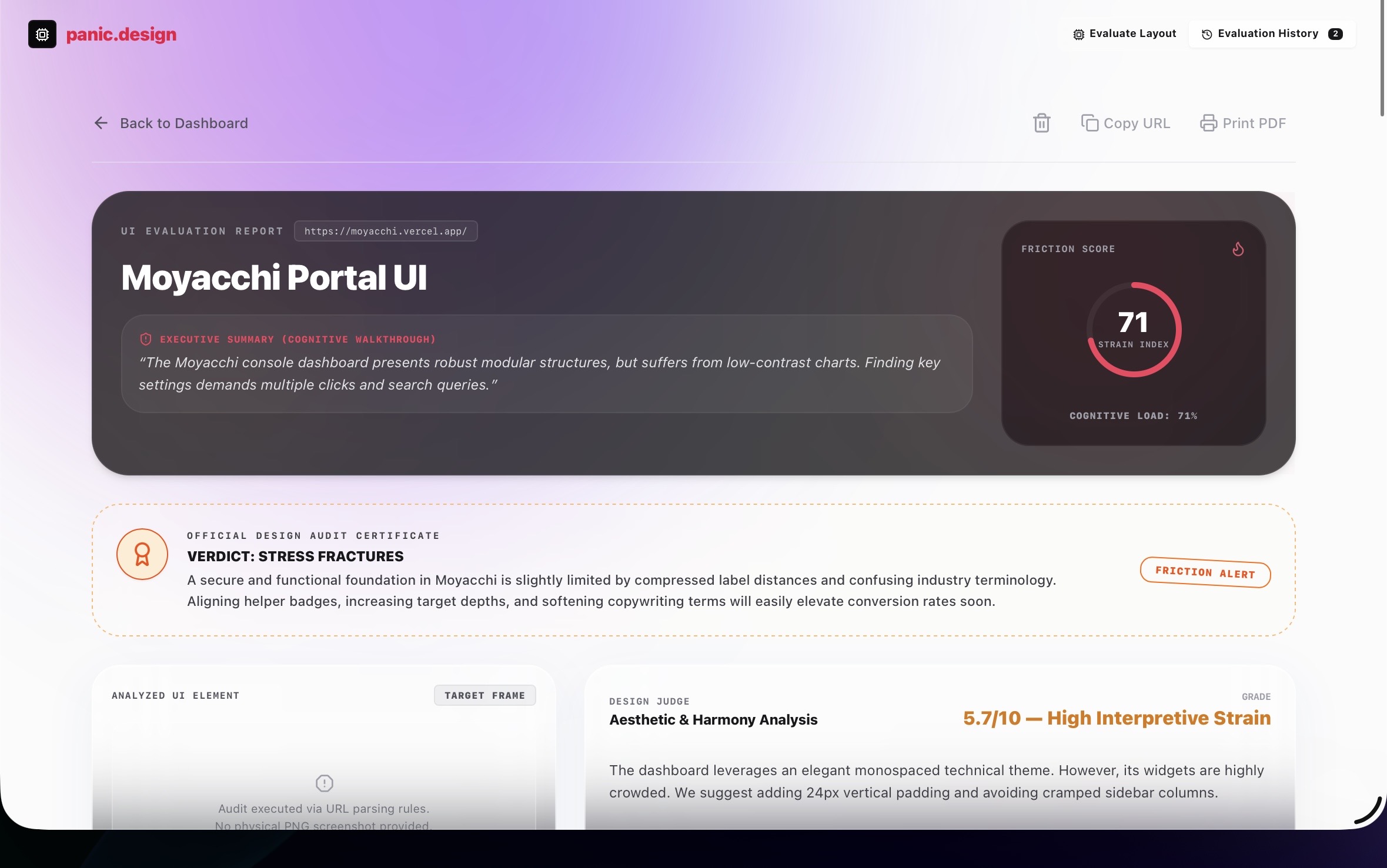
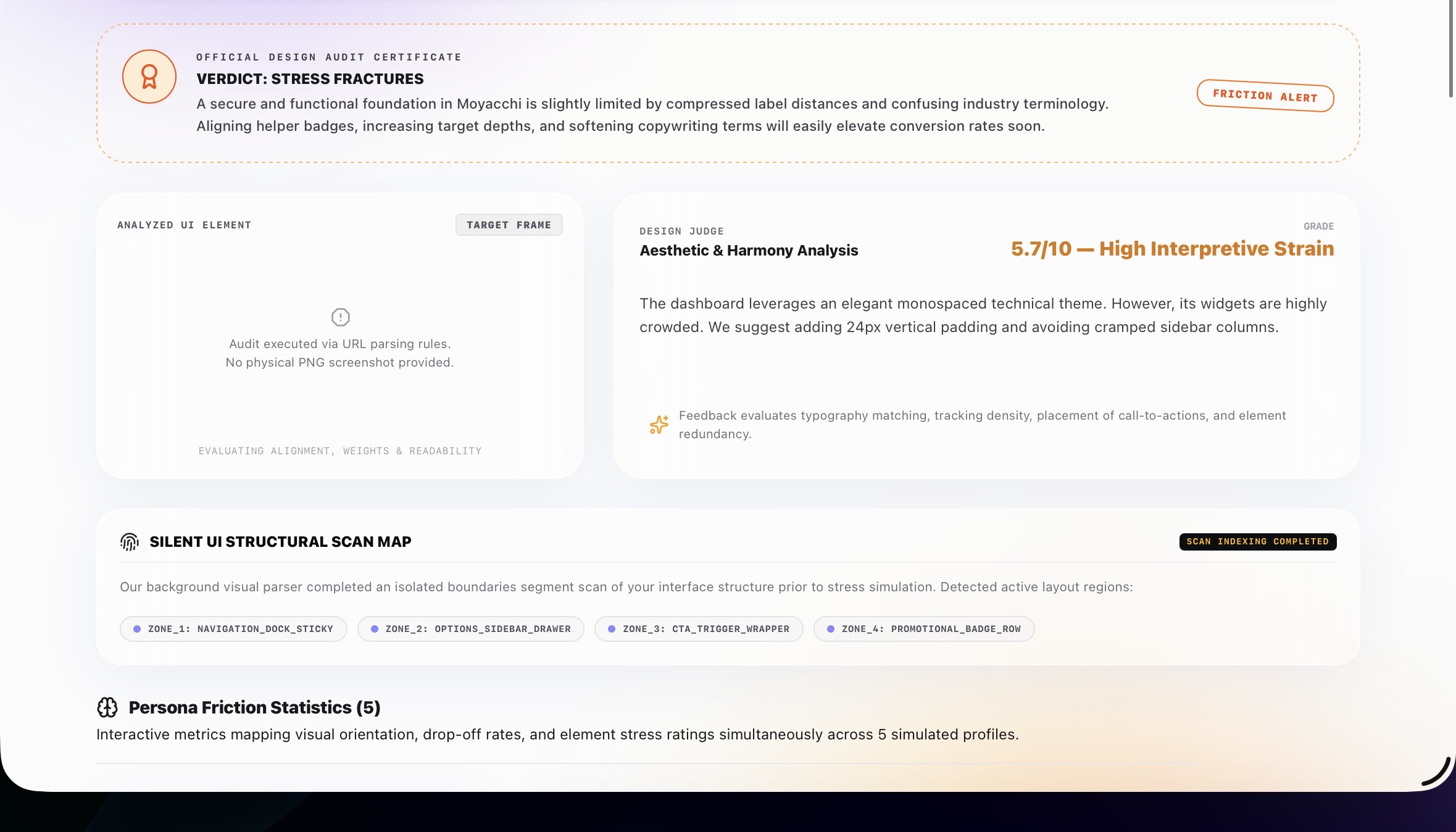
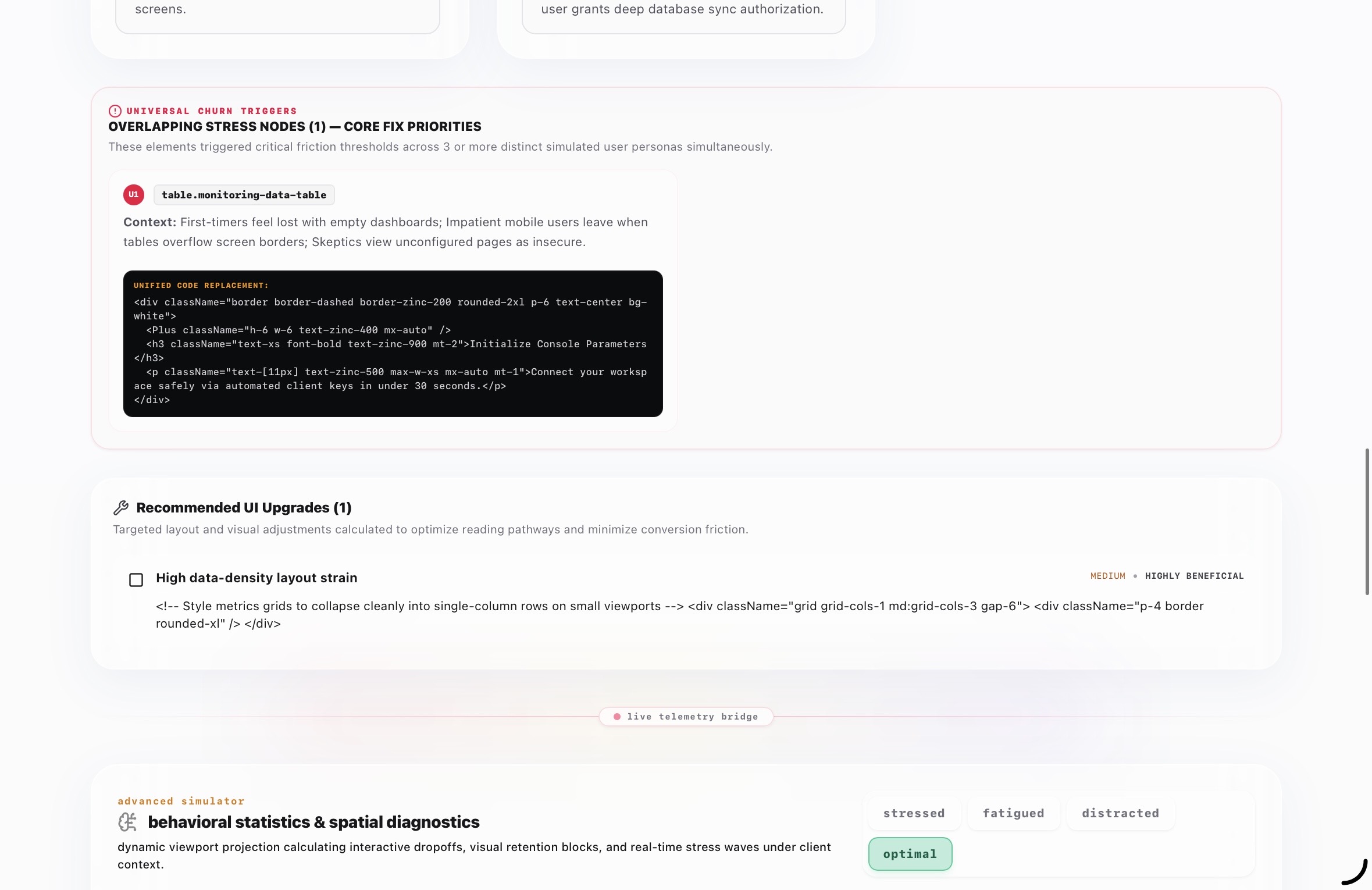
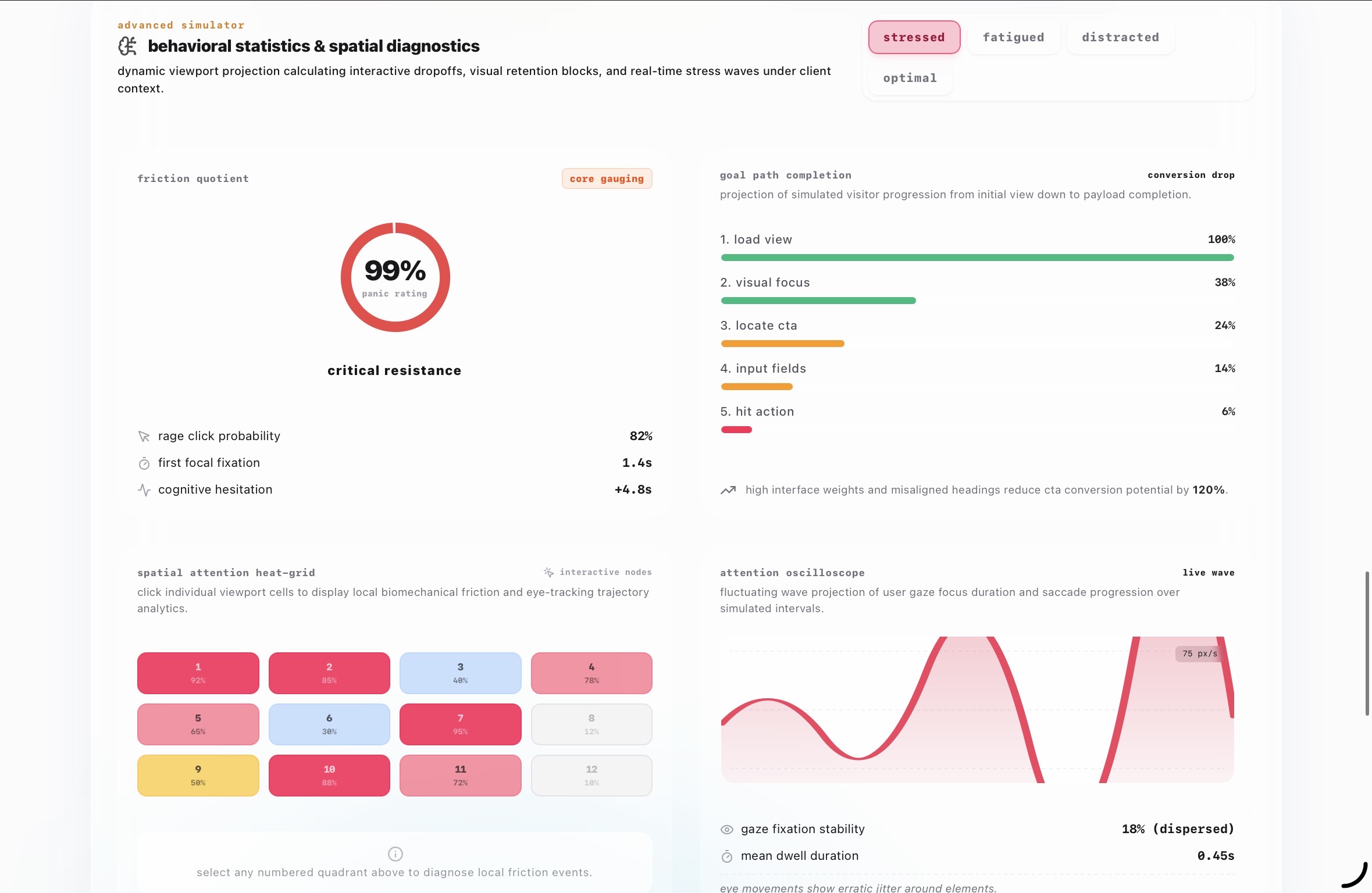
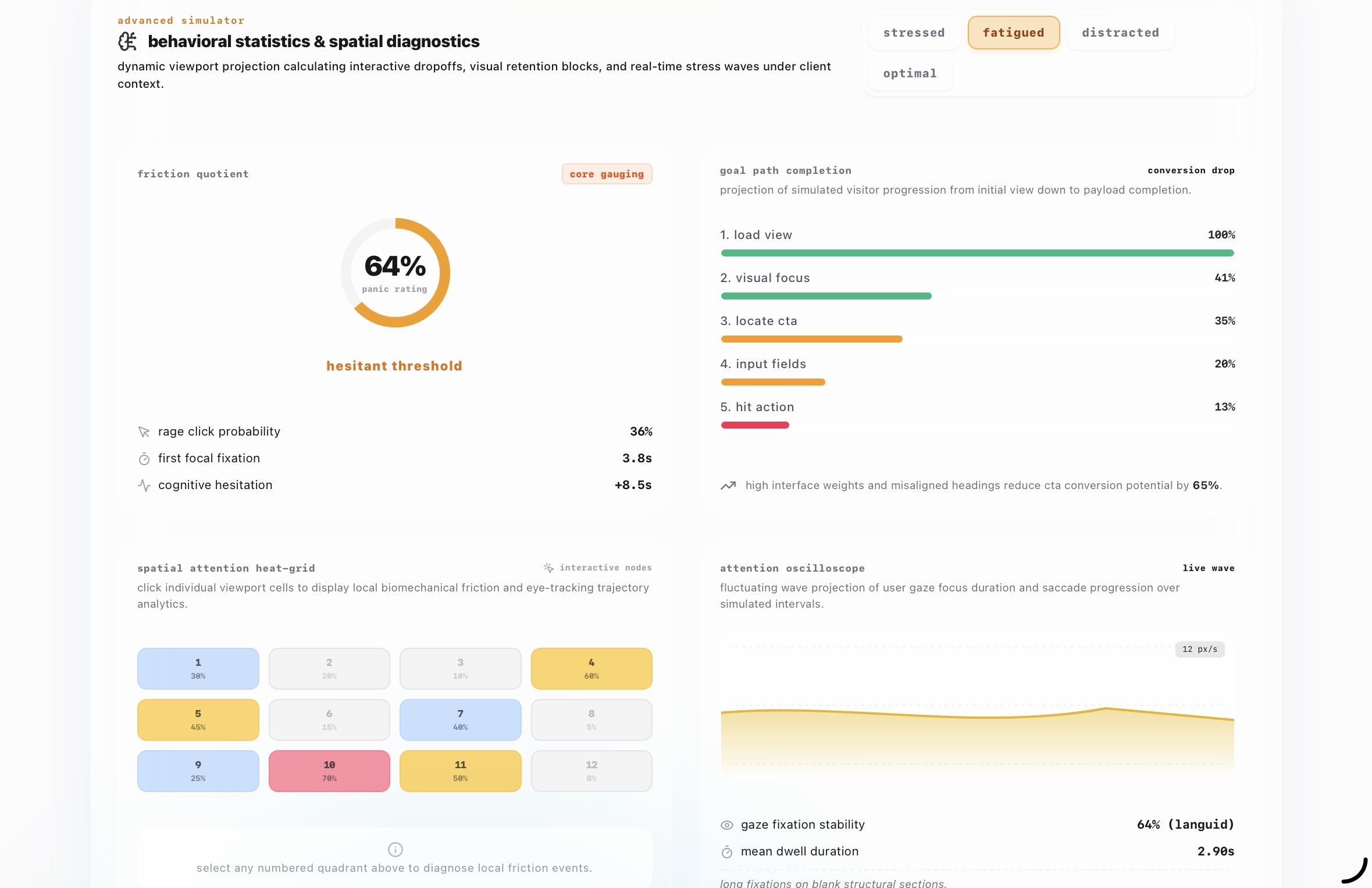
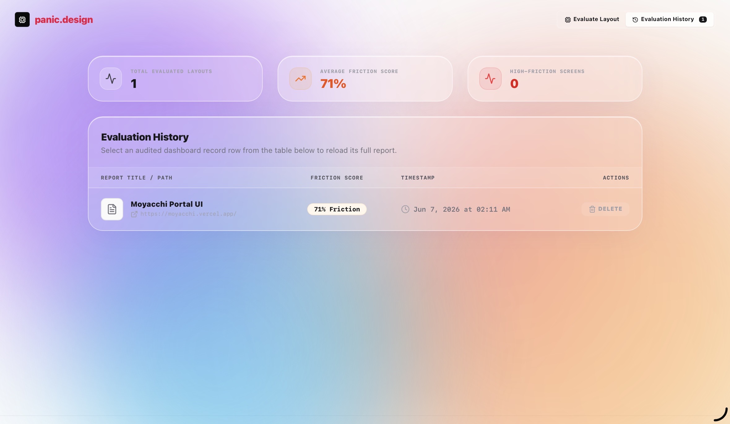
Each persona flags specific friction points, speaks their complaints in first person, and produces a sub-score. The app combines these into a single Panic Score. The score places your UI in one of five tiers: Panic-Proof, Steady, Work In Progress, Stress Fractures, or Crime Scene. Every complaint comes with a Fix Generator that gives you the actual rewrite, not advice.
How we built it
The AI analysis runs on Gemini Vision via Google AI Studio and its IDE. The URL input is powered by Nimble’s live web rendering API, which converts any live website into a screenshot automatically. The frontend is deployed on Vercel. The entire stack is free.
Challenges we ran into
Getting five personas to produce genuinely distinct voices and not collapse into the same generic UX feedback was the hardest part. Each persona needed its own reasoning pattern, not just a different tone. Prompting Gemini to maintain that separation consistently across wildly different UI types took significant iteration.
Accomplishments that we're proud of
The Before/After mode. Upload v1 and v2 of your interface and the app tells you which problems were solved, which stayed, and whether you introduced new ones. No existing tool does this at zero cost. The Panic Score animation and the Crime Scene verdict card also hit harder than expected in demos.
What we learned
Users do not fail at interfaces randomly. They fail in predictable patterns based on who they are. Building around that insight instead of generic heuristics made every output feel specific and honest rather than templated. Also Nimble’s rendering API is genuinely fast.
What's next for pain.design
Industry-specific persona packs. An e-commerce skeptic behaves differently from a SaaS skeptic. Mobile-only audit mode. A shareable report link so teams can send panic.design results directly to their designers without screenshots. And a freemium model at $19 per month for unlimited audits.
Built With
- css
- gemini-vision-api
- github
- google-studio-ide
- html
- javascript
- nimble-web-rendering-api
- vercel


Log in or sign up for Devpost to join the conversation.